
How To: Layering Patterns
I'm asked often how I layer patterns, since it's something I love to do with pillows, bedding, and even in the kitchen with various textiles. Would you like to know?

It's actually very easy, though difficult to put into words since most of it comes as second nature. I don't mean this in a snotty way, because other things (like numbers) do not come as second nature. We all have our strengths. Anyway, what I'm saying is that I never really put much thought into it. For the benefit of decor8 readers who send emails asking about the art of layering, I'll try to see if I can explain it. For readers who have an alternative way to explain the process, please comment below and share your knowledge. I'd love to learn about your technique.

There are several ways. If you're new at it, I'm thinking it may be wise to use patterns that coordinate somehow, working off of the same color palette. For instance, you have a floral that you are dying to work with and it is in red, blue, white, and yellow. Always try to drag in a solid or a small print into the mix as a foundation. Then, blend in something geometric, maybe sqaures, a check or a stripe with all of the colors in your floral, or perhaps just one or two of those colors. Next, locate a floral with a print much smaller (at least 50%) than the other floral print you have. Perhaps tiny yellow tulips against white poplin. For a solid, maybe a deep cobalt blue. I like to start with my solids first, so the cobalt blue would be the fitted sheet. Next, either use the large or the small floral for the top sheet, then add the geometric pillows, and then add again, either the small or the large floral print for additional pillows (some people sleep with 4 pillows on their bed). That's at least, how I do it. Are you following me?
For those looking to advance beyond that (i.e. you'd like to add prints to the mix that don't contain any of the colors as the other prints you're using), make sure you understand that this technique takes a little longer to master. If you understand color theory very well, and travel with your handy color wheel in tote, you're on your way. Use caution as you begin to layer with too many color choices or patterns from different cultures or eras. Make sure that the colors you are working with harmonize, a color wheel can help you with color relationships. Don't forget to consider your fabric - mixing textiles that are very expensive and well made with those that aren't (like polyester) will only cheapen the look. Also, consider what time period they are from. It's easiest to layer with patterns from the same period or culture, 20s, 30s, 40s, Danish, Early American, Japanese, etc. It's also best that you try not to mix eras that are too far apart in years. 60s prints don't always vibe with prints from the 30s, for instance. This isn't a hard and fast rule, but for beginners, it's a good way to start training your eye so you can advance onwards from there.

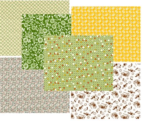
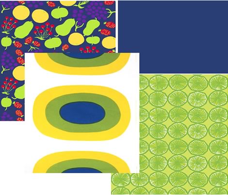
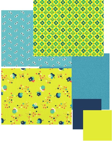
Now you try it. Head over to Repro Depot, a fabric supplier online who sells fabrics according to several categories. I did these and came up with all of the examples below, sticking only with one category at a time. Open up Photoshop (or whatever graphics program you use) and visit each of theese categories. Pull the images off of their site and drop it into Photoshop, arranging your favorites. Since they don't carry solids, try drawing boxes that show the colors you think would work nicely together.
I'd like to see your results, so when you finish a few, pick up to 3 combinations that you really love. I'll feature them here on decor8 today and throughout the weekend with your name/website so others can see what combinations you've come up with.
Have fun... And don't forget to shop Repro Depot when you're finished!

Related posts: Color Theory, 6.27.06
(images from reprot depot)