
Green Glorious Green!
Here's more green to inspire you today. From bold and confident, to charming and subtle, green is a color worth exploring! And don't miss a little secret of mine below because it may encourage some of you color shy types to stop standing along the wall and participate in the happy world of hue!
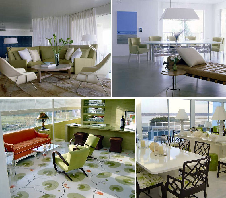
 Accessories from West Elm, a painting by German artist Anenette Meurer, Amy Butler fabric, and a random living room image that I loved for many reasons - color and the floor plan (great symmetry) stand out the most for me.( You can click on any of these images for a larger view, by the way.)
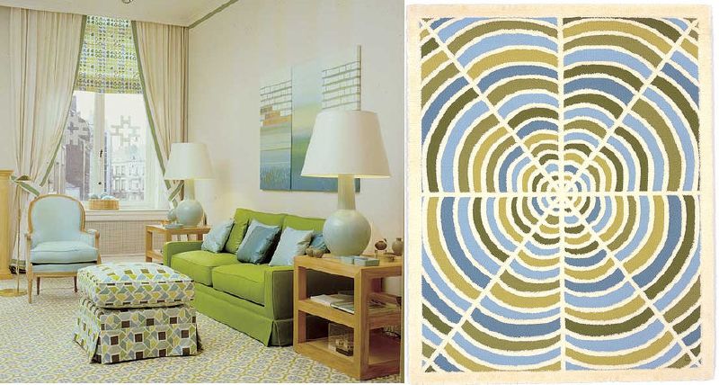 Even though this rug from Angela Adams isn't shown in the room, it's a fresh, modern translation of all of those fantastic greens and blues from that David Hicks space, don't you agree?
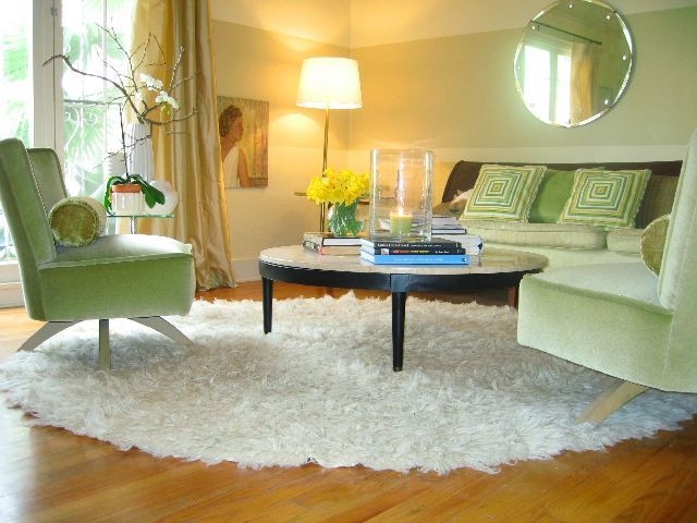
 This room, designed by the great Kelley Proxmire, oozes with confidence in every way. I can imagine relaxing in this calm, spacious living area. But it's also a bit tropical and fun. That lucite coffee table is a bit unexpected with the traditonal wood furnishings, but everything works. Notice all the plants. Don't forget to add green the natural way, by purchasing plants for your home. I love succulents and ivy myself, they're the hardest to kill. That's what I look for in a plant.
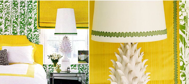 Jonathan Adler knows how to have fun with color, doesn't he? Even the ties he sports on Top Design could be made into a room. Love this bright yellow and green combo, I can't imagine ever waking up in this room and feeling depressed. Design prozac indeed.
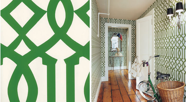 Chlo? Sevigny's entryway, pictured here from a recent issue of House + Garden, incorporated the Kelly Wearstler green imperial trellis wallpaper so well. I love wild and crazy patterns in an entryway for two reasons. You give guests a major welcome - first impressions are everything - so a hallway with the wow factor means so much. Next, because you can. A pattern like this is somewhat of an exclamation point print, it screams "Look at me! Over here! Look at meeee!", something you may not want to use on 4 walls in a living room or bedroom, but can totally get away with in a hallway, small bathroom, pantry, etc. In an entryway, this bold pattern accomplishes it's goal. Welcome! To! My! Home!
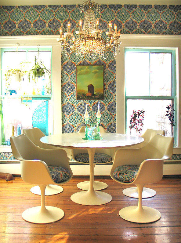 This Wary Meyers dining room is fantastic, from the tulip table to the seat cushions, wallpaper, and that green painting... It all works. That is what I love about their portfolio, you see things working together in ways you'd never imagine putting together.
 When I think about the color green, I think of versatility. When you are out in nature, green and blue and the two most dominate colors in most places, whether it be the blue sky, green grass, turquoise ocean, or the way mountains almost look blue or green from a distance. Then, you observe the colors around you in the form of shells, flowers, animals, rock, sand... Everything coordinates. You never look at a bed of flowers and think, "Oh my god, nothing matches! Dreadful!". Colors that occur in nature are so appealing. Images above, top: Vincente Wolf and bottom: Kemble Interiors.
 Look at the serene and sophisticated home of an Apartment Therapy reader. If anyone knows who this is or has the link to the original slide show, please comment with that below so I can give this lady due credit. I loved her space. Look at those velvet apple chairs. So inviting.
Now to share a little secret that may encourage those fearful of color. I was a neutrals-only girl for several years, stuck in a color rut just like some of you. How did I get out?
Let me clarify that things weren't always this way. I didn't grow in a color-free home, my mother loved color and even today, still uses it very well. I was actually quite the colorholic, I couldn't get enough. At 21, I moved into an apartment and my first purchase was a pink vintage refrigerator, huge floral wallpaper for the kitchen, and hardwood flooring that I installed myself. That was the wildest kitchen ever. Scary but gorgeous. After that apartment, I slowly allowed neutrals to creep into my life for reasons unknown. Maybe it was an emotional thing. I don't really know. But it was in my mid-20's that I hit a major neutral phase. I didn't understand what was happening to me. When I tried to introduce color, I fell flat, so I just didn't use it at all. Everything was cream and khaki.
What ultimately changed my perception of color was randomly hearing someone say that the best way to bring color into the home is bring nature inside. If it works outdoors, it will work indoors. I never thought about that in my life, seemed so simple, but so true. It was then that I started small. I brought home fruit and flowers. Instead of mixing fruit in a bowl as I always had, I started to put oranges in a single bowl, lemons in a tall vase, limes arranged on a platter. I always loved to buy flowers for my office at work, but didn't bring them home much. I changed that. I started bringing fresh flowers into my home once a week, but instead of buying a mixed bouquet, I stuck to a single color, like yellow tulips for instance. Placing fruit and flowers around my home helped me feel more comfortable about living with color again. The 21-year-old Holly with the pink refrigerator resurfaced. I was me again. Color was back!
Now I feel completely comfortable around color and I'm in a profession where I'm helping others to overcome their color fears. So start small and build, even if it's just fruit and flowers. Look to nature. Start with green.