
Back in Black
"Back in Black"
By Rachel Perls of Hue Consulting, decor8 guest writer
Fall is finally here; our palette has turned to deep, rich, autumnal colors. With the colder weather approaching, we move indoors, looking forward to making our spaces warm and cozy for the months ahead. Light, airy whites and pastels are tucked away in storage, and denser, muted tones become more prevalent, ushering in a feeling of weight, comfort and stability.
 Via Domino magazine.
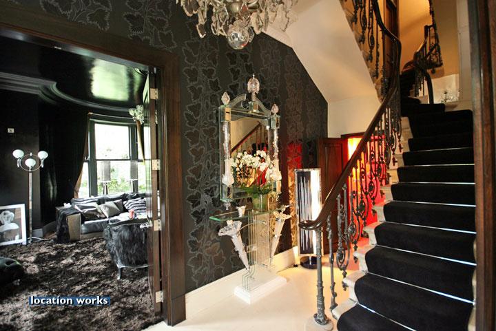
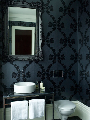
Black is a strong, dependable color that becomes quite prevalent in home decorating during this season. It has a sense of permanence, and solidity that is reassuring. How decadent and glamorous is this room shown above? Black represents sophistication and substance. The ultimate chic color for cocktail parties and black-tie affairs, it can morph into a completely different interpretation with a simple change of context.
People react quite strongly to this hue, which is actually the absence of all pigment. It signifies mourning in many cultures, as well as danger, or the supernatural. It is ominous, the fear of the unknown. Black represents power, which can be reassuring, or scary, depending upon whom wields it.
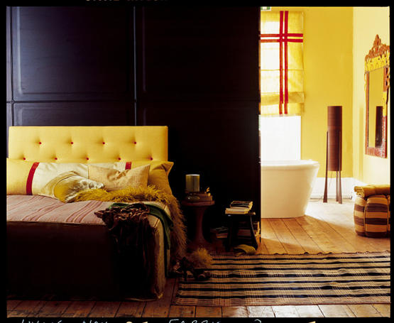
One combo that packs a punch is black and yellow. In nature, black and yellow color patterns communicate to predators that an animal is dangerous, like stinging wasps or poisonous snakes. We?re biologically conditioned to pay special attention to this color duo.

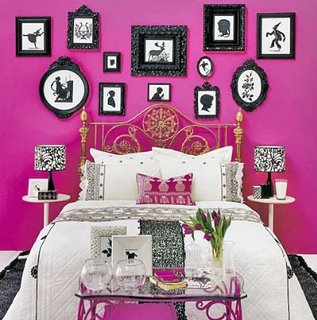
Another popular match is black and red. It has a strong Asian flair, and looks amazing in lacquered finishes.
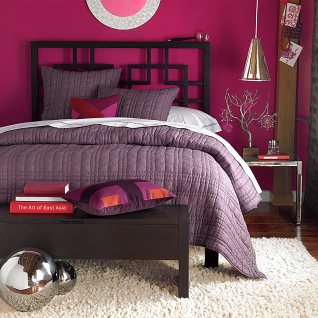
A fresh, modern variation of the red and black theme substitutes fuchsia for the red, lightening the mood considerably.


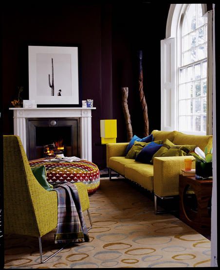
When paired with other bright colors, black works as a unifying element. How fun is this treatment? I feel like I just stepped into a pop art painting.

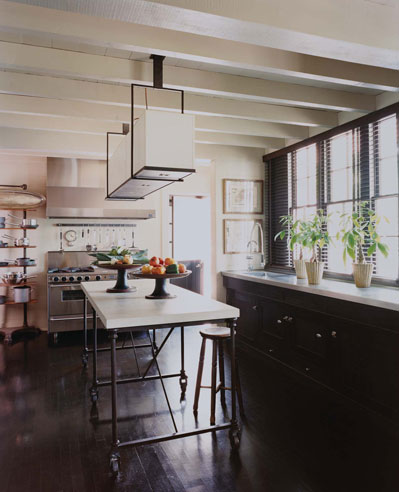
Trend-wise, I?ve read that dark cabinets for kitchens are very hip these days, Susan from the blog The Kitchen Designer, is a terrific source for trend watching in this area of the home. But be forewarned about those oh-so-popular black granite countertops. Ergonomically, they are horrible for your vision because there isn?t enough contrast between the work surface and your kitchen items; this causes eyestrain.
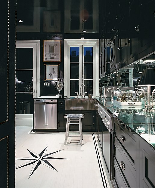
Just by tweaking the texture, surface, and tone of black, you can create vastly different moods. This shiny kitchen by Miles Redd is really over the top, but I thought it was so fun, I couldn?t resist.
 Here, a room by Nicole Sassaman has a soft matte black wall of chalkboard paint.


If you don?t know where to start, accent pieces and dark flooring are great places to begin introducing ebony into your spaces. (Remember the Nate Berkus NYC Aparment reveal on Oprah?) Black can look great with almost any color, especially if it is used with contrasting lighter colors. You absolutely need the contrast, so don?t go too overboard with this inky tone.
Any questions regarding black that you have? Please leave your question or comment below and I'll gladly do what I can to answer!
(images linked accordingly above. some links via desire to inspire.)