
Fashion Inspired Interiors
Priya from the delicious eye candy blog Love Made Visible posted about the Pirelli tire company?s 2008 calendar shot in Shanghai by Patrick Demarchelier and I couldn't resist sharing Demarchelier and his work with you. It also inspired a little something more...
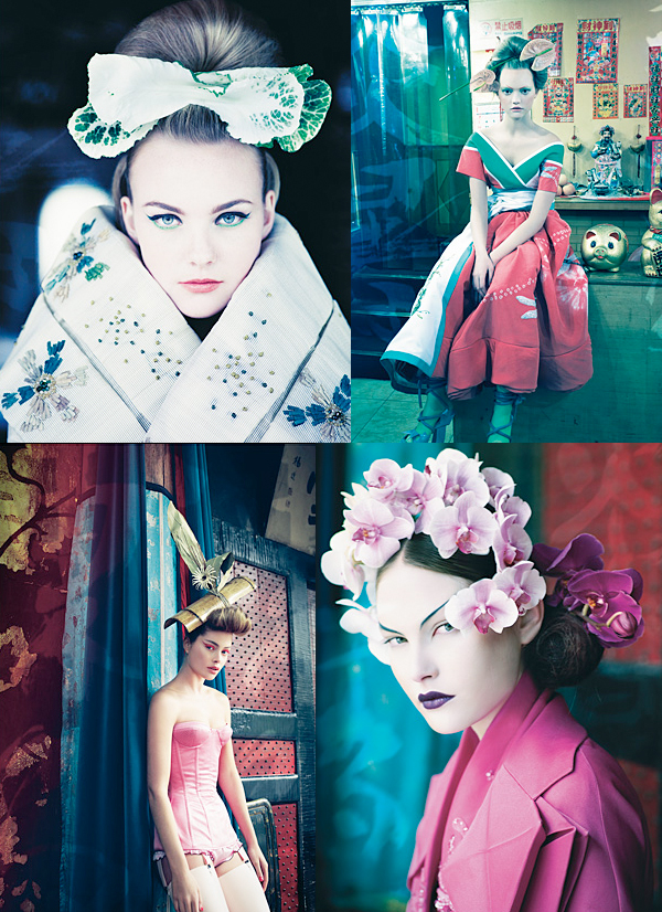
Demarchelier is primarily a fashion photographer with credits that include Vogue, BCBG, Vanity Fair, and Armani Exchange to name a few, along with top models like Gisele B?ndchen. You can view his recent work here. I'm so thankful that Priya showcased these images on her blog because it inspired me to build a palette around her collaged images as I imagined myself sitting in a luxurious living room surrounded by these exotic colors. Like a color saturated Tricia Guild showroom. Mmmm pretty. Perhaps the rooms would look like this...
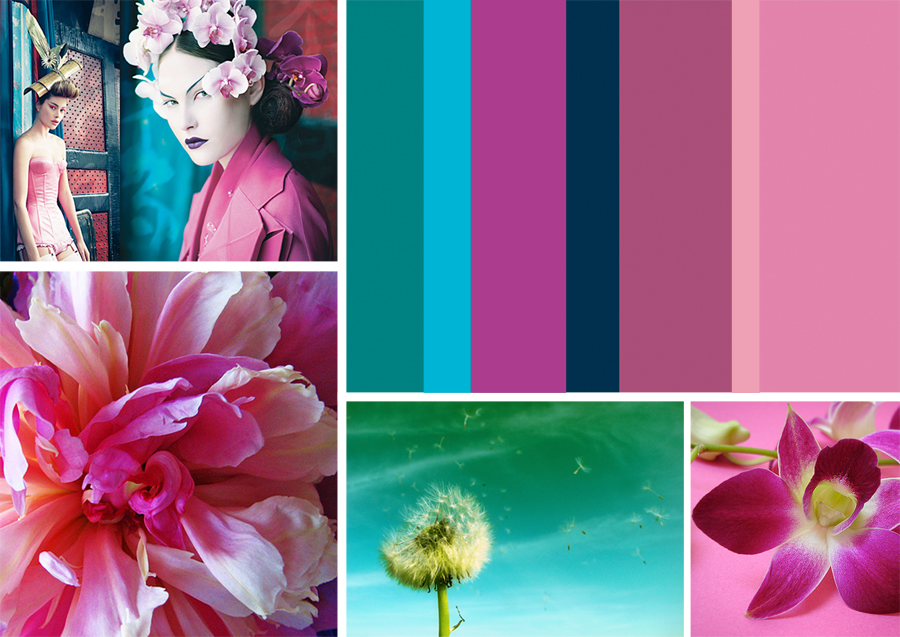 We're seeing lots of these colors (blue-green, violet, etc.) in the Pirelli calendar so I created this palette over at Colour Lovers. Colour Lovers is a great online color tool by the way, you must try it out. A palette and some inspiration is all it takes. (Peony by psr47can, Freedom photographed by my husband and the orchid is by wagner campelo).
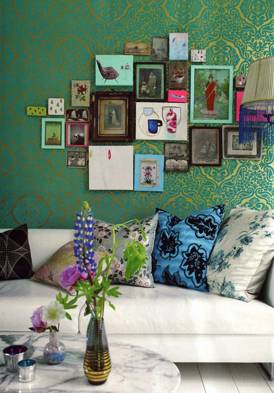
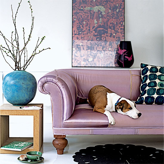 Image via House to Home.
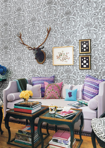
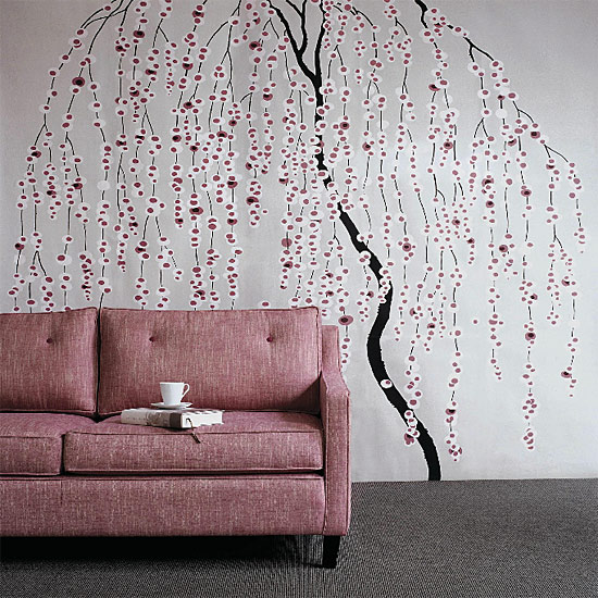 This is minus all the blue-green tones of course,
but the floral pattern and pink reminded me of Demarchelier's photos somehow.
Image via House to Home.
 via Domino magazine.
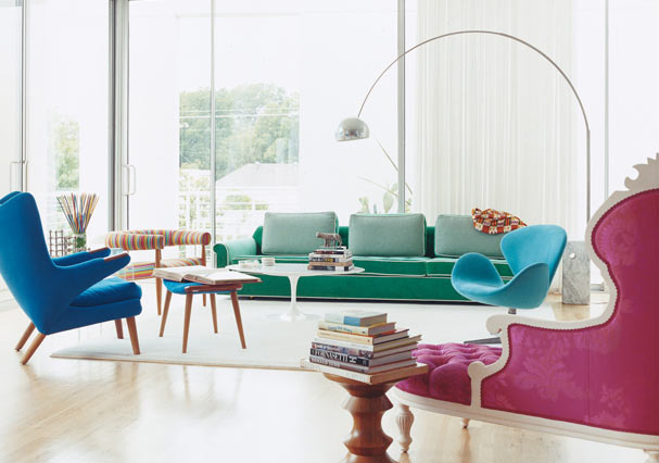 via Domino magazine
 via Living Etc.
Some of the best and brightest stars in the world of Interior Design take their inspiration from the runway. I preach all the time on decor8 that inspiration comes from nearly everything, from a walk along the shore to a found object (shells, bark, pebbles), a handbag, nature photography, it's amazing how the whole world just opens up when you start to look at the "mundane" things around you a little more carefully. Inspect product packaging, really notice wrapping paper, visit toy stores, look at the rooms featured in movies, notice the patterns that are formed by ice on a window or the various tones of flower petals. Have you looked through a microscope lately? The patterns and textures you see as you examine plants or liquids can open new worlds - I'm not kidding, these things are magical. Inspiration is all around so the next time you're feeling uninspired, pick up a copy of Vogue, visit a museum, or go for a walk in a nearby forest. There's so much to explore!
(fashion images from pirelli photographed by patrick demarchelier, collage created by priya.)