
Pop Pervert – Your Opinion?
Your opinion is needed for this budding new surface pattern designer… Alexandra Bedoya is based in Spain and is not only the resident Barcelona editor for Luxe City Guides but also runs a design studio called Pop Pervert that just launched a new line of over 120 prints and patterns & prints that can be applied to jewelry, textiles, wall paper, ceramics. The designer is her business partner, Ana Montiel.
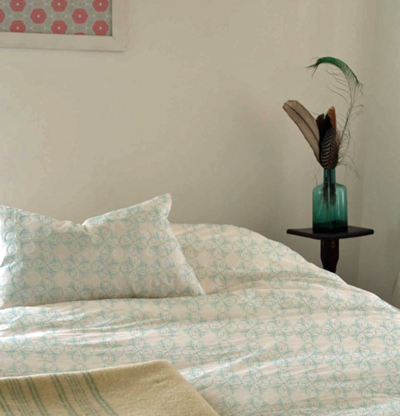
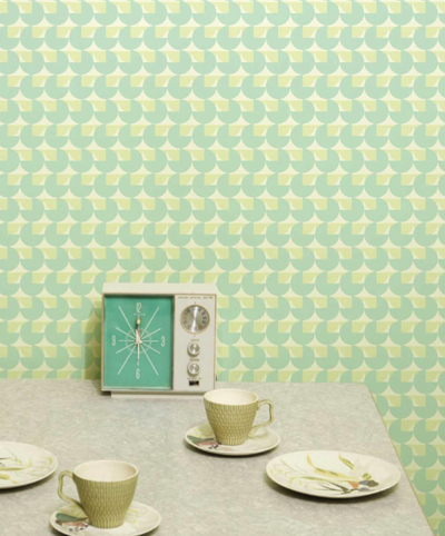
Though Pop Pervert is still in the beginner’s stage (no product for purchasing), Alex contacted me to present their work here on decor8 to see what type of reaction it gets from readers. A little market research. :) They really wants to get Pop Pervert out there and could really use your feedback, or if you are in a position to discuss something project-related, feel free to contact her for that too. What do you think, would you like to help? All I can say is that if Smeg produces refrigerators with their patterns on them, I will definitely order one. I would love to see washers and dryers go this route too, a little surface pattern would make for a great touch to otherwise boring appliances. Especially patterns that you can apply to that can be removed and replaced with other patterns, like giant decals or those shrink wrap ads you see on public transportation.
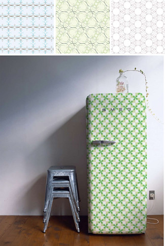
Pop Perverty has a very creative website that you may enjoy browsing too. I love that they took the time to show renderings because it really gives me a solid idea of what she as a designer is looking to do with their work, hers creative vision for it — but also helps me to better see it in a real world environment and to see the scale of the patterns because on paper a print may look great but once on the wall, the print is much smaller or larger than you envisioned which is sometimes a negative. This way, you can see things how Ana and Alex would like them to be. They pulled together an extremely professional pdf file (download it here for your viewing pleasure) with her patterns and renderings that I think makes for the perfect presentation to show to potential buyers, I love what they’ve done and am thankful for the sneak peek.
What do you think of Pop Pervert? Again, they encourage your participation if you feel so inclined… Thank you Alex for sharing these with us.
(images from pop pervert)


April 14th, 2008 at 5:41pm
So amazing! I would love to buy the fridge, and would also love these designs in wallpaper and fabric form.
April 14th, 2008 at 5:52pm
Oh.
My.
Goodness.
LOVE, LOVE, LOVE.
I’m not even sure what to say. I love everything to bits. I would definately consider purchasing things if they were to go on sale, which is quite the compliment considering I’m about to move out for the first time, and money will be tight! I’ll only be able to purchase things I simply adore and everything else will fall to the wasteside, but my gosh. I would have a very hard time resisting in buying something. Perhaps bedding. Wallpaper + renting apartment = nuh uh!
Sorry about all the confetti hearts I just spilt everywhere. I keep them for moments like this.
April 14th, 2008 at 5:54pm
I love the idea of patterned appliances! I especially like the wallpaper behind the yellow table – it has a “nature-y” feel to it that I like.
April 14th, 2008 at 5:56pm
Cool frig.
I am not a big pattern person, but there are several licensing shows that 1 can exhibit at to get one’s work out there.
Surtex in NY, Licensing show in NY but moving to Vegas in 2009, one in Hong Kong and one in London, http://www.brandlicensingexpo.com.
There are a few others- Craft and hobby Show is expanding their license and design section- http://www.chashow.org (is the url, I think)
Atlanta- http://www.americasmart.com just announced last week they are adding a license and design section starting in Jan 2009.
April 14th, 2008 at 5:56pm
Thanks for the beautiful comments! we at Pop-Pervert hope to find manufacturers soon and start selling lovely wallpaper, appliances and more fun stuff soon..
Alex & Ana- Pop-Pervert.com
April 14th, 2008 at 5:57pm
Great stuff! I get the very retro feeling from it. Love the potential product presentation (especially the fridge and the house). Wouldn’t that be great if decorating the outside of your house in some sort of weatherproof wall design was an option.
April 14th, 2008 at 6:00pm
I’m not inclined to like a company name with the word “pervert” in it, but that’s just me—it has a negative connotation in my mind.
April 14th, 2008 at 6:03pm
Wow so beautiful. Her application photos are totally realistic and so well done. I would not have known they were not real had I not been told. Her colors and delicate lines are gorgeous. I hope she comes to Surtex so I can meet her. I’m sure she’ll have lots of luck in the industry. She’s so talented. I wish her all the best.
April 14th, 2008 at 6:19pm
Beautiful! I would love these in all the forms suggested. They are lovely and so cheerful! Kudos to Alex!
xo
Melissa
April 14th, 2008 at 6:52pm
Oh I just love these patterns. They are busy, but the soft color combinations make it work just perfectly. Would love that fridge!!!! Maybe I could cover my ugly microwave in that:)
April 14th, 2008 at 6:55pm
Lovely! I would be particularly excited to see these patterns on eco-friendly textiles and wallpaper. I agree with the earlier comment about the name – not my favorite, and it doesn’t seem to match the personality of the photography or the patterns.
April 14th, 2008 at 7:06pm
I really like the patterns and the idea of creating decals for appliances well that would be just brilliant !
April 14th, 2008 at 7:16pm
I really love the idea of a patterned appliance! I would make me want to visit my laundry room more often! I would love to turn some of those prints into curtains or handbags, and would buy some yardage at a drop of a hat. :)
April 14th, 2008 at 8:13pm
I love it! It has a cool retro feel.
I don’t know about the name, lol, but the patterns are lovely.
April 14th, 2008 at 9:16pm
i recieved an email from pop pervert and very nearly deleted it because i wasnt sure about the name. i hesitated to download the catalogue and think others might feel the same. my advice – great patterns but should maybe look again at a new name for the collection.
April 14th, 2008 at 9:57pm
Hmm. I like most a lot! I seem to prefer many of these as fabric/textiles. I also like many of these for envelope liners/paper products/wrapping paper. Some seem a little too busy/or too geometric “computer-ish” for my taste in regards to wallpaper though (but that’s my personal taste talking). I love the duvet and pillow case shot. I’d buy that for sure! Very lovely patterns!
April 14th, 2008 at 10:57pm
I love, love that refrigerator! The colors and patterns are so pretty!
April 14th, 2008 at 11:13pm
YUM!
April 15th, 2008 at 12:14am
Absolutely incredible! I love the patterns, and I think that as bedding they would do quite well. Some of the patterns remind me of Dwell patterns, but these are more artistic and refined in my opinion. I can’t wait to see these in person one day soon I hope!
April 15th, 2008 at 12:33am
Loved quite a bit of it, but some of it seem a little washed out and to computer-imagey like for me. I really liked the DE FIORI series. I also am not a fan of having pervert in the name, I automatically had negative thoughts.
April 15th, 2008 at 12:42am
bowie you’re right — I nearly deleted it to when I saw the name and that their was an attachment — I thought it was spam porn. Then I saw her website link and clicked on it because below it I noticed her sig and it looked okay. The website was lovely so I felt it was okay to look at the pdf and download it.
BUT… Now that you said that I realized also that the email was in my spam folder not my inbox. So yahoo assigned it to a spam folder filtering it as perhaps porn. I’m sure “pervert” would be one of those high alert keywords for spam.
I agree with you bowie and the others who made the same comment, I think before they go too public with their brand, to alter it to something that will have a positive meaning. When I think of pervert I think of a dirty old man or a child molester.
From the American Standard Dictionary:
per?vert Audio Help /v. p?r?v?rt; n. ?p?rv?rt/ Pronunciation Key – Show Spelled Pronunciation[v. per-vurt; n. pur-vert] Pronunciation Key – Show IPA Pronunciation
?verb (used with object)
1. to affect with perversion.
2. to lead astray morally.
3. to turn away from the right course.
4. to lead into mental error or false judgment.
5. to turn to an improper use; misapply.
6. to misconstrue or misinterpret, esp. deliberately; distort: to pervert someone’s statement.
7. to bring to a less excellent state; vitiate; debase.
8. Pathology. to change to what is unnatural or abnormal.
9. to convert or persuade to a religious belief regarded as false or wrong.
?noun
10. a person who practices sexual perversion.
11. Pathology. a person affected with perversion.
12. a person who has been perverted, esp. to a religious belief regarded as erroneous.
Being that they are from Spain and I’m assuming their native tongue is Spanish, perhaps they never considered pervert in English is a pretty horrible word.
I think the name doesn’t fit the images either. Their prints are so subtle and lovely, the palette soft and very refreshing.
Holly
April 15th, 2008 at 12:57am
Like Emmy, the patterns are too “computer-imagey like for me”. I think I like patterns with a little bit of imperfection, something more organic.
I do love the colours, though.
All the best with it!
April 15th, 2008 at 10:50am
Thanks to all for your kind comments and advices -specially to Holly, for taking the time and effort on helping us.
After reviewing the implications involved in the name we decided to go back to our roots, present the patterns collection under our company name: itte studio.
will come back with a new catalogue and hopefully a manufacturer interested in producing our stuff.
best regards from Barcelona.
Alex & Ana at ittestudio.com
April 15th, 2008 at 11:46am
Like many of you, I love love love the images (especially the fridge)! . . . but not the name. The products are adorable: the name should be equally so.
April 15th, 2008 at 12:25pm
Wow! Gorgeous, delicious, succulent design. I LOVE their work.
April 15th, 2008 at 12:33pm
These patterns are fantastic and the name is more of a plus for me than a negative; I’m getting really tired of companies “playing it safe”, having a cute, punny name, and just doing what everyone expects of them. There is some boldness and irreverence to Pop Pervert that is apparent in their pattern collection.
While I obviously can’t speak to how deeply the name was thought out, I can say this: The idea of “Pop” actually needs to be perverted, twisted, misapplied, and corrupted, lest it become dull and stagnant… the latter is something we unfortunately see a lot of. So that being the case, the name is quite appropriate.
April 15th, 2008 at 1:16pm
i love the soft colors, but the patterns add pizazz. i would love fabrics in these patterns.
April 15th, 2008 at 1:24pm
I really like the patterns they offer, such a variety. I am completely taken with the foil patterns for the SMEG refrigerator. Since the refrigerator is such a popular item here in Europe it would be great to have the ability to “customize” it with a printed foil. Great work by Alex and her team. Hopefully they go into production soon so we can purchase!
Melissa
April 15th, 2008 at 3:12pm
jw – I see your point, and agree that playing it safe isn’t always suggested but I think it really depends on your product. It’s like opening a restaurant called Vicki’s Mexican and when you go inside expecting Mexican food they are selling baked goods. When you have a spicy name, your product should be spicy so that expectations are met. Also what market are they going after? In this case, home goods. I think if they were producing a range of designs for skateboarders or producing patterns in general that were edgier, then it would be appropriate.
Of course, I’m only bringing with me an American perspective and from the way you spell some of your words I’m guessing you’re not from the U.S. so it could also be a culture thing maybe!?
April 15th, 2008 at 10:16pm
LOVE LOVE LOVE it all. Ingenius! Beautiful! I love that the designs are so serene and happy and look very clean.
April 20th, 2008 at 4:18am
DO WANT Smeg refridgerator in a yellow/orange/red pattern! I have a bright retro kitchen and would LOVE a nifty pattern like that for it!
April 22nd, 2008 at 3:45pm
Very beautiful. I love patterns and prints and therefore really appreciate this collection. I would purchase the wall paper in the kitchen and the bed linens. When will the products be available!