fresh finds for hip spaces

Home
New: Graham & Brown’s Essence Wallpaper

Have you checked out Graham & Brown’s new wallpaper called Essence? I love how their publicist described it in her email to me this morning and since it’s such a nice description I think I’ll let her tell you about it… “Statement florals, soft shimmering trails and bold graphic stripes come together to create a collection that allows you to instantly revitalize a home. A truly sumptuous color palette introducing damson, crimson, taupe and sand alongside cream, duck egg and chocolate mixed with shimmering metallics offer both dramatic and subtle tones for a sophisticated backdrop.” Isn’t that such an inviting write-up? Now look at the photos and pick your favorite. I’ll tell you mine below… :)

Graham & Brown

Graham & Brown

Graham & Brown

Graham & Brown

Graham & Brown

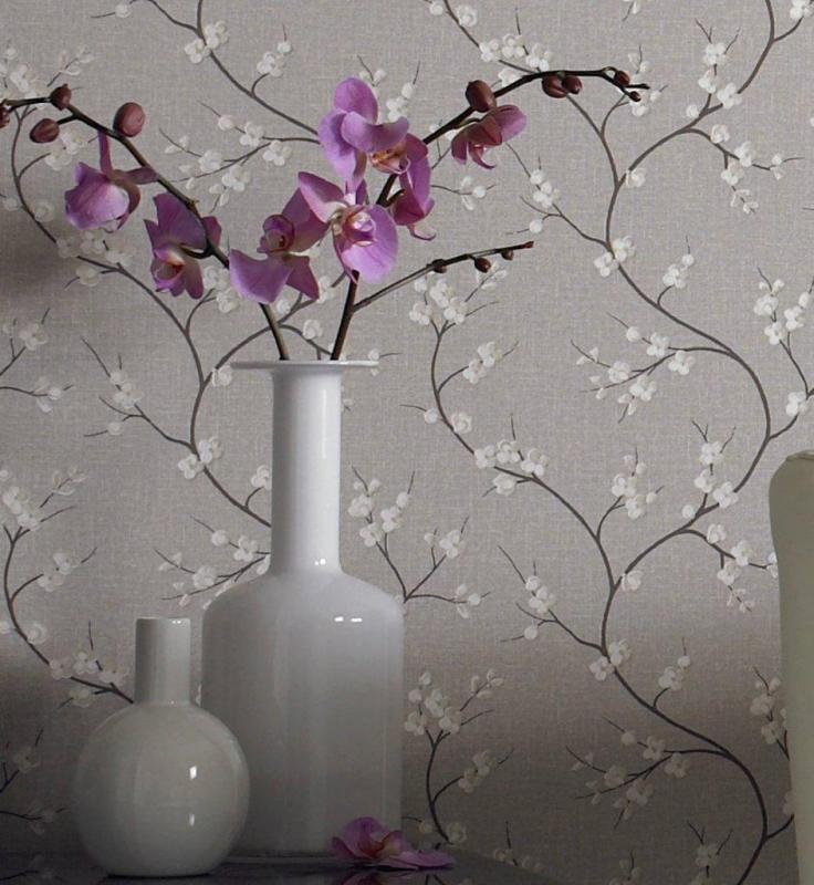
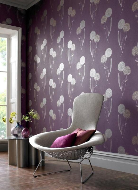
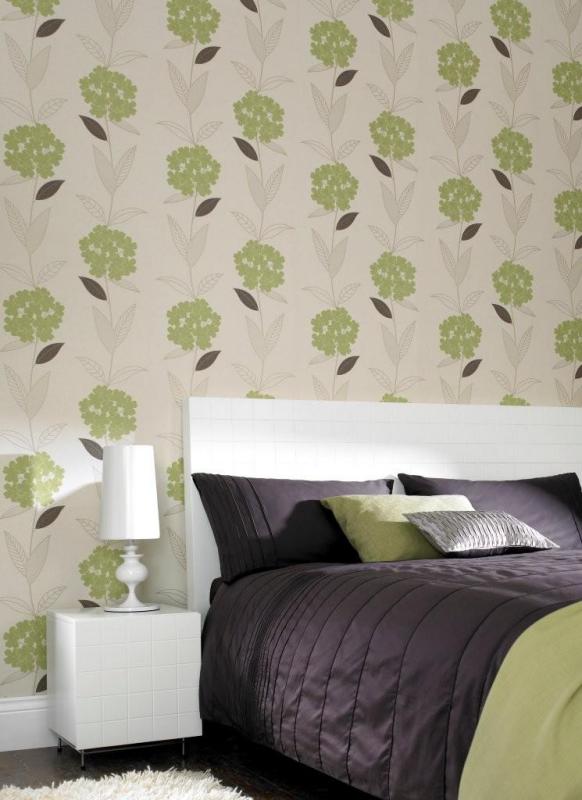
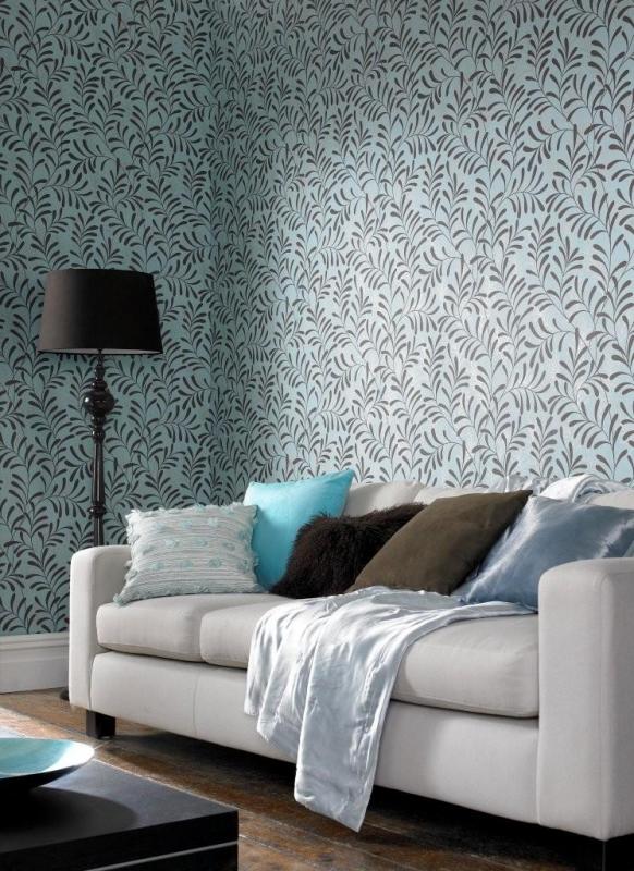
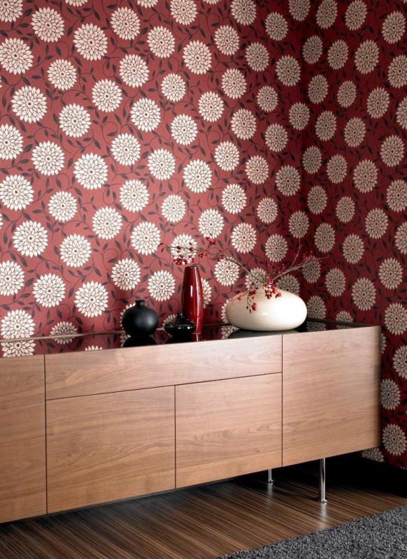
Okay so have you picked a favorite? Mine is the second image because the flowers are whimsical and remind me of balloons and floating away… I imagine this paper in a bedroom on the wall behind the bed only to symbolize floating… as in, off to sleep. Which one do you fancy? Why?

(images: graham & brown)


24 Responses to “New: Graham & Brown’s Essence Wallpaper”

  1. 1 Iva commented:


    those look so retro! :) many of the old apartments I’ve seen have similar wallpapers (well, a bit torn and dirty but still)

    I like the blue ones – I imagine it in a living room with high ceilings. the one at the top is lovely too :)
    Iva´s last blog ..Lovely Apartments My ComLuv Profile

  2. 2 vicki (simply hue) commented:


    These are gorgeous! I think my favorite would be the bedroom with the chocolate bedding and the green floral wallpaper. Next, I really like the eggplant paper. Great finds, Holly. :)
    vicki (simply hue)´s last blog ..Calling All Designers! My ComLuv Profile

  3. 3 laurel commented:


    i love the third one. its so light and happy! it would be awesome in a dining room with a farm table and green chairs!

  4. 4 Viv commented:


    The first is my favourite. Pretty!
    Viv´s last blog ..Today I’m loving… My ComLuv Profile

  5. 5 catherine m. commented:


    I love the last one. It would look great in a living room. The color combo is bold but not obnoxious and the flower pattern is great!
    catherine m.´s last blog ..dressing blythe : it’s your life shop My ComLuv Profile

  6. 6 Puppy commented:


    Gorgeous! My favorites are the first and the last one!
    The Japanese cherry trees are so peaceful, they ask you to meditate…and the strong red of the last one gives you energy! So beautiful!!
    Puppy´s last blog ..Amanda’s Closet – 08 My ComLuv Profile

  7. 7 samantha hahn commented:


    Love them. I hadn’t seen their latest. Thanks for sharing!!!
    samantha hahn´s last blog ..Moop bags (new maquette sponsor!!!) My ComLuv Profile

  8. 8 Summer B commented:


    Love that purple.

  9. 9 Alissa commented:


    I wish I could put up wallpaper in my apartment. These are gorgeous. The third wallpaper listed is my favorite! The green shade attracts me. It also reminds me of my grandmother’s retro lime green damask wallpaper that she once had in her hallway.
    Alissa´s last blog ..00015 – False Lily of the Valley print My ComLuv Profile

  10. 10 jamieofalltrades commented:


    Mine’s the third. I love that green, beautiful!
    jamieofalltrades´s last blog ..bastille seattle My ComLuv Profile

  11. 11 eileen commented:


    Love the red! I just papered a wall in my bedroom with Graham and Brown wallpaper. They have some amazing deals in the clearance section so I couldn’t be too picky but it’s still a Lawrence Llewellyn-Bowen print and I love it.
    eileen´s last blog ..Day 18 and 19 – August 8-9, 2009 My ComLuv Profile

  12. 12 Petergaye Kisielewicz/yahgie commented:


    They are all great wallpaper patterns. If I must chose I would pick #1 with a dash of #3 ;=)
    Petergaye Kisielewicz/yahgie´s last blog ..Shopping for your home on a budget My ComLuv Profile

  13. 13 megan commented:


    I loke the first one, i feels kind of asian inspired yet romantic. I can imagine that in a powder room with elegant fittings.
    megan´s last blog ..De De Ce Showrooms My ComLuv Profile

  14. 14 visualingual commented:


    My favorite is the top image! The last one is messing with my eyes a bit, creating odd angles on the wall. Anyway, these are gorgeous!
    visualingual´s last blog ..Cloverleaf Interchange Trivet My ComLuv Profile

  15. 15 Amy - no. 15 creative commented:


    I love the cherry blossoms in the first one. I think it looks like it would be so relaxing in a bedroom.
    Amy – no. 15 creative´s last blog ..Mad about Mad Men My ComLuv Profile

  16. 16 talentedmissripley commented:


    My favorite is the first one. I’m a sucker for blossoms against dark, leafless spring branches.

  17. 17 Lynne commented:


    My heart skipped when I saw the second one and then I continued down and saw it was your favourite too. I liked the first one too, but not nearly as much. It evoked some hidden memory in me, as I have nothing in that colour or pattern in my house. I haven’t figured it out yet, but it must be a good memory.

  18. 18 Kiran commented:


    I love the first one – maybe coz I love cherry blossoms :D
    But I like all the wallpapers. I think because of the modern colors, patterns and textures. Not your ol’ grandma looking wallpaper that’s for sure :)
    Kiran´s last blog ..Happy Independence India! My ComLuv Profile

  19. 19 emma lamb commented:


    oooh, i would have to choose the last one… i love deep dark moody reds, but i like the way the cream flower lifts it so that it’s not depressing… i would love a wall of it in my livingroom… :)
    emma lamb´s last blog ..flickr v etsy… My ComLuv Profile

  20. 20 Six Different Ways commented:


    very very nice. I especially like the first one.
    Six Different Ways´s last blog ..Drawing With Chairs My ComLuv Profile

  21. 21 Donna Gallant commented:


    Shades of red are my favorite so I definitely choose the last one as my favorite. My husband and I just bought a condo and I would love to figure out a place to use that wallcovering.

  22. 22 Garnet commented:


    Lovely graphic wallpapers! I love the first because of the blossoms and muted colors but that last one really plays to my Indian design aesthetic!
    Garnet´s last blog ..I drew the Ace of Wands this morning as my card of the day. I… My ComLuv Profile

  23. 23 Rachel commented:


    My mom order some beautiful Graham and Brown wallpaper through Home Depot Canada for our bathroom. I have to say although it gorgeous paper; (ours was a soft teal with silver leaf print) it is not pre-pasted and unless you have perfectly (and I do mean perfect) even walls or just box shaped room it wont match up. It is extremely hard to match up. We spent a couple of days trying but no success. It is gorgeous paper though.

  24. 24 Penny Patten commented:


    The three I like the most are, the first, fourth and fifth! So unique and pretty. Thanks for sharing!
    Penny Patten´s last blog ..So our Chicken Coop is complete! My ComLuv Profile

CommentLuv Enabled

When you comment…

Please feel free to comment, whether you agree with the opinions found on this blog or not, your voice is important to other readers who share this space. Constructive criticism can be useful if left in a tone meant to help and not to shock or overly offend. However decor8 reserves the right to delete any comment that is abusive, profane, rude, or considered spam.

Comments are the sole responsibility of their authors. decor8 is not responsible, nor will be held liable, for blog comments. For more, please read the full disclaimer.

comments

  • Ele: Those are so lovely! It seems like every ceramicist whose work I...
  • lisa: the red thread: I went to a trade fair (here in Sydney) a couple...
  • Lori: so pretty! you could definitely get creative with her ceramics....
  • Flourish: These are beautiful – I have an obsession with porcelain...
  • Ishtar Olivera: yes, they are very refreshing and transmit calm and...

friends