fresh finds for hip spaces

Home
Color Me Pretty

Hello Friends, it’s me Leslie again for Color Me Pretty! This time around I decided to play with turquoise, persimmon, lots of neutrals, a little grey and a touch of black. I wanted to use this palette to explore some David Hick’s inspired patterns. It seems Hick’s has influenced many American designers these days, like Kelly Wearstler, Tory Burch and Jonathan Adler. It is easy to see why as his work was bold, graphic and loaded with colors and textures. I tried to tone it down a little to see how we could incorporate some of these bold graphics into our existing décor with a little DIY project, I hope you like this little study.

Color Me Pretty

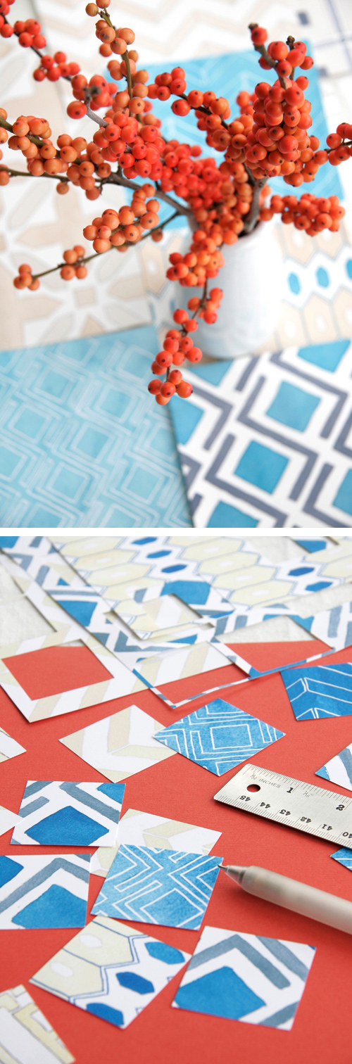
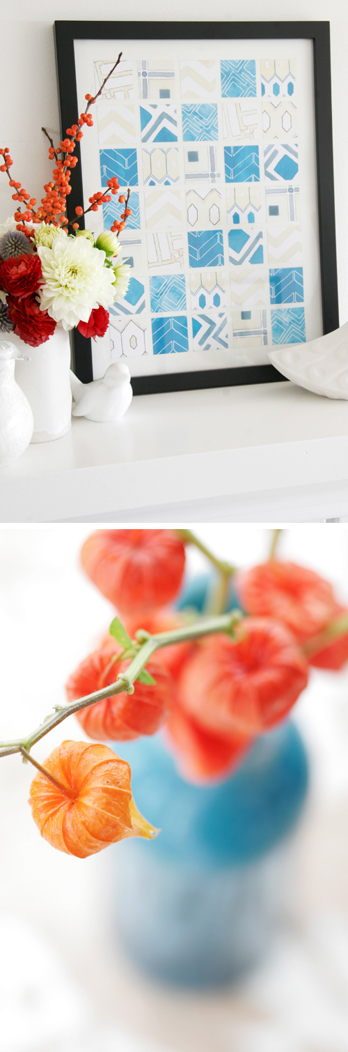
DIY I wanted to create a super easy piece of wall art with some of the patterns I painted for you. Thus, I scanned in the painted patterns and printed them out onto matte ink jet paper. (The colors do not always come out exact as scanners vary – like mine -which is not very good!) I then took my lovely little Marvy square punch and quickly punched out squares from my patterned paper. I then created a grid on a piece of 12 x 18″ paper – I used this size because I had an old unused frame in my garage that was just waiting to be dusted off. I used spraymount adhesive (a type of toxic spray glue that works beautifully as it does not warp the paper like regular glue) to lightly spray each square and then placed it in the grid I had penciled on the white paper and voila! Now, if you do not have a square punch it is easy to cut up paper with an x-acto blade and a ruler. As for the patterned paper you could use anything with a design on it that matches with your home…it would be really nice to use old photographs too- because if you are like me there are lots of photos in boxes that could be used and would look great. (Like all those ocean or flower shots!)

Color Me Pretty

Color Me Pretty

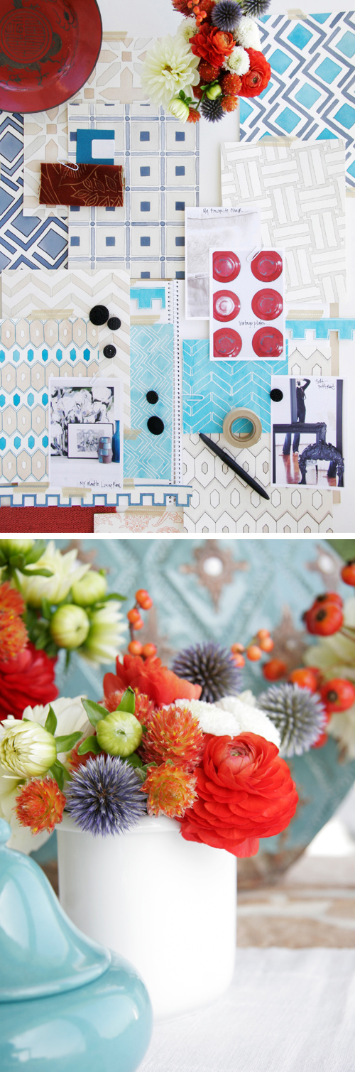
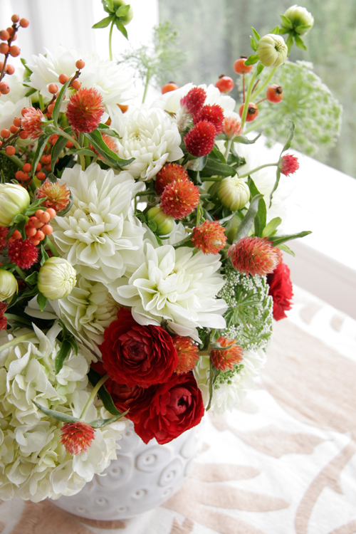
When you use a primarily neutral color scheme in your home you must rely on texture and pattern to create some interest so that the space does not look to bland. It is fun to then use dabs of bold color to really show off the colors you enjoy like persimmon (which is basically just a darker orange but sounds more “designy” – right?). I use this color in little doses in my dining area with some vintage plates hanging on the wall along with some art that features the dark orange-red along with grays, whites and wood. Turquoise looks great in the mix too as it really makes the dark orange pop especially when you have the neutral tones in there creating negative space around the colors. If bold colors kind of scare you start with some flowers or a small accessory like a vase and see if in fact the color may just brighten your day!

Color Me Pretty

Color Me Pretty

I hope you enjoyed this study and I will see you back here November 9TH, enjoy the rest of the month! – xo, Leslie Shewring

To see  more of Leslie’s posts, click here.

(image copyright: Leslie Shewring)

Tags:


53 Responses to “Color Me Pretty”

  1. 1 Katie - Coco Målé commented:


    I’ve always been a great advocate of orange in the home (much nicer than red or burgundy in my opinion), but never thought to combine it with turquoise!!! how refreshing and mouthwatering…
    Katie – Coco Målé´s last blog ..Always look on the bright side of life! My ComLuv Profile

  2. 2 Antoinette commented:


    I absolutely love the color combination used here! It’s a perfect combination of warm and cool colors. The patterns are also so fresh, and the way styled the shoot really allows these colors to pop! Thank you for sharing.
    Antoinette´s last blog ..Our Invitation was on the Today Show My ComLuv Profile

  3. 3 Melissa A. commented:


    I never dreamed I would like blue and orange together, but I really like the way you designed your color palette today.

  4. 4 Danielle commented:


    I actually did this color scheme in my kitchen and it turned out so cute! I added a little chocolate brown to the mix and am so pleased with it!

  5. 5 Sophia commented:


    Love this combo..have had it in my studio for about 5 years.

  6. 6 monica burnett commented:


    breathtaking, i love that BRIGHT orange!

    http://monicaburnett.blogspot.com/
    monica burnett´s last blog ..what i wore today My ComLuv Profile

  7. 7 trish commented:


    For the love of jesus- such gorgeous work and love that went into this post. Really well done, again. kudos. note each post, very much appreciated!
    trish´s last blog ..today’s wish list My ComLuv Profile

  8. 8 laura trevey commented:


    Gorgeous vibrant color palette!!
    laura trevey´s last blog ..Italian Seaside, Original Watercolor, Fine Art, 20 by 28 My ComLuv Profile

  9. 9 Sallie Ann Westbrook commented:


    I love this color combo, and in fact, used something similar 2 years ago for holiday decorating. There is actually a really gorgeous collection of fabrics by Kravit (I think) in this color way. My favorite was a crewel work textile, with big birds. Your pictures are gorgeous!

  10. 10 blue bicicletta commented:


    I love the turquoise and persimmon combination—the two colors really riff off of each other! And what a great DIY art project! I love the combination of different patterns pulled together by a common color and the repetition of the square shape! Truly inspired! You can do such interesting things by using repetition with variation.
    blue bicicletta´s last blog ..Edible Escapades My ComLuv Profile

  11. 11 Concha commented:


    Wonderful, as usual!

    Today I was thinking about my next sitting room’s colour scheme (first I’ll have to move… let’s see when that happens). I am considering light grey, white, aqua and some splashes of salmon… and now I see that persimmon is fabulous too!

    Thanks Leslie!
    Concha´s last blog ..Corners of my home :: bedroom My ComLuv Profile

  12. 12 Wedding Chicks commented:


    love love love this color scheme!!! what a great diy idea!

  13. 13 becky from hatch commented:


    Love Love LOVE Turquoise & Orange! I’m envious of your berries and paper lanterns, as well as those papers you used in the DIY.

  14. 14 Lindsay {Shrimp} commented:


    Oh. My. Gosh.

    You are absolutely brilliant with colors!!! This whole compilation is beyond gorgeous!

    That cutout wall art is a differently-colored version of something I made in college, and you just inspired me to dig it up and frame it – thanks!
    Lindsay {Shrimp}´s last blog ..The Anti-Treasury – Winter With a Chance of Fall My ComLuv Profile

  15. 15 Kelly in Canada commented:


    I love this…it reminds me of the sentiment that there is some of every season in all the seasons. The cool blue hues make me think of late summer skies but the persimmon (especially on the Chinese lantern pods) are truly autumn wonders. I am quite new to your site but after seeing this post I can’t wait to explore the colour me pretty entries and all the others. Thank you.

  16. 16 Nuit commented:


    what a LOVELY piece of wall art!! totally adorbs. I do like the color combination but your patterns are to die for!
    Nuit´s last blog ..My idea of happiness…. My ComLuv Profile

  17. 17 Penny Patten commented:


    Such a pretty combination of colors!
    Penny Patten´s last blog ..Antique Dress/ Altered Couture My ComLuv Profile

  18. 18 My Owl Barn commented:


    Thanks Leslie for the tips. DIY project instructions seem easy for me to give it a try. Your art work really looks nice. Color palette is just perfect.
    My Owl Barn´s last blog ..~Owl Themed Baby Shower~ My ComLuv Profile

  19. 19 Pixel Wild Child commented:


    I love the DIY project, it came out so beautiful!!! I may try it with photos of flowers as suggested ;O)
    Pixel Wild Child´s last blog ..Mondays are not for me! :OP My ComLuv Profile

  20. 20 kristyn commented:


    Leslie,

    Are you using a potter’s pen or regular masking fluid for the white lines in your watercolor sketches?

    I love blue and orange together – great project!!

  21. 21 decor8 commented:


    Kristyn, I think she’s using white ink with a fine tip brush… that’s what I use…

  22. 22 leslie commented:


    Hi Kristyn and Holly :) I use a pen holder (potter’s pen) with a Speedball pen point #513EF -I learned about it from Geninne’s Art Blog. Holly you must have the steadiest hand!!! The pen holder was the only way for me to get a consistent line weight quickly…I have tried tiny brushes though…just gives a pretty painterly effect.

    Thank you for the lovely comments everyone!
    leslie´s last blog ..Island Apples My ComLuv Profile

  23. 23 decor8 commented:


    Leslie – I don’t! At all! I am going to see if I can find one of those now. I learned about the white ink from Geninne too!!!

  24. 24 Kristi @ Addicted 2 Decorating commented:


    Oh my…I almost with I hadn’t read (or seen) this post!! It took me ages to decide on the colors I wanted to use in my Tiny Little Condo, and I finally decided on turquoise and apple green. I knew I wanted to accent with touches of either cherry red or orange, and I finally decided on cherry red. Now I’m wishing I had gone with orange!! There’s just something so fresh and vibrant about orange.

    Hmm…maybe I can work some of it in somewhere. My place is just SOOO tiny that I don’t want it ending up looking like a circus with so many colors.
    Kristi @ Addicted 2 Decorating´s last blog ..Before & After:: Chest of Drawers My ComLuv Profile

  25. 25 Ashley commented:


    What refreshing colour palette! I just love the deep rich oranges you used and the blue and tan are just so serene!!

  26. 26 Melissa de la Fuente commented:


    wow….speechless….again! At the risk of sounding repetitive….I just don’t know how you do it Leslie…you are amazing and so incredibly talented. Plus, your tone is so inclusive and warm, which means a lot to me for one. I just adore this color combo and you have solved a decorating dilemma for me! I have a room with turq accents and had been ruminating on how to tie the room together. Now I know! So, thank you sweet Leslie. Once again , I am completely amazed by you and I wish you lived right next door so I could see all of this beauty first hand! :)
    xo
    Melis
    Melissa de la Fuente´s last blog ..Monday: lovely and magical My ComLuv Profile

  27. 27 Amy Strodl commented:


    Absolutely beautiful color study!
    Amy Strodl´s last blog ..Flower Power! My ComLuv Profile

  28. 28 Heather- Gathering Spriggs commented:


    Thanks Leslie. You continue to inspire. I am constantly amazed at your attention to detail. Everything is perfection (even your writing style as you describe your process)!
    Heather- Gathering Spriggs´s last blog ..Blog of the Week: Miss Wallflower My ComLuv Profile

  29. 29 ellie commented:


    Amazing blog again!!! Love your fresh flower bouquet, the neat fall fabrics
    and the inspiring art ideas, it’s like an art lesson. I’m going to get busy!
    Thank you, love Ellie.

  30. 30 Diane commented:


    Once again, an absolutely beautiful post with amazing color combinations. I love the turquoise and bright orange…who would have thought?
    Thanks for the inspiration Leslie.

  31. 31 Kellie commented:


    very very pretty! wonderful!
    Kellie´s last blog ..Baby Announcements for Friends! My ComLuv Profile

  32. 32 Kylie @ All Things Lovely commented:


    What a gorgeous combination! Not something I’ve seen a lot of, I really like it. :) Plus, I love the artwork you created!
    Kylie @ All Things Lovely´s last blog ..Roses A Blooming!! My ComLuv Profile

  33. 33 Amanda commented:


    I was so inspired by your post Leslie, that I put together my own palette of Tangerine and Tiffany – a slight twist on your Persimmon and Turquoise. I have posted it to my blog if you are interested. http://amandafullerdesigns.blogspot.com/2009/10/palette-play.html
    Once again Decor8 Daily fills my daily inspiration needs!
    Thanks Holly and Leslie!

  34. 34 vicki commented:


    Leslie, you are beyond creative! I’m in awe when I look at your photos and the the projects you put together. Beautiful and truly stunning. :)

  35. 35 Fraulein F. commented:


    Oh wow- this color combination is just so lovely! A great inspiration! The winter season gets more bright.
    Fraulein F.´s last blog ..Zwingligeist vs. Savoir Vivre My ComLuv Profile

  36. 36 Jacqueline commented:


    I always enjoy this colum! I aodre these colors and leslie always give me such wonderful inspiration! Aodre the DIY project! Have a lovely merry happy day and love to all of you!

  37. 37 My Sweet Prints commented:


    Beautiful colours and photography! I might try that at home one rainy day soon. Thanks for the inspiration. Janette

  38. 38 Judith ~ Felicity Crew commented:


    Oh I love the color schemes presented here! Great post, Leslie – thanks!
    Judith ~ Felicity Crew´s last blog ..Fall apples – 5×5 original fine art photograph My ComLuv Profile

  39. 39 Isabelle commented:


    I am in the process of refurbishing our retirement bungalow. It is small and I have decided to use white on all of the walls and neutral floor coverings. I had been worried about how to give it that lift, this article comes at the right time.

    I had thought blue, but decided it was not quite right. This gives a way of giving the brightness I was looking for, I would never have thought of persimmon – or burnt orange!

    Thank you.

  40. 40 Juana @ SweetVisualAids commented:


    Love the DIY project! what a simple and great idea to have a unique art piece :)
    Juana @ SweetVisualAids´s last blog ..Simple, recycled and unique, this is Freitag My ComLuv Profile

  41. 41 Caitlin commented:


    This is absolutely amazing!! I have always really disliked orange, but now seeing it in this context it looks completely different to me!! I love all of these. This colour combo has been stuck in my head ever since, and I feel so inspired by it! Its so great when an unexpected and previous disliked colour palette can be so captivating and inspiring!
    Caitlin´s last blog ..Vintage Glamour My ComLuv Profile

  42. 42 IngerTing@blogspot.com commented:


    Wow! I’m lost for words, but I really love this blog!

  43. 43 eva / sycamore street press commented:


    love this! your watercolors pattern drawings are gorgeous. (And we call that color “persimmon” over at SSP, too:)

  44. 44 fresh365 commented:


    This is one of my favorite color palettes right now. Another amazing job, Leslie! And those flowers are amazing!

  45. 45 norwegian.autumn commented:


    These pictures are sooo amazing!!! Wow – kind of breathtaking!! <3
    norwegian.autumn´s last blog ..One evening and two free days left… My ComLuv Profile

  46. 46 kristyn commented:


    Thanks Leslie and Holly for the watercolor info, inspiring posts and my favorite blog!!!

  47. 47 maria1975 commented:


    Such a pretty color palette – great post :)

  48. 48 Alice Wilson commented:


    Love the combination of colors! You do beautiful work and thanks for sharing it with us. I thought you may be interested in some diy ideas that I came across on the ReadyMade site. I work with them and couldn’t help, but find a connection with your project.

  49. 49 seema commented:


    Gorgeous colors and one of my favorite inspirations- David Hicks! Thanks…

  50. 50 lvdecor commented:


    Wow! I Love that color combination! I don’t know why I can’t come up with that kind of thing on my own! I really appreciate your inspiration. I like to decorate my rooms using wall decals, so if I find something I like better (like just now!) I can easily change the look. I’ve been wanting a “different” fall look, and this is just the ticket! I’m very excited!

  51. 51 sarah commented:


    nice project! i will be linking on my blog!

  52. 52 Cindy commented:


    I love your color studies. They’re always so beautiful! The wall art project is a great idea for something quick and easy. I might just have to give that a try w/ some patterned paper!
    Cindy´s last blog ..Stuck in a rut My ComLuv Profile

  53. 53 gypsy commented:


    Orange and blue – I love this cool combo, ahev started to collect blue glass so perfect x

CommentLuv Enabled

When you comment…

Please feel free to comment, whether you agree with the opinions found on this blog or not, your voice is important to other readers who share this space. Constructive criticism can be useful if left in a tone meant to help and not to shock or overly offend. However decor8 reserves the right to delete any comment that is abusive, profane, rude, or considered spam.

Comments are the sole responsibility of their authors. decor8 is not responsible, nor will be held liable, for blog comments. For more, please read the full disclaimer.

comments

  • Tod: i adore the green! love love love Leslie’s work! xoxo .-=...
  • simply grove: Congrats to you Holly!! Everything is sooooo well...
  • Christina: Congratulations on the interview! What a special and exciting...
  • Yasmine: So glad you have been given time and space to showcase your...
  • Jessa: *Love* these. It’s especially important in tough times to...

friends