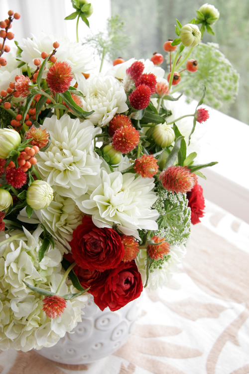
Turquoise, Persimmon, Neutrals, Grey and Black
Hello Friends, it’s me Leslie again for Color Me Pretty! This time around I decided to play with turquoise, persimmon, lots of neutrals, a little grey and a touch of black. I wanted to use this palette to explore some David Hick’s inspired patterns. It seems Hick’s has influenced many American designers these days, like Kelly Wearstler, Tory Burch and Jonathan Adler. It is easy to see why as his work was bold, graphic and loaded with colors and textures. I tried to tone it down a little to see how we could incorporate some of these bold graphics into our existing décor with a little DIY project, I hope you like this little study.
DIY I wanted to create a super easy piece of wall art with some of the patterns I painted for you. Thus, I scanned in the painted patterns and printed them out onto matte ink jet paper. (The colors do not always come out exact as scanners vary – like mine -which is not very good!) I then took my lovely little Marvy square punch and quickly punched out squares from my patterned paper. I then created a grid on a piece of 12 x 18" paper – I used this size because I had an old unused frame in my garage that was just waiting to be dusted off. I used spraymount adhesive (a type of toxic spray glue that works beautifully as it does not warp the paper like regular glue) to lightly spray each square and then placed it in the grid I had penciled on the white paper and voila! Now, if you do not have a square punch it is easy to cut up paper with an x-acto blade and a ruler. As for the patterned paper you could use anything with a design on it that matches with your home…it would be really nice to use old photographs too- because if you are like me there are lots of photos in boxes that could be used and would look great. (Like all those ocean or flower shots!)
When you use a primarily neutral color scheme in your home you must rely on texture and pattern to create some interest so that the space does not look to bland. It is fun to then use dabs of bold color to really show off the colors you enjoy like persimmon (which is basically just a darker orange but sounds more “designy” – right?). I use this color in little doses in my dining area with some vintage plates hanging on the wall along with some art that features the dark orange-red along with grays, whites and wood. Turquoise looks great in the mix too as it really makes the dark orange pop especially when you have the neutral tones in there creating negative space around the colors. If bold colors kind of scare you start with some flowers or a small accessory like a vase and see if in fact the color may just brighten your day!
I hope you enjoyed this study and I will see you back here November 9TH, enjoy the rest of the month! - xo, Leslie Shewring
To see more of Leslie's posts, click here.
(image copyright: Leslie Shewring)


