
Kimberly Ayres Interior Design
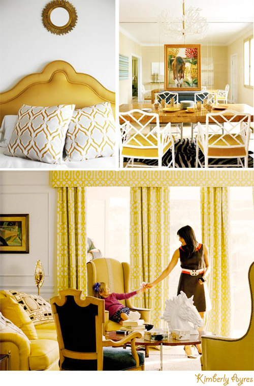
I was catching up on some much-needed blog reading today and came across a post that my friend Anh-Minh Lee wrote just yesterday about California-based interior designer Kimberly Ayres. Not knowing who she was, I clicked on her link and found a most delicious portfolio that I thought I'd highlight for a little eye candy inspiration. Kimberly's design style is classic meets bohemian with a feminine, elegance in her well-edited rooms. There's nothing like drooling over the work of a talented interior designer to spark an idea or to light the fire under your butt to work on that idle project in your home, right!?
After reading her bio, I learned that she didn't start out as a designer -- she actually practiced law before tapping into her creative side. Leaving her profession behind, she went to school to study painting, antiques and interior architecture. The more I looked at her work I realized that her name rang a bell for a reason...she was mentioned in Domino magazine as one of the Top Ten Young Designers to Watch in 2009. Do you remember that article?
Anyway... before launching her own practice, Kimberly worked for Kelly Wearstler and then, Michael Lee. In 2000, she launched her own practice and now, nearly 10 years later, she is a successful designer with not only her own practice but also owns a furnishings and accessories store in San Francisco called Kimberly Ayres Home.
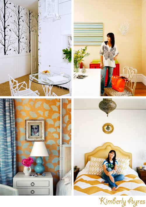
And hello yellow! Don't you love all of that warm goldenrod in her home shown in the photos above? That color is super fab, beautiful in the summer, gorgeous in the autumn... and truly a great hue for California living. I also adore {drool drool drool} that turquoise bedside lamp -- so much! It's very Domino-esque -- something we we would have seen in Domino mag, are you with me on this? The nightstand is pretty too, looks a bit Asian but I cannot see the legs to truly tell. The fish cup/jug/creamer/vase/whatevertheheckitis is also great with those bold fuchsia blooms -- it's truly the ice breaker in that vignette, it keeps all those blue and yellow patterns looking perky and modern. Don't believe me? Place your index finger over the floral arrangement. See the difference in that photo now? The colors aren't as snappy, are they? Almost a bit dizzying. That pink really creates healthy tension and I love it. And so if you ever look through magazines and don't notice the flower arrangements at work already, start paying attention to them and how stylists use cut flowers to often add a lift. They're the push up bra of decoration. :)
I say this a million times on decor8, but again... another example of a career changer who turned out to be a successful small business owner. So if you're considering a career change, don't lose sight of your dream! Imagine if Kimberly didn't go for it?
(photos: Eric Cahan)