
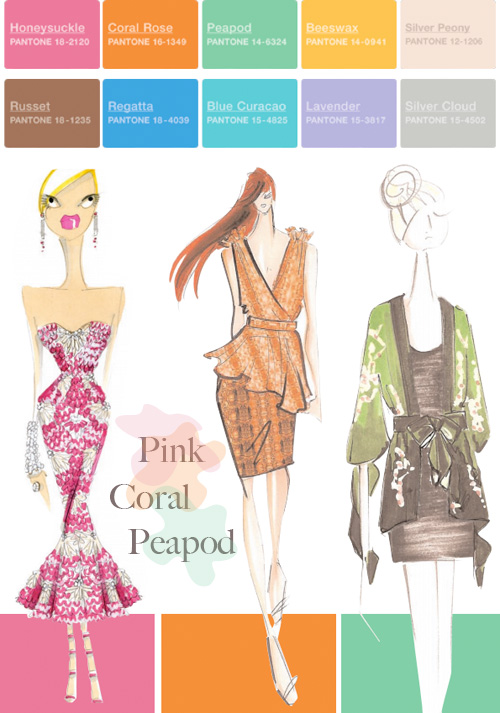
Pantone Color Forecast: Spring 2011
Pantone is THE global color authority for the fashion and home industry so I shared their Spring 2011 color forecast with Real Simple readers today (view it here) because I was so inspired by the palette. Here is a pretty little presentation that I've put together for you to view these colors -- maybe as you look at them you can think of which ones you'd like to try in a room scheme...


Over at Real Simple, I also shared a few things in my home since it seems that rather unknowingly, I had a feeling for pink before it was predicted to be the color of the year. I guess when you work with interiors and are around products long enough, you just start to get a feel for things, don't you? You must find this true of yourself, blogging and the internet makes us all feel pretty tuned in to what's going on out there.
Did you know that Pantone has a gorgeous PDF to download each year that is filled with color inspiration for the season to come, from some of today's top fashion designers? Oh yes. I've been downloading it for years. In it, you'll read various expert opinions from a panel of fashion designers who talk about what inspired their color choices and overall collection and which ones they believe will work well together in your closet (my favorite part) -- though you can also try the same suggestions in your living room.
Here are some colors that I think work together from the 10 shown above:
- For a mid century modern enthusiast: Mix Coral Rose, Russet and Beeswax.
- For a modern, contemporary home that is also warm: Mix Color Rose, Russet and Regatta.
- For a fresh Moroccan vibe: Regatta and Blue Curacao all the way! Add Silver Cloud, too.
- For a little cool sophistication try: Regatta, Blue Curacao, Lavender and Silver Cloud.
- For some spice why not go with: Coral Rose, Honeysuckle, Russet and Beeswax.
See a favorite or two? What colors do you see working well together in a room?
(images: pantone)