
10 Ideas For Realistic Wallpapers
I'm not sure about how trendy this is in your part of the world, but realistic wallpaper seems to be a growing trend where I'm at so I thought I'd share a few with you and then give you 10 ideas as to what you can do with them if you decide to pick up a roll for your home. But first, what I mean by realistic wallpaper is wallpaper that looks like something but when you touch it, you realize that your eye was playing tricks on you! For instance, faux bois -- these papers have many different looks and finishes along with wallpaper that looks like tile, leather, stone, concrete or brick. I'll show you the wood varieties that I like, mostly the scrap wood variety, along with a few concrete versions and a tiled wall that isn't really tiled at all. Surprise!
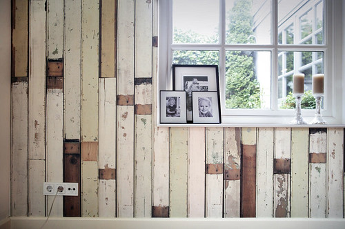
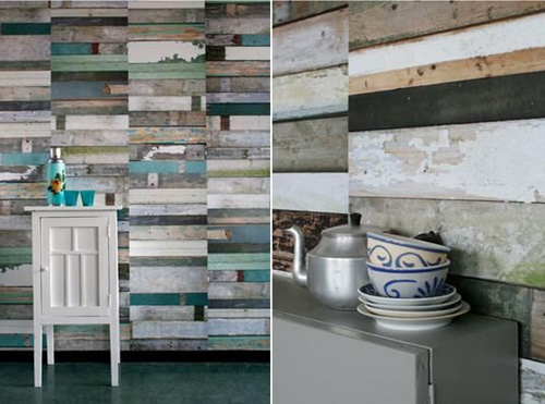
Photo: Frank Jensen for Piet Hein Eek
As I see these wallpapers emerging again and again in magazines and design shops and showing at fairs around Europe I am not sure exactly where I stand really. I find them oddly fascinating though because I remember a time when brick was coveted in Boston brownstones, everyone wanted a brick wall, but then the trend died and people opted to hide it by tossing up a wall. Same goes for concrete, everyone wanted a loft with concrete walls but then that trend sort of came and went. But now people want that tactile, earthy vibe in their home all over again. And though red brick walls didn't come back in style, people are painting them white, gray or black and that seems to be a big trend now though once you paint brick, well, it's impossible to change it back so make sure you are certain before slapping white paint on your brick walls if you happen to have them in your home.
Trends in interiors have started to lean towards casual, natural, relaxed, less fussy decorating than in times past when most US and UK magazines directed everyone towards a very proper looking, professionally designed, home. That changed in 2005 and continues to change as I type this. In my opinion, you always need guidelines in decorating, even loose ones, because even a home that appears to not have been fussed about, I can assure you, really was if it is beautiful and functional. Most people out there (not us bloggers and blog readers, we know the scoop) think rooms in books and magazines really look that in real life - in fact, I once thought that myself until I started working for magazines and now, having done a book on interiors myself, I can assure you that very few homes look exactly as they are shown in a photograph before the stylist and photographer showed up.
There is definitely an art in making a home look casual and non-fussed about, but it's still work and talent and it's still very much decorated because someone has to have a good eye to make it work. Basic design rules are followed to make that casual beauty shine regardless of how effortless it all appears. I think it's freeing to know this because it's easy to look at your own home with too critical of an eye as you wonder why you can't toss a magazine on the arm of your sofa with a teacup on the side table and have it look effortlessly chic when you take a picture of it for your blog. Well, I'll tell you why. The color of your sofa doesn't complement the tea cup and the dainty tea cup doesn't work with the modern lines of the table because the size is all wrong... and you forgot to put actual tea in the cup, so it looks staged, and the magazine on the arm needs to be looser, not so perfect, so fan out some of the pages... And the cushions need to be squished a bit, they look too crisp... See what I mean? There is a science behind it all, a sort of smoke and mirrors magic, and so those effortless looks that people try to promote as super attainable are attainable, sure, but are also done by skillful stylist who know how to make a room look effortlessly chic.
If you really want your home to look casual and chic, study images. Really STUDY them. Look at what is working in the photo. Count objects on shelves, normally you'll find odd numbers vs. even ones. Notice on shelves how objects are not all lined up perfectly but often set at different levels to add dimension, some objects closer to the wall while others more towards the center of the shelf and a few near the edge. This could be a book in itself - there is so much practice and training involved. I suggest you clean off an entire bookcase, find a photo you love, and try to mimic how that bookcase was styled in your own home, piece by piece. It won't look the same because you have different items and your books have different spine covers, but practice. Stand back. Pull away what doesn't work. And most importantly, photograph it and look at it on your computer. See what doesn't work - photographs reveal things your naked eye just can't. This is why most interiors photographers and stylists shoot tethered these days - they can pick out the flaws in a photograph while styling it as they see it on the computer screen, not on the camera. We shot tethered for my book, it was the only way to get chair legs looking right and bed linens to appear smooth and inviting.
And so now back to this trend, to have rooms looking casually chic and absolutely amazing without any thought to decoration, floor plan or function. I'm all for it, I'm a very casual decorator myself. Though in reality, in your own home, it's pretty hard to achieve without the house looking like a chaotic mess so don't ditch the grid paper yet - sketch up floor plans, do mood boards, consider what you are doing to your room before you actually do it to avoid costly mistakes. And most of all, have fun and personalize as much as you can - paint furniture, line drawers with wallpaper, paint furniture legs in contrasting colors to surfaces, personalize and re-purpose as much as you can and definitely "shop" other rooms in your home, even storage rooms, for things that may work better elsewhere.
I imagine these wallpapers suit current trends in interiors because of how casual they appear -- how effortless to have faux scrap wood on your walls vs. installing the real thing - I mean, this is anything but high end and fussy. And I like it, I think it's cool and in the right home, can absolutely work. Faux surfaces are really hot at the moment if you aren't lucky enough to have the real thing and this "realistic" wallpaper is definitely part of that faux movement. Check out some more photos and links below and see what your eye is attracted to (if any at all).
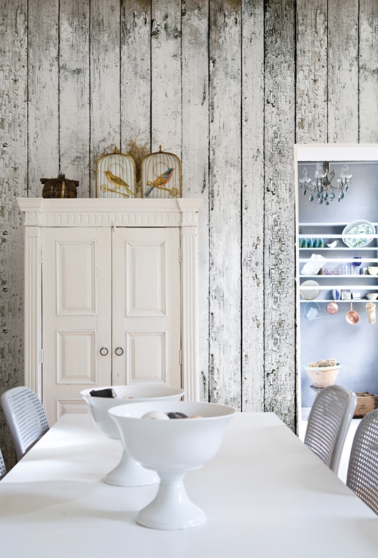
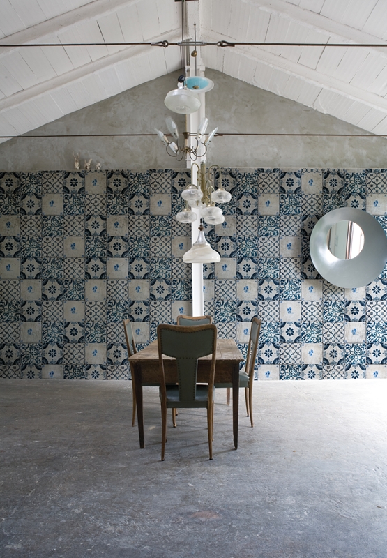
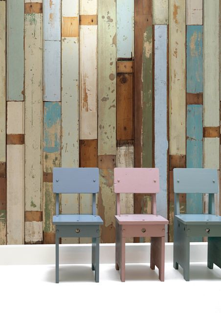
Shown above: Wall + Deco in Italy. I think these are my favorite two papers from the bunch shown in this post, though the neutral one from Studio Ditte is second runner up for me along with scrap wood from Piet Hein Eek.
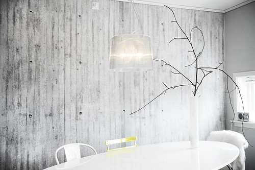

Shown above: Faux Concrete Wall - Norway
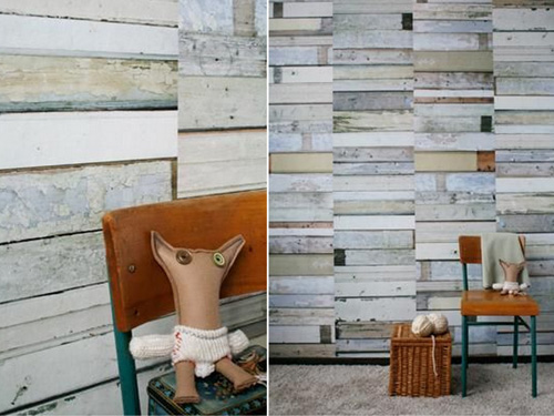
Shown above: Studio Ditte in The Netherlands.
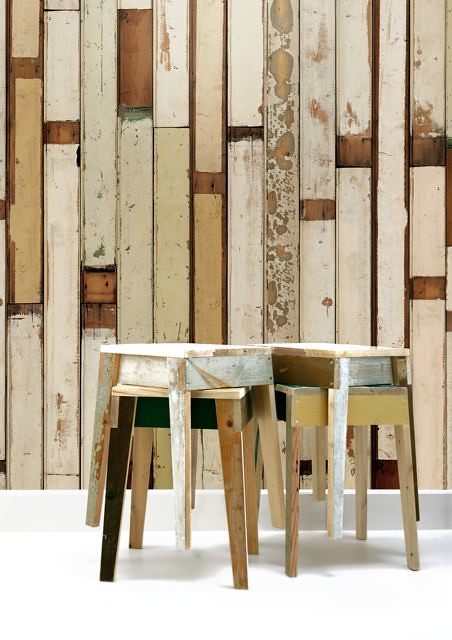
Shown above: Piet Hein Eek in The Netherlands (buy his scrapwood wallpaper collection here at Bodie & Fou.). I love these too, I saw them at DR Wonen in Amsterdam on Hartenstraat 27 over the weekend and really liked them in person, too. It's a fun trend, I wouldn't do an entire room but I can certainly see these working in a variety of settings used in different ways.
Now for some ideas for using "faux-paper" as I call what I've shown above. Put some thought into this, you may find some very clever ideas of your own!
1. Apply faux wood wallpaper to a slim piece of plywood and lean it against the wall as a room accent. You could even lean one on each side of the bed and mount a light to them, running the cord through the back. Or use one in a living room as a reading light. How cool would that be?
2. Use "wood" wallpaper and apply it to the back of a china cabinet so it peeks through your dishes.
3. Try the concrete papers as a backsplash in the kitchen behind the sink and stove, just beneath the cabinets and paint the rest of the kitchen in grey or black for an edgy, industrial vibe.
4. Take a simple wallpaper table or IKEA table and wallpaper the top of it in a concrete or scrap wood pattern, and apply a thin, durable sheet of glass to fit on top. Try this on a coffee table you no longer like, too.
5. Decoupage these papers onto furniture, stools, cabinets, doors.
6. Only use it "inside" of doorways, so paint a door bright yellow on both sides and then, inside of the door frame, paper it with scrap wood paper for an interesting contrast. I saw something like this in an amazing wallpaper ideas book years back by Derek Fagerstrom and Lauren Smith that I loved and never forgot it, only they used a patterned paper but I think a scrap wood paper would be the coolest to try!
7. Apply a chair rail to the walls in a bathroom and paper the bottom in scrap wood and paint the top a solid color, like a neutral scrap wood paper for the bottom and then paint the top above the chair rail in a mushroom color, for instance. Would look gorgeous in a bathroom with a big white clawfoot tub.
8. Apply your favorite fauxpaper to wood or something durable that will take the paper without it peeling up, and then apply it to the wall over the sofa as a piece of art.
9. OR you can apply it to a big piece of plywood, maybe something long and slim like the size of a full length mirror, and apply it to the wall (horizontal), and then on it put your artwork or favorite photos, framed, to create a cohesive and pretty display for art.
10. Wallpaper the ceiling and paint the walls a solid color - how pretty would that be to have scrap wood on the ceiling and neutral color walls with a gorgeous pendant light in the center, like the Moooi Paper Chandelier (my favorite light in the world).
Other sources not shown: Nobilis from France and faux wood wallpaper inspiration in the U.S., on Design Press.
Do you have any creative ideas of your own to share? How would you use scrap wood wallpaper, concrete paper, tile paper, etc.? Are realistic wallpapers hot or not?
(images linked to their sources above.)