
5 Color Palettes That Include Pink
Do you love pink but have a hard time using it at home? Do you find it tricky to know which colors to pair it with in order to avoid an over-the-top Hello Kitty loves Barbie fest? Well, are you familiar with designer Emma Lamb? If you've been reading decor8 for awhile, I'm sure you are -- I've mentioned her before and find her crochet work so nice -- especially if you are into the ever popular homespun style that is taking over the internet at the moment. Emma's blog really caught my eye lately because of her color boards and the more I see them, the more I'm reminded to feature them on decor8. Like most of you, I like peeking into the imagination of those working in creative fields to see what their starting point is for a design. On Emma's blog, I particularly enjoy her color palette series and though she has tons more on her blog, here are five of my favorites at the moment, all layouts below are by Emma and images are individually linked below.
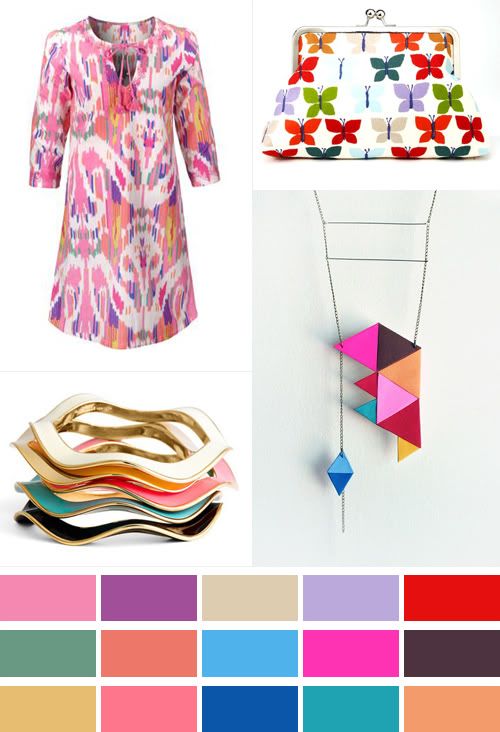
1: GEMSTONE: A bold, almost neon pink paired with other jewel tones is so pretty. These colors make me think instantly of Kate Spade! Images: 1. Cath Kidston, 2. Penny Royalty, 3. Lepidoptery, 4. Kate Spade.
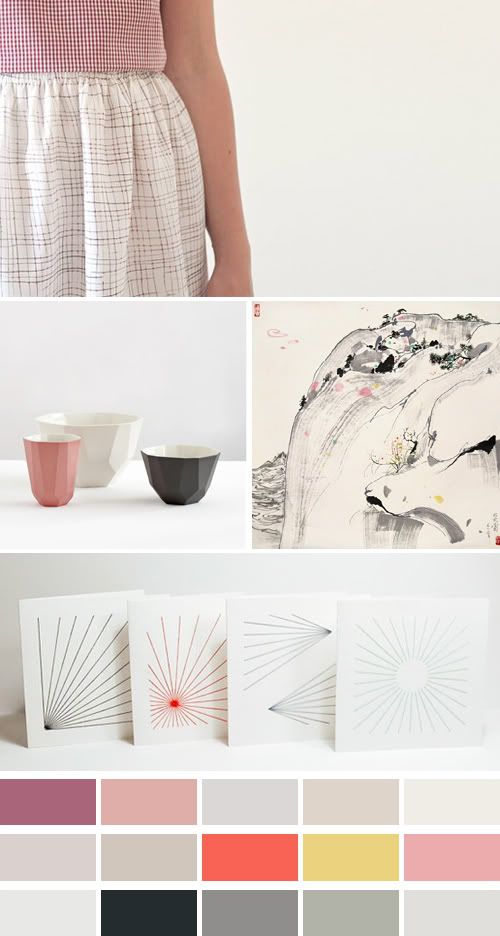
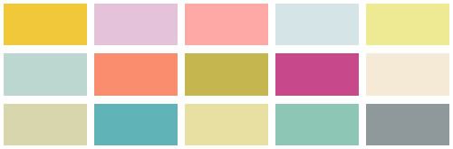
2: MINIMALIST AT HEART: This looks very Scandinavian mixed with a Japanese touch -- all rolled into a minimalist, clean aesthetic. The black makes this palette work so well. I love how pink is almost bubblegum but looks so grown up alongside the "hot" colors and the very cool grays. This palette reminds me a bit of the most recently Chloe collection. Images: 1. Conni Matta, 2. Retro Villa, 3. Wu Guanzhong, 4. In Queue.
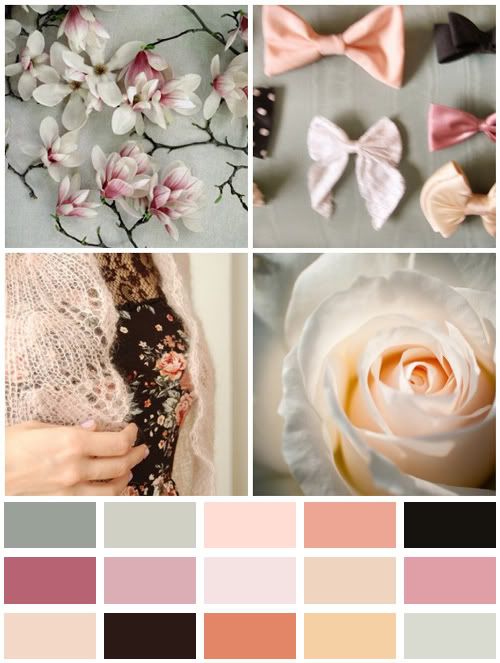
3. ENGLISH COUNTRYSIDE: This is a romantic, cool palette using various tones of pink which gives this palette a lot of depth - it's subtle, layered... sweet. Images: 1. Alicia Bock, 2. Sarah Wynne, 3. Derya Davenport, 4. Tetsu-FMR.
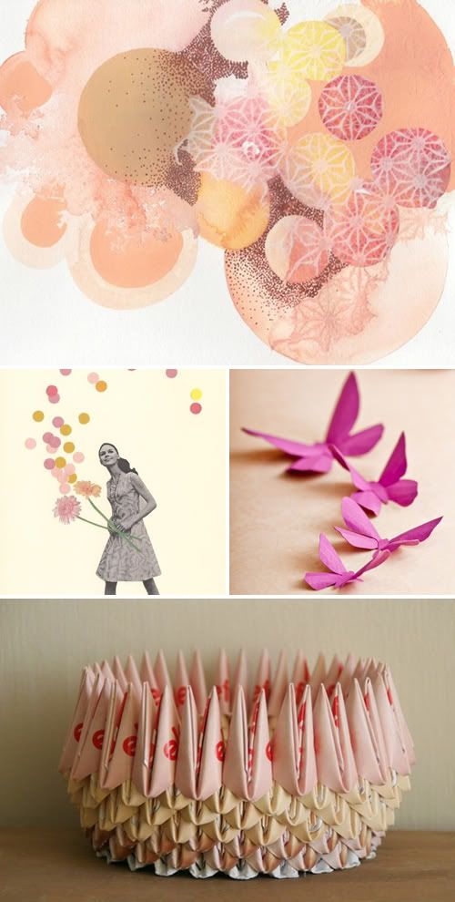
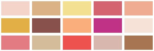
4. AUTUMN FEVER: Pink here is used in various tones with a variety of brown, yellow and some orange-red to warm it up. This is a great alternative to the typical Autumn palette that so many stores throw at us with the normal brown, orange, red and copper colors. Mix in some warm mustard, apricot and fuchsia for a kick! Images: 1. Marisa Peterson, 2. Violet May, 3. Hip & Clavicle, 4. Ruti's Roots.
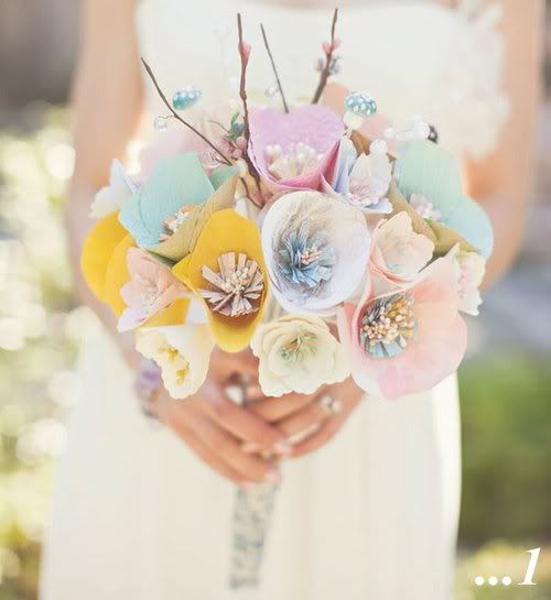
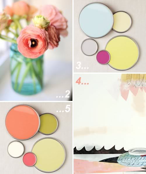
5: FRESH PICKED: This is an enticing use of pink for the summer - for a wedding, patio decor, tabletop styling, even a pretty summer outfit. This is very J.Crew, isn't it? Lots of blue, yellow and green tones here. You could wear white linen pants with a colorful top with lots of these colors in the pattern, a solid tangerine handbag and gold sandals to pick up the warm yellows in this palette. Here, pink is very retro modern and has zing. Images: 1. Style Me Pretty, 2. raehein, 3. Better Homes and Gardens, 4. Eva Magill-Oliver, 5. Better Homes and Gardens
Out of the color groupings above, which one caught your eye? What do you like about it? How would you like to use it? Did this inspire you to think outside of the box when it comes to pink? It doesn't always have to be super sweet and girly?
Gorgeous palettes, Emma - we're all so inspired by these mood boards you've done!
(images linked above to their source, collages by emma lamb)