
Inspired by Calm, Casual Interiors
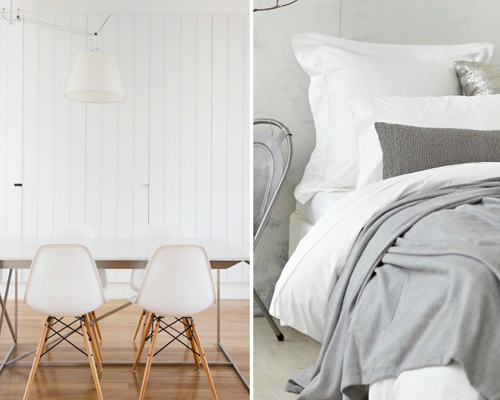
EST Magazine makes me happy. Mainly because I've been into black and white interiors lately, not that I'd ever try a 100% b/w monochromatic scheme at home, but because I absolutely love the idea of bringing more black into my home to warm it up for winter. Especially soot black, that gorgeously yummy matte -- it's a favorite of mine at the moment and I'm trying to think of what I can paint to include it in my living room scheme. I already brought in a big recycled rubber tote for my living room for storing magazines and a matte black Eames rocker... So I'm thinking what else can I add. Which brings me to EST magazine - it's packed with ideas for those of you who want a calm, casual interior. Sand, charcoal, dove gray, navy blue... all paired with cream or pure white. Heaven.
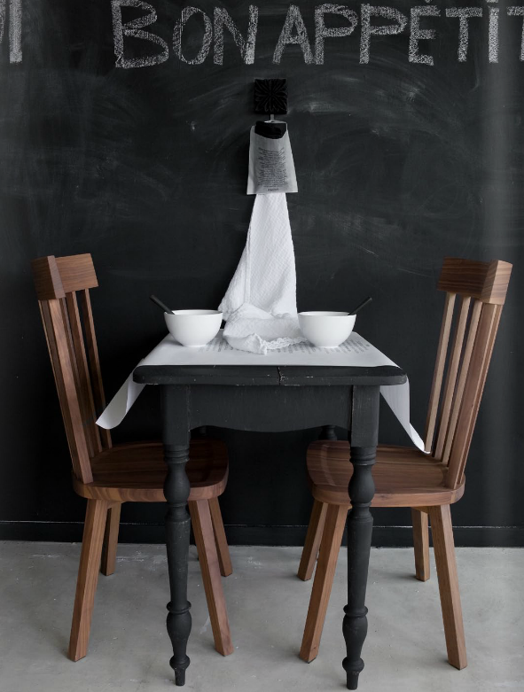
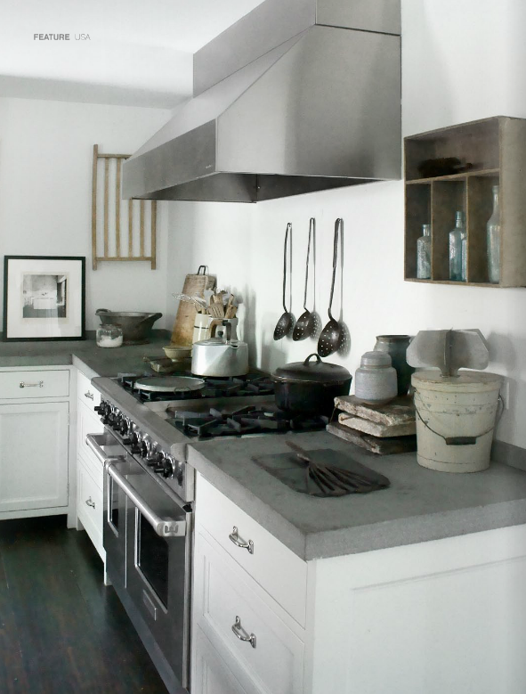
EST just announced their 3rd issue that just rolled out on monitors worldwide and of course, I'm smitten... Look at that table above - could it be much better than that?! I use PTMD paints out of the Netherlands because they are mostly chalky neutral colors and recently I painted a wooden bookcase a medium gray matte and I love it. I mean, I really, really love it. There is something so tactile and real about chalky surfaces on furniture and walls. I'm not sure how well it will hold up over time (I may need to add a clear top coat) but for now, I dig it completely.
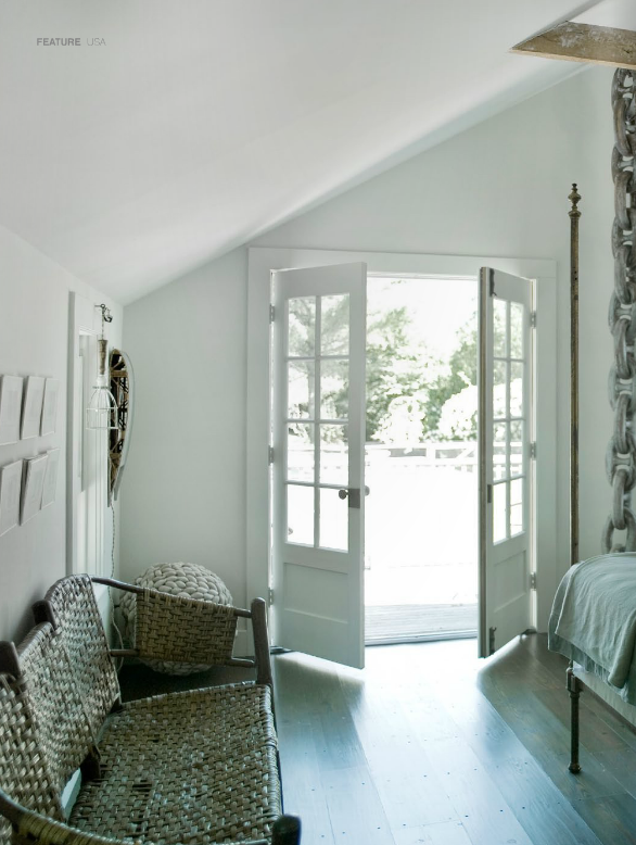
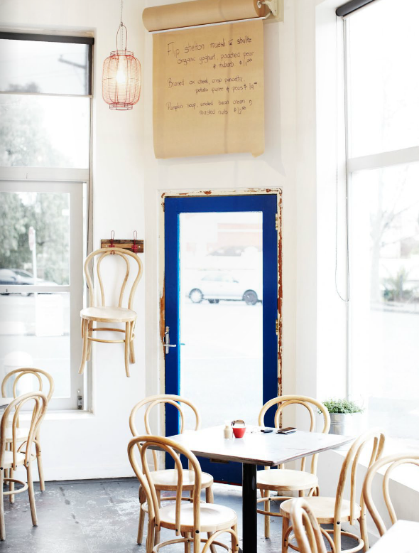
From LA to the Hampton’s, from the inner city of Melbourne, Australia to Scandinavia -- you can find lots to make you drool this month in EST. But I want to focus on the black I'm seeing in so many of their spreads... Gorgeous!
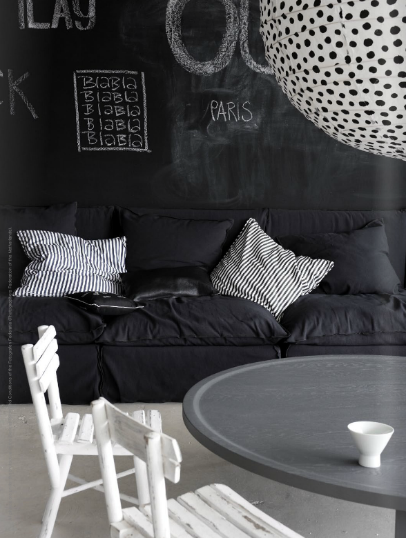
Did you notice the huge white paper lantern above? It may be one of those cheap ones from IKEA... and if so, what a great idea to add painted on details - spots, stripes, anything goes. Love the black organic spots! By the way, that table above is the exact gray I was telling you about - that is the color of my bookcase.
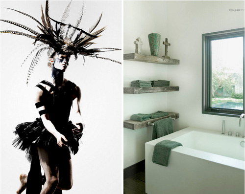
I'm really into feathers and anything in black white and or/brown that looks very modern but also Native American. A headdress, antlers, reindeer furs, feathers, a dream catcher in white... but all very muted and organic looking. I first noticed one of my favorite Danish stylists using them in her home about 5 years ago and started to like it then but most recently, I'm finding Native American influences in design very fresh and beautiful. It seems that Europe gets more in touch with this trend than we do in America and I'm not sure why. I think we may associate it with the typical Southwestern style in the rust tones with blue and yellow... but in Europe, particularly the Netherlands and Scandinavia, they interpret Native American style into something quite amazing -- they make it very neutral and tactile and pay special attention to the details. I find it completely inspiring.
If you recall, I first told you about EST when they launched, and I loved what I saw, but most like digital magazines you wonder if they'll have what it takes to stick around or if they'll just become another e-mag that looks and feels like everything else on digital newsstands. EST is different and they are really proving it - their consistent, gorgeous editing and fresh, clean take on design is both inspiring and motivating. I can't wait to see how far they go and how popular they become - they have the potential to be a huge success and hopefully, if you like what you see, you'll become a regular EST reader and support them. Enjoy!
(images: est magazine)