Catalina Estrada Introduces Bold, New Wallpaper
Over the top? Yes ma'am. Bold? Yuppity yuppers. Saturated with color? Oh, baby. Opposite of understated, this new wallpaper and wall mural collection from Catalina Estrada isn't for the fraidycat decorator! I've noted my personal favorites below. I wonder which ones you'll like...

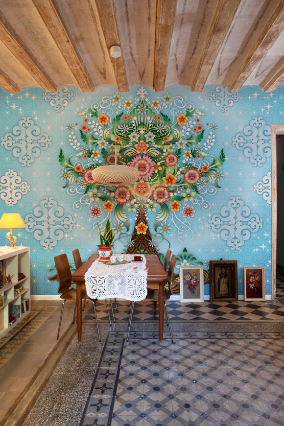
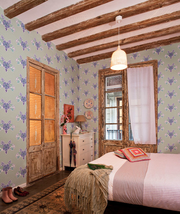
This pattern is nice... but HELLO - great floor alert! Ding, ding, ding! I want that gorgeous tile... I love it worn and dated.
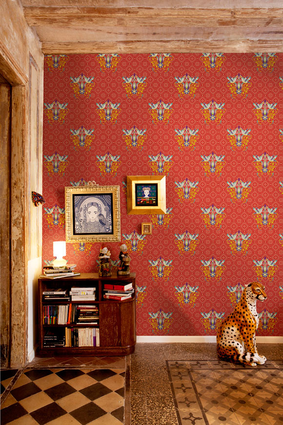
The red/white pattern on the right wall is really sweet and boho.
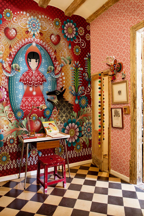
Very sweet pattern for a retro china cabinet to line the back or to cut out some of the flower patterns and stick them to a dress or bottom right corner of a white cabinet for a little color and pattern. Whenever I see really bold papers that I know I couldn't live with on my walls, yet I like them, I immediately try to think of alternate ways to use them. Cutting out patterns and adhering them to furniture can look nice when done neatly and with attention to detail - you'll want to use small scissors and cut the shapes out very, very nicely - avoid tearing or sloppy cutting as it can make all the difference in the world when you apply your cut out pattern to a smooth surface.
This one is sweet because there is still some white space to hang art and things.
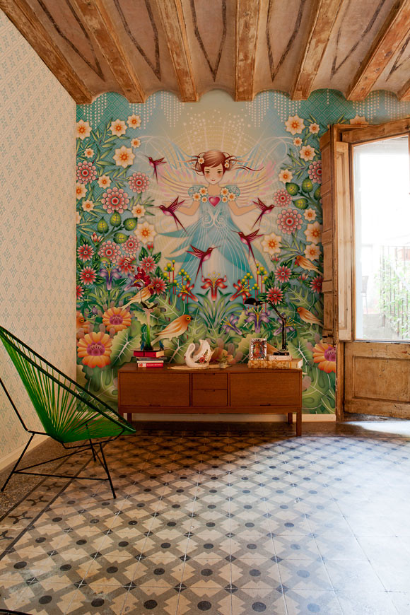
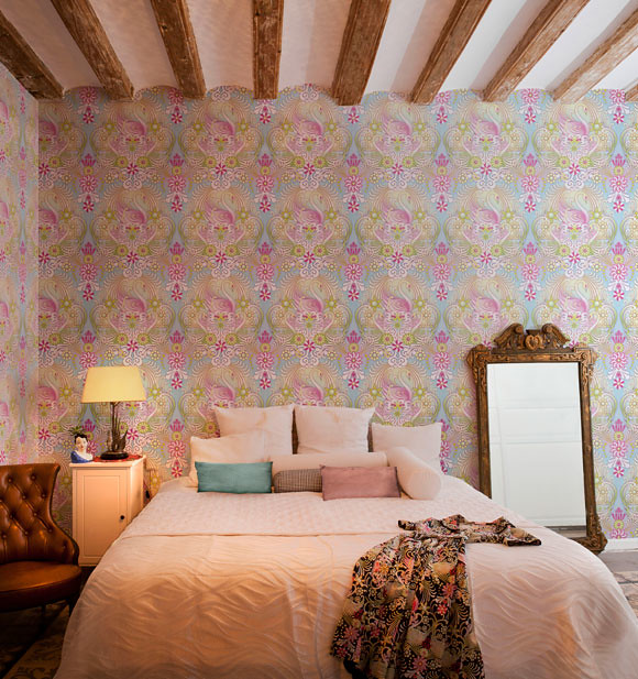
I'm definitely not daring enough for this on my walls but I could rock out some of the patterns inside of china cabinets, closets, or even on the ceiling with painted walls in a complementary color kept simple and soft. Could be really pretty in a little girl's room. Fun!
If you'd like to purchase this paper or stock it in your pretty shop, since it is in collaboration with Coordonné, you can contact them directly. If you are in Spain you can email: ventas@coordonne.es and elsewhere in the world you may contact: export@coordonne.es.
(images: cataline estrada)

