Blog Mood Boards
Hello everyone! I've been offline for several days as I was away in London but I'm back home now and ready to blog! I hope that you are doing well. Between the stress of the weather on the east coast (a hurricane first, now snow in the northeast) and the election, I think my American pals are in need of some inspiration because it's been a bit draining to say the least. It's time for a little cheer so lets look at pretty things today!
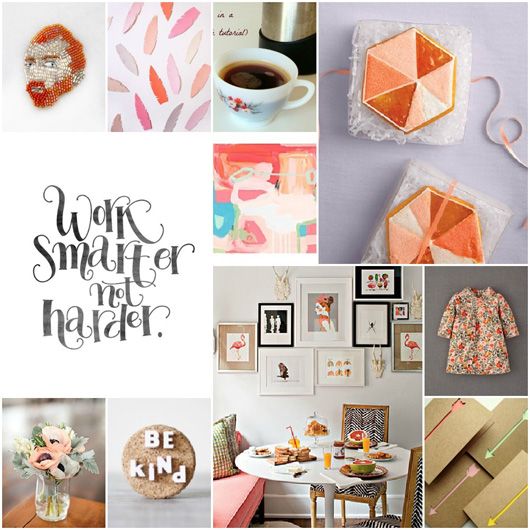
I'm not sure if most of you are aware of this, but in addition to decor8, I run an e-course focused on blogging and creativity called Blogging Your Way and I also teach in-person workshops on everything from paper crafts to blogging, styling and creativity. I've made a business out of blogging and like anyone who has a small business, I'm always thinking of ways to improve it and make my clients even happier. It's not easy, as everyone has a different learning style, but the one thing that I teach time and time again that students really click with is the exercise of translating your ideas into something visual and I do this via inspiration boards, mood boards, story boards or whatever else you feel like calling them. For this post, I'm going with mood board.
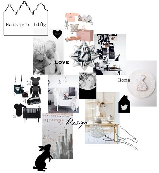
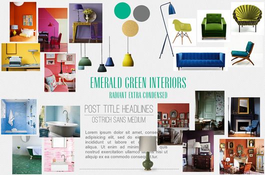
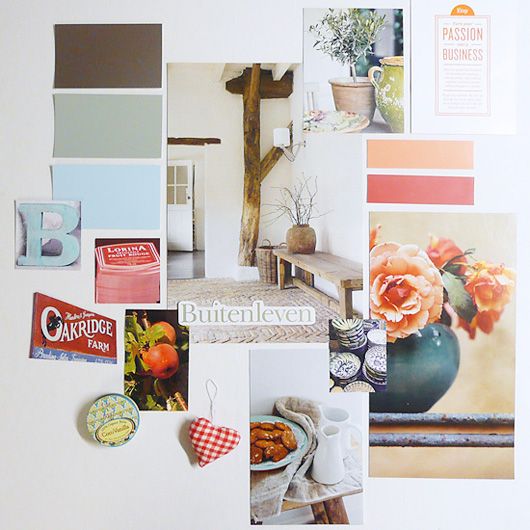
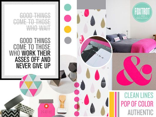
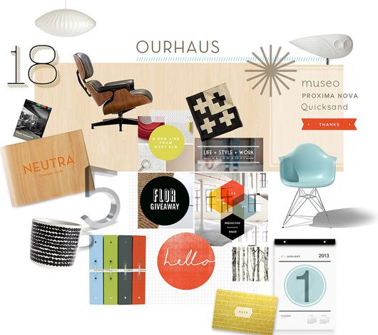
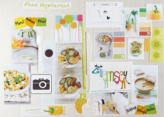
A mood board is one of the best ways to filter your ideas and give a voice to what feels very muddy or trapped inside of your head. It's easy, fun, can be done with your hands or on a computer, and oftentimes doesn't cost a penny. In my most recent Blogging Your Way class, which just wrapped up last Friday, we worked on blog mood boards. A blog mood board is a way for new and even seasoned bloggers to hone in on what they want their blog to be about and what they what it to look like whether it's for a redesign or for their very first blog. In this post, I'm showing you some from my students that I found inspirational - please visit their blog links below each image to visit them AND you can see all of the student mood boards on the Blogging Your Way Boot Camp Pinterest page.
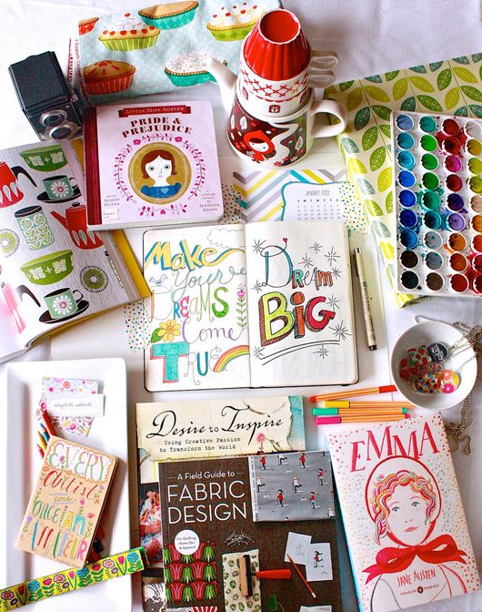
Lots of times we think we know what we like or want to talk about on our blog but have a hard time focusing or narrowing down our concepts. This is where blog mood boards help. You can take all of your ideas and start moving them around before you on a board, on a table, on the floor, and see how everything works together and then, see if everything really "fits". Magazines and book publishers work like this and so do designers and many other creatives when it comes to figuring out next steps in their creative process. When I was working on both of my books, I pinned spreads to my wall and even scatted them about on my massive table to see how they "laid" together and to imagine the flow. It's not that different when you are trying to pull a concept together for a blog.
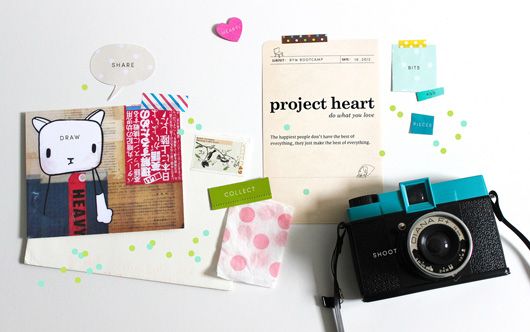

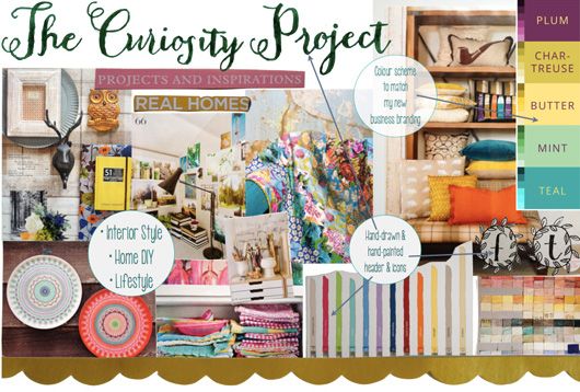
The Curiosity Project
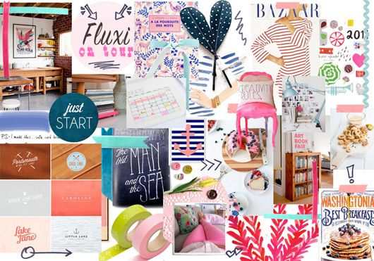
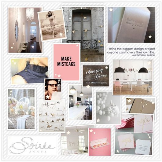
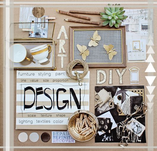
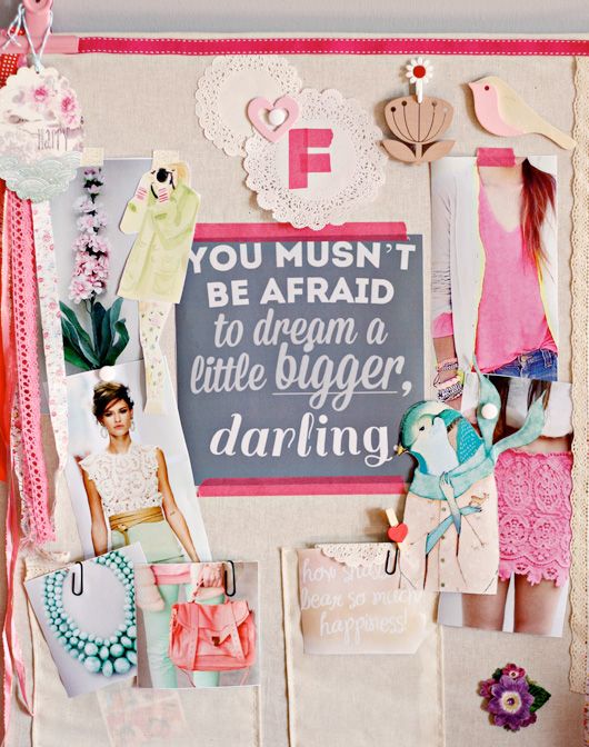
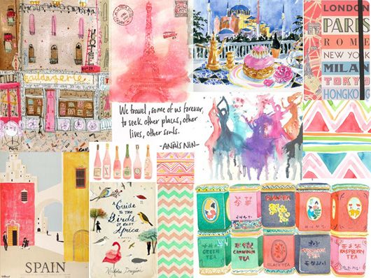
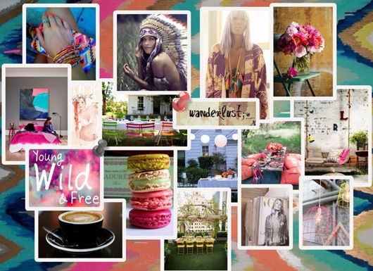
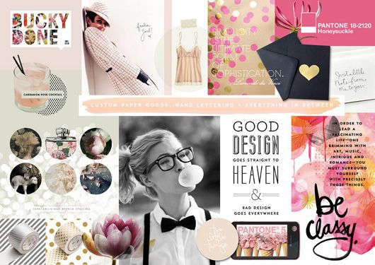
Mischief, Flapjacks, Pantone & Me
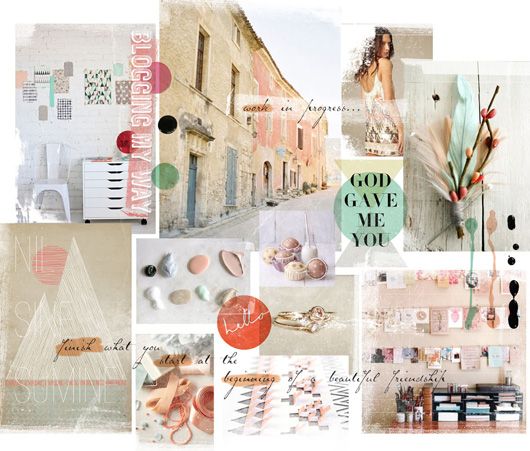
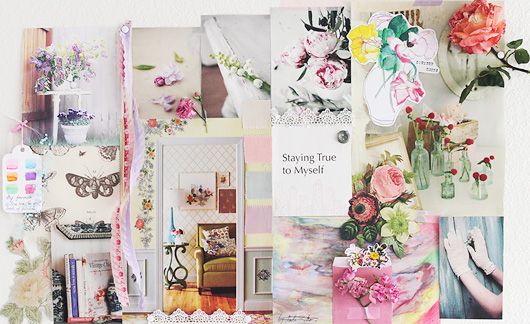
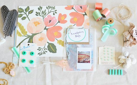
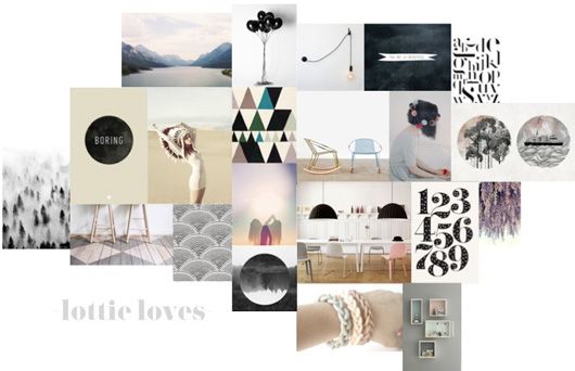
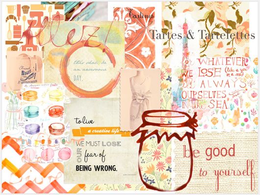
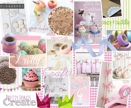
Aren't these inspiring views of how one wants their blog to be? Have you ever tried mood boards for design concepts - either for your brand, blog, website or something else? Did it help you? Did it help your designer?
(images: the talented ladies who made these moodboards are credited below each image with a link.)
