Trending: Moody Colors
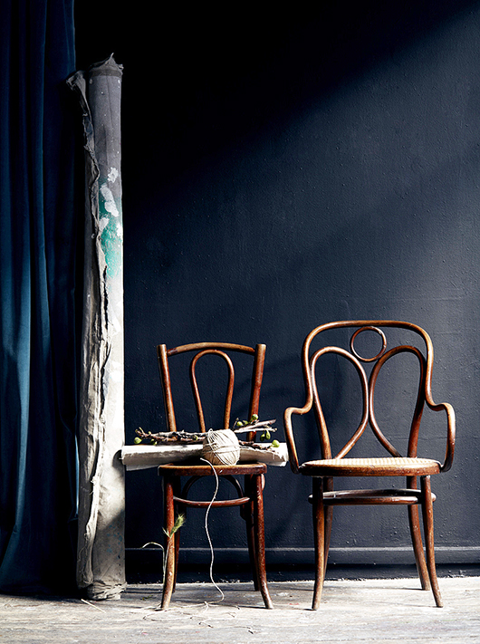
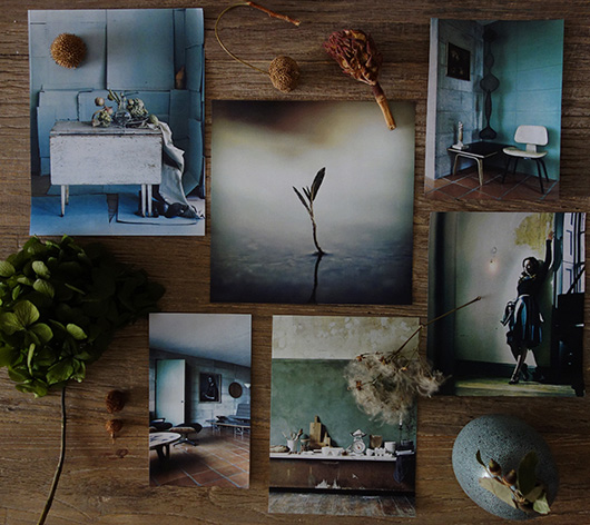
Hello everyone! Moody, dramatic and captivating - these are the characteristics for this season's wall colors and so I'd like to highlight the current trend: moody colors! When stylists like Maria Grossmann, Hans Blomquist and even the queen of white walls, Lotta Agaton, start to work into their projects misty blues, different shades of grey and darker greens, you know we are talking about a trend on the rise. For my trend post this month we're going to examine 3 different moody colors with a focus on walls. I am personally working with moody colors this month - here is my current mood board in my studio here in Barcelona.
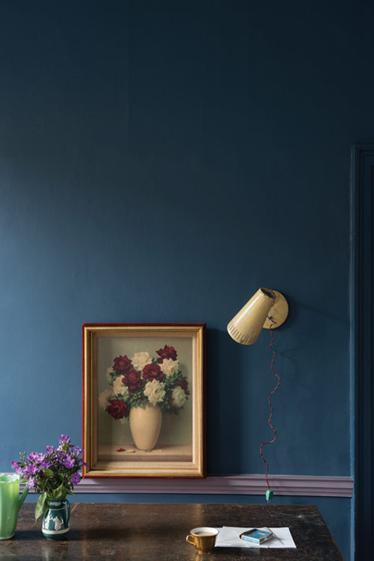
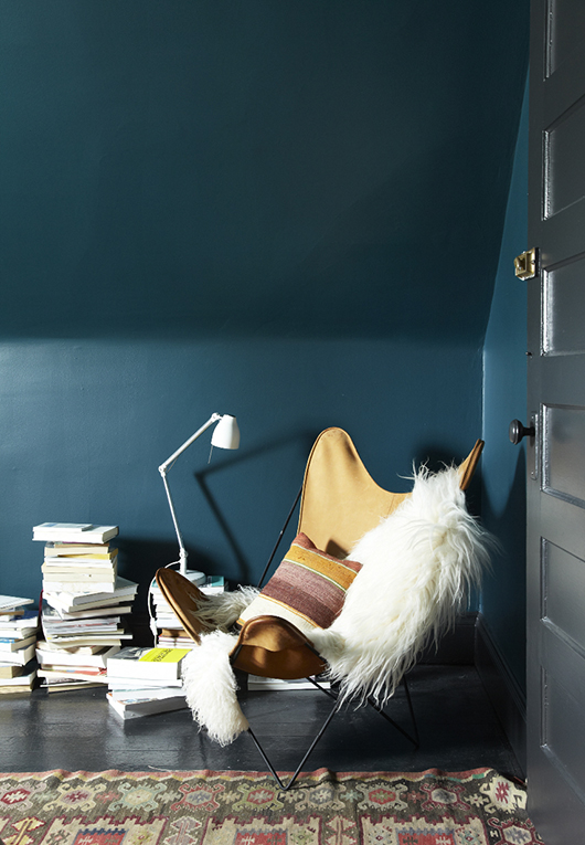
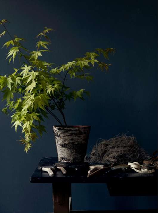
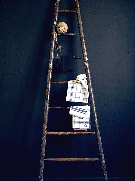
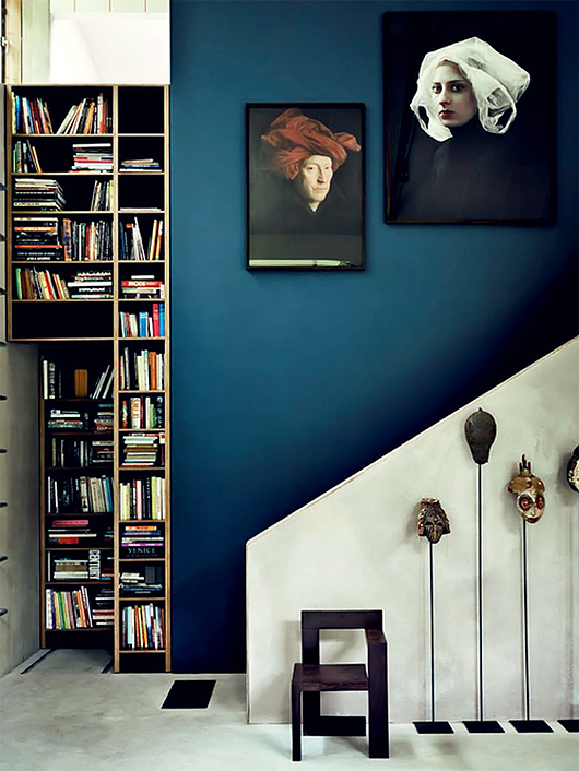
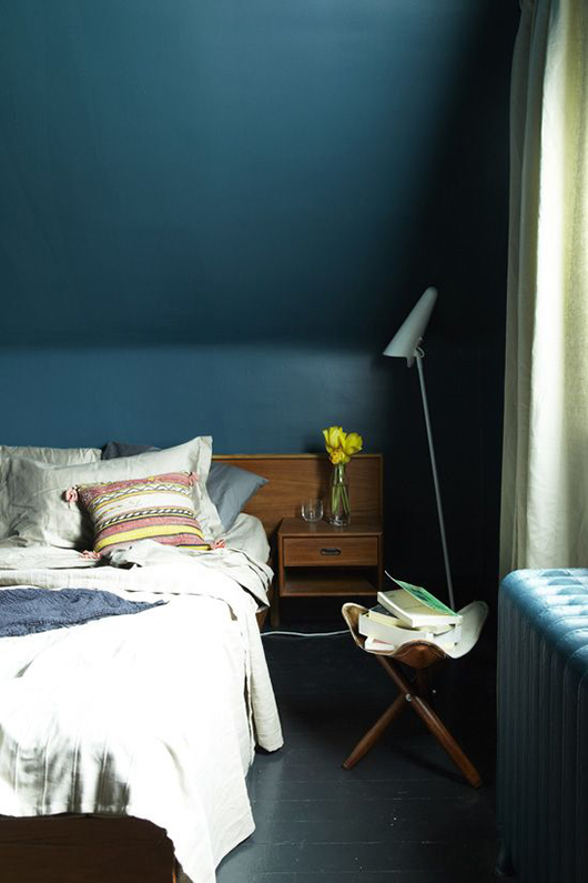
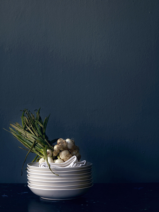
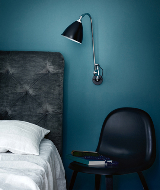
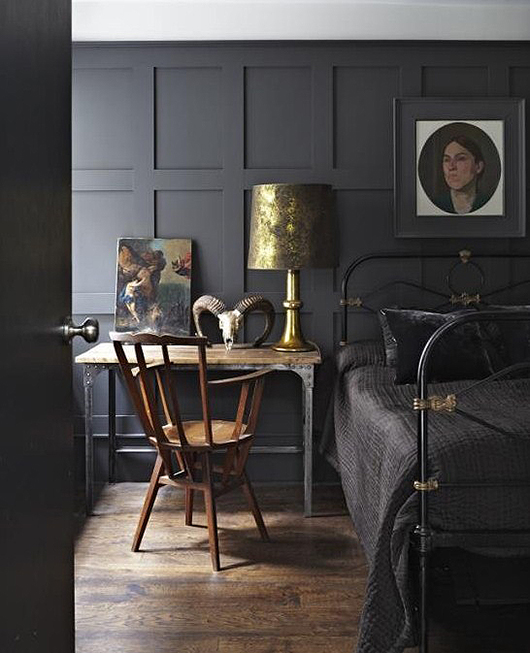
MOODY BLUES Deep, dark blue tones are taking over currently in the interior color scheme. I'd describe it as greyish-petrol. Blue is considered a cold color but this hue embodies a wonderful moody atmosphere inviting you to read, sit by the fireplace, gather around table for hours and to relax. I never quite know how to name colors but Farrow & Ball helps out this time calling it Stiffkey Blue in honor of the mud found at Stiffkey beach, Norfolk. The first two interiors shown below have Stiffkey Blue on the walls. As you scroll down, notice the the other moody blues and click on the links I've left so that you can visit some pretty amazing websites and portfolios while you're at it!
 Styling Ditte Isager for Fritz Hansen
MOODY GREYS Moody greys can be comforting and are very much in vogue this season in textiles such as thick knits, crumpled linens and tactile fabrics adding a wonderful link to walls painted in a similar shade. Colors range from warm pearl grey to an intense matte charcoal. If you are not too much into a single tone color palette or believe these are too dark for your taste then opt for contrasts with some accent colors in mustard, pink or pops of gold. Teal and grey are beautiful color combos too.
 Hotel La Maison Champs Elysees
 Interior Designer Athena Calderone on Refinery 29
 Interior Designer Athena Calderone on Refinery 29
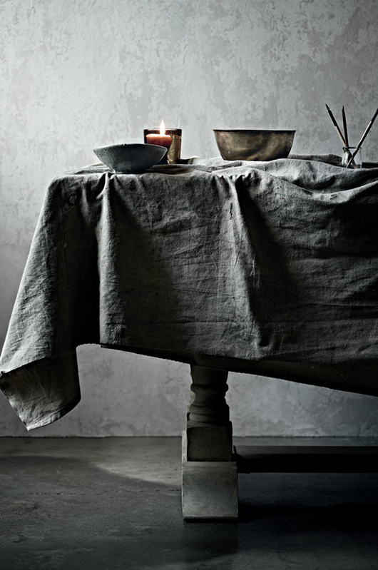 Styling by Glen Probstel
MOODY GREENS Moody moss green is probably the least seen and used domestic wall color so far and mostly applied in styling projects. Pantone called the jewelry tone Emerald the color of the year and we have been observing a flawless transition towards a more moody and richer green inspired by the huge indoor gardening and local farming trend.
 Stylist Jeroesn van der Spek
 Vangelis Paterakis Photography
 Joanna Laajisto Creative Studio for Bar & Co in Helsinski
These three moody colors have a common base holding some mystery, they are rich and sophisticated in their darker and deeper shade. So, are you moody? How do these colors make you feel? Could you paint your walls in these deep hues? Have you?
Wishing you all a nice Christmas season to come!
P.S. If you want some more moody inspiration, follow the decor8 MOODY pinboard here.
(text: gudy herder/editing: holly becker/images: credited and linked above)

