
How To Decorate With Radiant Orchid, Pantone's Color of 2014
I've been researching color lately and because so many of you are having a hard time with the Pantone Color for 2014, namely, Radiant Orchid, I thought I'd show you some brilliant examples of how to use it at home. It's one of those shades that can be tricky to use, can't it? It can go wrong so easily! Here are some tips and visual inspirations in orchid to give you some encouragement to go for it along with ideas as to how to add the perfect dose to any room in your home.

For casual living, a simple stool in orchid as the accent color can work wonders. This is the home of jewelry designer Kathleen Whitaker as seen on Remodelista. This is a great example of how a little can go a long way when it comes to a unique color.
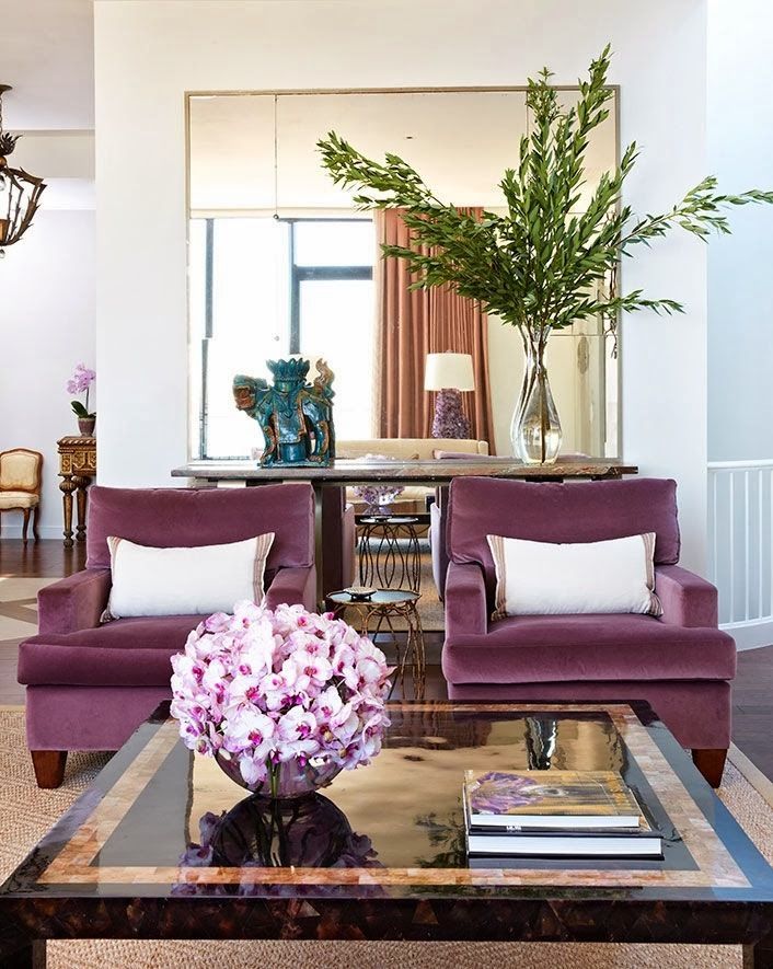 Home Sweet Home - This is a great example of how to use flowers in a home (orchids!) to add in a color you don't normally decorate with. In this case, the flowers bring out the lush, sophisticated chairs in deep plum so there is harmony.
Regarding decorating with this color, the experts over at Pantone comment in their press release about this color, "Spruce up interior spaces by incorporating this eye-catching hue in paint, accent pieces and accessories. As adaptable as it is beautiful, Radiant Orchid complements olive and deeper hunter greens, and offers a gorgeous combination when paired with turquoise, teal and even light yellows. Likewise, the vibrant color is sure to liven up neutrals including gray, beige and taupe. Uplifting and bold without being overpowering, Radiant Orchid reenergizes almost any color palette and provides a unifying element for diverse spaces." Do you agree? I think it also looks amazing with a deep gray.
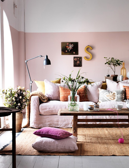
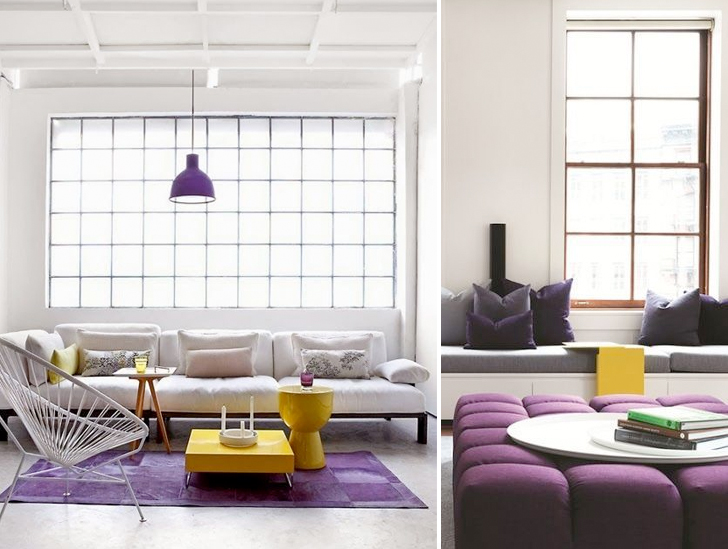 Here is how it looks with yellow. Not bad!

Nice examples of orchid found in rugs, throws and as a strikingly handsome chair from Blog Contrast that borders fuchsia. Remember, orchid comes in several tints and tones, after all it is the violet (purple) color family - it's a bright, rich purple that looks like the orchidaceae flower. You can find orchid in tones that range from grayish purple to purplish-pink to strong reddish purple.
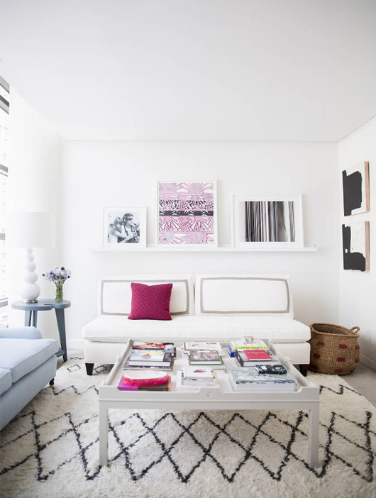 A simple print above a sofa brings a dose of orchid in without overkill. It pairs lovely with pale blues and neutrals, as seen in this room from Domino, don't you think? This is the home of Lucky mag Editor in Chief, Eva Chen. You can see more of her apartment here.

You know, this orchid tile looks quite gorgeous in this bathroom seen on Kathy Kuo Home. Very striking!
 Paint by Benjamin Moore in orchid tones... Would you add this color to your wall? I wouldn't, but that's just me. I'm sure lots of you would and you'd love it!
 Architectural Digest is always showing rooms that I know cost around 100K to pull together, yet I still find them inspiring. This one is no exception with a luxurious deep orchid velvet sofa paired with pale orchid on the side chair. Would you mix tones in the same room on such large pieces? It's a daring move, I'll admit. It only works if you play with the tints and tones of the color and also the shape of the furniture, otherwise it could be a bit too much if the chairs and sofa were all in the same fabric or in the same shape.
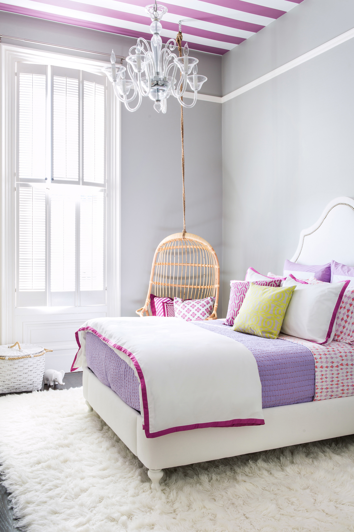
I can see a teenage girl totally going for this room as seen on Project Nursery. It's stunning, right? Using orchid as a border against crisp white bedding adds a touch of glamour and that ceiling! Oh that ceiling! Chic, chic!

A nice touch of orchid in a few throw pillows show restraint, and yet add a certain something. You can find this color used frequently in textiles from countries like Morocco and Turkey. When I studied color theory in college, I found purple to be a most interesting color to research. Did you know that the most famous dye in the ancient world was Tyrian purple, which looks quite a lot like the modern day "orchid" color we're seeing here. It was created using a snail from the Mediterranean sea called a murex. And did you know that purple was one of the first colors used in prehistoric art? It has been associated with royalty for centuries, too. It's no wonder then why you find purple (and also red) in so many woven textiles that come from countries that still employ traditional techniques, patterns and colors into their works today.

Here's an orchid-y leather pouf and other soft furnishings mixed nicely into this city apartment.
One simple throw cushion on the floor, as seen in Sköna Hem magazine, makes a statement.
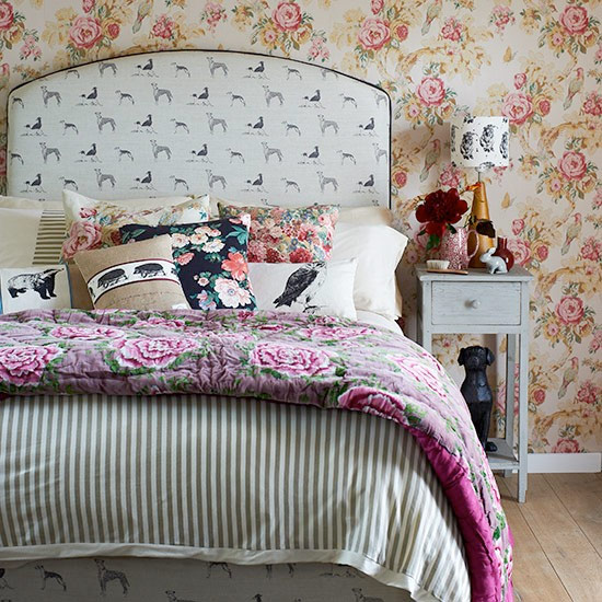
Who would have ever imagined that these patterns would work together in a bedroom? Yet they somehow do. And did you notice the orchid throw at the foot of the bed?

Little details in orchid in this kid's room are so pretty!
When decorating with orchid, here are 7 of my top tips:
1. Not in love with it? If it's not your favorite color, mix it in with colors you love that are close on the color wheel and see if that changes how you feel. Often, we think we dislike a certain color when really, we need to bring in variety of other colors that mix nicely with it to quiet it down and make it work. So often, a color you didn't like becomes one that you adore simply by creating the right mix of patterns and colors.
2. Go bold. If you adore this color, then add a very bold piece to a room in the form of artwork, a sofa, a chair, a rug. Make orchid a real focal point. If you love it, why not? It's your home!
3. Kid's room. Most young girls love purple (I hit a purple phase when I felt I was "too grown up" for pink), yet purple isn't always a favorite of parents. Orchid can be a great and stylish compromise.
4. Less is more. Add simple touches with a leather pouf, a throw cushion, trim on linen drapes, a throw at the edge of a bed, a vase... You don't have to overdo it to make it work.
5. Flower power! Instead of interiors objects, add this color through fresh flowers. Many Fall blooms are in this fabulous color. And of course, there are always orchids themselves!
6. Experiment with tone! Deeper or lighter can change the mood completely from dramatic and elegant to pastel-y and sweet. See what you like and don't be afraid to play. Pair with gray for drama, pair with yellow for bold, pair with white and pastels for a light and sweet room scheme.
7. Bring some "wrongness" to a room. My friend Sania Pell, a stylist based in London, once told me that you need a little wrongness to make something right, especially when styling a room or vignette. She's right and I now apply this to my own styling work as I see fit - though it's not easy and does take a trained eye to do it right! Oftentimes, we try too hard and things look very perfect and boring as a result - you know those rooms that are so perfect that nothing stands out? Orchid can be that touch of wrongness to a space - a quirky painting, a piece of porcelain in a cabinet that you've spray-painted orchid (like a quirky cockatiel!), a lamp base spray-painted in this color against a charcoal wall with a bright canary yellow shade... Often a single element of "wrong" can make it right because it catches the eye and adds interest. It makes you think. It makes others talk. Often you have to learn all of the rules before you can begin breaking them and with decorating, it's no different.
And a huge by the way... In my upcoming book with Leslie Shewring, Decorate With Flowers, we actually explore this color and show a winning combination of how it works at home through flowers and decor. The funniest thing about it is when we were writing the book, we didn't even know Pantone would select this color for 2014, so I'm quite excited that we have a chapter dedicated to contemporary living with orchid tones showing how we used it and what colors we combined it with. Good timing for us all!
What do you think about orchid? Would you add it to your room? In large, small or medium doses? How?
(images linked to their sources above)