
IMM Color Trend Report Spring 2014
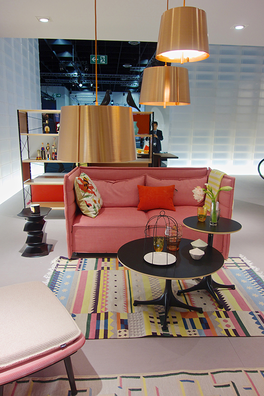
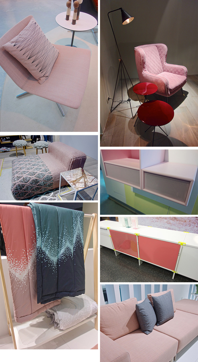
Hey everybody, I'm here with another trend show report, this time from the IMM Cologne in Germany. I have to say, it is a serious design show and very well visited... This time, I'd like to focus my report on color because there is not much going on that I haven't reported on so far in my previous columns on decor8 when it comes to form, material, finishings, etc. (you don't want me to write about copper or indoor gardening again, don't you?), so let's see what happens with color schemes in the interior design world. Interesting enough, there is not THE color anymore. Yes, you do have pastels, and yes, there is grey, and other colors considered trending right now. Interior trends once relied on a certain Pantone code, or Dulux (and others), but now brands are working within their very own hue interpretation exploring a single color. Let me show you what I mean and share the photos I snapped at IMM. PINK Pale pink is still the pastel color! It used to be almost the only one for the past few years. Now we see a bolder pink, we have peach, there is blush, bubble gum, and a long way of other shades. When it comes to pale pink, it is often combined with grey looking for a cooler approach now (see the last report from the M&O).

(click collage to enlarge)
Above: Arper | Baxter | GandiaBlasco | Montana | Normann Copenhagen | Pension | Softline


RED There is no show where you won't find some red pieces. Seriously. It is probably the color you'll find literally as a 'red thread' through all the interior design events but never considered a true trend. This time, I have seen red allover, probably linked to the burgundy trend we have been observing in fashion this FW 13/14 season. As a statement piece, it will bright any space, you decide if you like it on your side table, armchair or if you'd even go for a bolder sofa. So, are you open to bright red, burgundy, coral, dark orange, oxblood (brownish red)?


(click collage to enlarge)
Above: B&B Italia | Baxter | Danskina | Delightful Lamps | DePadova | Living Divani | Moroso | Normann Copenhagen


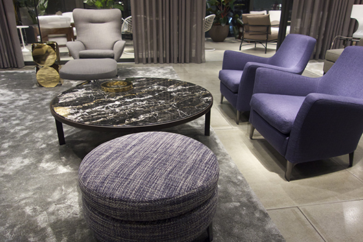
PURPLE Oh, yes, purple is staying and evolving from the darker violet spotted already at last year's show very very slowly to a brighter approach with a more feminine touch. But for now, dark hues are more common and the overall feeling is of a certain sophistication and elegance.


(click collage to enlarge)
Above: Baxter | Ligne Roset| Signet | Rugstar
BLUES
Again light blue would be here the key role coming from the pastel color trend. Teal is hot spot. Petrol is another ongoing trend which I suspect will be replaced during the next year. But watch out for more moody colors to come mixed with a greenish and greyish tone and real dark blue which is beautiful for sofas.


(click on collage to enlarge)
Above: Baxter | Kenneth Cobonpue | Linteloo | Moroso | Palau | Soft Line | Wogg

GREENS Here we have grey-green, blue-green, moss green, olive, chartreuse, etc. and the only newcomer for me this time has been a darker and rich green. It looks precious on velvet, quite masculine and sophisticated and belongs to the more moody color scheme we have been talking about in November. Green is hot in all shades, and I truly believe it stems from the current indoor gardening trend. Green just feels natural, refreshing and if not applied in a too bold shade, you don't get tired of it.


(click on collage to enlarge)
Above: &Tradition | Arper | Baxter | Gubi | Linteloo | Muuto | Normann Copenhagen

Samuel Wilkinson for Emu
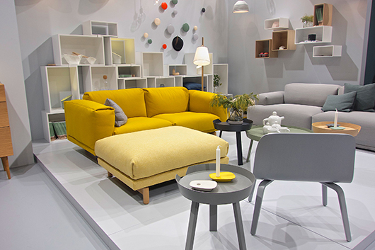
YELLOW This has been kind of a surprise since yellow was already done for me. I have observed a lot going on in this color on the IMM and yes, there is a stronger shifting to saffran and moustard but Muuto came up again with a very bright proposal. Other brands lean towards curry and darker color. It's interesting to see that the Northern labels are working their designs with yellow whereas you won't see yellow much in the halls with most of the Mediterranean brands.


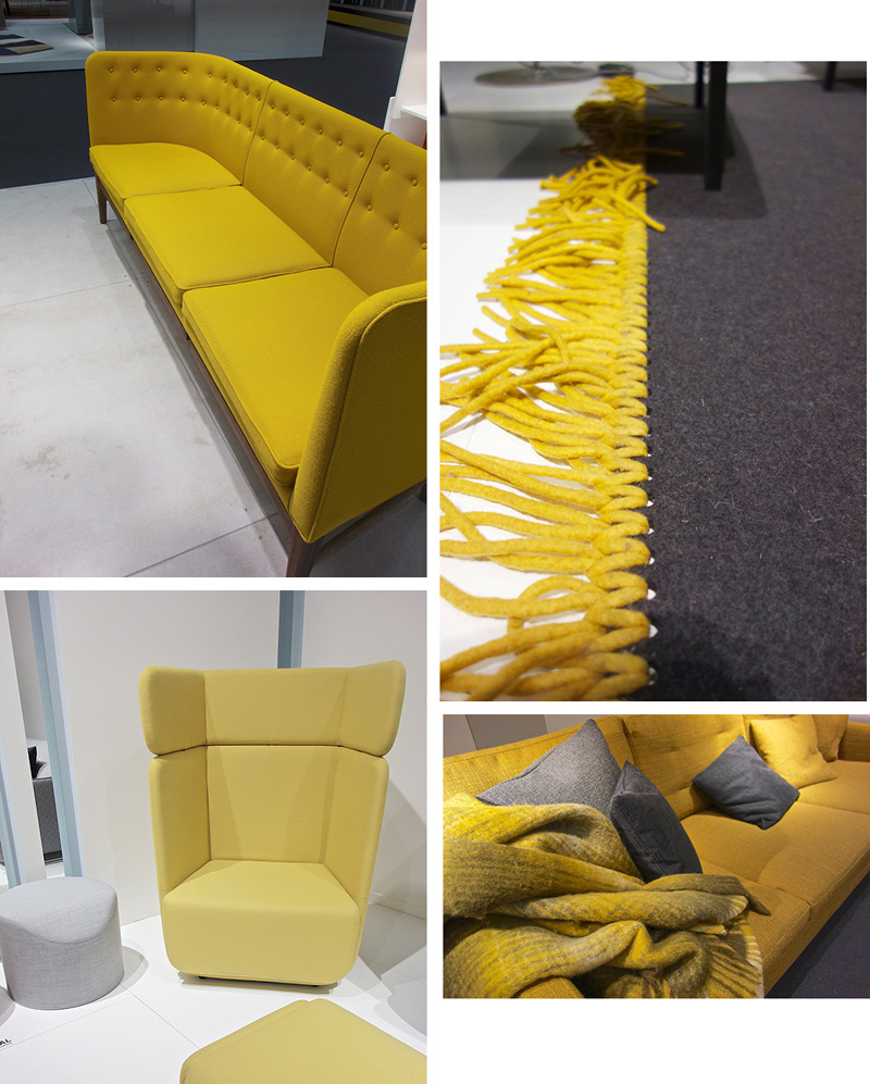
(click collage to enlarge) Above: &Tradition | Ligne Roset | Softline
BLACK + WHITE + GREY No show right now is complete without b&w. And then there is just black. Or just white. Plus Grey. B&W is king and comes back in stripes, dots, chevron, herringbone - you name the pattern. All black on furniture is trending, white helps to set up light spots and grey is probably one of the most used colors right now when it comes to combining color schemes. It is the perfect 'to go with' or complementary shade. You find grey+pale pink, grey+black, grey+yellow, grey+white, etc. Italian brands use them in an allover look&feel for a quite dark atmosphere at their stands whereas the Northern countries combine a lot with white structures (walls and flooring), accessories and furniture. We can talk about the same furniture but the overall feeling is totally different.


Vitra

(click collage to enlarge)
Above: B&B Italia | Baxter | Moroso

SUMMARY As a general observation: Colors get darker, and there is an authentic color democracy meaning every brand comes up with its very own interpretation.
What do you think about this statement? Is it good or confusing for the markets?
(images/text: gudy herder/editing holly becker)