
The Key Colors For Scandinavian Interiors 2020
COLOR LOVERS UNITE! It’s all about bringing HAPPINESS to the home for 2020 and I can’t wait to show you my color report today from FORMLAND because it’s so fresh — Nordic design isn’t all about white and gray anymore! There is a huge color wave hitting Scandi design at the moment and everything in the home is influenced by it - particularly walls and textiles.
After over a decade of stark, clean white homes with color dotted about through art or other design objects, COLOR is now THE dominate force in Scandinavian interiors, especially in Denmark. Whether or not this will stick, that’s to be seen… But color is around to stay becausin my opinion since all of us seem to be asking for more personality, authenticity and vibrance to our interiors and color (and pattern) are the quickest and most affordable ways to add a new mood to a space with little hassle.
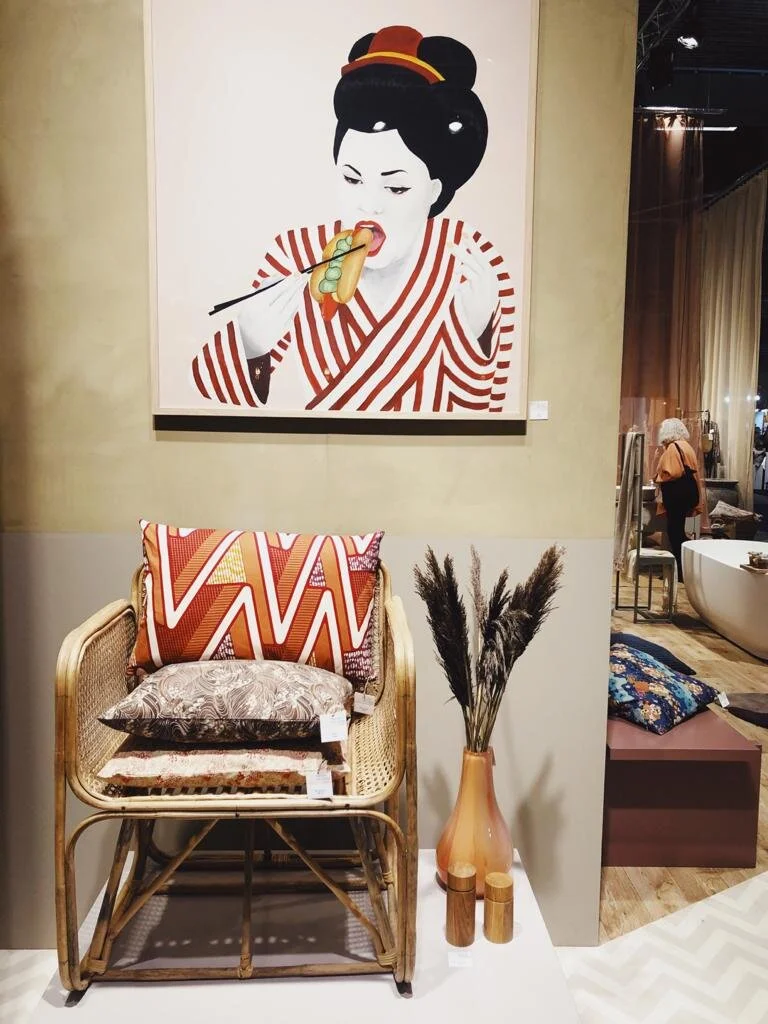
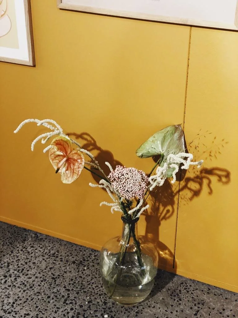
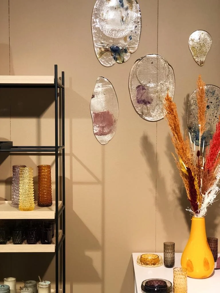
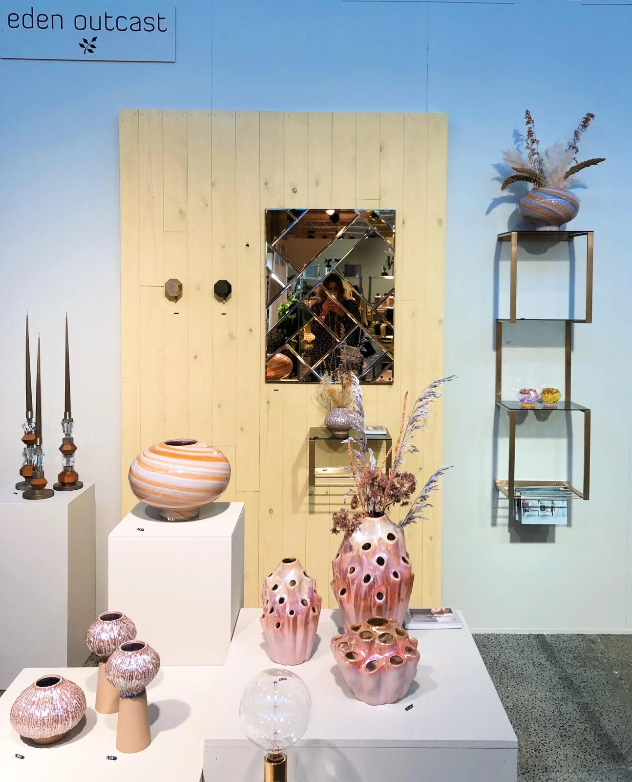
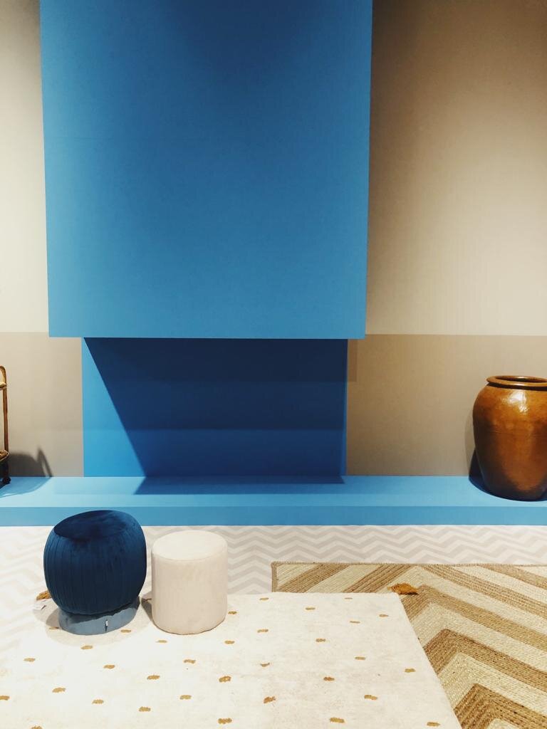
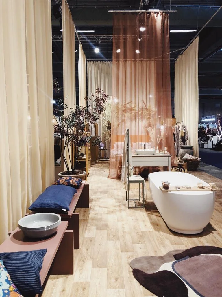
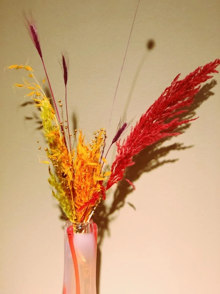
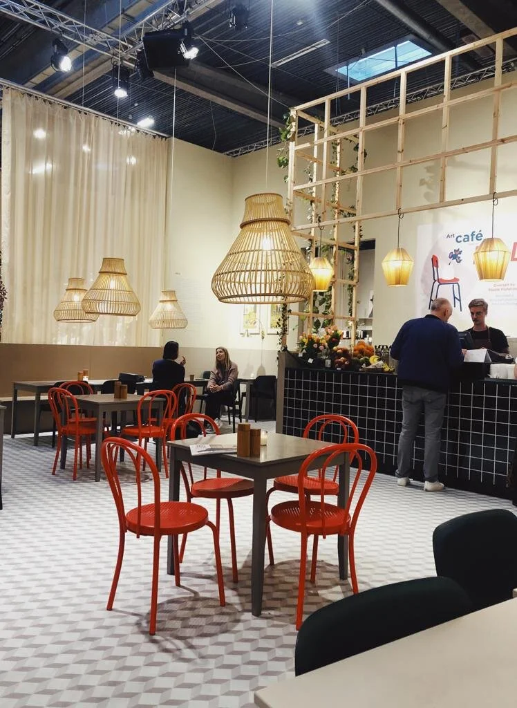
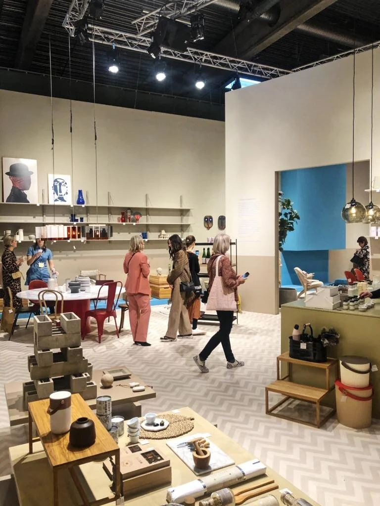
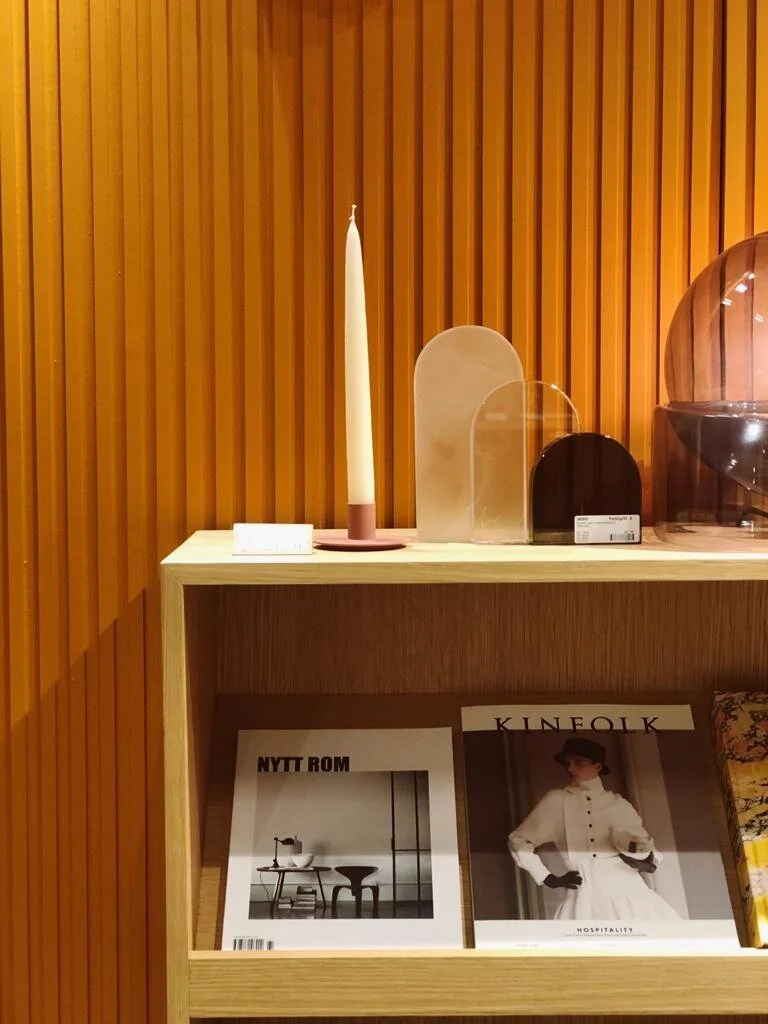
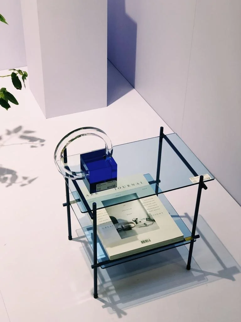
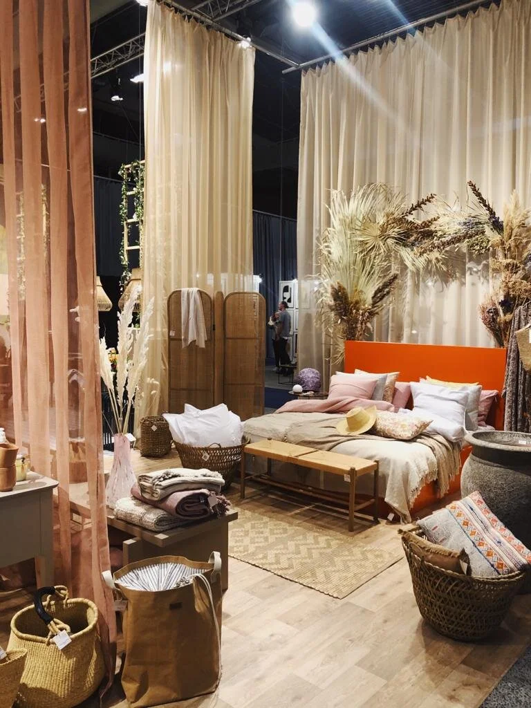
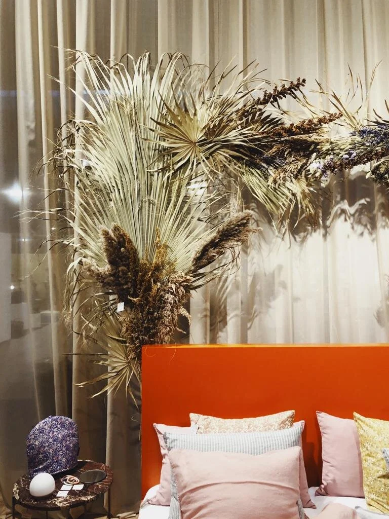
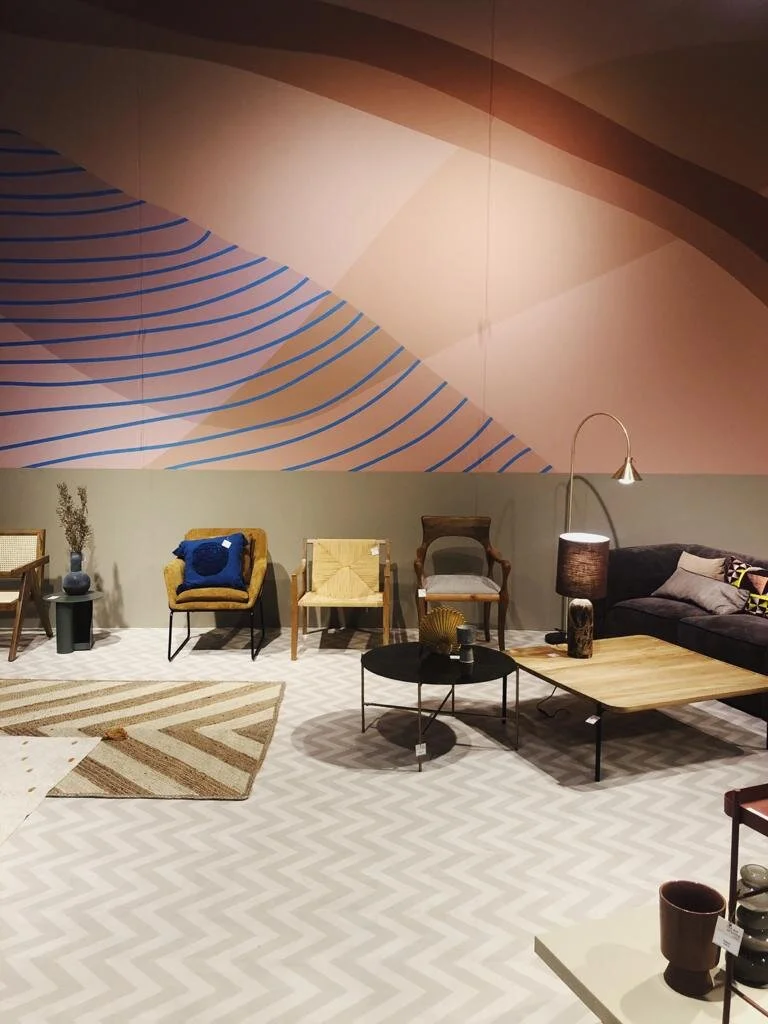
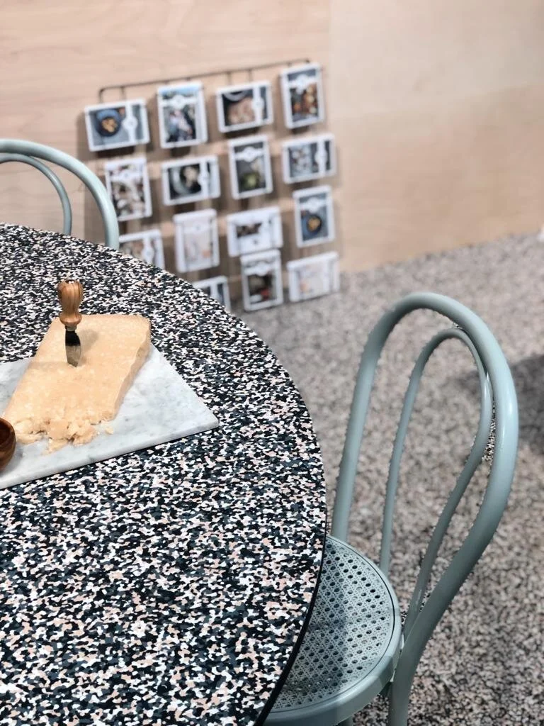
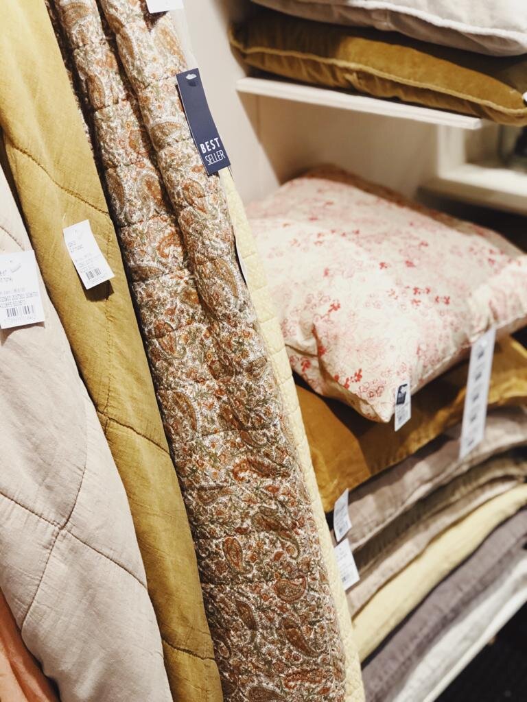
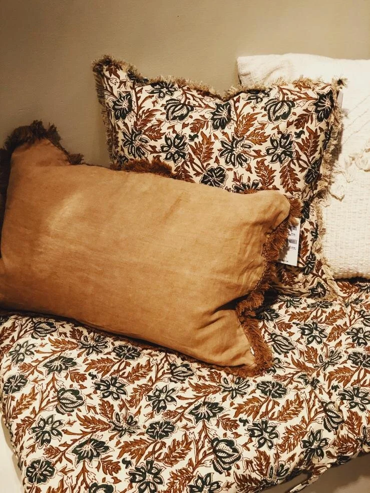
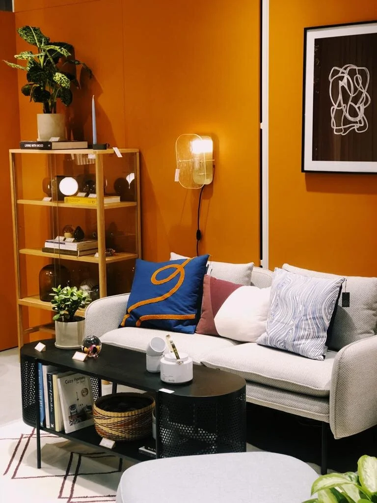
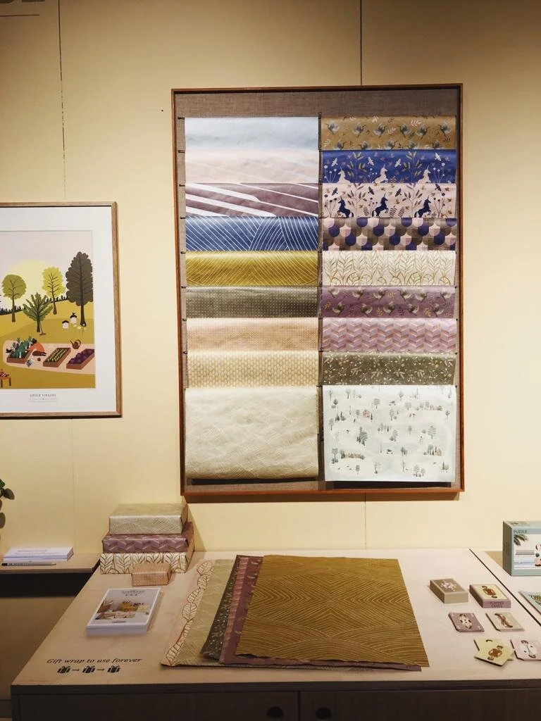
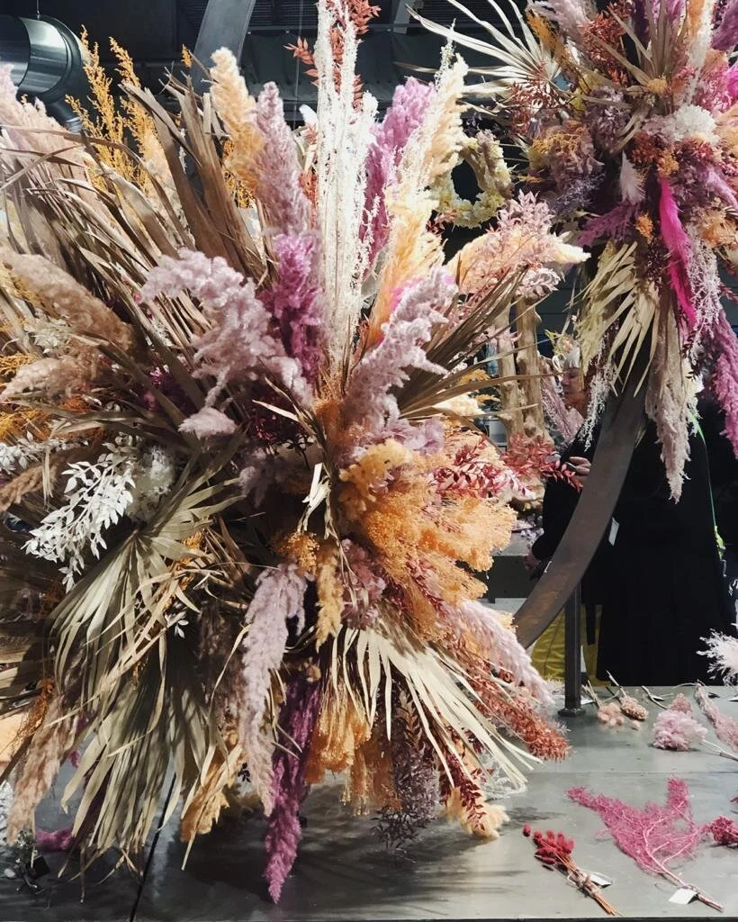
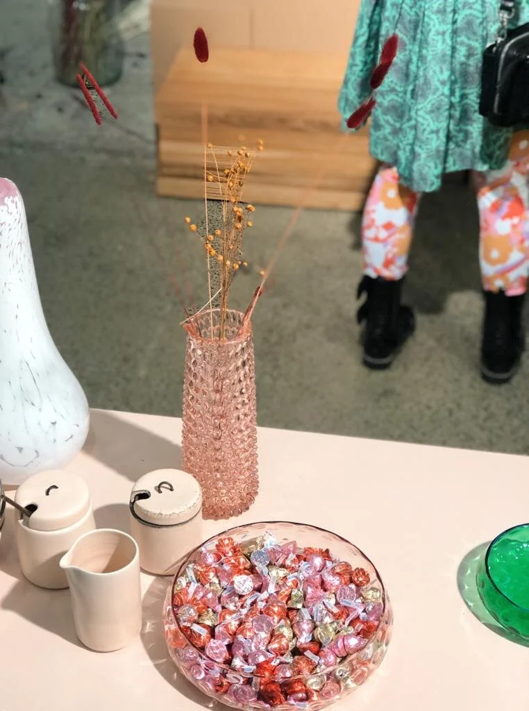
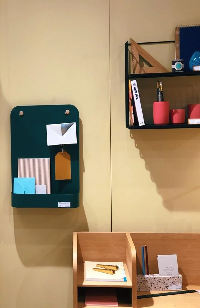
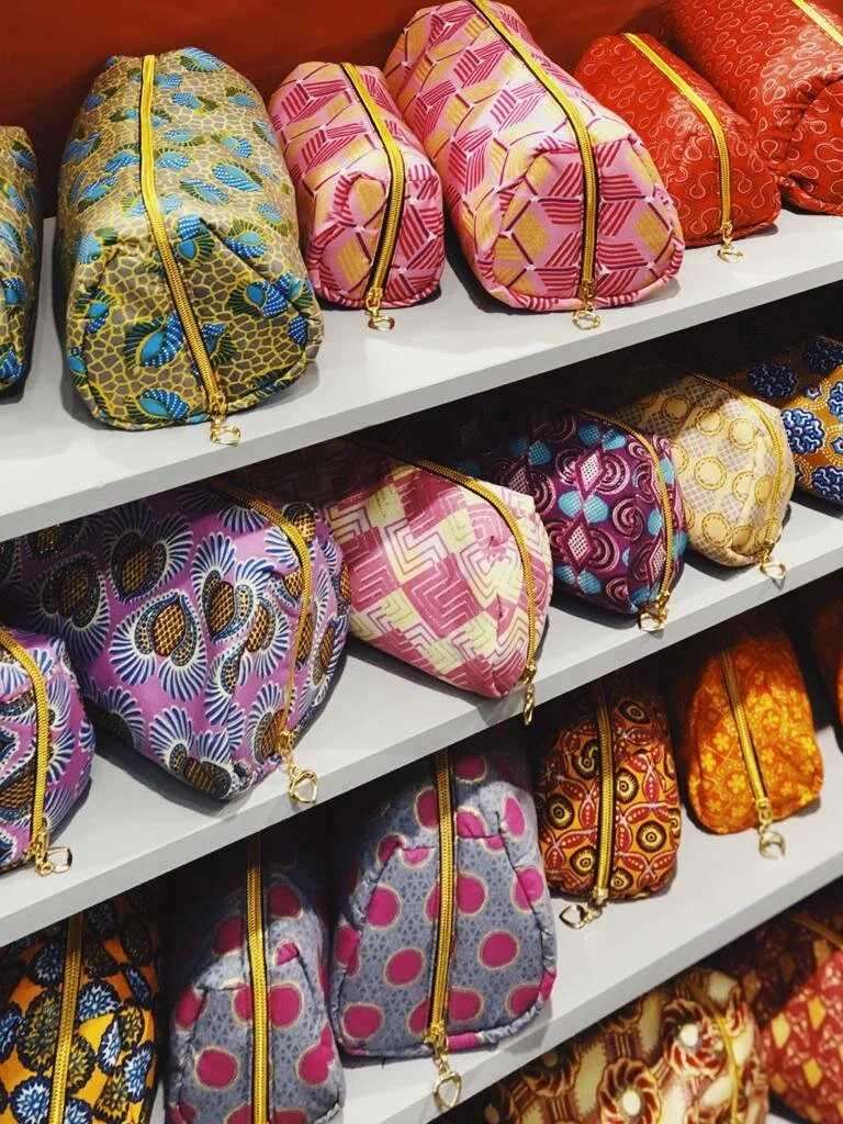
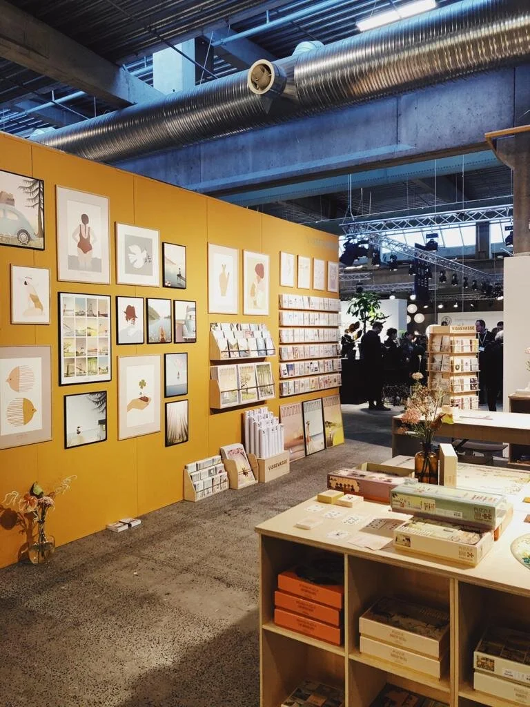
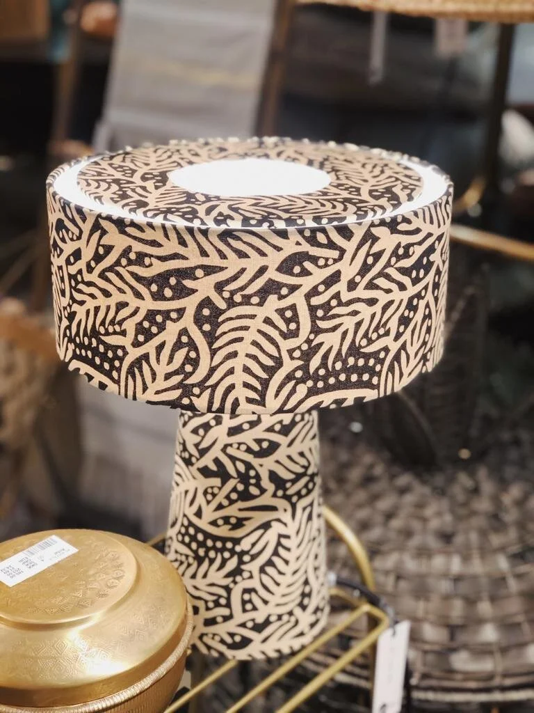
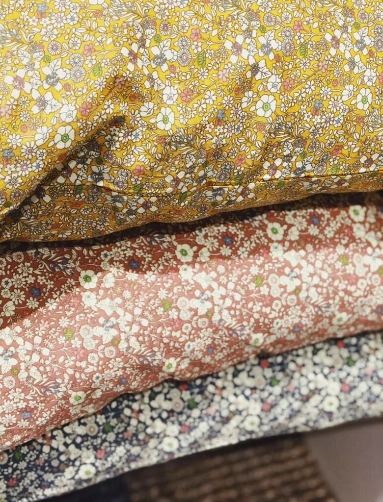
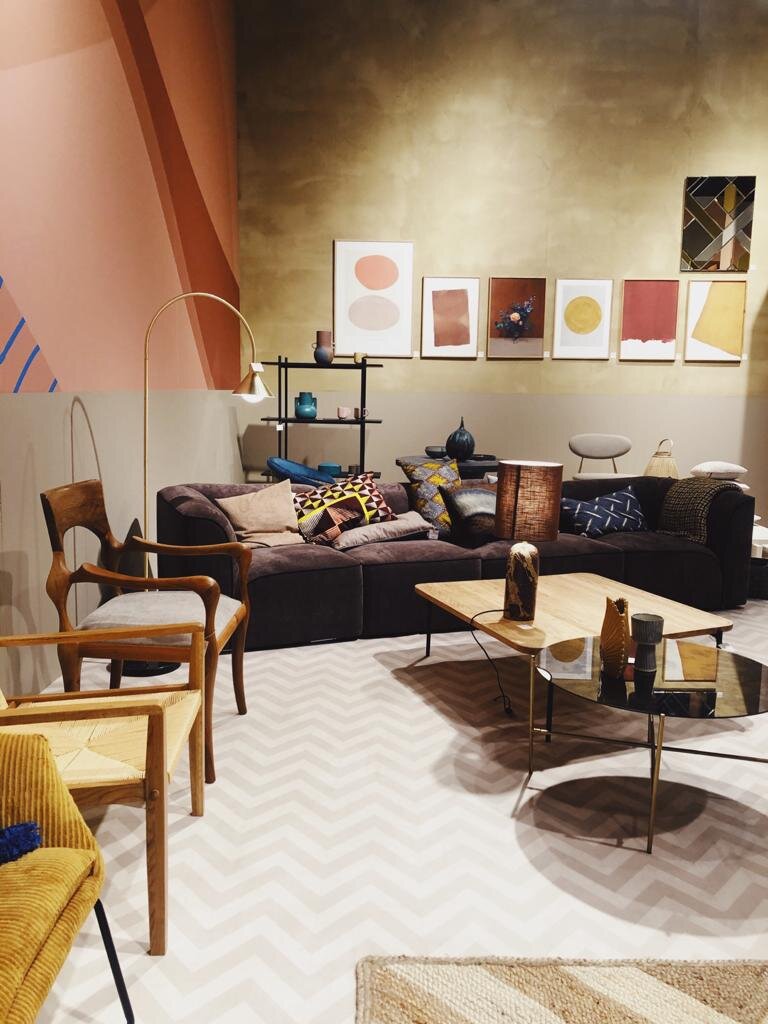
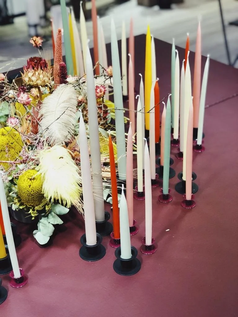
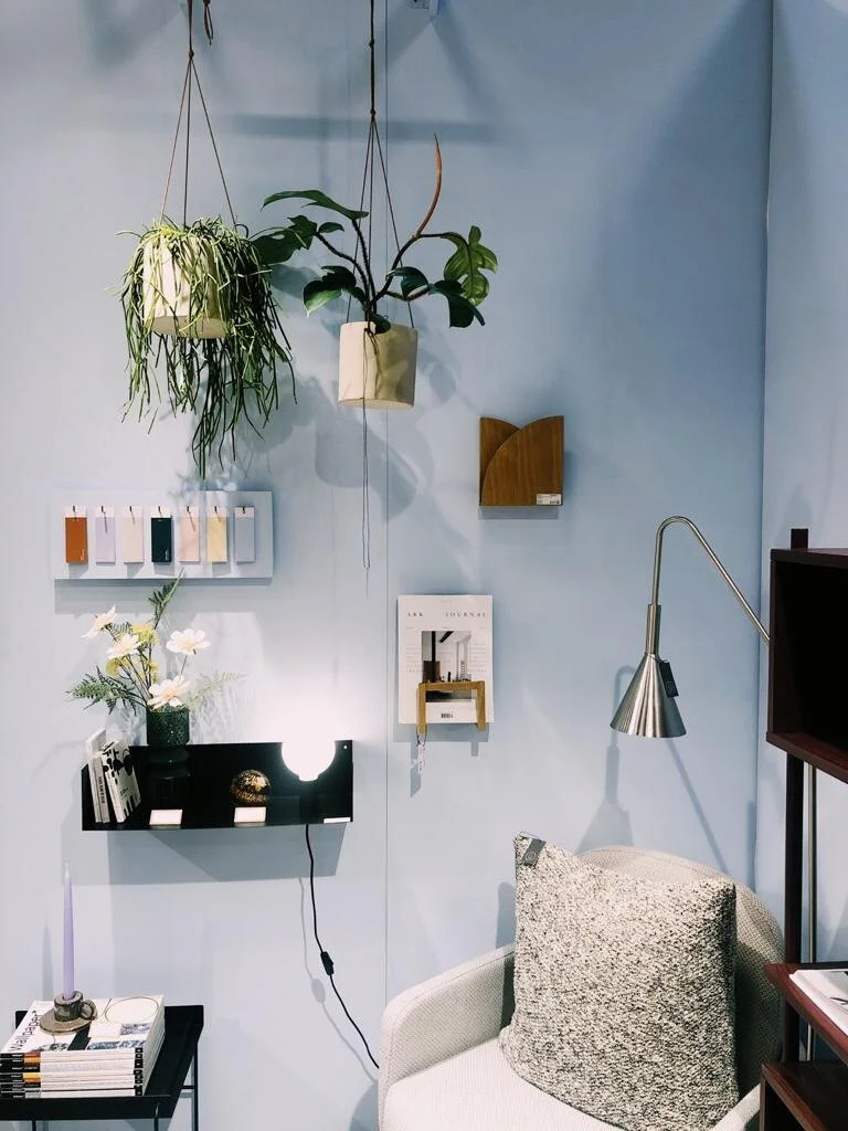
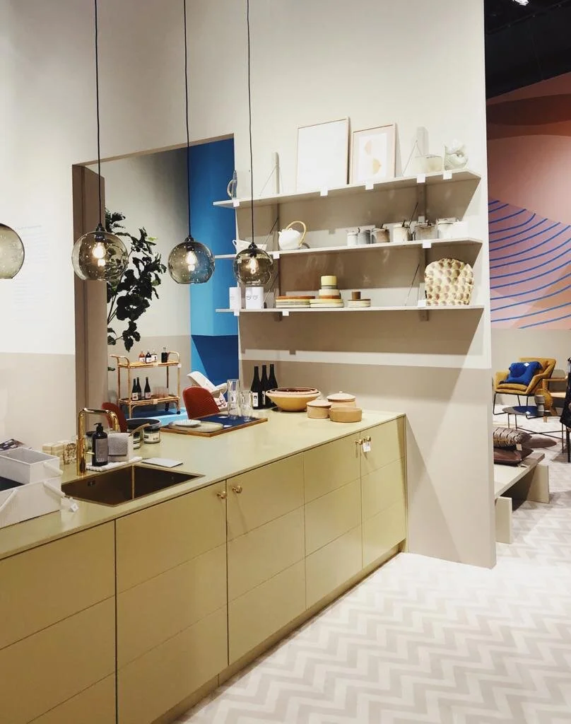
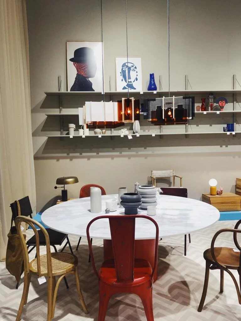
At Formland, one of the most inspirational fairs in Scadinavia, you really could see how color is shaping the interiors landscape at the moment in a very big way. Gray has been replaced by a new neutral - beige. Beige isn’t just on it’s own either, it’s being paired with a hot orange red, cobalt, pastels in lavender or pale blue… And then you see colors on walls like emerald green, pale terra cotta, rust or curry. COLOR IS HOT.
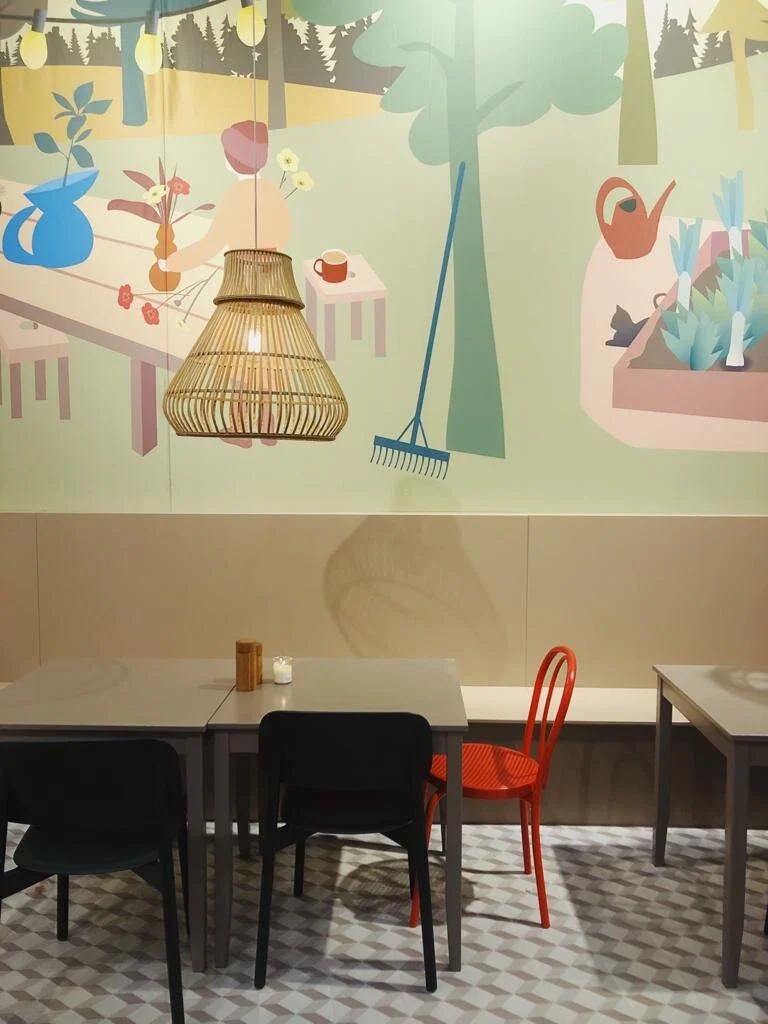
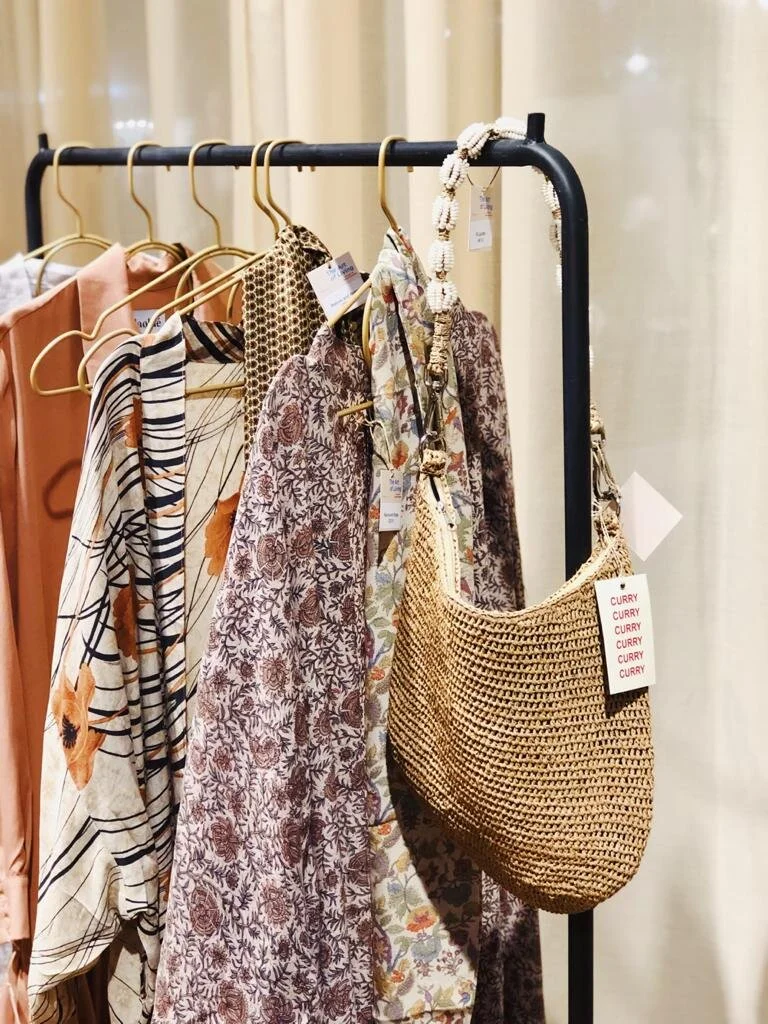
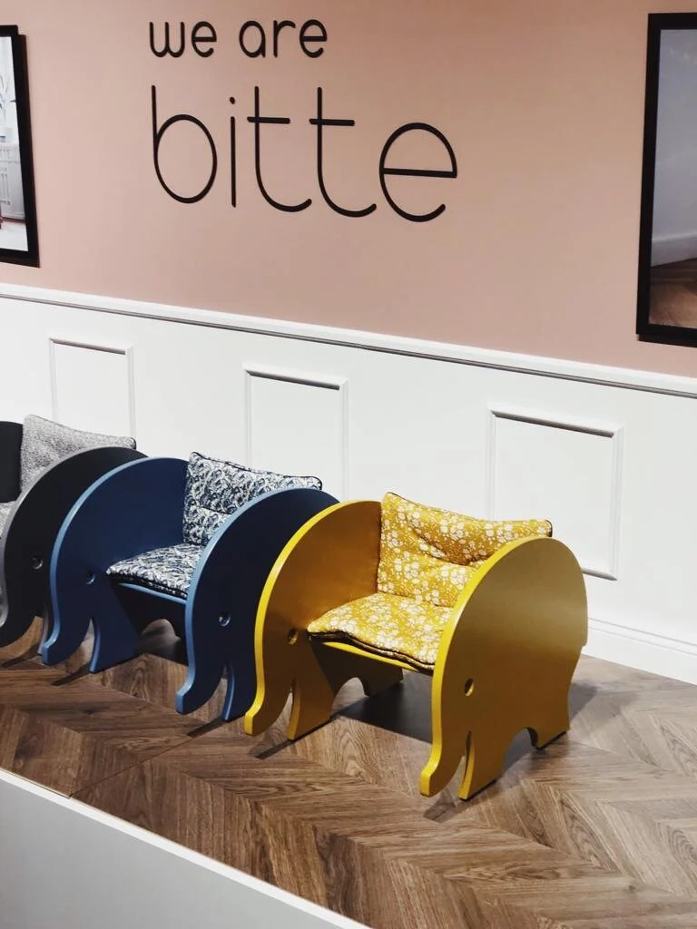
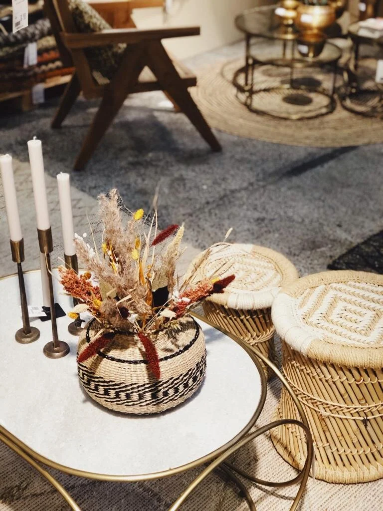
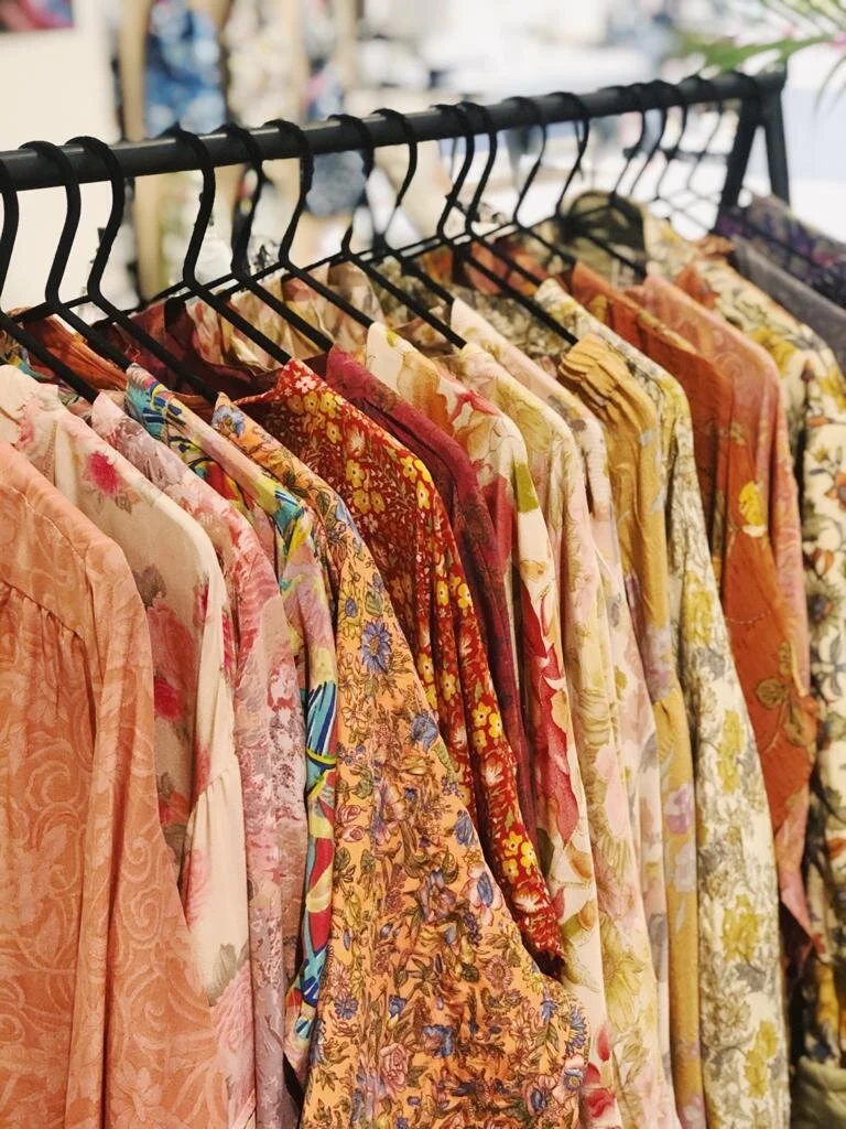
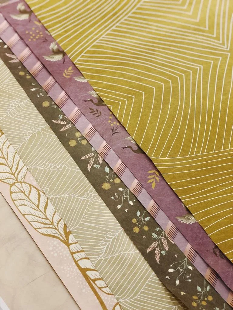
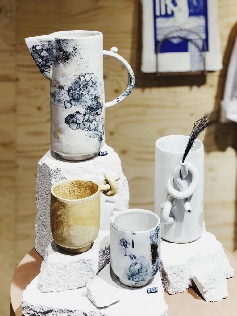
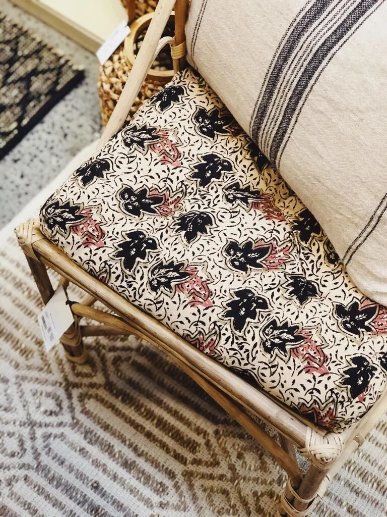
Color on walls through paint, textiles and wallpaper can be seen everywhere but also colored glass, colored ceramics, textiles (global designs hitting harder and harder but also bold stripes, too), drapes, furniture, rugs, artwork… It was rare to walk around and find a stand without color - only a few were very minimalist and beige, 99% of the exhibitors used color in their collections either as accents or as THE foundation and focal point. Take a look…
So… What are the key colors?
Pale powder Blue
Cobalt Blue
soft Lavender (instead of purple)
Orange-Red or rust (accents)
Curry (Dark Yellow)
Beige (instead of gray)
Nude
Apricot (all orange tones, really)
Dark Green
Mint green (accent)
Camel
Black (accents)
Cream (instead of white)
So…. Do you see any colors that make you happier? Any that you want to bring into your home this Spring? What about patterns, anything that strikes you? Global prints are really in at the moment, ones you’d imagine seeing on the market in places like India and Africa, but also bold stripes from Greece and beach resorts are very “in” at the moment.
Photos: Holly Becker iPhone for decor8
(Note: This post is sponsored by Formland. All opinions, photos and thoughts are my own. Thank you for supporting the brands and clients who allow me to keep this blog running since 2006.)