Country Living: Before/After in a City Apartment!

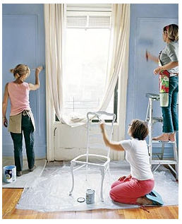
Did you catch Country Living magazine for August yet? I was tickled to see their city apartment freshen up, Two-Day Decorating Makeover (pages 32-40).
For one thing, it's rare to see Country Living (or any of the home magazines that feature primarily the cottage/farmhouse style) spotlight a city apartment with, what appears to be a single girl, at the helm of a makeover.
The best part about the makeover?
That's hard to narrow down. Although I loved that they show an IKEA bag in one of the photos filled with pillow inserts for the renovation project and, hold your squeals of delight, a Saarinen table. Yes, in Country Living. This is a breakthrough moment, people.
The bones of this apartment are stunning, it resembles one you may spot in an east coast city, soaring 10+ foot ceilings, hardwood floors, prewar details, huge windows. The color palette for the apartment is simple: blue, gray, silver, white, beige - very subdued, on the cool side, with a somewhat Scandinavian slash London apartment vibe going on. With before and after photos, a cool stencil idea for the walls (don't stress, this really is a hip stenciling project using a baroque floral pattern and silver paint against Ben Moore's Regal Aquavelvet, eggshell finish, Sapphire Ice). The room was pulled together on a budget too, another strong point of the article.
Surprise bonus: There wasn't a dog, husband, picket fence, cooing baby, or massive 4,000 square foot midwestern farmhouse home in sight. Not that I have anything against those things, but it's nice to see a country living magazine step into the concrete jungle for once. Not everyone in the city dreams of monochromatic loft spaces, nor do they shop at high end Italian contemporary stores. Country Living is catching on, and I'm liking it.
If you're not a big Country Living fan, grab the August issue and see what you think. Seems they may be interested in appealing to a broader demographic, and this article in particular has a very Domino feel to it with the fonts, arrows connecting tips to photos, and the style in which it's written.
What would I change about this makeover? Hmm. First, I'd purchase a real sofa for the living room (vs. the twin bed with bolsters) and a much larger rug. The rug selected for the living area is to small. I'd also paint the walls to the ceiling, although above the molding I would have went a few shades lighter for the paint (they stopped at the crown molding about 20" from the ceiling leaving the top half of the room white, which is standard. I'm not a standard girl). I believe that if you have high ceilings, don't try to minimize them. I'd also highlight all of the fabulous picture and crown moldings in either white (for a crisp look) or two shades lighter than the Sapphire Ice (more subdued, yet still highlighting the gorgeous details of the molding). I think the stenciling idea over the eating nook could have been repeated in the living room, as well, confined within the boundaries of the picture molding.
The bedroom was very serene, I can't see much about it that I would change except for the bed - I would bring in a crisp navy/white Scandinavian floral print and add a touch of butter yellow or lilac somewhere in the room - a vase or fresh tulips would suffice. I'd like to see some clean white ceramics displayed on a shelf, too. Ones that have a very organic feel with lots of detail, all of them in white.
In the end, I'd say the makeover is a great success on a budget, and with it's vintage modern appeal, I'm a big fan.
If you'd like to check out this renovation, pick up the August copy of Country Living and turn to page 33 (pull out this section and save for your look book). For quick candy, you can view the renovation online, too.
Psst: Love what they've done to this vintage suitcase - so girly!
Your comments on this renovation?
Related posts: My DIY Look Book Project, 4.11.06
(images from country living)
