Dutch Design Week: Lift-Off Loves
I've finally organized all of my notes and completed my assignment for Domino magazine, so let's take a peek at Dutch Design Week, shall we?
First stop is Lift-Off Loves, where I headed immediately upon arrival this past weekend in Eindhoven - this was my first glimpse of Dutch Design Week. First impressions are everything, and as I strolled through Lift-Off Loves, I knew that waking to catch a high speed train at 4:00 a.m. for a 5 hour journey was well worth it. As the rain began to fall, we dashed towards the shelter of a building in city center with Lift-Off Loves posters on this windows. It was about at this moment when my breakfast of about 10 cups of coffee and some deep fried cheese thing, no clue what that was (lekker though!), finally kicked in. My false-sense of energy (I slept 4 hours the night before) had arrived because here I was attending the highly esteemed Dutch Design Week. Although this was the 5th annual presentation, it was my first time, and I was beyond excited.
As we entered the building, we were greeted by reception with plenty of information about the Lift-Off Loves exhibit along with a voting card, and lots of smiles. I appreciated the warm welcome, as I was quite wet from the rain and with the temps being much cooler in Holland than in Germany, I was chilled to the bone. Reception directed us inside a vast light-filled space where ceilings seemed to go on forever.
 Amidst a sea of Macs were six or so busy creative types shuffling things around, very involved in what appeared to be work as usual. The space was actually a well-known creative studio, Buro Vormkrijgers, and despite being a Saturday, they seemed completely engrossed in their work. Following lead from a few who, unlike us, seemed to know what they were doing, we entered a long, multi-colored, very narrow hallway.
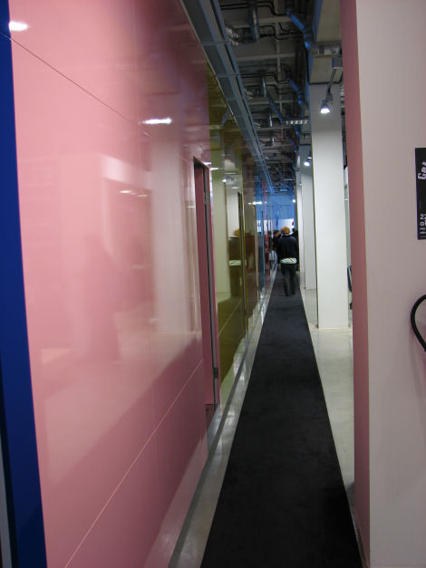 At this point, I realized that this was the actual space for the exhibition (not the main room as I had assumed). Each office was completely gutted of the usual furnishings (desk, chair, etc.) and outfitted with products on display, each room belonging to a designer or design team . The doorways were clearly marked so you knew exactly who was presenting in the space, and many of them were available for a chat. See the designer's name on the floor? That's what I'm referring to... Easy to find who you were looking for, although in my case, all names were new ones to me so I wasn't scouting for anyone in particular.
 Note: Lift-Off Loves wasn't an exhibition for the Design Academy Eindhoven graduates (I'll cover that later), it was more of a meet and greet between the public and about 16 or so established designers. When I say established, I just mean that are out of school and most have their own business with some of their products in production, some post, and others with fingers crossed hopinh the exposure at Dutch Design Week would give them some solid leads. We arrived just as the exhibit opened, so we were lucky to get a glimpse of most of the products before the crowds rolled because within an hour, the place was hoppin' and it was hard to see anything with so many visitors packed into each of the tiny rooms.
Directly off the hallway was what appeared to be a lunchroom or conference space transformed into an area where the public could mingle, rest, or to meet Ninne Meulendijks, an illustrator who presented her work there. She graduated just this year from Sint Joost in Holland. Aren't her posters great?
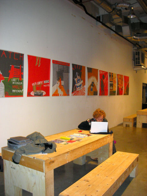 Nanne was so sweet and friendly, eager to explain her work and a real pleasure to meet. Being the first person that I spoke to, her enthusiasm and warmth was the perfect start to my day. Here's Nanne...
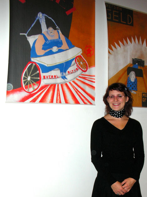 "Dat Hoort Zo", the dictator of how you have to behave, is a project consisting of 10 posters meant to bring attention to "the silly unwritten rules the Dutch live by, handed down by each generation, all following rules but few asking why". Through it, Nanne infuses humor and sarcasm into illustrations created to imitate the political propaganda common during the communist regime under Stalin. "Everything looks great and free, but you get oppressed in front of your own eyes if you do not comply!" she said. Nanne is using this project to raise awareness in a playful way with hopes that the younger generation will start to ask why they repeat the traditions handed down, ones that she thinks are quite stupid.
Here are more views of her work, a series of 10 limited edition posters (only 8 of each available), priced at 106,- Euro each, 83cm x 100cm. Each is signed and numbered. You can purchase them from her directly if you are interested, email her at nanne[underscore]meulendijks[at]yahoo[dot]com
 In addition to her posters, Nanne illustrated "Kind van Niemand" By Jochen Otten and Pepijn Koolen. If you're interested, the ISBN number is: 90-810220-1-6. I tried finding the book online with no luck, so if you'd really like a copy, just contact Nanne, she may be able to help you find one. She also works on projects for magazines, too.
Next, we visited Cultivate to check out Doggy Style, their new Woofers. These creepy headless dog speakers in black or white had a certain appeal though. I'm just not sure I knew what it was. Nonetheless, someone took the time to design it and I'm sure many will take to it as it would make quite the conversation piece. I didn't dislike the concept though, I just prefer my dogs with heads. 599,- per set.

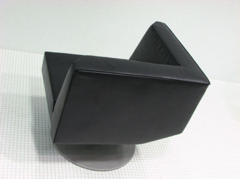
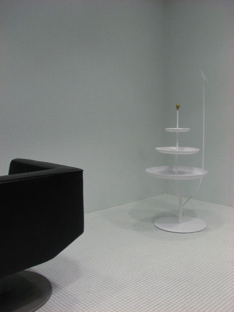
 Following Cultinate, we browsed the works of Wiebe Boonstra from Studio Wiebe. His latest works, a 3-tiered table called the Bird is Free and the Apartment 17 chair upholstered in black leather (also available in cognac) with classic tailoring techniques. The base was matte, but also available in polished aluminium. The cool thing about this chair was its memory spindle - it rotates back into the original position. Kinda neat. For 2,950- it's yours. I'm unsure of the cost of the birdy table. It looked almost like a fountain to me, and had a little gold knob that embellished the top. What do you think? Opinions so far, anyone?
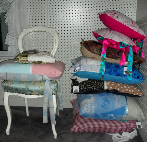
 Next, onto the exhibit from Wikita who showed their new collection of pillows, priced between 35 and 200,- Euro each. I'm not so sure about these... Thoughts? I guess I didn't expect pillows to be part of this presentation, so it took me a little off guard. Then again, with all the pamplets in Dutch, perhaps these pillows were more than they appeared - could've been created from a new material perhaps, or completely eco-friendly perhaps??? Not sure. Since arriving, I noticed that all information was only available in Dutch. With 34,000+ attendees at Dutch Design Week from all over the world, I would have expected a little English language love! When the designer wasn't present (the ones that were all spoke fluent English), I knew I was lost because I certainly couldn't understand the Dutch materials and my Dutch friend, Danielle, wasn't due to meet up with me for another two hours... I digress... Anyway, I figured this much out on my own, that if you'd like more information about these pillows, you can contact Wikita via email at wiet[at]hotmail[dot]com.

 Next, I visited Floor van Ast and David Krings. David had a few of his porcelin designs on display (like a very cool cake stand). Although he doesn't have a website yet, you can email him at davidkrings[at]hotmail[dot]com if you have a question for him.
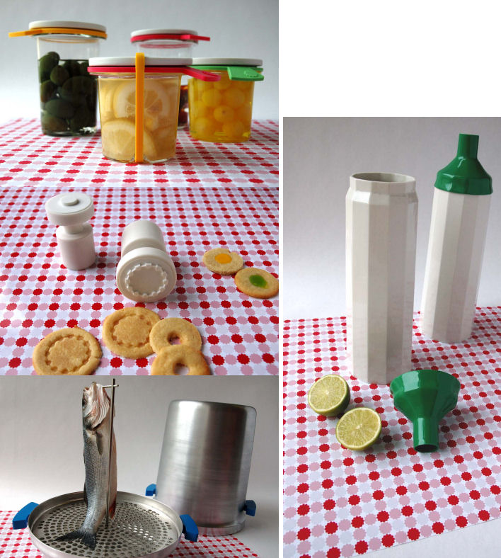
Floor showed kitchen tools designed for smoking fish, storage bottles, cookie stamps and preserving jars. All are prototypes and not yet for sale, but hopefully that will soon change. Designs were based on traditional Dutch kitchen tools, but giving them a breathe of fresh air for our times. Floor, who graduated at ArtEZ Arnhem Academy of Arts and Design, displayed her graduation project called "Keukenwerk" translated Kitchen work, containing kitchen accessories. She designed these products based on her obsession with food, she loves to cook and enjoys the utencils used during the preparation process. She also loves to study the history and meaning of food in modern society.
Floor comments "This collection of accessories appears to take you back in time as these aren?t day to day accessories but products that ask of your time and because of their specific use. You realy have to work with them." She continues "With this project I would like to give consumers back there control on what they eat, how their food should taste, and the consistence of the ingredients in their food."
Here's David and Floor:  Items on display:
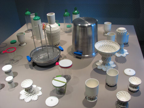 On her collection Floor adds, "The idea for this collection started with a research about old Dutch cooking tradition. With my products I give authentic uses a new place in the kitchen with the goal that people decide there own taste. You can call them almost forgotten products, in my opinion they are very useful in this time to answer the request of good food." More shots sent to me by Floor (thanks, Floor!):
 I also visited Kim Geerts' collection of soft toys (could these be the next generation of Ugly Dolls?), displayed in a space meant to imitate a park complete with swings and grass. The display was very cute in person, but I had a tough time shooting these spaces because these offices were so tiny, so I can't really show you in photos exactly how cute it was. Priced between 35,- and 55,- Euro depending on size. Email kimgeerts[at]yahoo[dot]com for more information.
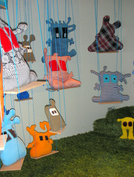 Most resemble little aliens, don't you agree?

 Next up Bureau de Bank from designers Floortje Donia and Hans Van Veen. They displayed an all weather chair with a foot stool meant for use outdoors. A modular piece, you can remove the foam cushion and the stool becomes a table. You can leave the cushion on and push it against the chair for a chaise. Move two chairs together for a two sofa. Currently available in black tile with a white foam cushion. Currently in production, expected roll out is next year. At that time, they plan to incorporate various other cushion colors.
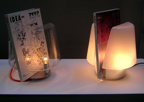
 Reading lamps from Bureau de Bank were also on display, but I forgot to snap a photo, so here's an image from their website. I really loved these... Materials: Perspex and stainless steel. Available in clear or white. Lamp and magazine/book holder in one.
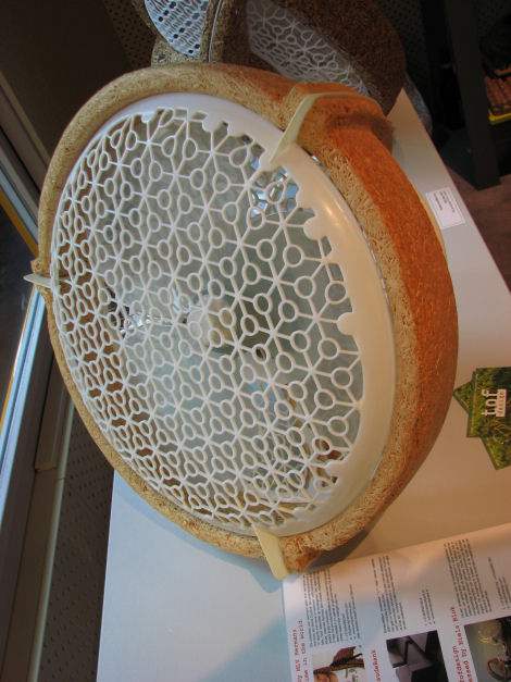
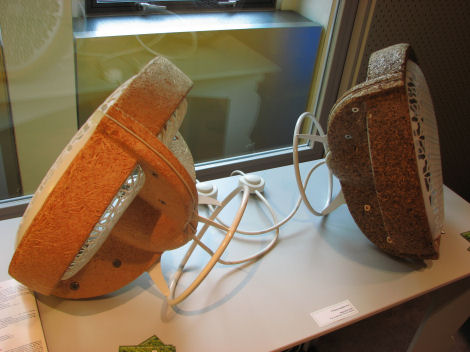
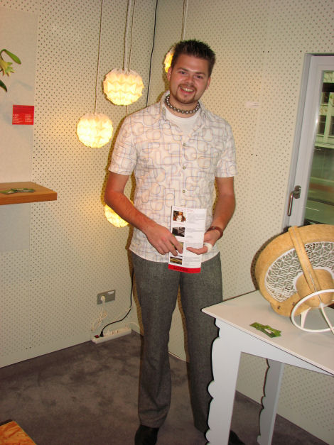
 Next up, Tof Design made up of Jet Vlietstra and Niels Blok. I met whom Niels, who is pictured below, and he was just great. Another friendly Dutch designer. Was this a trend? Everyone was SO nice - no snotty designers here. It was refreshing! Niels told me all about their pressed wood designs, my favorite being the fans - I would have purchased one on the spot had they been available. But, sadly they aren't in production yet. I guess they're still waiting to be picked up by someone. Their briefcases are in production though and soon to be sold for around $250,- Euros each at Studio Hergebruik (also a must-see website), Rotterdam and Design Daily, Eindhoven. I loved the pattern on the fan, and that you could roll it around, hang it on the wall, flip it on it's back, it was the fan of many positions. I'm a big fan of the fans!
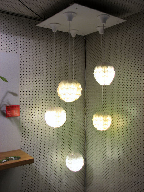
 Some lights from Tof Design - very tactile!
 The briefcases mentioned above... What do you think?

Some vases from Tof Design, too.
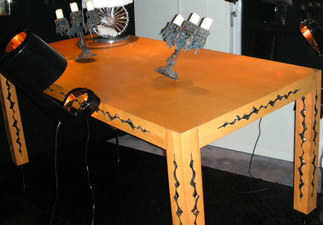
 Moving along from pressed woods to the Asylum Collection from Bo Reudler aned Seroj de Graaf proving that bad boy style is still very much alive, only I didn't spot one skull, gun vase, or handcuffs in sight. The aesthetic was more grown up, polished, and designed to stimulate the imagination. They believe that with so many rising problems (violence, terrorism, etc.) that your home is your cave where you should go to escape from the cruel world, to dream, imagine, play. You can learn more about their design philosophy on their website, which is completely in English (they have some very bold takes on minimalism!). Asylum is definitely own to watch. Their entire line is in production in case you're interested. (psst: I see Jeffrey from Project Runway diggin' this table, don't you?)
 Same shot with more flash so you're able to see the details of this laser cut pattern on the table.
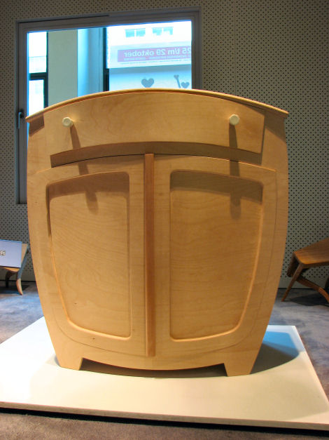
 Johannes Gille introduced Lovable Characters, a collection with an almost Alice in Wonderland appeal that ventures away from his usual design aesthetic. (I like that, I can tell her challenged himself with this project.) I couldn't help but wonder though how you'd place even a simple glass on the top of the bureau, but I guess the point is that it does what it's intended to do, store clothes. If you're not into clutter, this would encourage you to keep things out of sight simply because you have no place to rest your mess! There was also a bookcase in the room, but with so many people around by this time, I had to snap quickly and run. The excellent craftsmanship was there, the wood was beautiful, I'm just not so sure if I'd own these things. The bookcase was pretty neat, but I'm still debating on this dresser, which was priced at around 1,850- Euro. What are your thoughts?
 Eindhoven design team Maurice Blok and Anke van Gestel of BLOK meubel introduced their prototype 'Cut Chair' in oak, glass, steel and concrete. I loved seeing concrete transformed into something with such clean lines.
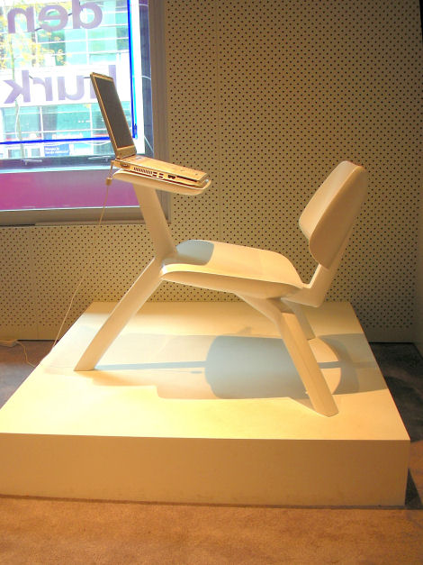
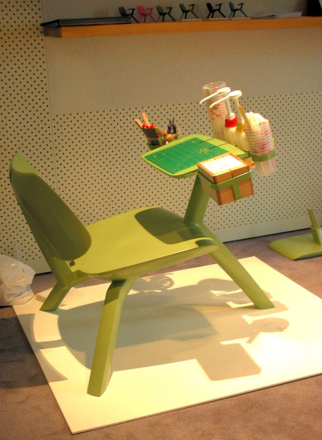
 Ontwerpers of Rotterdam showed their Classroom Chair. Designers Christiaan N.J. Oppewal and Silvijn van der Velden created it for reading or working on a laptop, with a detachable table and a weather resistant finish for outdoor use. Green and white on display, but light blue, deep blue, red or black are also available and you can request any other color you prefer, too. Prices will run around 1490,- Euros.
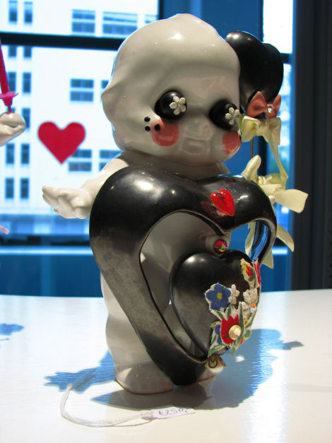
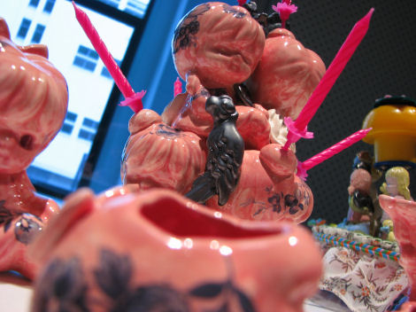
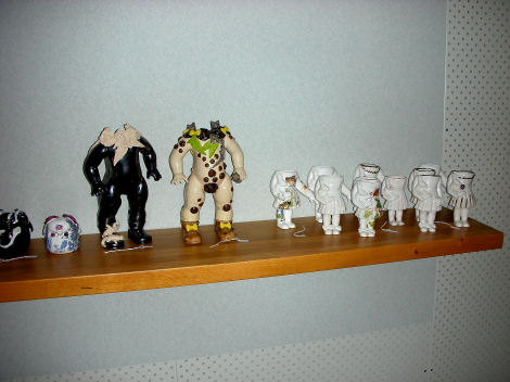
Danielle Smits brought her dolls, some missing heads, others without limbs, to life in Welcome to my Dollhouse. I was a bit creeped out by these porcelin creations at first, but they grew on me as inspected them more carefully, noticing all the details and how each was trying to tell a story (I just wasn't sure what it was and the designer wasn't available to ask). You can shop online for these dolls here.
 That wraps up my coverage of Lift-Off Loves. I really hope you enjoyed it.
Although I've mentioned nearly all of the designers who displayed, there are some that I didn't photograph simply because they didn't have much to do with the theme of this blog. Here are the four not mentioned above, in case you want to learn more about them: Tinkebell, Buro Vormkrijgers, Emily Hermans and Sandwich Bikes (these were COOL - they had one that glowed in the dark.).
In the next few days, I'll post highlights from the Dutch Living Room and then onto the Graduation Galleries early next week (you're going to LOVE that, for sure!). Stay tuned.
I'd like to know what you think so far. Inspired? Uninspired? Favorites? Spot any future classics?
(images from Holly Becker for decor8 unless otherwise indicated.)
