Notes On Mystery Clients
I really enjoyed Top Design last night, at least the first 10 minutes of it when the designers were assigned a mystery client with only a short bio to go on. It reminded me of the projects in design school that I enjoyed so much, and watching the show encouraged me to run upstairs and drag out my very first design board because it was based on a mystery client.
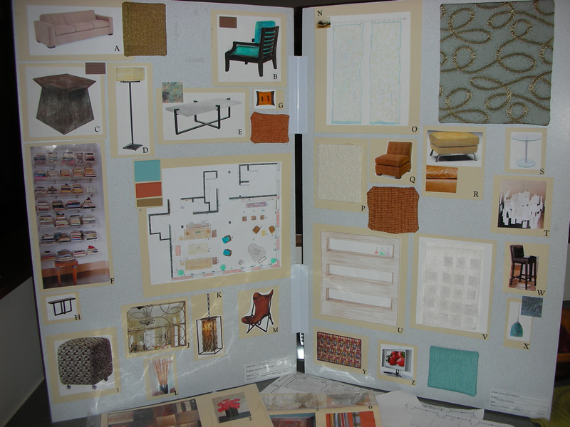
 The mini bio I was assigned disclosed that my clients, Sid and Darby, had an extensive art collection, were downsizing from a home to a loft space, newly retired, loved warm, rich colors and ecclectic decor, and were big on texture and hardwood flooring. Both needed a space for books, their baby grand piano, and because Sid entertains often, he would love a bar. Although the floor plan was open concept, both wanted their own 'area' to do the things that they enjoyed most. Neither wanted traditional bookshelves. Both craved one leather piece in the room to bring back memories of their Texan childhood. I selected the Joshua Tree Camp Chair from Ralph Lauren.
Each student in my class had their own mystery client to work on, each slip of paper had a budget, and only two slips had a "no limits"budget -- guess who was assigned that one? Yes, me. I was thrilled. We also had to work within the confines of certain space limitations in regards to plumbing and such, and each student had to work off of the same floor plan (see floor plan on left side of the board).
We were given a week to complete the project, access to the design center, etc. and within that same week, the board had to be finished and presented before the class, including a complete report detailing everything about the lifestyle of the client and why certain choices were made, and of course a larger, more detailed, floor plan (forntunately for me, models or computer rendering wasn't a requirement back then, thankfully as I only do hand rendering and only dabble in CAD).
This acrylic built-in for books was my favorite feature. I want this in my own home someday as the appearance of 'floating' books is quite lovely, don't you think?
 Thankfully, unlike Top Design, we weren't later told that our space was really for children. :)
(images from holly becker for decor8)
