Color of the Month: GREEN
I've invited fellow blogger and Color Consultant Rachel Perls, to drop in and talk to us about color once a month. As a color pro, she'll share both the visual and psychological effects of color, suggest a few color combinations (with images), and give us tips on how we can incorporate more of it into the home. If you'd like Rachel to explore color more in-depth, please be specific and leave a comment below so she can take your ideas into consideration for her next post.
We kicked things off last month with a post about blue, and now for March, we're going with green for the obvious reasons, Spring! Spring! Spring! In fact, all day on the blog today, I'll be posting plenty of Greenspiration. Stay tuned!
Take it away, Rachel...
Going Green By: Rachel Perls
For me, March is synonymous with the color green. Not only because of Saint Patrick?s Day, but also because March 21st is the first day of spring in 2007. Buds are forming on trees, leaves are just starting to grow on bushes and delicate shoots of grass are sprouting up through the dirt. The earth is coming out of hibernation, and the first color to re-emerge is green. It is a sign of freshness, new beginnings, and hope.
The human eye detects more variations of green than any other color in the rainbow. As a secondary color composed of blue and yellow, the combinations are practically limitless: from hunter and olive to jade and turquoise to spearmint and lime. There is a green to suit us all.
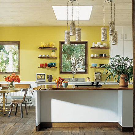 The yellow-green walls are spunky and fresh against the clean lines of this kitchen. (Joe Nahem via Elle Decor.)
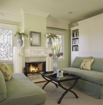 This room has a light airy feel, with celery green walls and soft taupy-sage sofas. Cool, inviting, and friendly. (Picario Designer)
 These yellow and green walls really sing, don?t they? This space feels very elegant and regal to me, not stodgy or outdated. (Stephen Shubel Design, Inc.)
So, how can you use green in your home? What does it say about you and the feeling you want to evoke in a space? Green, like all colors, communicates meaning in many ways.
 Associations can come from cultural contexts. Green conveys good luck for Irish and Americans. It represents heaven for those of Muslim faith. And in Japan green is the color of eternal life. These bright blue drapes against a backdrop of teal striped wallpaper, feel lively and whimsical. The addition of pink and gold completes the palette creating a dramatic color scheme with lots of flair. (Designer's Guild)
There are countless examples of how green is used to influence people?s feelings about a space. Actors relax backstage in the ?Green Room? before they go out to perform. In elementary school classrooms, a light soft green can aid in children?s concentration levels. Many hospital operating rooms are painted a light green to reduce glare and to keep a surgeon?s eyes acute to the red and pink of the operating field.
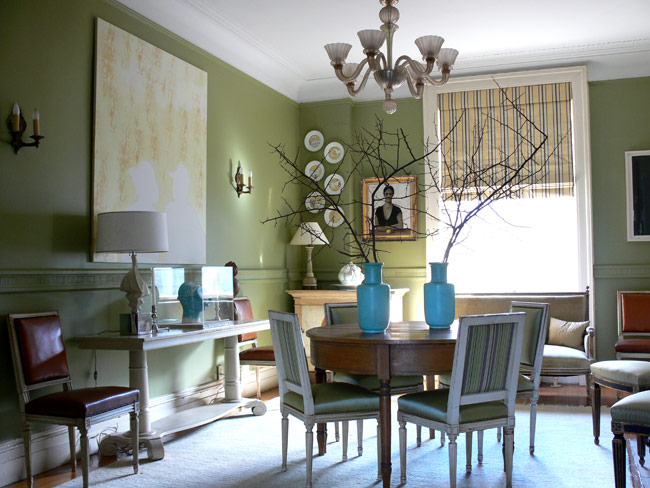 This sage green room has always felt very calming and elegant to me. Nice spit complementary color scheme demonstrated by blue vases and rust-colored accent chairs. A split complement is formed by choosing one color and using the color on each side of its compliment on the color wheel. (Sheila Bridges)
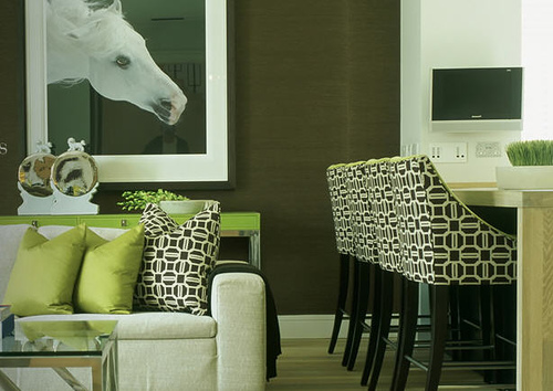 A deep sage or olive is warm, inviting, and grounded with brown undertones. The olive walls work well as a deep neutral in this room to set off the bright lime pillows and crisp black and white upholstery. (Taylor Howes)
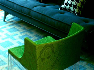 On the other side of the spectrum, emerald and jade are mysterious and powerful. Combining the strength of deep, rich jewel tones can really make an impact. Like this navy couch paired with an emerald green chair and turquoise patterned floor. (HGTV)
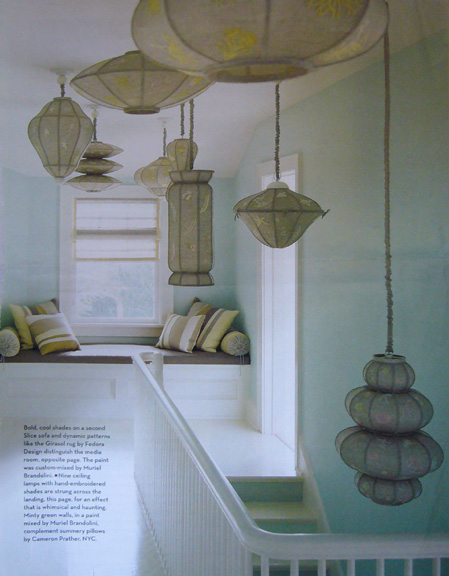 Sea foam and aqua are clear and meditative. This scene, minty green walls with embroidered lanterns hanging in the stairwell, feels like an underwater scene. (House and Garden Magazine, July 06 issue)
 Also think about the companion colors you can use to compliment, accent, or set-off your greens: blues, reds, bright pinks? An amazing mix of chartreuse, red, and pink. Wow, doesn?t it pop? (Domino magazine)
 Or you can add a little turquoise to the mix. What do you think of this color combo? (Domino magazine)
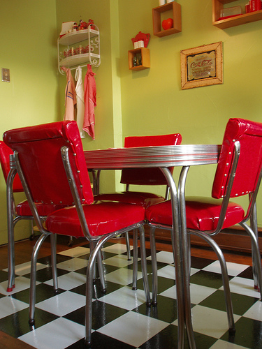 A fun, retro look reminiscent of a diner, complete with checkered floor and chrome furniture. The cheery red chairs really punch against wasabi green walls. (Flickr user marydeluxe53)
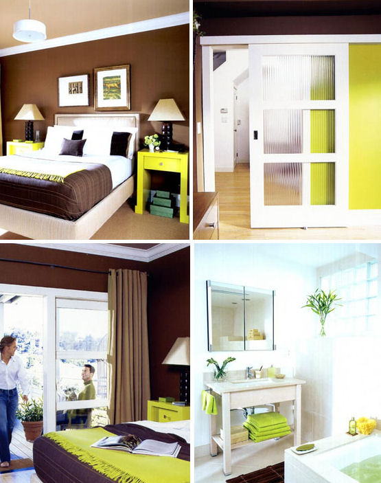 You can also tone down the strength of chartreuse with a warm, velvety chocolate brown. Interior Designer, Jay Jeffers, combined his signature chocolate brown with chartreuse in his entire home - so fresh!
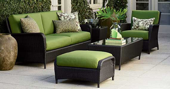 Designers love using green to decorate interiors because it is a perfect ?neutral? backdrop. Just look at nature and how every color looks amazing against greenery. In fact, looking outside for inspiration is an excellent way to get started. Why stop at decorating your interior in green? Outside living areas benefit from a jolt of lively green, too. This patio furniture compliments its surroundings by reflecting greens from nature. (Sunset, Crate + Barrel.)
It all depends upon the mood you want to set; but the possibilities are endless. How do you use green in your home?
-Rachel Perls