Tara Hogan: Art, Design + Greetings
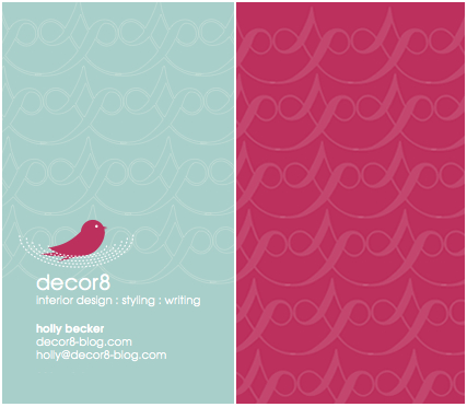
Tara Hogan flat out rocks. Not only does she design amazing paper products and prints on etsy, but she has a graphic design studio where she churns out creative designs for clients in the form of business cards, logos, and websites. I've been working with her all week on my new business cards. At first, I thought I wanted robin's egg blue and fuchsia, but you know, it feels a bit dated now, the blue feels draining and cold, and so I pleaded to Tara to not kill me, but I needed to change the entire concept. I'm sure she lives for clients like me.
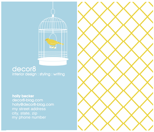
 So I told her about a bird in a cage...A yellow bird, and the cage and all the text on the front of the card would be white. And the background would be sky blue, that color to me represents absolute freedom. And the little bird is me because I once felt trapped in my 9-to-5 but opened the door and escaped into the world of freelance. I also had a pet bird as a child that I adored so much that I still talk about my childhood pal (just ask my poor husband who gets to hear me repeat such stories, thrilling, right honey?). Luckily, Tara thought to leave the cage without a door, and I like it that way, everything has to be tied to a deeper meaning for me or else it doesn't work. And maybe the bird motif is a bit pass?, but please, it's my card and I've decided that the bird stays. Chirp!
The geometric trellis pattern on the back is so me. I'm thinking of having her plump it up and add joints to resemble cane, but that may make it too trendy or seasonal and I'm not sure I'd hand this card out in say, the middle of October, if it felt too much like summer. Perhaps this is perfect as is. What do you think?
I'm now trying to decide on whether or not I want the color yellow somewhere else on the front. Maybe a trellis pattern along the white band on the bottom of the cage? Or maybe "8" in decor8 in yellow? Or my name in yellow? I'm not sure. What do you think? I'd like to see the trellis pattern SOMEWHERE on the front. I consulted design guru Tara about this, so let's see what she comes up with. Clever Tara. Hire this girl, she really is amazing to work with. And patient. Oh, and I forgot to add that the card is shiny, high-gloss, with rounded edges. It almost looks like a playing card.

Note: While you're viewing these cards, you may notice my new url. I've been working on this since December since I've moved off of blogger to my own server and domain, but since it's still "in process" please do not update any of your links until I have everything finished. Thanks.
(images from tara hogan)
