New Look for Summer
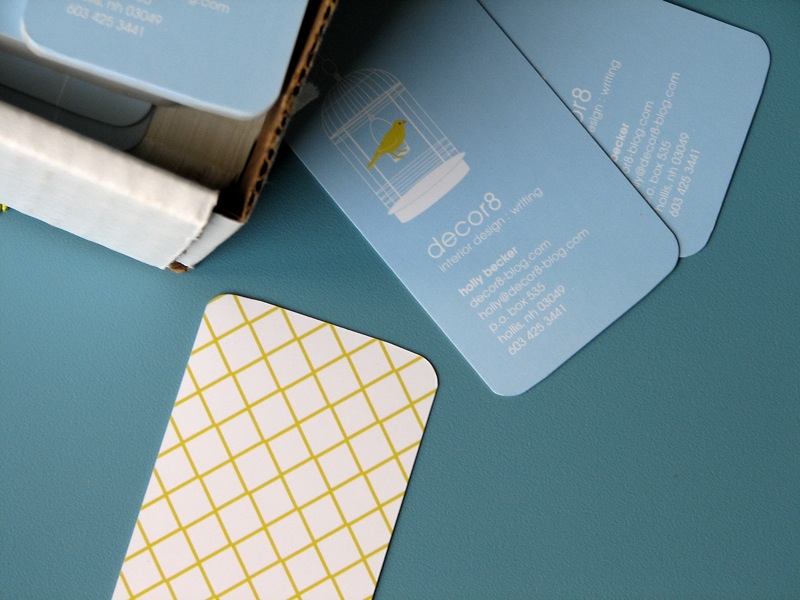
With each season, the decor8 header changes, so it was only fitting to add a new look for summer. I recently asked the amazing Tara Hogan to design my latest business cards, so graphic designer Brent (my close friend in Minneapolis), spotted my new cards and decided to give the header a similar look for the season. (He's also the man behind my last 2 blog headers here and here.)  Some of you wrote in recently concerned that changing my header damages my brand, and I know that you mean well, so thank you so much for your concerns. I realize that changing headers with the seasons may not be so great for "branding" but I'm not worried. Dooce swaps out her blog header monthly, along with Delicious Days, and I think they're both pretty awesome blogs because they allow themselves some flexibility with their design and that, unlike large corporations, they do it because they can. I want to keep things fresh and inspiring here too, and because I came from corporate, I think I'm intentionally rebelling against anything that fences me in -- right down to creating a set brand for myself. If anything, people know this blog by its contents and my voice, that's "brand" enough for me. But thank you all for the nice comments you've sent in, and the words of advice, I really do appreciate that you're looking out for my blog. :)
So with all that being said, I hope you like the new banner! I really love pods for their organic shapes and thought capping them in yellow would be nice. And of course, birds are always in style, so why not? Of course, in October this will all change when a Fall header is introduced, but for now, birds and pods work for me.