Hem 2007 {Stockholm}
I think I'd mentioned before heading up to Stockholm that I wanted to visit their home show called Hem 2007 (Hem is Swedish for Home). And I did! Ready to visit along with me? Good. Here we go!

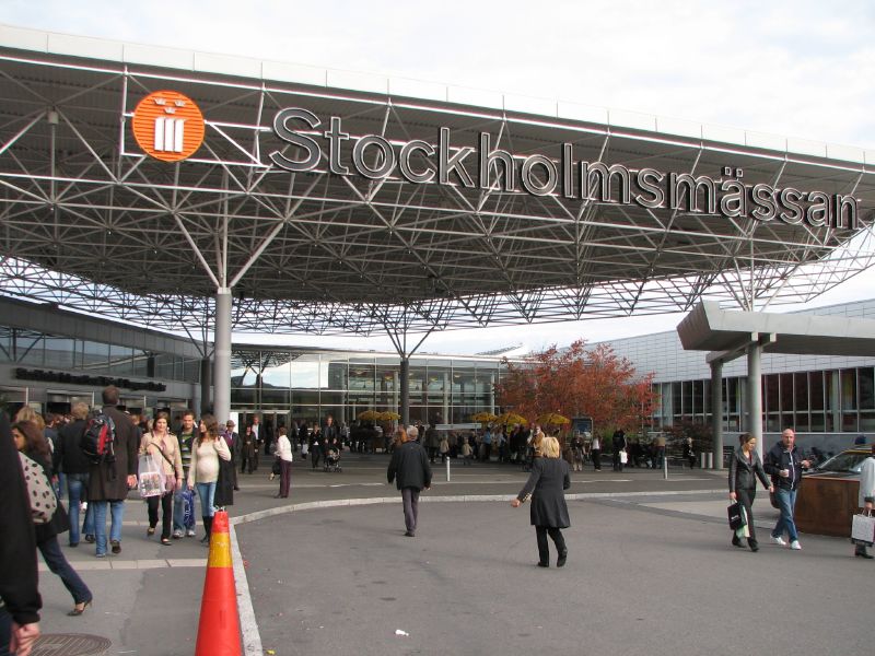 Hem '07 was held at Stockholmsm?ssan, a huge trade fair center only a 20 minute train ride from downtown Stockholm.
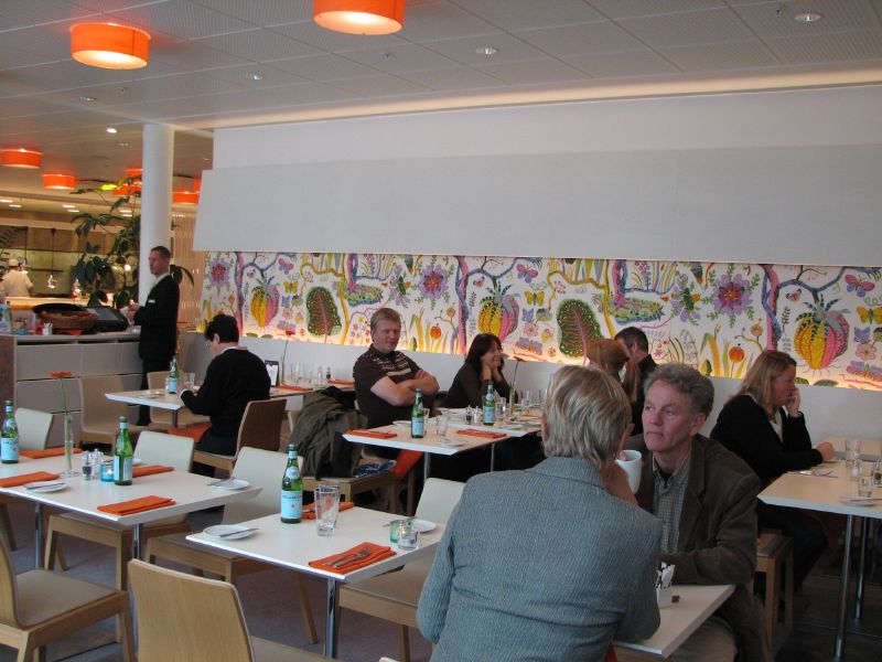
 Upon entering the exhibit hall, you turn right and enter the "Inspiration and Trend" hall, which is where I spent the day. There were other exhibit halls, but those mostly focused on appliances and such -- all things that I have absolutely no interest in because if it won't fit in my suitcase, I figured I didn't need to bother. :) The Inspiration and Trend hall had lots of exhibitors with items you could purchase, so this was the ideal place for a design hungry girl to make a bee-line for. But first, I have to show you this beautiful restaurant to the left, it's called the The Garden and featured some of the best design elements, from the lighting (overhead) to all the Josef Frank fabrics that are so popular in Sweden.
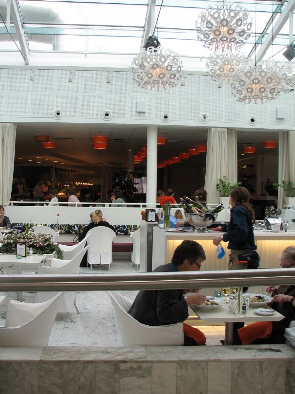 I think every home has at least one throw pillow designed by Josef Frank, so if you're looking to mimic Swedish design in your own home, take note. You need something from Svenskt Tenn somewhere to truly be a wannabe Swede. :)


 The first exhibit I enjoyed looking at was called "Up Side Down" styled by Synn?ve Mork for Elle Interi?r. I was excited to see that Elle Interi?r also had a booth where they offered current and back issues of their magazine for only a few dollars, it was heaven. I hope that American magazines hop on this idea and do the same in the big U.S. shows because I'm sure many would love to scoop up past issues for a good price.

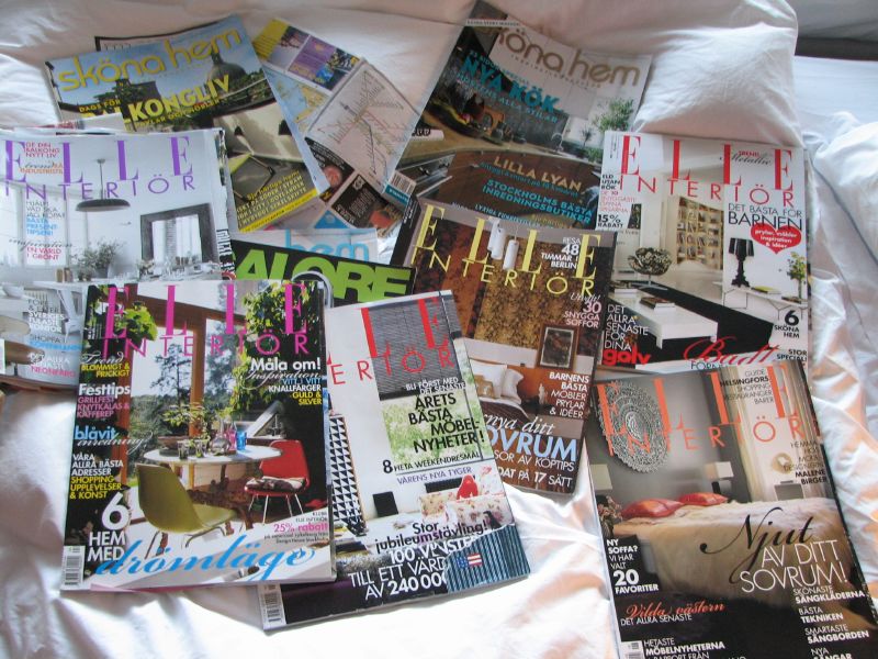 As you can see, I clearly had no problem scooping up magazines. :)
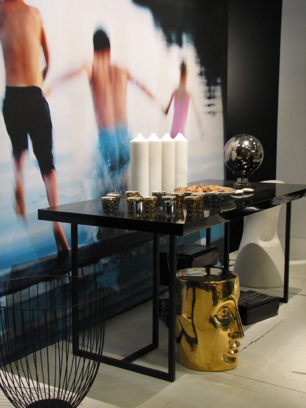
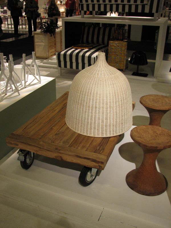 I started to spot some trends, black, white, natural wood, metallic gold, and a few Asian finds. Nothing new but still fun to see.

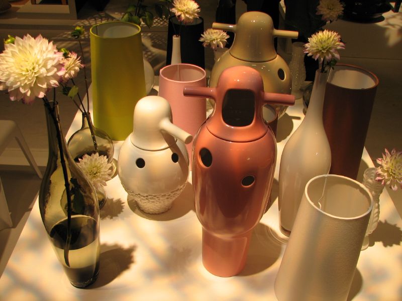
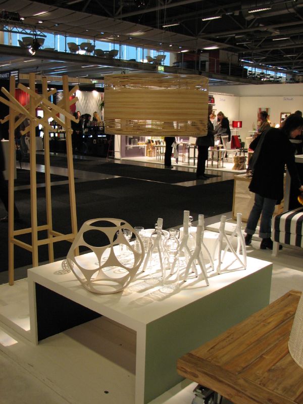
 I absolutely adored this light but couldn't find any information about it. I like the shadows it casts, it really captivated me.
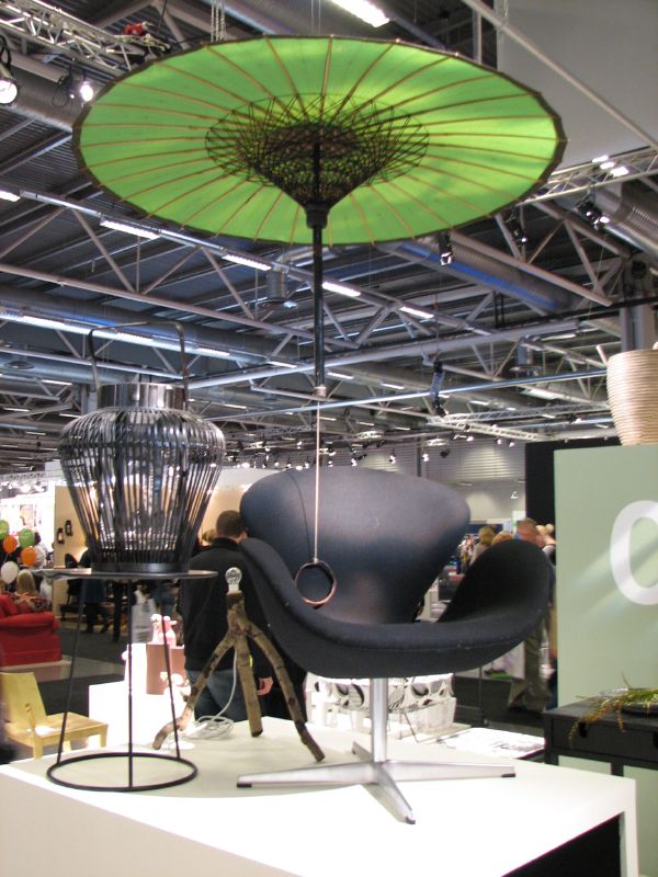
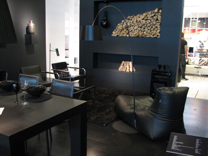
These rooms (below) were created by Helena Sandberg and Jimmy Sch?nning, both Swedish stylists. The theme chosen was "Personality" showing three living rooms - one white, one black, and one in black, white, with gold accents. The black room felt unusually warm - the wood, leather, and wool felt contributed to that. Despite the nice design of this space, it didn't make an impression on me, I didn't connect to it on any level as I couldn't imagine living in a space like this at all. It felt a bit heavy and draining. Not for me. But the white on the other hand...

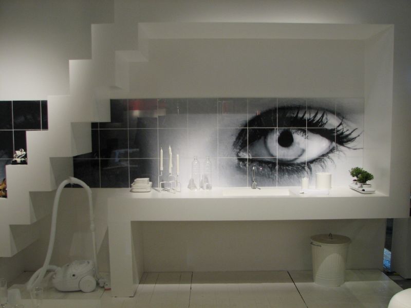 This was my favorite space of the three, the all-white living room, complete with a white vacuum, which I would definitely own. The eye is a photo tile (above) by Fotokakel, a company that had a booth at the show displaying their new photo tiles. You can take whatever image you like and they'll create tiles for your home. I think this could become a trend, but given that tiles are a long term investment, you'd need to carefully select your image because once it's installed, you can't easily change your mind.
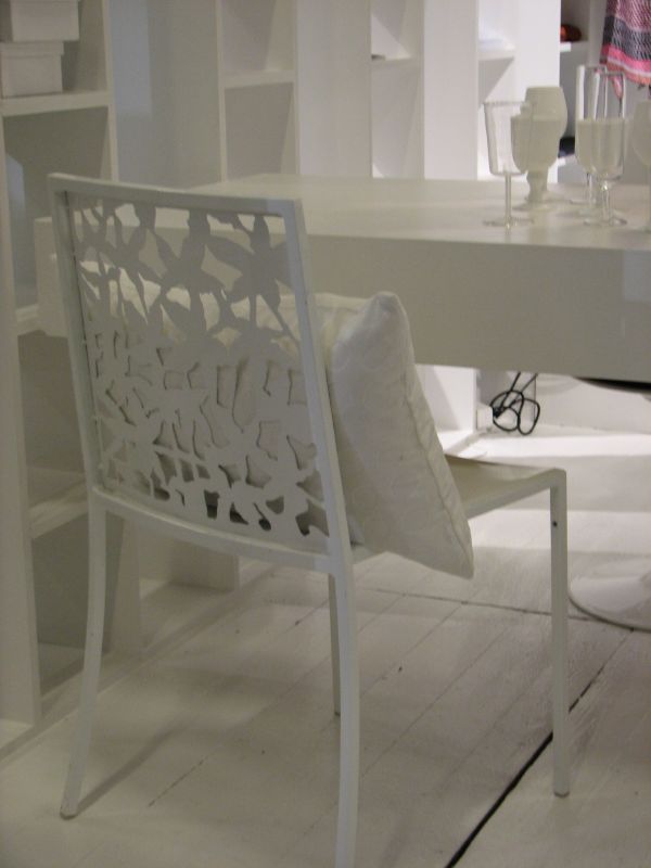
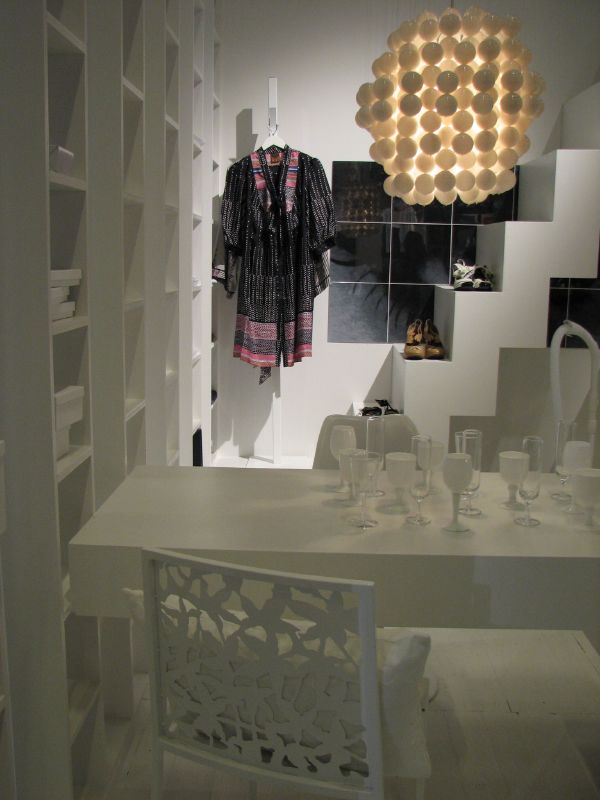 I loved the ping pong ball light, it reminded me of a mini version of the Troy light designed by my friends Marcia and Paul of Zia-Priven. I also love this metal cut out chair in white. Oh so pretty!
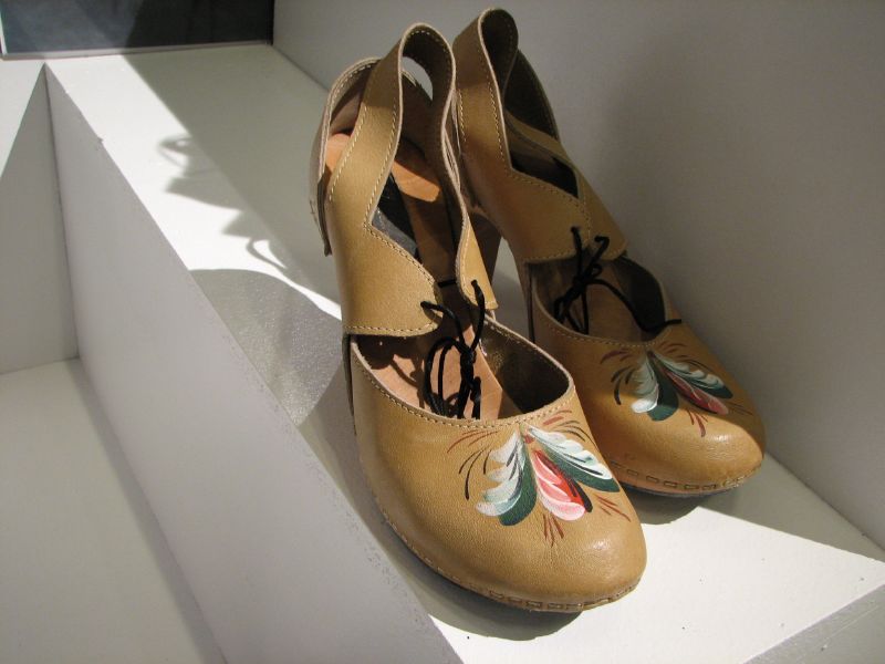
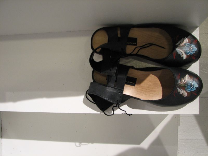 {edit: found the name/website!} I couldn't help but notice the very Scandinavian style shoes on the staircase designed by Asa Westlund, they're called There Goes The Neighborhood. I've seen them in lots of Jeu de Paume books. I adore these shoes and I kept hoping I'd find a pair whenever I went shopping because I think they're just adorable. I would use them as a bit of a prop for my home, I think clothing and shoes can definitely add a decorative element if displayed in the right spot, don't you? I wonder how long before Anthropologie picks these up...
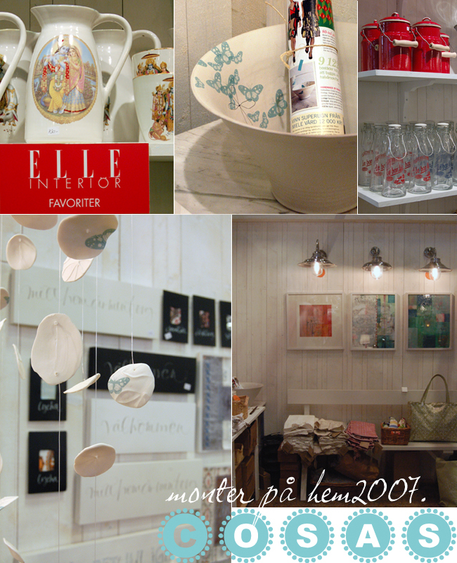
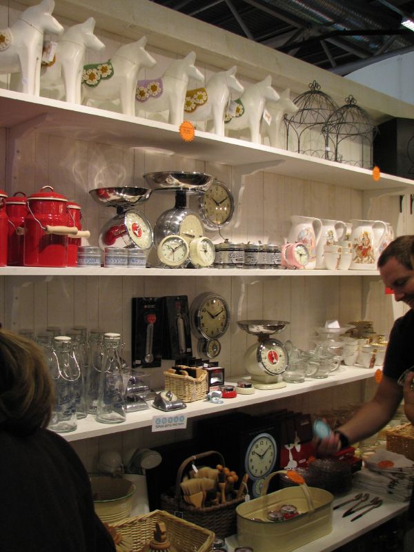 This is the Cosas booth, where I met fellow blogger Anneli Levin and purchased a Swedish horse and some Karin Eriksson ceramics. Anneli was so nice to meet, I've admired her blog for a long time so it was exciting to meet her in person. I didn't expect that Cosas would have a booth at Hem '07, so it was a very nice surprise for me to bump into her. Here's a grouping of images that Anneli took and arranged herself, I just love this collage and have to show you it. I hope she doesn't mind. :)
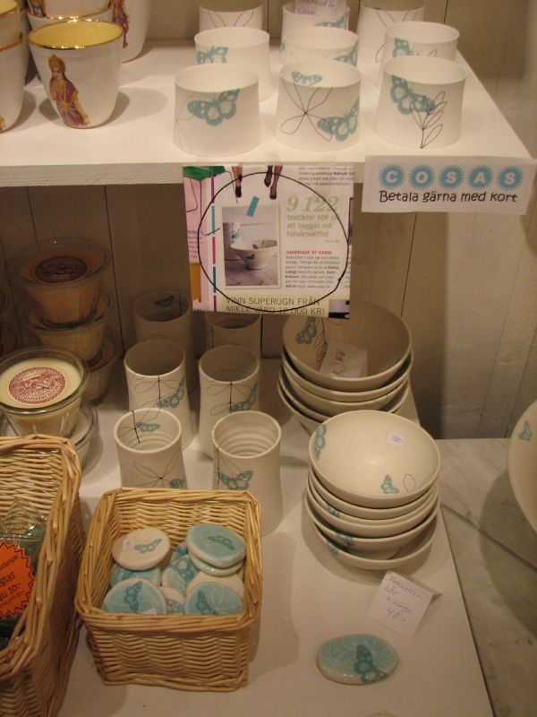
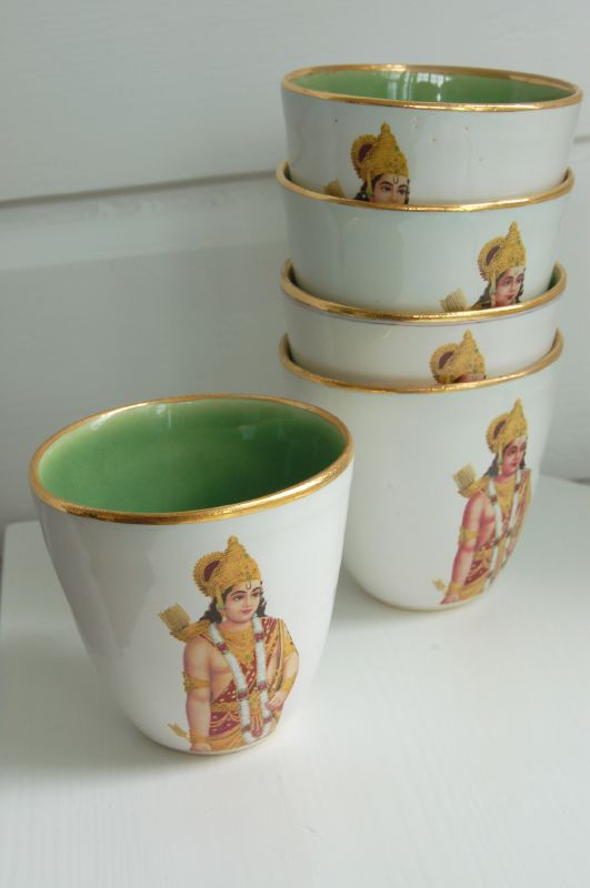 Cosas carries a popular ceramic cup designed by Anna Svensson, voted as one of favorites from this show by Elle Interi?r.
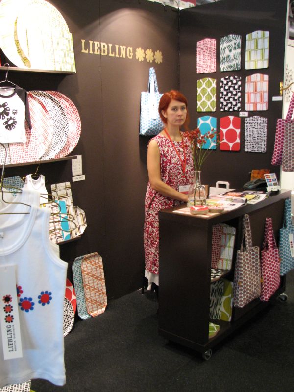
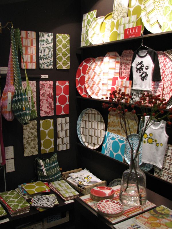
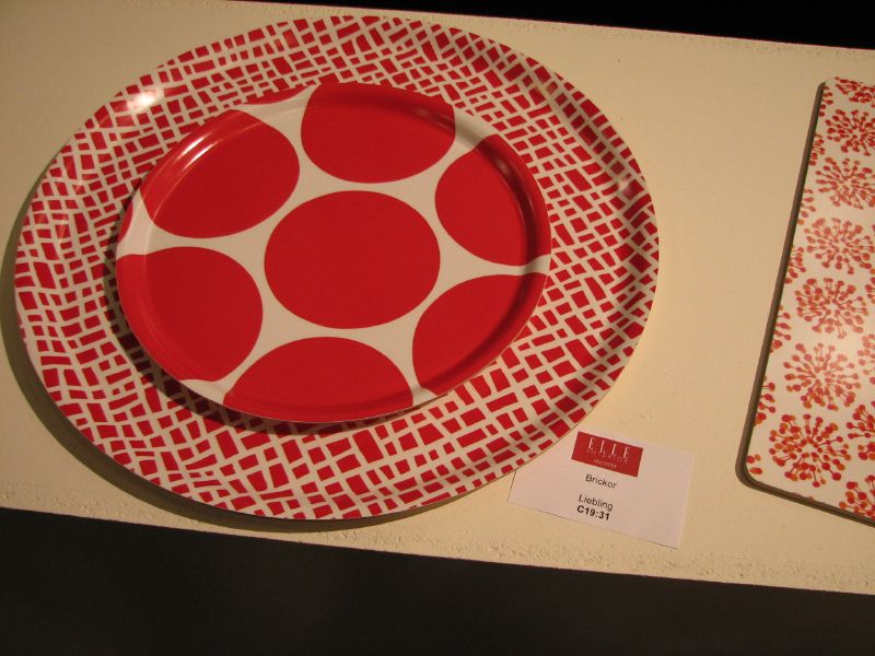 Along with this tray designed by Liebling (love their patterns). Here are a few shots of the Liebling booth, one that I wished I'd lingered at but by this point, I was starting to get a bit overwhelmed!
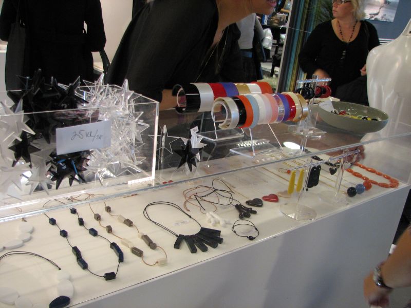
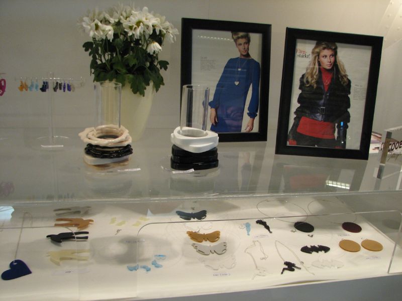
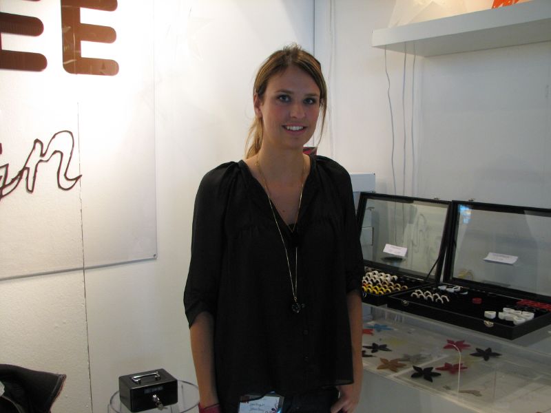 And this is jewelry designer (above) Catrine ?berg of Cooee, who helped me select a necklace from her line. Imagine two acrylic heart pendents, one clear, one silver, dangling on a long silver box link chain. I love it! In fact, I fell head over heels for all of her designs (you have to visit her website). Psst: She is actively looking to network with some stores in the U.S. to carry her line, so if you're a shop owner, contact Catrine and tell her that you read about her on decor8 since she knows who I am now (we met at the fair). Her jewelry was a huge hit at the show, the foot traffic was incredible, she's quite a popular lady!
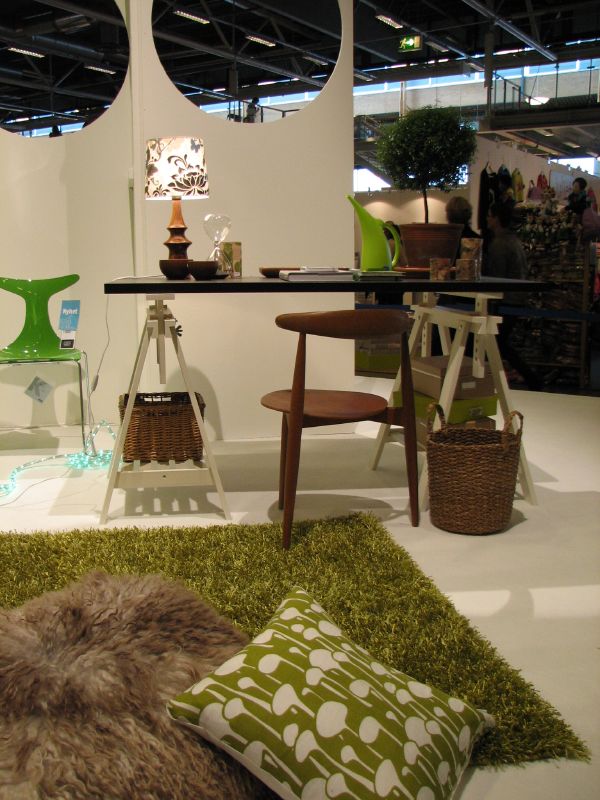 Here's a room designed for a teenager that I liked by Jan Rundgren. I liked the lamp the best but again, couldn't find information regarding the source.

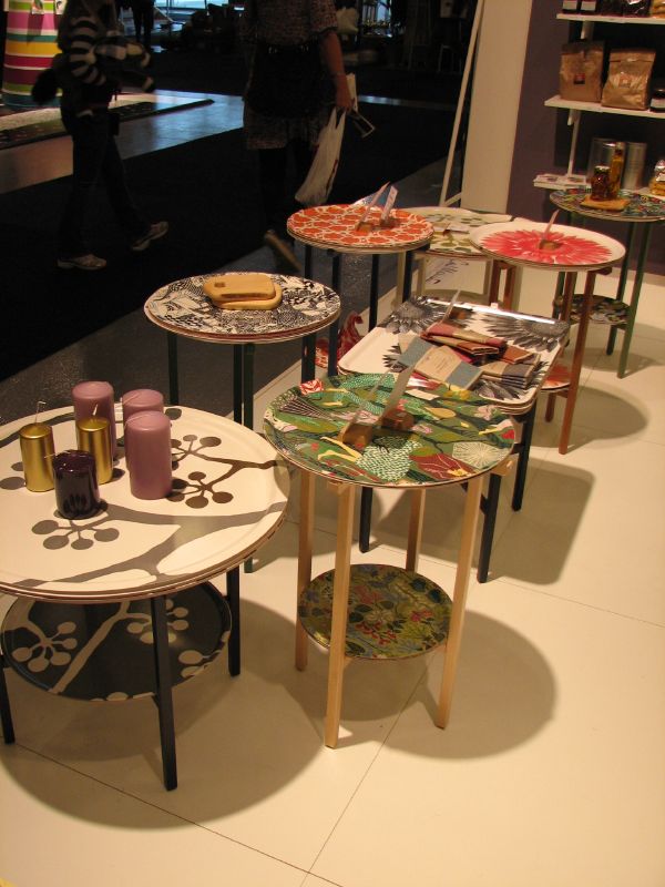 I couldn't resist snapping a photo of these gorgeous trays! I wanted them all. So hard to resist.
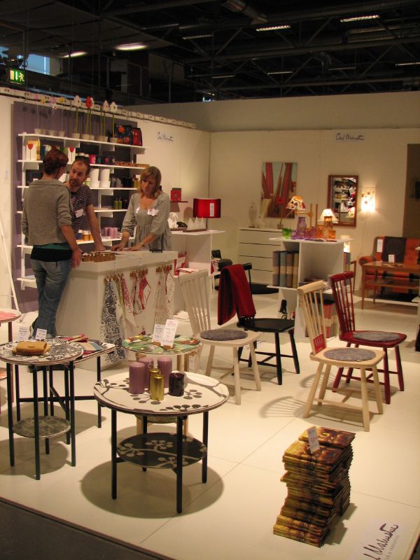 And these great chairs (above), designed by Carl Malmsten, were another favorite of Elle Interi?r at this show.
 And finally, here are some pillows I liked from Kreativ Insikt. Not a lot of pillows at this show, or textiles, so it was a bit sad for me because I was expecting to see a lot of prints and patterns and instead I found mostly black and white.
Summary: Hem 2007 was a bit small and honestly, a little dull to be set in such an innovative capital city like Stockholm. Outside of what I've featured in this post, the many additional booths (not shown) felt very dismal and somewhat tacky even - and the room arrangements I saw did not inspire me so I didn't bother photographing them. I got the sense that other attendees they felt exactly the same, so I'm not alone in this. However, the fact that I had the opportunity to attend was extremely exciting and an experience I won't forget, so for me, it was worth it to be there. Plus, I was able to meet some nice people and see some beautiful things, so I can't complain too much!
Would you like to see additional coverage of Hem 2007? Visit Emmas Design Blogg and The Style Files.
(images from holly becker for decor8 with the exception of the anna svensson cups, photo by cosas)
