Rice: Color Me Happy!
Most of you know that I'm a big fan of Rice in Denmark, so I thought today during the dead of winter (at least here in New England) that some of us buried under snow could use a dose of color. A ginormous dose.
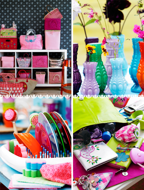
Rice usually isn't this colorful, yes they're pretty big on blue, pink, red, but it seems this season they've taken their usual palette and turned it wayyy up to near neon excitement. Think lime, bright pink, orange, colors that leap from the page. Happy! Joy seems to be the feeling they're going for with their energetic Spring collection.
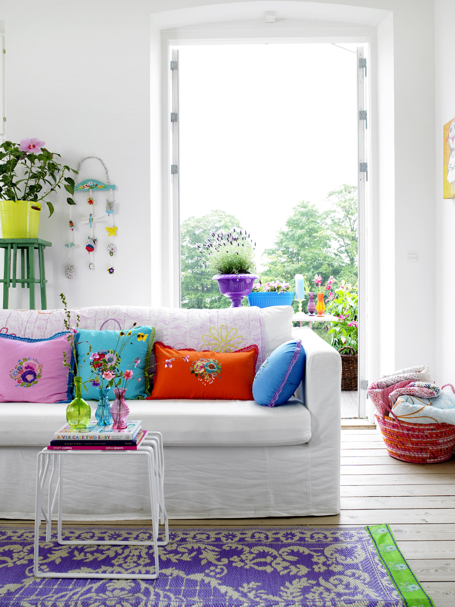 One day I vow to have a living room with ceilings this high and light this gorgeous filling it. Am I dreaming?
 Lots of hand painted furniture, this bright blue table is so easy to duplicate - you can find lots of tables like this in those unfinished wood stores or in second hand shops.
 I always think of toile as super stuffy - nice to see it displayed in a whimsical space like this.
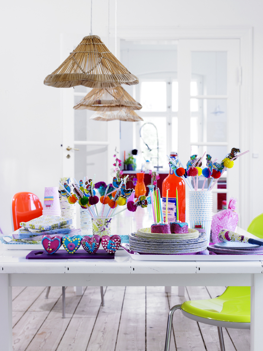 Everyone who is designed obsessed, moves around their furniture at least on a monthly basis, and is color crazy (but who cannot commit) needs to live in a space like this. Pure white walls (devoid of any color/tint - decorator's white from Benjamin Moore is my favorite) with neutral flooring. Larger pieces of furniture should be a mix of mostly white and wood (light to medium tones). Splashes of color can come from soft furnishings, trunks, small tables in bright hues, art, etc. That way, we have the perfect canvas for our constant need to change things around. Tired of your little green table? Paint it blue today. Sick of pink? Remove the pillow covers and sew up two vintage silk scarves and slip them on instead. Isn't this the perfect interior scenario? To me it is.
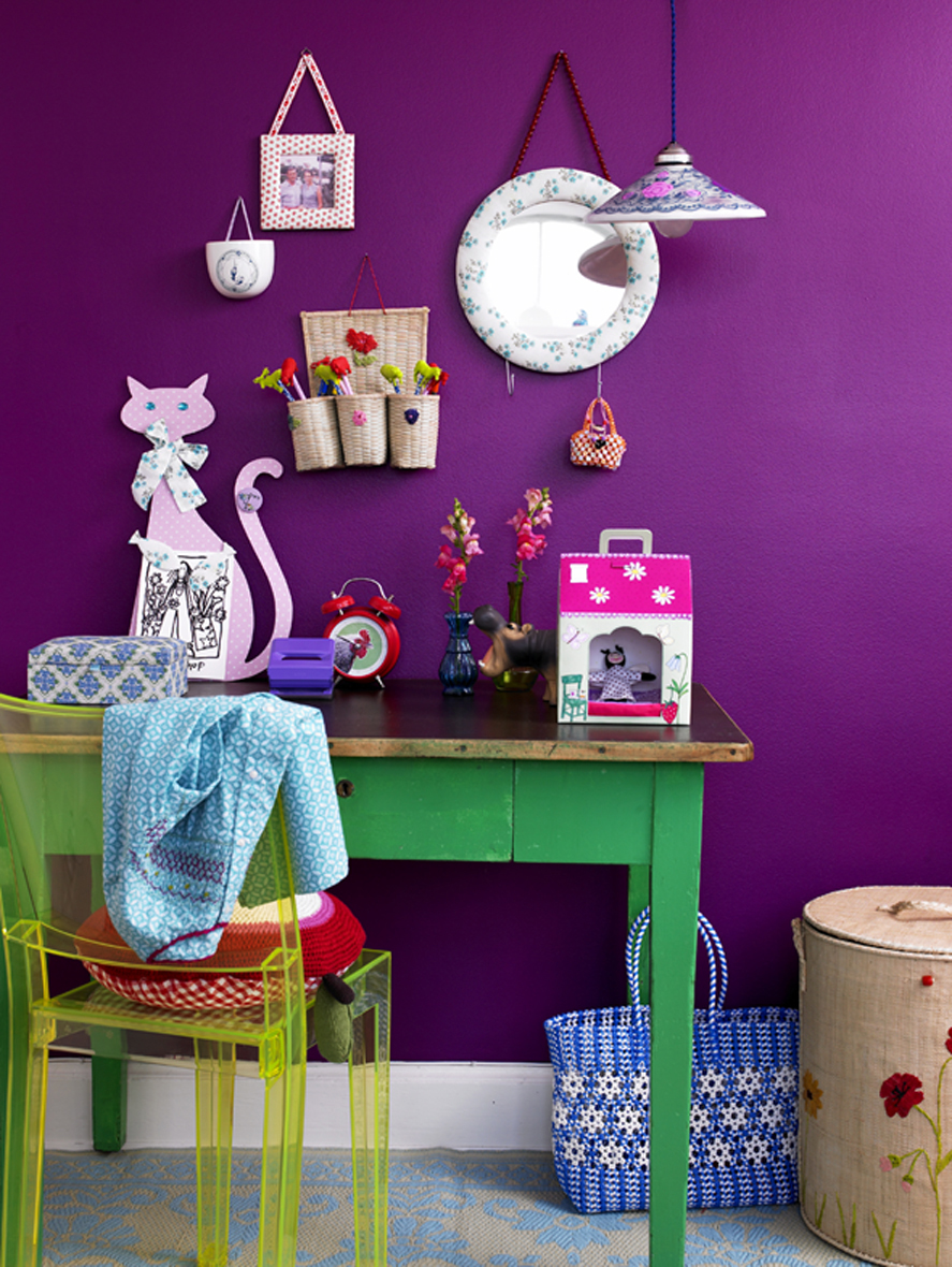 What little girl wouldn't love a purple bedroom (and parents who are totally cool with it)?
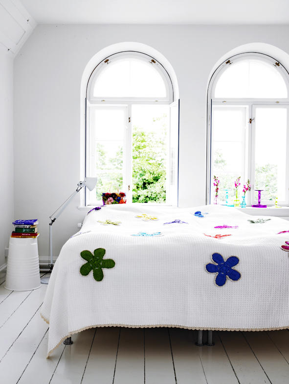 Furnishings aside, look at this light and these large windows. How can a space not look pretty when you have these bones to work with? Decorating is so much easier when you have a room like this as your starting point. It's like working with Kate Moss, you can dress her in anything and she'll be stunning.
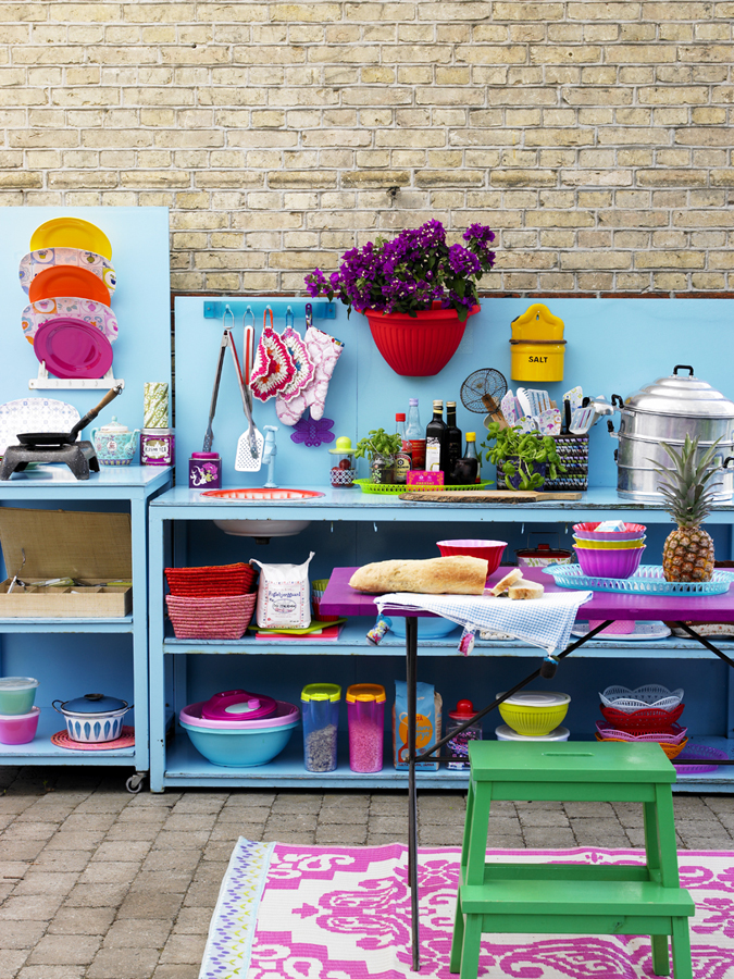 This is a super saturated outdoor patio, but you can't help but respect the lady that could run a home so well. :) Only in photos, remember that, only in photos.... {sigh}

Fun entryway. I especially like how they've painted only part of the wall. This was a very common fad in the 1980's in America only we were so clever as to use wallpaper border to trim it. Eek. What were we thinking? But '80s flashbacks aside, I could deal with a wall painted only part of the way up if it's done right - this is an example of right. Very nice splash of color, a nice way to welcome guests. Interesting animal head. I could perhaps do without Mr. Rhino and instead, I'd have my new favorite chandelier installed by Patrick Townsend.
{1/31: I have to update this post! I'm so excited to say that I just returned from Barnes + Noble with a copy of the Feb 08 LivingEtc magazine in hand and as I flipped through it during dinner, I saw an apartment that looked so much like these images. The pendants over the dining room table were a dead giveaway. I realized that the apartment featured on pages 58-66 is Charlotte Geeniau's place - owner of Rice. And it's a rental so if that doesn't inspire you... But what an awesome coincidence. You have to pick up LivingEtc because the full on spread is amazing.}
(images from rice)
