New decor8 Header!
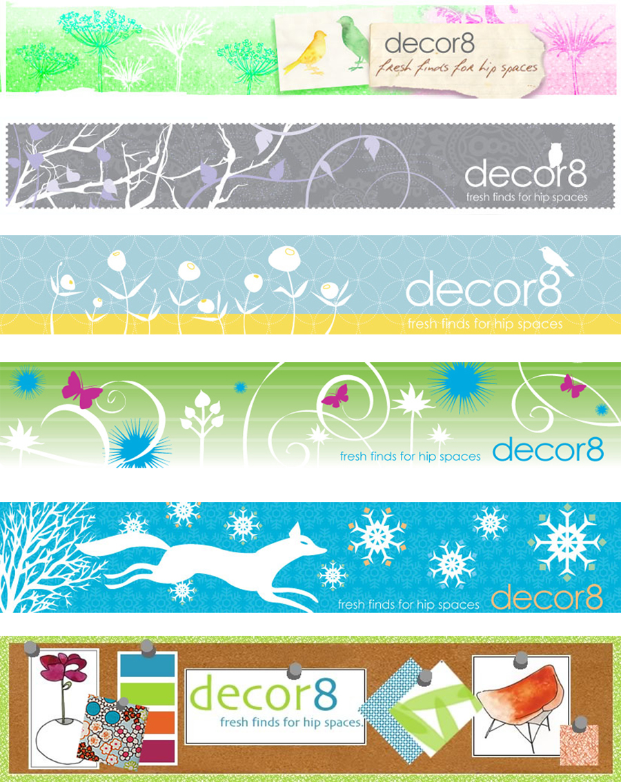
Last Friday I told you that I have some good news to share and I do, starting with a new decor8 header for Spring. It has been so gray and bleh in New Hampshire for many months, I felt drained looking at my our header each day seeing gray staring back at me! I worked with my graphic designer, Brent Meyers, to pull together a look that fits decor8. We went with a soft palette, my usual bird and floral motifs (I really like cow parsley this season), and a watercolored look. This time the bird was removed from my logo, usually I have one perched on top, and added in birds as a design element within the header instead.
decor8 headers change with the seasons, you can see how much progress Brent and I have made since the original one on the bottom. Once my new template is designed (hoping for a May 1st launch), I will go with a quarterly header showing the things that currently inspire me tacked to an inspiration board, getting back to my roots as you can see above - the first decor8 header was an inspiration board. Of course, the new boards will be designed by Brent and I and will look much more professional unlike the original one that I designed long before I was introduced to the power of Adobe Illustrator. :)
I hope you like the decor8 header for Spring! Tomorrow I will share some more good news with you that I'm pretty exciting about. See you then!
(images from holly becker for decor8)
