Unclutterer {Home Tour}
As warmer days arrive and birds start singin' their songs, Spring cleaning and organization becomes all the rage. We want to unclutter, neatly contain our chaos, send the dust bunnies packing, and make our homes sparkle. It's almost hardwired into our DNA, we must start the season with a fresh, very clean, and organized slate. I've invited Erin Doland, the editor of Unclutterer, to take us on a tour of her mid-century modern home located just outside of Washington, D.C. so we can inspect her organization techniques and learn a few tricks from a pro. Here's hoping this post will encourage us as we embark on the annual Spring clean-up!
First, a little about Erin's home. A three-story home shared with her husband, don't let the number of floors fool ya, it only has around 1,300 square feet of livable space. I think that's enough for a married couple, but considering that both work full-time from home, you can see why they need to keep their home organized and clutter-free. Built in the middle of the last century, it's architectural design was inspired by the international style. With plenty of light flooding the home since both the east and the west walls are predominantly glass, the north and south walls are a combination of brick and concrete on the exterior and your common dry wall inside. Ready to take a little tour? Erin will take it from here...
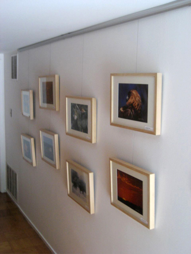
Erin Doland:
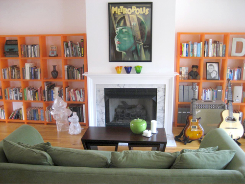 Erin Doland: The second level of our home is a large, open space. Looking to the north, the bookshelves are Cubits shelving units and can be reconfigured into many shapes. On the left shelves, you can see that we've turned an Olivetti typewriter upside down in one of the cubes as a design element when it's not in use. The fire hydrant and dog sculpted out of packing tape were made by artist Mark Jenkins and were used in his Storker Project. I feel that I should add that we purchased them as part of a Katrina fundraiser and didn't just grab them off the street. The color scheme of the room -- orange, green, and yellow -- was inspired by the Metropolis poster above the fireplace. The poster was the first piece purchased for this room.
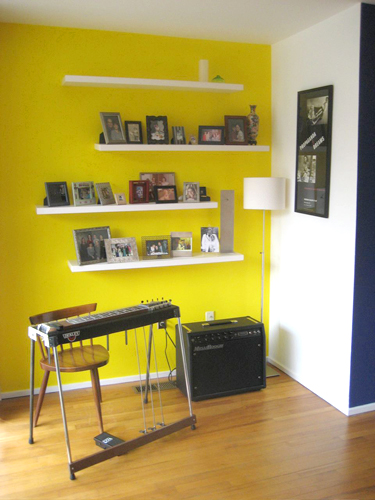 Erin Doland:
 Erin Doland:
 Erin Doland:
 Erin Doland:
Thank you Erin for touring us of your very organized home! For organization tips and tricks, visit Erin everyday over on Unclutterer.
(images from erin doland)
