German Design via Wohn Idee Magazine
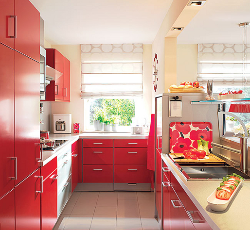
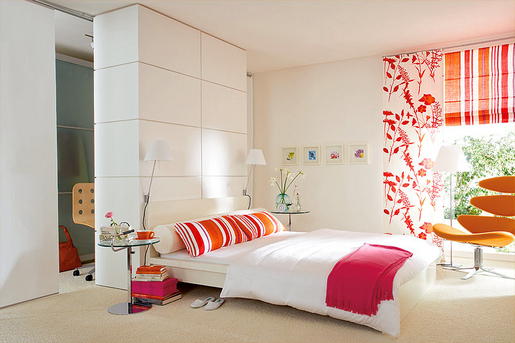
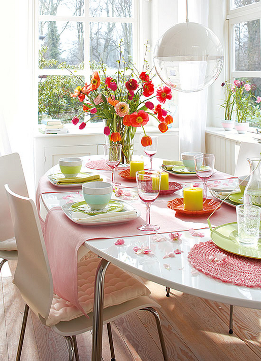
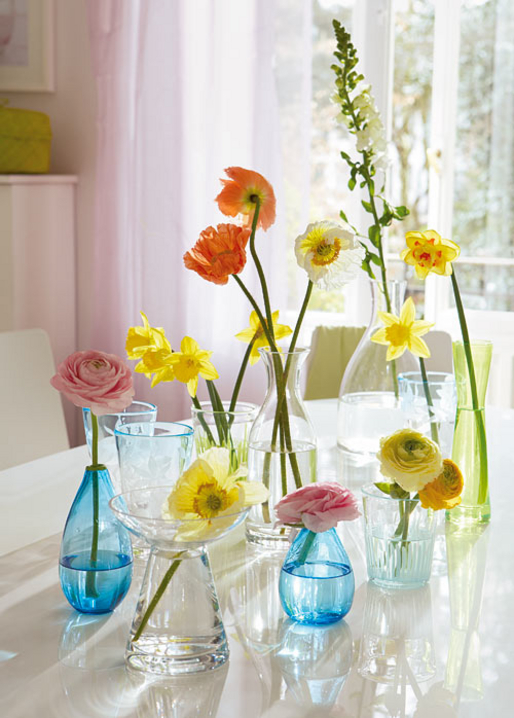
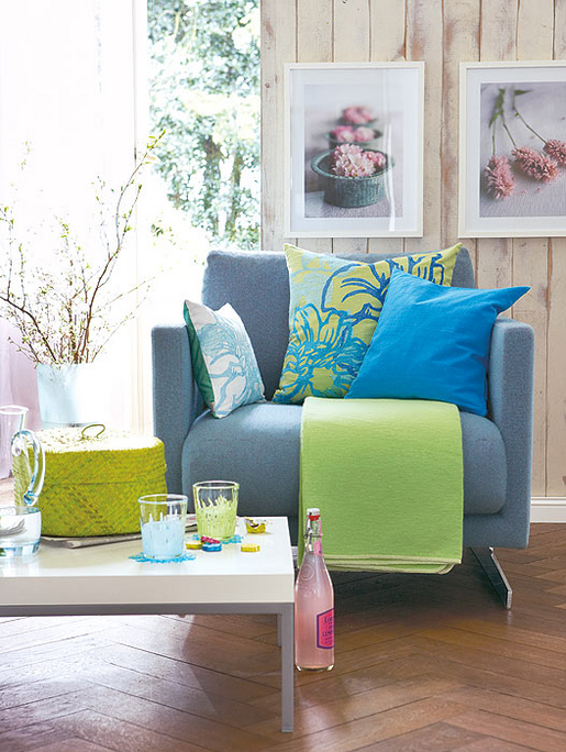
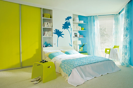
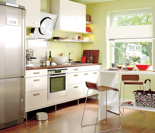
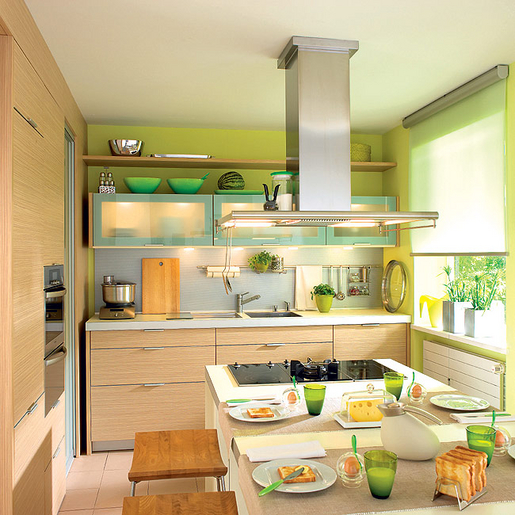
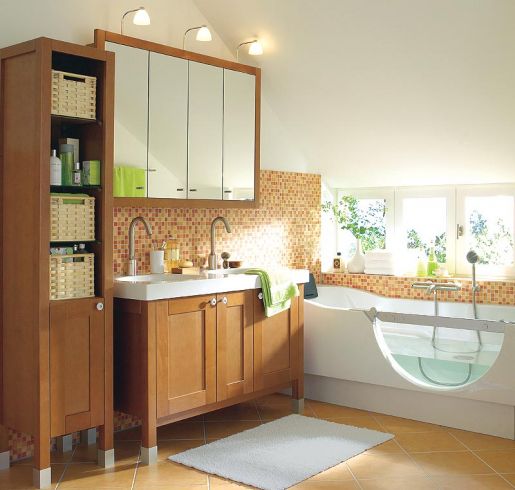
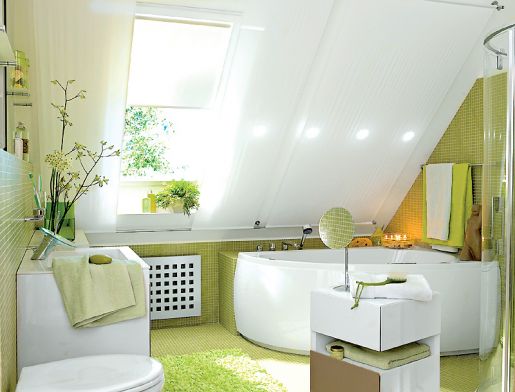
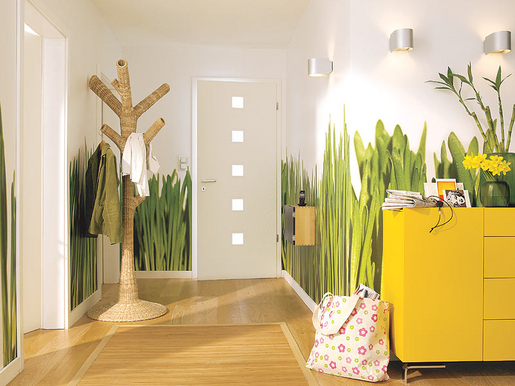
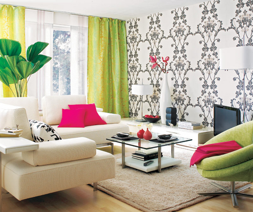
Lots of people ask me what design is like in Germany, at least the more mainstream stuff. Like if I went into a 'normal' furniture store in Germany, what could I expect to find. Of course, like Americans, everyone has their own unique style and some homes look nothing like these photos below. But again, this is more of the look you'll find in mainstream magazines and furniture stores and so I thought I'd share these images with you. They are from Wohn Idee magazine.
As you can see, bright colors and contemporary furnishings and patterns are very common in Germany and have been for a long time. It was all about primary red, blue, orange, and yellow at one time but I think the German design aesthetic, at least mainstream, is starting to mellow out a little and explore beyond primary hues, but they still love their primary colors!
And don't forget, if you live in Germany or are just passing through an airport there, pick up a copy of Wohn Idee for more inspiration and decorating ideas.
Isn't that hallway pretty cool!? The 'grassy' walls is wallpaper from a company called Berlintapete. They take any image and transform it into wallpaper. Imagine the possibilities.
(images from wohn idee magazine, copyright Bauer Digital KG, germany)

