Top Design: The Weekly Dish
Miss Becky is back to share her take on this week?s episode of Top Design. Becky, take it away! -- Holly------ Hi Everyone! Before I get started talking about this week's episode of Top Design, who caught Wisit's opera-etic departure TWICE on The Soup this week? I almost fell off the couch laughing! I also noticed that they changed the cover of the Elle Decor they show at the beginning. It used to be the issue with a cover showing the dining room of Cynthia Rowley, a judge on competing show Design Star.
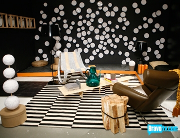
Well, this week's "Room of the Future" episode was a major improvement over last week's depressing green offices. I remember doing those kinds of exercises in 4th grade, except the future year we were told to imagine was 2000! I guess my "space car convertible" was a little ahead of its time. It was really interesting to see which designers were able to think about the future, and which ones were still stuck styling bookshelves with woven baskets. I agreed 100% with the judges' decisions tonight. I also liked that they had two and a half days plus a carpenter to help them execute their designs. Besides the fact that it takes a good week to put together several pieces of furniture from IKEA, it really gave them ample time to execute their designs well.
It was hilarious to hear Ondine, "the road runner on crack," drop the f-bomb so many times, and that she spilled big cans of paint or varnish twice. I was pleasantly surprised that Eddie handled it so well. I will give him props for that. I loved that the Pop Design challenge actually tested their knowledge of design history, and it was interesting to see who dropped out and when, though I suppose it wasn't much of a surprise who knew their stuff and who did not. Personally, I could not tell if the vintage lamp was a garage sale find or an L.A. high-end modern furniture store piece, and I got that one wrong! My guess is that the store charging $1,200 for it today found it at a garage sale for five bucks last week.
The two funniest, or in one case, ironic things Kelly said in this week's episode?
1) "I love the plates on the wall" to Nathan. Um, Kelly, that's because it's almost exactly like your design at the Viceroy Santa Monica. It's funny that Project Runway judges pick up on those who copy Balenciaga and Alexander McQueen, yet a Top Design judge doesn't call out her own work as an inspiration. Nathan's plates did look great, but the rest of his styling was a bit of a hot mess.
2) "It's like Grannies Gone Wild" to Eddie, regarding his room. Um, honey, WHAT ARE YOU WEARING? Socks with pumps, beads galore, the crazy hat, purple and green, the ruffled dress, uh, if that's not Grannies Gone Wild, I don't know what is! I loved it though. If there's one thing I've learned from these discussions, it's that people love Kelly or hate her, but there is absolutely no middle ground. Perhaps that's why I love her.
So, what did you think the year 2000 would be like when you were in third grade (I was in third grade in 1980, BTW)? Which futuristic plans did you think stood out in a good way? Which ones did you think were ridiculous? Do you know how to pronounce "Chaise Lounge" better than Preston does? Whose room would you choose to live in if you had to? Who is worse at receiving constructive criticism, Eddie, or Kenley from Project Runway? Were there any issues of the future you would have addressed through a design that were not mentioned in this episode? Would you ever wear a suit with sneakers and no socks? Do you think Ricky Schroeder looks smokin' hot in that picture that Andrea brought with her?
(image from bravo, text from rebecca harris)


