New: Tine K Home {and less is more}
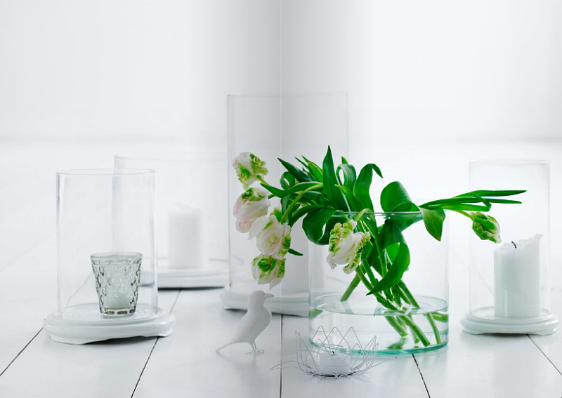
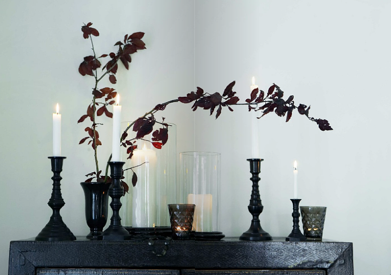
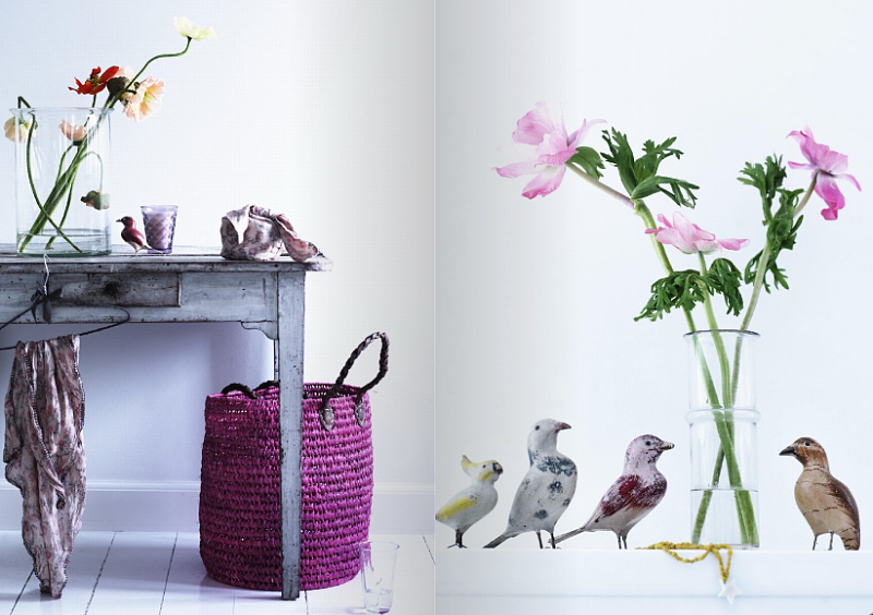
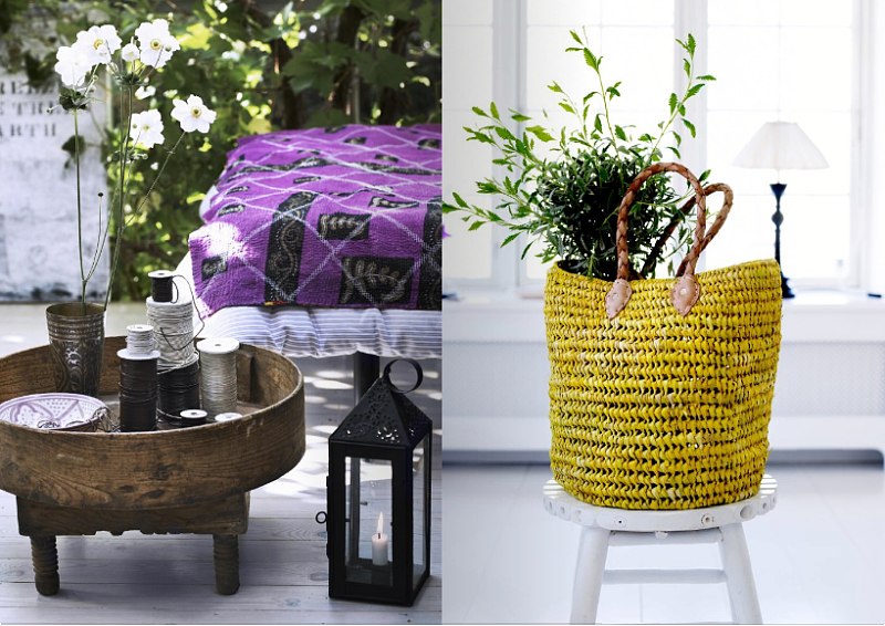
The second you hear the words Danish and Design in the same sentence I'm willing to bet beautiful images come to mind. What do you imagine? I see large rooms, clutter-free living, and a great sense of style and an attention to detail that feels very relaxed -- like it all just fell into place without much thought. I also think of Tine K Home, a lifestyle shop based in Denmark that I've raved about here before. Time for more. 
I did a little drive by today (it's a site that I frequent with hopes of finding new content) and noticed their current 122 page catalog that you can browse right here while enjoying your afternoon tea (or coffee) at work today. Looking at the catalog made me feel inspired and depressed. I realized that I really need to get my act together.
I'll start by asking you... what decorating plans do you have this year? I've vowed to clean things up a bit starting with my wall space. Just glancing at Tine K Home today made my resolution a bit stronger: time to remove all of my art, spackle, sand and paint the walls, and then install only my absolute favorite pieces of work to display vs. the current batch I have fighting for attention. I especially want to make this change in my home office because the spot above my desk contains an inspiration board and 2 calendars, 3 original pieces of art, a paper wreath, a screenprint (framed), a framed photograph, a gocco print, and (yes another and), this tiny faux deer head. I'm not happy with this massive inspiration board which is really just a cluttered wall that is NOT providing any inspiration at all. It's one big blob of color, texture and pattern -- all very beautiful things but nothing stands out. Must. Change. ASAP. I don't know if you've done it before but get this, I make an effort -- I TRY to avoid looking at the wall because it makes me feel overwhelmed, confused and out of balance. When I'm working I keep my eyes on my desk because glancing up disturbs my flow. Not good. I need to simplify so I can think.
In fact I'm going to start paying more attention to the visual clutter in my home, from the soap I use on my dishes to the shampoo in my shower. I have always paid close attention to product packaging but this year I want to step it up and make sure that everything I purchase that can be seen is not competing with something else in the room affecting the overall harmony of the space.
I know, you're sitting there thinking I've lost my mind and you are right. That's the problem. I am losing my mind amidst all this stuff. I never realized this was a problem until I came back from Germany in December. I noticed that I felt so much more at ease and even more creative in my German apartment because I have about 70% less there. The look is clean, bright, serene. I discovered that is exactly how I currently need to live to do my best work.
So those are my current plans in my home - to scale down, remove, de-clutter, have less on the walls but more peace in my heart.
Now let's get back to the regularly scheduled program: Tine K Home. I see lots of black, pale pink, gray, purple and green tones, mochas, plaids, stripes, attention to detail (embroidery, crochet work, etc.), natural wood, and subtle ethnic influence... Ah. Breathing space.
(images from tine k home)


