Interiors By Francesca
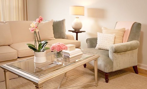
The lovely designer Frances Herrera Viola who runs the New York-based design firm Interiors by Francesca, sent in a few before and afters of her space and I thought it was so nicely done that you may find it inspirational. Francesca offers decorating services to those living in New York City and Long Island, in case you are local and have an interest in hiring out for design help whether that be a one day project, home staging, or a complete redesign of your space she just may be the lady for you to call! The first few photos below are of her recently designed bedroom (before & after) and the others are glimpses of her living space.
Seeing a makeover like this is helpful for those not living in magazine-like homes (most of us!) or around fancy architectural details — in other words people who basically have four blank walls and a floor — normal ceiling height, average windows, mediocre views, and annoying things to deal with like built-in air conditioners. A space like Francesca’s is a terrific example of how you can cozy up an “average” home using furniture, drapes, and throw rugs because not everyone has soaring ceilings, perfect floors, ocean views, and gorgeous fireplaces to fall back on! In fact, it’s much more of a challenge to design a home like this in my opinion. If you have a gorgeous flat overlooking the beach with massive windows, a massive fireplace and ceilings that go on forever well I see this as not much of a design challenge. You can put a sofa and a few chairs in a room like that and editors would be begging you to photograph your space for their magazine. It’s not so easy when you don’t occupy what I call, a home with supermodel good looks. This space is the perfect example of that — even a somewhat boxy room can have style - this ‘before’ bedroom photo below looks like a lot of plain Jane rental properties I’ve toured in my life. Plain Jane was transformed into Chic Chantal. It helps to see spaces like this to be able to train your eye to look for the potential.
I really admire the editing in this space, Francesca clearly knows when to quit. Though I must confess that if I lived here, I’d have a lot more color and art work, that’s for sure! Of course though, my personal taste is not the point — it’s more about foundation pieces. I could really build on a foundation like this. I love the trimmed drapes in the bedroom, and appreciate how the built-in a/c unit was replaced with a newer model in white — way better on the eyes! The pendant over the dining room table looks very chic, and the round table allows for good movement in a small space and enables flexibility with seating, you can add more chairs if needed for a larger gathering. Really nice work, Francesca!
(images francesca herrera viola)


