Swedish Design & Your Thoughts
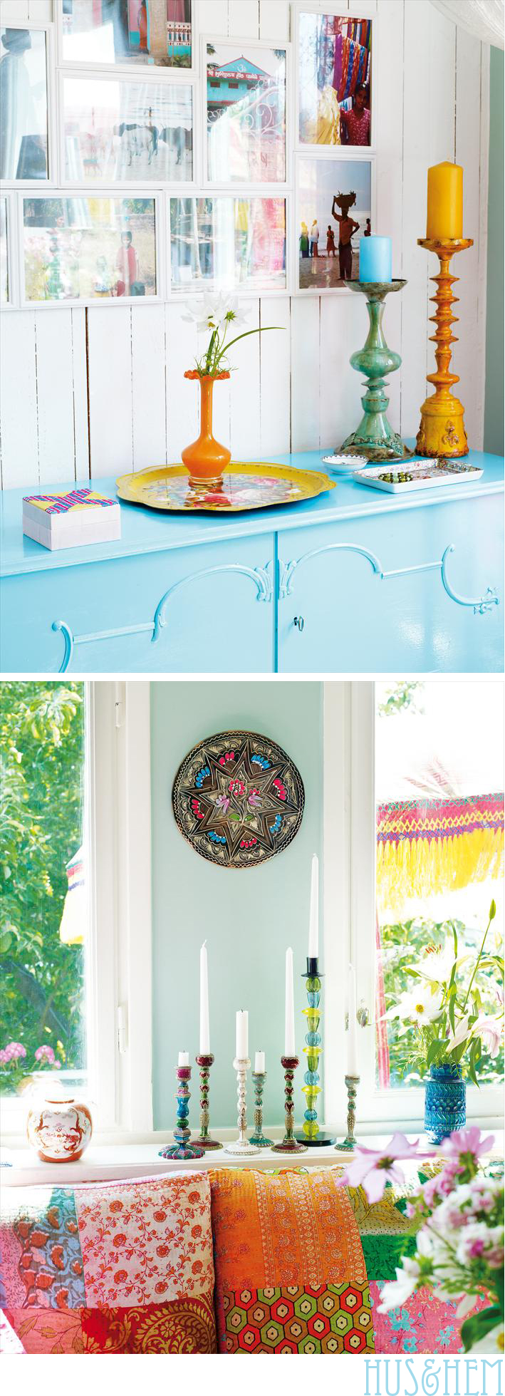
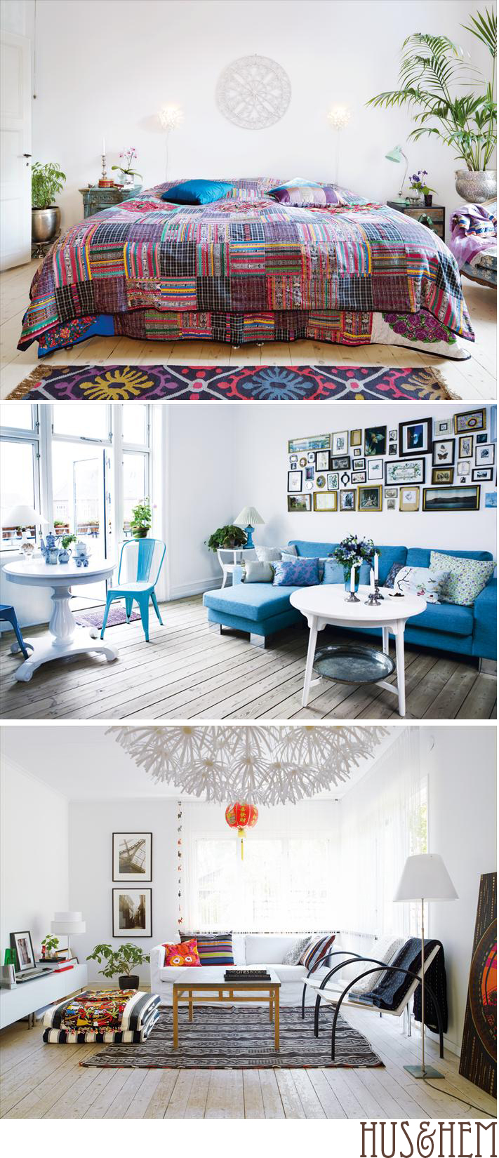
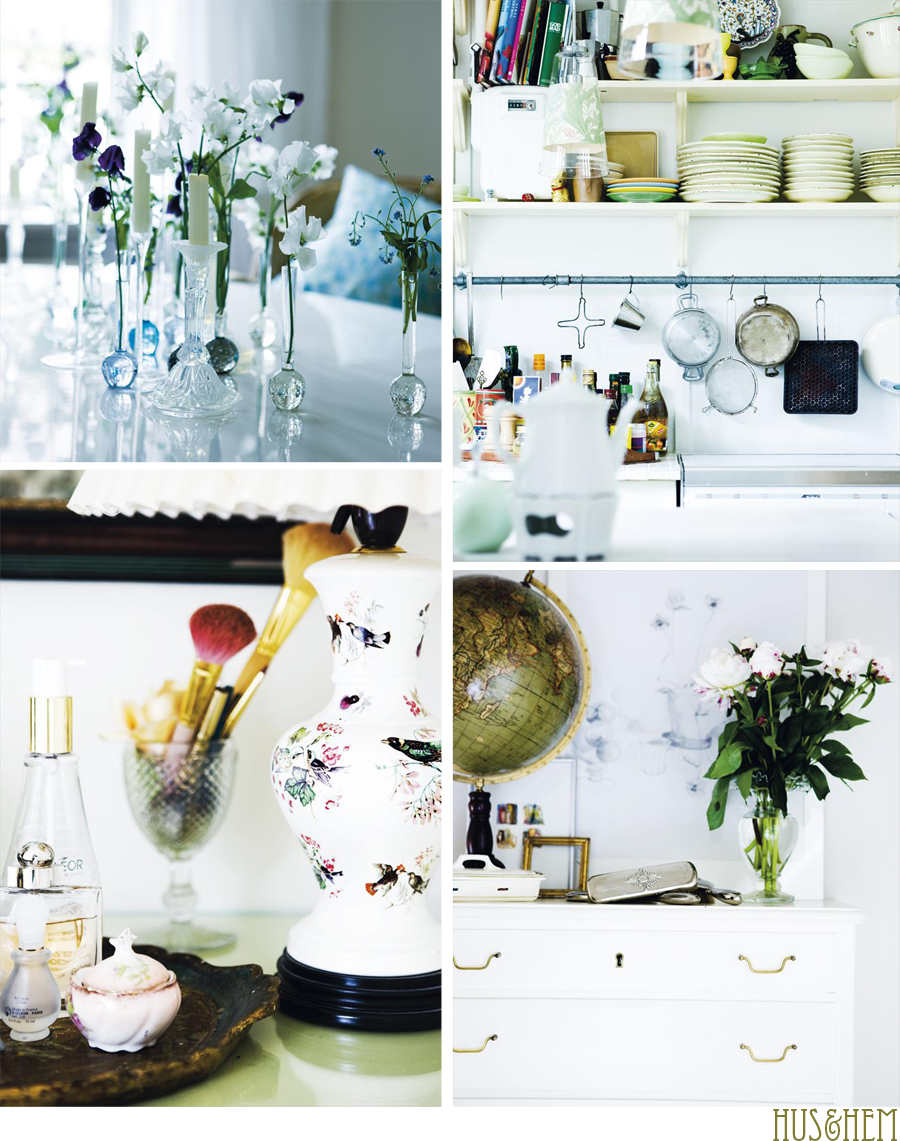
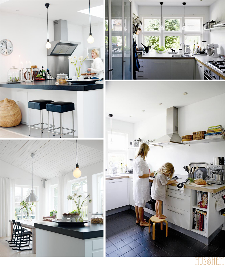
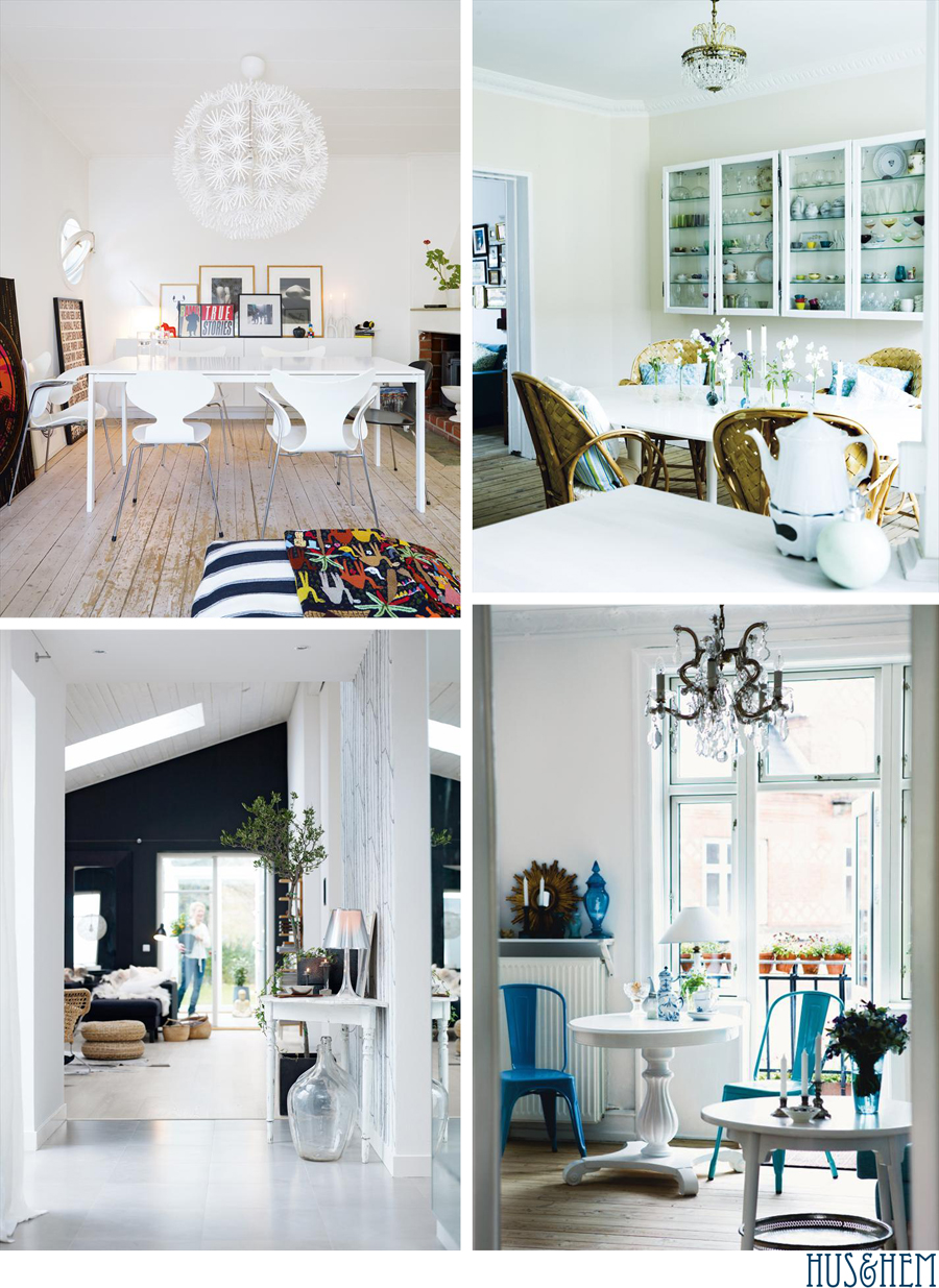
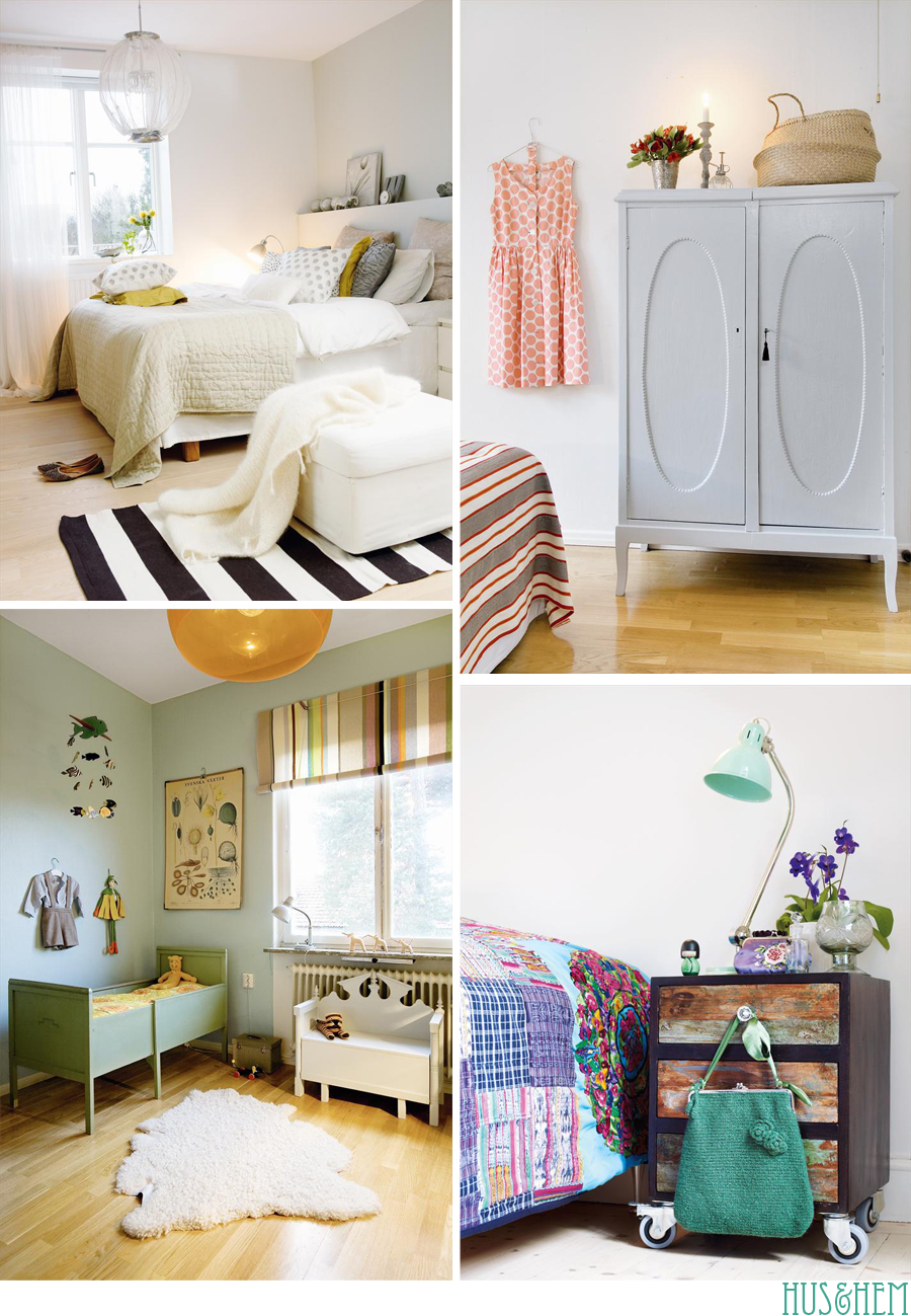
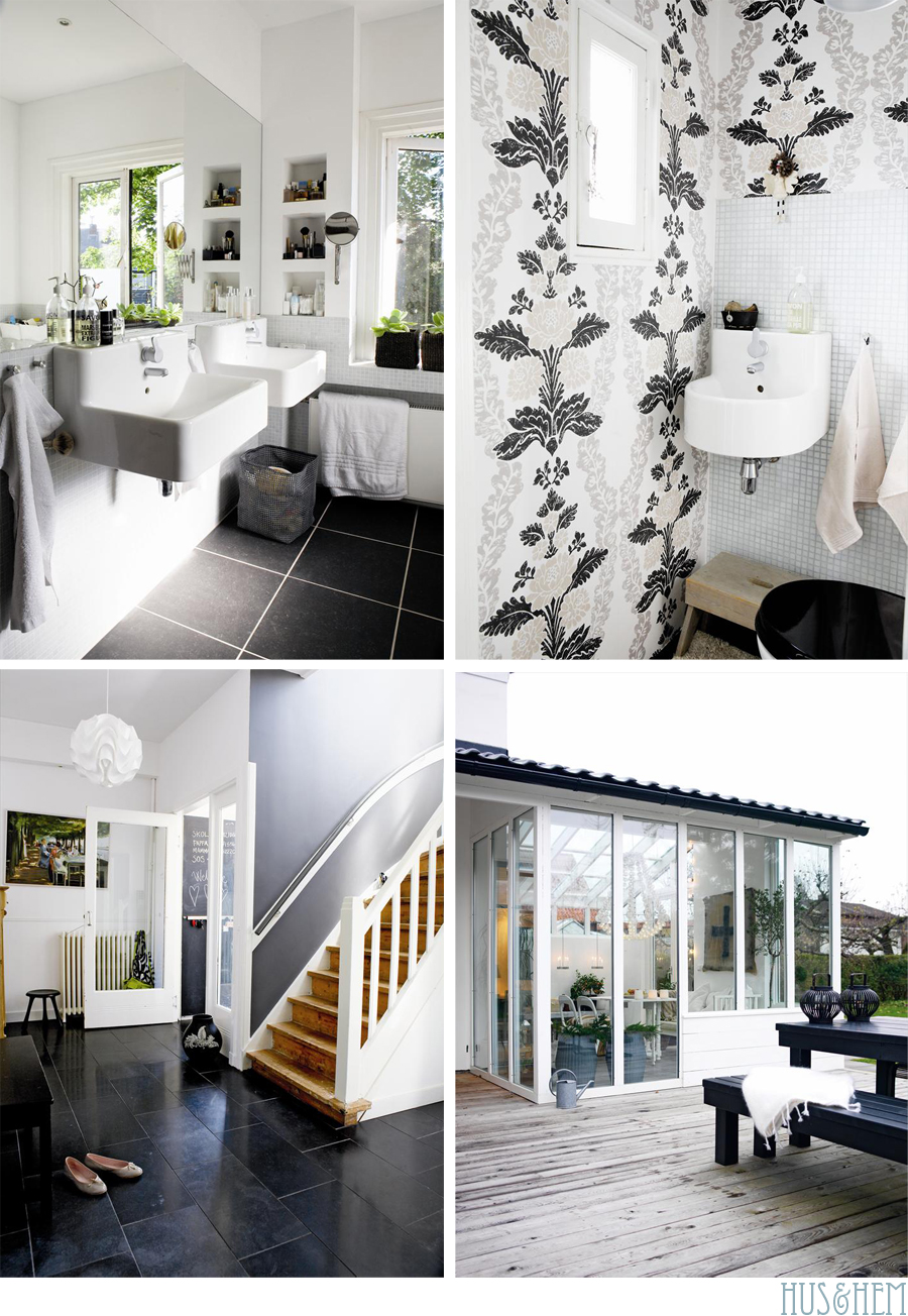
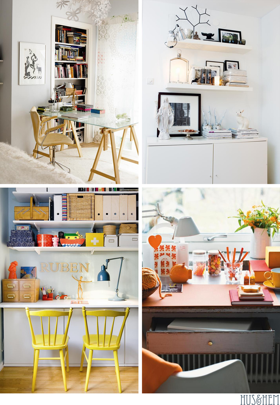
Let's talk about design, some common stereotypes and other things that were on my mind when I hopped out of bed this morning. First of all, I decided yesterday that I seriously need to go back to Sweden again for vacation because I love to shop there and find so many things that appeal to me. I am inspired by Swedish magazines too because whenever I look at them I'm reminded of why I love certain elements of Scandinavian design so much. Of course, like any country, the rooms featured in magazines are not entirely representative of the average family home and how all people live in Sweden, or any other country for that matter. When you look at Elle Decor in the U.S. do you think of your friends house? Most likely not. But the design found in magazines is representative of what the "ideal" home may be in the minds of the majority living in that particular part of the world -- based on culture, available products, local architecture, what people use, don't use, etc. And so from the homes I see in Swedish magazines, I take it that there is a more relaxed mentality when it comes to decorating and though the design is thought about and well edited, comfort is more important than perfection. Do you mind if together we spend a moment to consider this topic as we examine a few rooms that I found in Hus & Hem, a popular Swedish decorating magazine? Oh good, I was hoping you'd say yes!
I'd like to share something with you that I feel is important to consider. I had the chance a few years back to visit Stockholm where I met a number of bloggers, one who stood out was Emma who authors Emmas Designblogg because she asks a lot of good questions and is as bold as she is charming and fun to be with. I would define her as a hot ticket. :) She's also a gracious host, she gave my travel partner, Danielle, and I a great run around her city. That is why when Emma recently wrote about Swedish design on her blog, I took note. I'll quote part of what she said, "I've received quite a lot of comments and emails lately about Swedish style, that it is so wonderful and everybody here must be born with a great sense of aesthetics and so on. Well, that is not the case. The pictures I show here are in no way representative of what an average Swedish home looks like! If I were to show average homes, no one would want to read this blog. Most people live in common boring apartments and haven't changed their sofas since 1998. They have curtains with ugly flowery prints, apricot walls and IKEA posters on their walls."
Interesting point she makes, right? What she said makes us all feel a little better because often we think design in this or that country is so amazing and often we assume that the majority who live there have these slick, high fashion homes. Partly this comes from the magazines we read but also the film industry. Whenever you think of NYC you imagine the massive industrial loft or classic brownstone architecture, right? I do. But let me assure you because I've visited many apartments in Manhattan in my lifetime, the average person does not live in million dollar property. Lots of my friends in Germany have this impression of Manhattan that doesn't fit what it really is. I mean, how many single journalists could ever live (and shop) like Carrie Bradshaw? And how many live in an apartment like those kids had in that film Cloverfield? And Will Smith and his monster-size brownstone in I Am Legend or Meg Ryan and her flat in You've Got Mail. Those are the dream apartments but they are not the way most New Yorkers live because spaces like that are either not available and privately owned by the super rich or if they are available, they run in the thousands per month to rent and who in the world has that kind of money in your social circle, right?
Then again, not even celebs have massive flats in New York. Remember Nate Berkus' apartment featured in Oprah magazine a few years back? It was a two room apartment. Or even Lisa Loeb in that reality show she once had (that I loved) -- she's loaded and yet she did not live in a massive townhouse. Of course, some do live large in cities all over the world and I'm not saying otherwise, but the norm in films or the norm in magazines is not the norm in real life. It's a lifestyle, a dream, smoke and mirrors, not a reflection of daily life lived by the entire population. So the next time you look at a foreign decorating magazine keep in mind that those living there aren't all design aficionados who have posh flats. (pop pop bubbles are bursting, I hear them!) Even the posh flats you see were styled to perfection and given a thorough cleaning before the crew arrived to shoot. These homeowners weren't caught with their pants down in other words - preparations were made. I try to remember this whenever I'm standing in my own tiny apartment flipping through my mass loads of glossies thinking my home doesn't even compare. Ring! Ring! Reality calls!
But overall, the design that comes out of each country is coming out for a reason so it's not that it doesn't exist. There is a background -- history, culture, art schools and artists all influence it, the designers coming out of that country influence it and the average homeowner and their tastes and needs influence it. And of course, the super rich influence it as well as the most stylish apartment and home owners who have their spaces featured in magazines, on television, etc. So there is something to the design we are seeing -- there is a reality to it all though it's not how every single person decorates or lives. It's interesting to think about all of this and to discuss it, don't you think?
So back to these lovely rooms and what we know as Swedish modern design. I really like how each of these spaces shown above feel accessible and within reach. And is it just me, or does black seem to be part of nearly every room shown above? I read once that there is design rule that states to always add a shot of black somewhere in a room and though I don't believe that is necessary, I do see the value in it when I look at these rooms and see that black certainly gives a certain something to them, don't you think? I also notice a trend with stripes and how they appear to be a pattern used in home decor in Sweden.
Each of these spaces shown within the pages of Hus & Hem have something I appreciate, and you must have noticed to as you were inspecting them. They are lived in but also design matters to those dwelling in the space -- and there is a feeling of positivity, creativity, individuality and a cozy comfort without over accessorizing. It's clean and balanced living that I think is a hallmark of modern Swedish design, don't you? And I like this because it supports how I like to live. So while not every home may look like something from a magazine, there is definitely a striving for it that makes the whole obsession with decorating more fun.
Let me turn the table now. What about you? Out of all of the design you've observed in the world - from Australia to France to America and beyond, which one, or combination of, speak to you the loudest and the clearest? How is design presented in your part of the world - what are common elements and such that seem to be what your country is known for?
(images: hus & hem)
