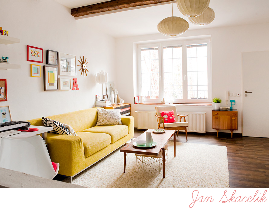
Happy Corner in the Czech Republic
We always hear about beautiful homes in San Francisco, Paris, London... but how about giving the lesser known spots on this planet a little love, like Olomouc in the Czech Republic! If you have no clue where Olomouc even is, then visit this link for an overview. I recently talked to 26-year-old graphic designer and photographer Jan Skácelík via email about his great apartment which I found because he posted shots of it in my Interior Styling group on Flickr where he is a member. And since his home hasn't appeared on this blog yet, I figured it would be fun to share something fresh with you today.
Jan says that he is inspired by design blogs like Apartment Therapy and decor8 and is a big fan of mid century modern design and illustrations from that era and his books from the 50s and 60s give him a lot of inspiration too. I think you can really see this in his amazing apartment. Don't you love it? Someone recently posted on decor8 in the comments section that they have the impression that in Europe homes all have high ceilings and white walls and I just smiled because that is mostly what European blogs, at least in the northern parts, show the most but of course not everyone lives in old buildings here with white walls.
I personally love white walls and apartments that are flooded with light, particularly now because here in northern Germany the days are not so long and it can be mostly gray during the winter so the more light I can trap in the house the better! Plus where I live you can find lots of old buildings with apartments for rent and the standard look in most of them is white walls and high ceilings along with other things like large windows which are typical here. Especially in the buildings from the late 1800s and early 1900s. Most northerners use either bright colors on the walls or white because it helps to brighten the rooms during the cold long winter. You can find some homes with really bright yellow and orange walls here too because these hues warm up a space and give the feeling of light and sunshine. But, because I personally like to have flexibility with my decorating and tend to pull in different colors each season, I usually change the prints on my walls and the cushions on my sofa to bring in new colors and so I keep my walls white though I have wallpaper that I am dying to hang in yellow so that should be installed within the next year or so when I find a new flat. I digress...
But yes, back to the clearly talented Jan who obviously is inspired by the mid century color palette so I can see why he has chosen such bold choices and think that they are quite lovely - a yellow sofa, bright red accents -- it's all just great and he does what some who have mid century modern furniture have a hard time doing -- his finds look very modern, fresh and current because he mixes them with energetic colors and newly purchased finds. Some have similar pieces but mix in colors that make them look almost older and not so fresh but with all that white, bright red, yellow and blue he really injects spirit and makes his pieces come alive so that they fit this century. Great style, Jan!
(images: Jan Skácelík)


