Decorating Tips From Denmark
Hello Friends, it is Leslie here dropping in for a moment with some design tips from the Danish magazine Bolig. Since Holly was recently in Denmark (and I just got back) I though it would be nice to highlight some lovely images featured on this magazine’s ever inspiring site. I know she is fond of their aesthetic and posted about them here in April. I am starting with a pretty kitchen that has some good ideas.
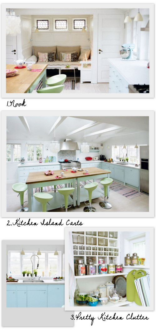
1. Nook: This image reminded me of how useful little sitting nooks are for hanging out and feeling cozy! It is a great way to make a small or awkward space feel perfect don’t you think? I remember an old apartment I had where the eating area was too small for a table and this would have been perfect. You can use a simple bench or a couple square stools lined up and then top with some foam covered in fabric. Throw on a few pillows and some cushions and you are ready for tea and a book in your cozy little nook!
2. Kitchen Island Carts: A really pretty kitchen! I like how they painted the carts that make up the island with the same color as the cupboards (at least it looks similar). Usually carts like this are always silver metal but there is something about the paint that looks really fresh. There was a Martha Stewart issue years ago that discussed taking metal furniture to an auto body shop to get powder-coat painted or sprayed. Does anyone remember this? Have you tried it and was it expensive? I am curious because it does create a nice look and then you can fasten a counter on top.
3. Pretty Kitchen Clutter: Displaying beautiful packaging like these Kusmi Tea tins and the jewel toned tea cups in the same palette as the kitchen is visually inspiring. Even if this look has been styled for the magazine shoot it is still a reminder of how to display your own collections that may be hiding in your cupboards and if you are going to fill some counter or shelf space have it be with you nice stuff!
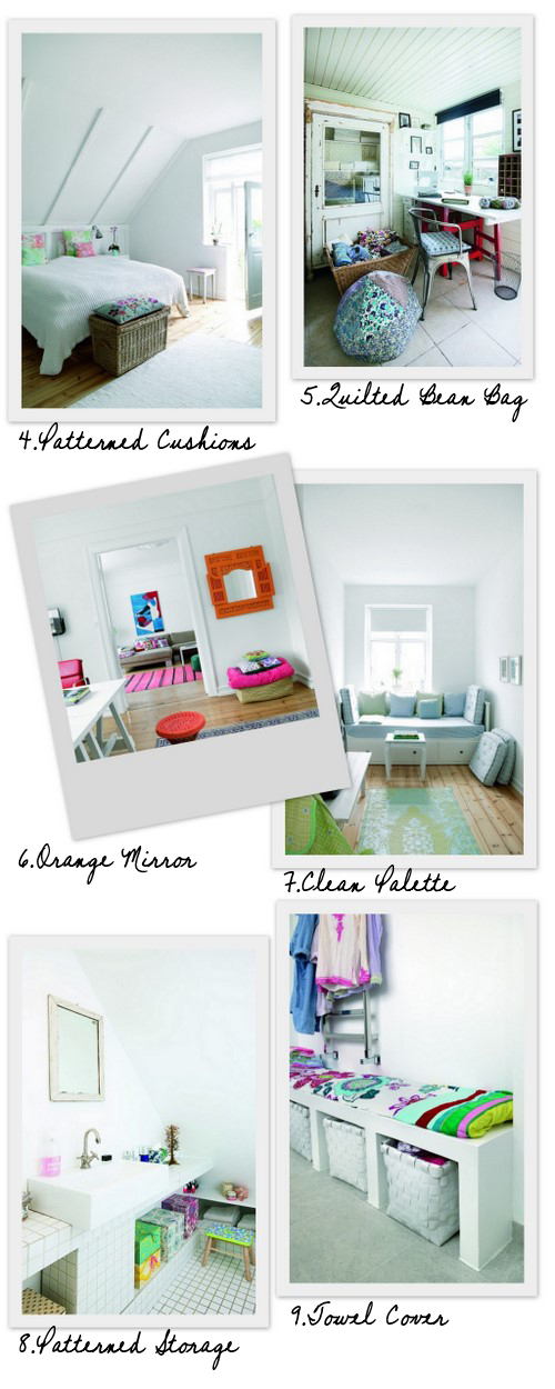
The use of pattern in these images is really fresh and creates a unique look in the white spaces. Instead of just using just plain blocks of color the patterned elements add a little more decorating power!
4. Patterned Cushions: I know this is simple but I must say effective. The cushions would read very differently if they were just solid blasts of color on the bed. The look is a little more delicate and detailed now.
5. Quilted Bean Bag: The patterned bean-bag and chair cushion are fun and modern in this more rustic space.
6. Orange Mirror: The intricate frame pattern around the mirror painted with bright orange is bold and interesting compared to a plain rectangle frame painted orange. The pattern adds that extra wow factor.
7. Clean Palette: A simple light blue and green palette with subtle patterns looks inviting. There is that “nook” look again with the day bed creating a comfortable space in a narrow room.
8. Patterned Storage Boxes: A pretty alternative to baskets in the bathroom and there seems to be many tutorials on how to do it yourself like this one online.
9. Towel Cover: This bench cushion in a bathroom seems to be covered with a brightly covered towel, which seems fitting – right? There are so many affordable printed bath sheets available now that would make a practical fabric covering for a seat in a bathroom like this or outdoors.
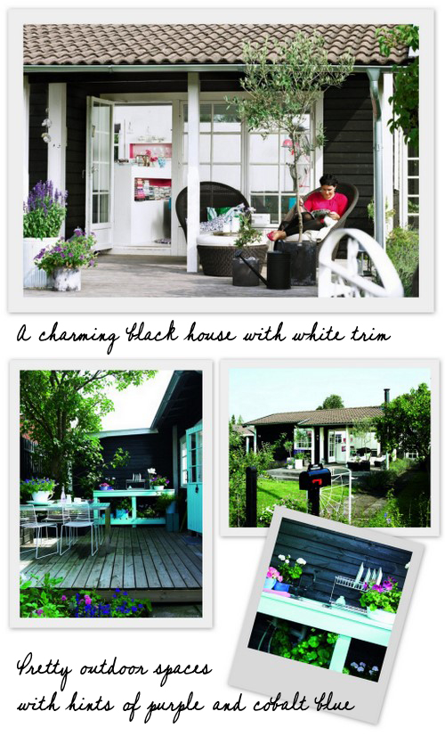
Lastly, I had to share with you this charming black painted house. Maybe it is not a west coast thing because I rarely see ranchers, bungalows or cottages painted this lovely black or shall I say “ink” color here in California. I am curious to learn more, is this popular in Scandinavia, as it definitely seems warm for absorbing light? What do you think, am I alone in my adoration of this black house? -Leslie Shewring
(images: bolig magazine)


