House & Home Design Contest 2010
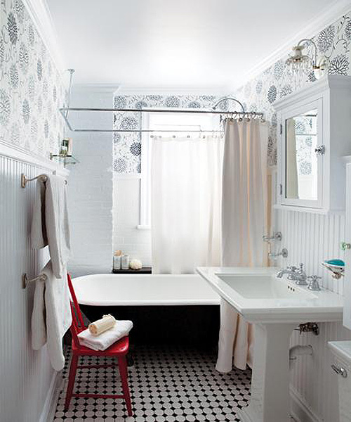
Canadian House & Home (a lovely magazine that I miss since moving to the other side of the world!) is hosting their annual Design Contest once again. This is one winning entry from last year that I loved - the bathroom is gorgeous, don't you think? I adore the graphic floral wallpaper in black and white, so fresh and clean, with that red chair adding just the perfect bit of color to break things up. It's a truly lovely space. And the tub! Oh how nice to paint it black and to use those gorgeous tiles on the floor. I think the bathroom is the one room in the house that I don't mind looking absolutely catalog-perfect. I don't know, I expect other rooms in the house to feel lived-in, but the bathroom I always expect to be simple, clean, spa-like and styled perfectly. I don't like a lot of clutter in a bathroom, less is more! That is why this space appeals to me.
If you feel you have what it takes to enter their design contest this year, why not click here to learn more about it and to see what you could win. Go for it, why not? You may walk away with a nice prize and a feature in their smart magazine.
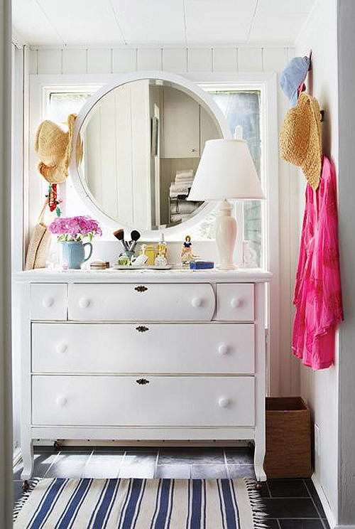
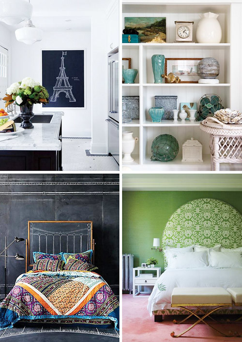
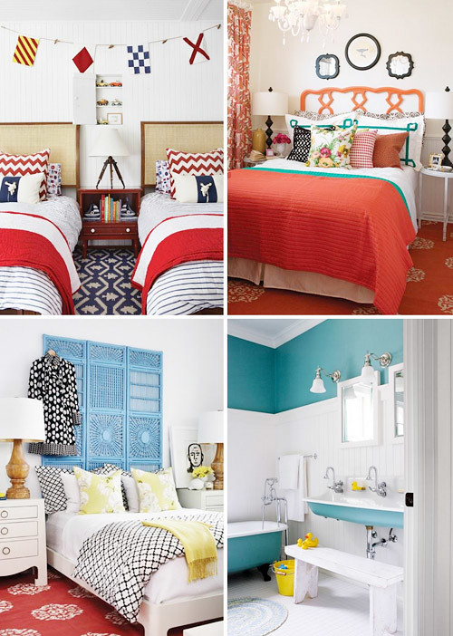
Simply take a photo of any space you have renovated or decorated yourself and enter it into any of the six categories that it would fit in -- like the best use of color, kitchen, best budget style, small space, best house and best decorating, Remember, read the contest rules first and note: you must enter and submit your photos online by October 13th and the contest is open to only residents of Canada. That means the rest of us have to simply wish our Canadian friends the best of luck and wait for the big reveal online! Until then, here are some more smart rooms from the magazine that I found interesting enough to share today. Do any of these rooms speak to you?
Bold never grows old, does it? Above I'm seeing a little Palm Beach, a little Morocco, some coastal blues, and some over the top graphics. It's all so, so good.
Do you ever watch House & Home TV online? It's great, especially when you don't have design television (me!) and only have the web to turn to for design programs. I love their design editor and host Cameron MacNeil -- I've followed his work for years now since he was super young and love watching him now on video, he's even better than I had imagined!
(images: house & home)


