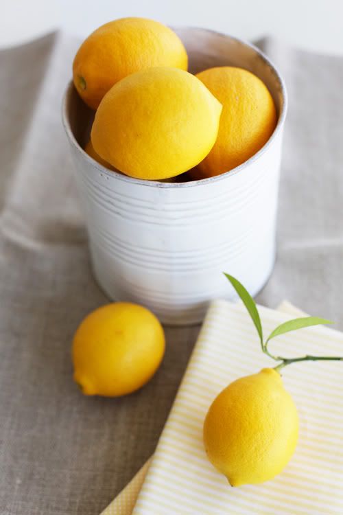
Lemon Yellow
Hello Friends, it is Leslie with Color Me Pretty for January. This month I have been thinking about lemon yellow since all of my little lemon trees are dripping with fruit here in southern California, however I was not sure what I wanted to pair with it for this column.
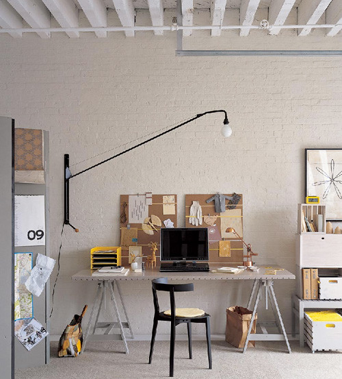
Then I saw Holly’s post on Shane Powers work (his website is here) and I got inspired to pair yellow with craft paper brown, some gray and a little black. Here is the image that sparked some creative projects in my studio...
I printed it out and tacked it to my moodboard and started to think of ways that I could inject a little yellow into my life. Here is my moodboard with Shane's work as the focus.
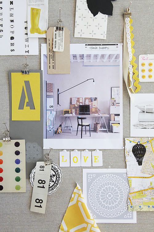
After posting Shane's image on my moodboard along with other bits of inspiration, I looked to it as a visual guide to help me pull this palette in to my life. Here are a few small ways that I turned an inspiring photograph and a pretty palette into something tangible in my own home to enjoy.
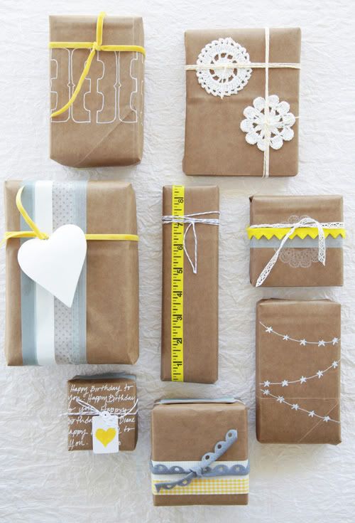
Over the holidays I wrapped many of my gifts with Trader Joe’s paper grocery bags. I loved the white hand drawn looking illustrations they had printed on them. Since I have lots of these bags leftover I decided to continue using them for gift-wrap but just turned the paper around so that the holiday illustrations are no longer showing. Even if the outside of the bag may have slightly faded, the inside is that nice craft paper brown. I had fun using an opaque white ink pen to draw, stencil and write on some of the gifts.
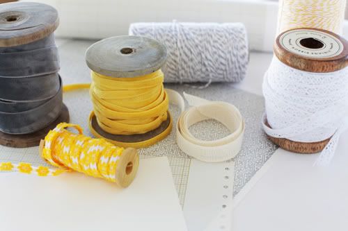
I also used Japanese washi tape and some ribbons I had to further decorate my little packages.
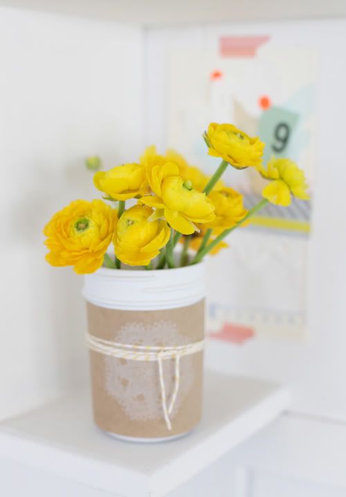
I wrapped a container with the paper from the same bags and placed in some of my favorite flowers to further bring sunshine into my home. This is shown on a shelf in my crafting studio.
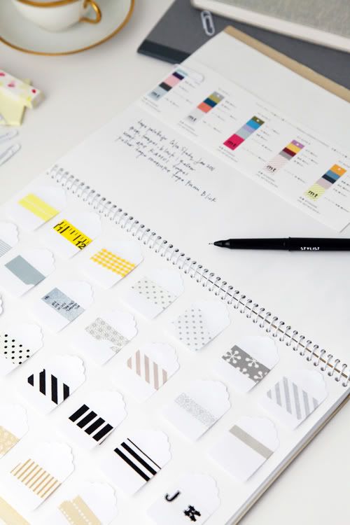
I decided to add this palette to my inspiration book using some fancy tapes that fit the scheme. Now I can refer to it as a jumping off point for a future project.
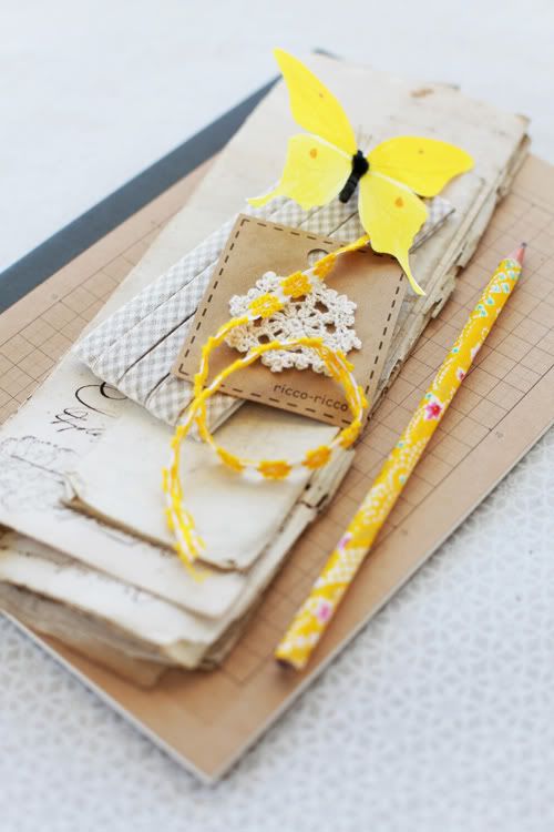
I even collected some things that I found in drawers and bins in my studio that fit this color scheme and stacked them on my desk to give me further inspiration.
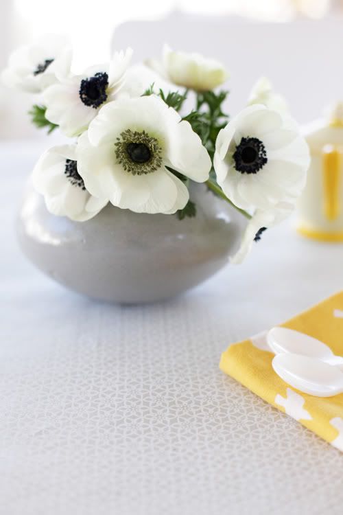
When combined with pretty yellow fabric napkins, fresh flowers, a gray vase and a crisp white table cover this palette looks sophisticated for a patio lunch or if it's not warm where you live, an indoor lunch with a touch of Spring.
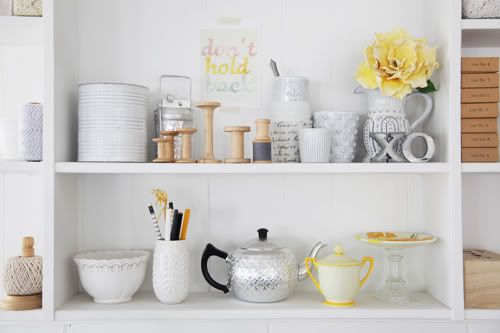
My studio shelves were rearranged to bring in this palette. Some of the books were wrapped in the paper from the bags and labeled them to identify their contents. The "Don't Hold Back" print is by artist Nan Lawson.
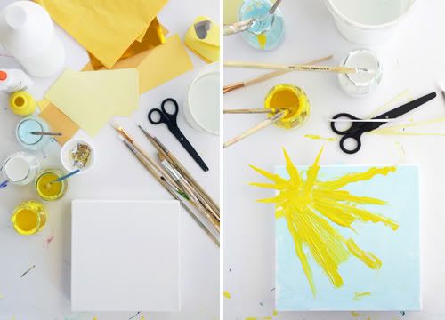
I thought it may be interesting for a few of you if I shared some of the art projects I do with my four-year-old daughter since she is often dancing around my studio when I am trying to shoot my posts. It is enjoyable for her to work in the colors I am working in and since it was all about yellow, I laid out some supplies for her to use. You can see her work above. A while ago I came across these two really interesting posts about occasionally setting palette constraints for your children in order to teach them more about color and composition. You can read more about this concept from Uniform Natural and Shin + Sons -- let me know what you think and if you have tried this before and with what results.
Don’t you think this color combination is a nice transition from winter into spring or even from late summer into fall? It is warm and fresh at the same time. I like working in color combination's that I have not used before because it is a great way to understand new possibilities for projects to come. I hope you enjoyed this series.
Thank you for having me and I will see you next month. - Leslie.

