5 Artists That You Should Check Out
Hello and happy Friday! Earlier today I posted a book review on Real Simple for Pulled, A Catalog of Screen Printing by Mike Perry so feel free to hop over there and read it... but this post isn't a repeat of that, rather it's to meant to share 5 of the 40+ artists in Perry's book that I really liked. We each have our own definition of what beauty is so something I love may not be your personal favorite but at least check these creative folks out below and see what you think. In fact, I'd love to really see what you think - so if any of these artists click with you, let me know and tell me why. Okay, let's get started! :)

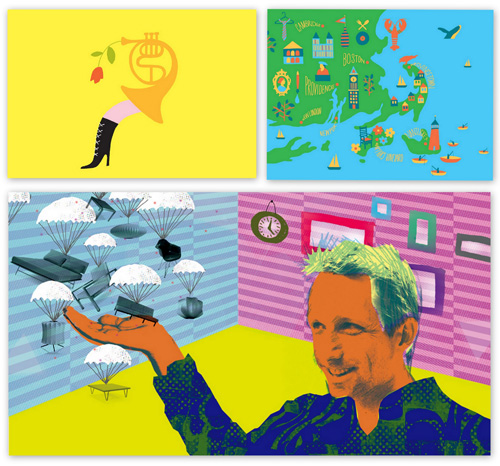
First up is Ashkahn Shahparnia - his work is bold, colorful and awesome and I love his shop. And yes, that is an illustration of blogger Maxwell Gillingham-Ryan who founded the web's first, largest and most popular design blog, Apartment Therapy that all other design bloggers sorta laud as the god of blogging. That snazzy illustration appeared in ReadyMade magazine who just so happens to always have the best illustrations, don't you think?
Next is Brooklyn's own Jim Datz, I love his city posters. Great stuff. The London one is funny, spiffy, and I like the colors. I also love the little black cab with the man riding in the back reading his newspaper (an actual newspaper, remember those?) with his giant mustache. I'm happy to see the mouth of the cab driver completely shut because most cabbies I've had in the past several months wouldn't stop talking about god, politics, religion and terrorism. Yeah, I always seem to get the best cab drivers (not). At least this little guy with the fancy stache can read his paper in peace.
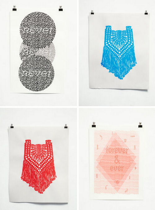
Rachel Domm, whom you may know from some of her awesome work for jumbo clients like J.Crew is also in Perry's new book. She has a store, too. I like that subtle pink Forever & Ever poster.
Next up is Andrew Holder and really, what's not to love about his work? So strong and clean. Peacocks, bear, deer, raindrops, pine trees. He does them all so very well and his color mixes are phenomenal. Swoon.
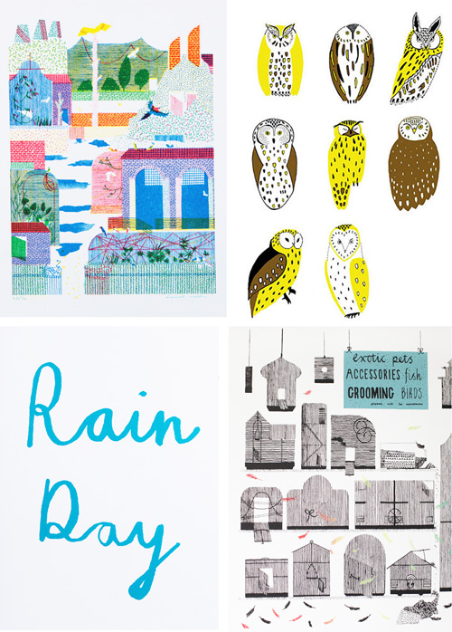
And last, but not least because Perry's book has tons more artists to browse, is Hannah Waldron. She has a bigcartel store too. I like her work because it's intricate while feeling casual and that's hard to pull off. I can't explain what it is but I love the Rain Day poster. It's sweet but I'm not really sure what it's all about. When I first saw it I thought it was like another way to say Sick Day, like a Rain Day would be a day when you are just blue and not really ill, sorta depressed and sad and needing a warm bed, a hug and a vodka martini. :) I really don't know what a Rain Day is, do you? But I like the swirly letters, the color, the spacing and just the vibe those two little words put off.
Also in this book is the work of Steven Harrington (not shown above) who I think is pretty darn special. I own a limited edition print of his, two actually, and really like the colors and shapes he uses. I love the work he did for Target - I'm so inspired by this video. Can you imagine being an artist and seeing your work displayed like that?
Do you have any favorites from the PULLED book?
(images: linked to their sources above.)


