Fresh Wallpaper Patterns For Your Home
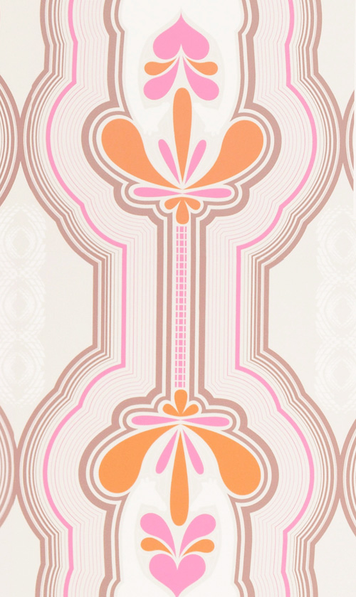
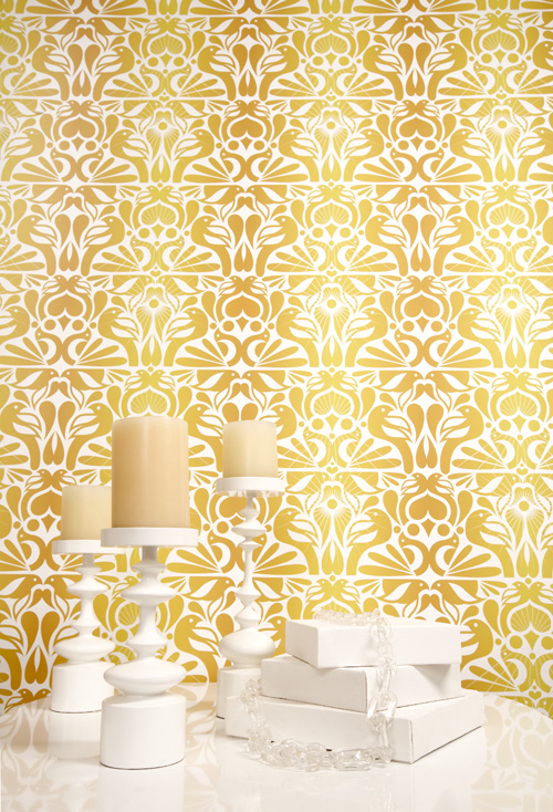
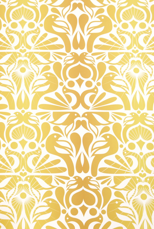
When it comes to pattern in the home all I can say is, YES, PLEASE! Yesterday over at Real Simple I wrote about my favorite wallpaper prints from York Wallcoverings and I'd like to quickly share them along with two others from a company called Kreme Life... But first, the two Kreme Life patterns that caught my eye - I love these. The pink pattern is called Giraffes and the other is Yellow Birds. These are not for the color shy or those in fear of bold statement making pattern! Bold papers work so nicely in small spaces as well as larger rooms - for instance inside of a glass cabinet or in a small guest bathroom. I imagine the pink and orange paper shown below featured behind a bed in a guest room - fun and bright - with a duvet and bed linens in stripes and tiny floral patterns with a retro feel. I can see it in little girl's bedroom, to0. It's very retro and charming, don't you think? 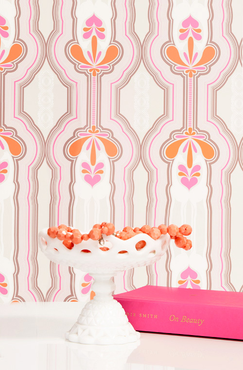
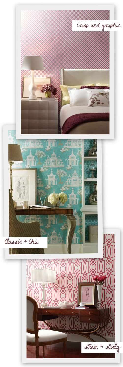
Next, let's look at these papers below from York Wallcoverings. You can find them all on their website.
These patterns are quite smart looking, don't you think? I love the "mix + match" combination using two different patterns in blue and white - very chic! I appreciate all styles from retro to modern and find that if you tap into your creativity a bit and use your imagination, you can mix lots of different styles as long as your colors match and some pieces in the room are tame - for instance, wild and crazy wallpaper with furniture that has clean lines and then for fun, one funky chair or a crazy lamp -- that is the way to go for me. Of course, we all have our own personality which should be directly translated into our room decor, so you may love tons of busy patterns in a single space (or none at all) and well, if you love it then knock yourself out because it's your home - you can do whatever you want!
BUT for those of you who currently get stuck with mixing patterns and color then a good decorating "rule" to follow is to pick a focal point in the room - a good leading lady or man - (wallpaper, art, your patterned sofa) and then mix in your "supporting actors" around the focal point being careful that everything complements the star of the show -- though as you experiment and gain decorating confidence it's a good idea to throw in a little healthy competition and to not play it too safe which is why I suggest adding in something that competes with the focal point - like a lamp that is out of scale in the opposite corner from the focal point or a chair off to the side in a wild, totally bonkers pattern. Healthy tension is good but if every single thing in a room is fighting for attention it all can be very overwhelming and draining to the person living there and to your guests.
With everything though - edit, edit, edit! I preach the power of editing because often it's the few pieces that you remove from a styled bookcase that ends up making the display look finished and gorgeous.
One last bit before I go, remember what Coco Chanel once said, "The most courageous act is still to think for yourself. Aloud." I believe this applies to decorating - it takes courage to bring your ideas to life through your interiors but go for it and enjoy the process and the results. Think for yourself, aloud, in your interior style.
Do you have wallpaper? How do you use it at home - on walls, ceilings, in cabinets, in drawers?
(images: york + kreme life)
