Heart Home Magazine: Winter Issue
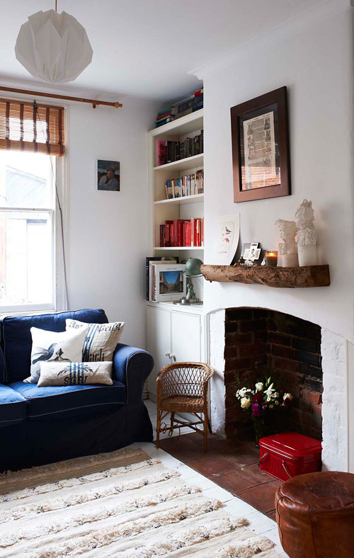
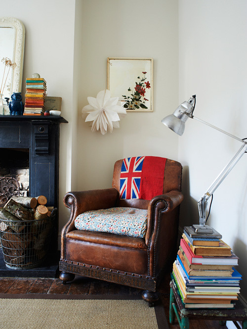
I'm so happy to announce that the second lovely issue of Heart Home magazine goes live in just a few minutes and it's a lovely feast for the eyes. I love this magazine and look forward to seeing many more in the future because it covers mostly British designers, crafters, artisans, etc. and well, that niche stuff gets me all tingly. I love it when magazines have a very clear focus and aren't all over the place and totally random, I know what to expect! I know when I look at VTWonen the aesthetic is mainly Dutch, or Inside Out is mainly Australian with lots of Aussie homes... Same for Selvedge magazine, it's all about textiles. This is the kind of focused content that stands on its own and for me, Heart Home has a good thing going on. Are you ready for a special peek into their next issue? I'll start by sharing my two favorite images in this magazine -- this gorgeous bedroom for one... 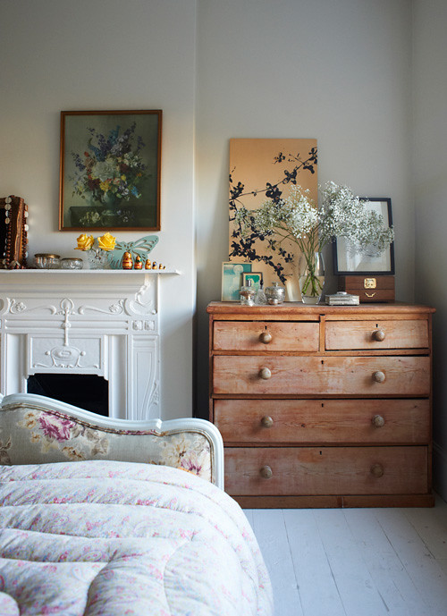 Oh dear this is where I imagine going on a weekend holiday... I love the natural light in this space and that gorgeous duvet or "eiderdown" as the English call them. The white floorboards are lovely and I like the contrast of the flooring against the wooden dresser - truth is, contrasts excite me. The fireplace and its surround is enchanting, in fact I noticed that in all of my favorite spaces in Heart Home I could see a fireplace - my absolutely favorite element in a room. The arrangement of things on the dresser is perfect, this room is fun to examine I think, don't you? And now for my second favorite room in Heart Home, this amazing living room below... The corner nook is so appealing to me. I dream of finding a yummy leather chair like this and curling up to read on a Sunday morning... The flag is a perfect touch I think. If you put your finger over the Union Jack and try to imagine that corner without it, it's simply not the same. That statement piece provides energy and fun.
  Lets get a closer look at what's on that mantle, shall we (see below)? Well isn't this a nice arrangement of quirky and sweet bits - some look sentimental, others perhaps were collected during a walk and still others could be flea market finds. There is sure to be a story behind each item, wouldn't it be nice to know?
When I look at vignettes like this in other people's homes, I often try to imagine my own stories for each of their objects. Maybe that black No. "3" is their birth month (March) or how many children they have or perhaps their lucky number. I have a ceramic vintage house number on my wall with "22" on it. I bought it in New Hampshire before I moved to Germany because I knew it would be the house number of my first address abroad, when I moved here I lived on a street in house No. 22. I've moved since, my new house is No. 46 - but my little No. 22 will always be special to me. Whenever I look at it I think of when I was planning to relocate and the excitement I felt, and my first apartment in Germany. These are the layers of stories behind objects that we decorate with that give a home some heart.
The second issue of Heart Home has around 160 pages and is packed with diverse homes and ideas to suit every taste. I was thrilled when editors Carol, Ari and Daniel gave me exclusive photos from the magazine to use in this blog post - it makes me happy to see how the rooms look without copy laid on them and they are gorgeous and totally pinterestable (new word, I know!) now so pin them, tag them "Heart Home Magazine" on Pinterest, and spread the word!
This photo above gives me ideas for my vintage Moroccan wedding quilt that is currently folded on my sofa... It really looks beautiful on a floor, doesn't it?
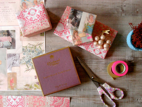
Lace and neon is a great way to freshen up something seemingly old-fashioned with a little 'edge' appeal. I love the gift wrapping feature in this issue, lots of pretty ideas and color palettes.
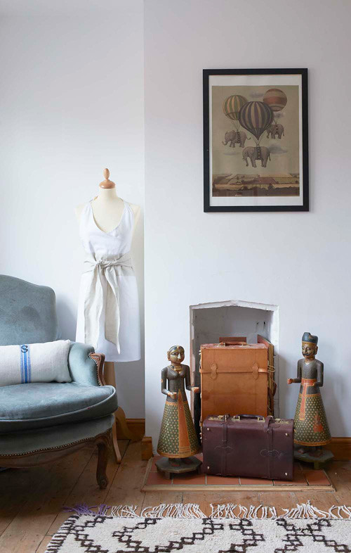
I don't know if the random purple fringe on the far left of that rug was an accidental soda spill or intentionally dyed to add some personality, but either way the result is great - I love it! This is something I find about British design that always makes me smile - a sense of humor and slight wrongness where you stop and say, "Wait, that shouldn't be there... or should it?". Even rooms that appear a bit serious seem to incorporate slight bits of quirk in England, at least from my outsider observations...
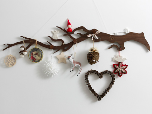
I like this idea because you can also use a found branch if you don't have a fancy one like this. Aren't all of these ornaments pretty? I have the reindeer, he is from Anthropologie and I know that because my friend Joanna just gave him to me. :) You can make some of these ornaments yourself - paint some found acorns white and leave the caps natural, then string them to hang or buy vintage door keys at a tag sale and paint them a chalky matte white to make them look almost like ceramic keys.
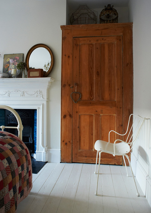
I like the wooden cabinet above as well, the knotty wood adds character and warmth. It is also a great contrast to the all-white floors. The quilt is cozy and charming and wow, what a gorgeous fireplace - what is up with English homes anyway, do they all come with amazingly aweseome fireplaces or?!?
I hope you've enjoyed this peek into Heart Home's latest issue - it will be live on their website very soon today so keep clicking by their page until you spot it - there is a patio set on the cover with a huge wreath above it, you can't miss it!
(photography: Oliver Gordon, Sarah Hogan, Andrew Boyd and Jeska Hearne)

