Moody Colors Make Me Happy
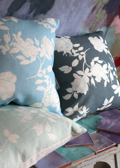
Something about these rose-patterned pillows entices me, especially the moody charcoal gray. I've been drawn toward a moody palette lately more and more (it started towards the beginning of 2011) and I'm not quite sure where my new leaning has spawned from but I'm willing to guess it all began at Liberty in London back in February of last year. I remember walking around that store all alone and suddenly 'getting' why I loved it in there so much - because it felt cozy and edgy while still being floral and colorful. Plus Liberty has amazing natural light and shadows during the day, the vibe in that shop really sets my creative wheels turning! Sadly, magazines haven't inspired me lately but restaurants and retail spaces have so I've been out and about a lot with my inspiration radar set to ON.
For some reason this Spring, I'm really feeling more moody, muddy, dark colors with bursts of energetic hues. I'm not so keen on only brights lately, they feel a bit hyped BUT I do like them mixed into a moody palette but not so much on their own. I know, this is coming from the queen of color and white! In fact, I'm going to paint my living room wall a very dark gray soon, it's begging me to and I'm going to listen. For instance, check out that very grown up gray rose pillow above (which I would love for my sofa!)... I'd make drapes for my living room in the same pattern and use a neon pink curtain rod to add some energy. Fun! The pillows are from a Swedish creative studio called G. Bruce Design and the collection is Purété Blanc inspired by the French countryside. The motif began as a watercolor painting by graphic designer Gunilla Bruce and then printed onto linen. I think it's really pretty!
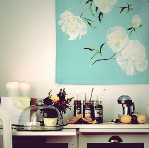
I really like this styled shot above from Gunilla's website. Again, moody, imperfect, lovely. I'm loving this look!
(image: gunilla bruce)


