Weekday Carnival Blog
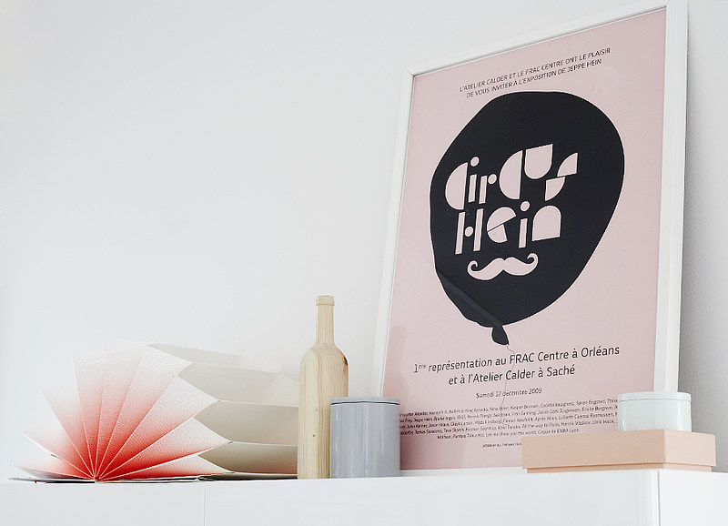
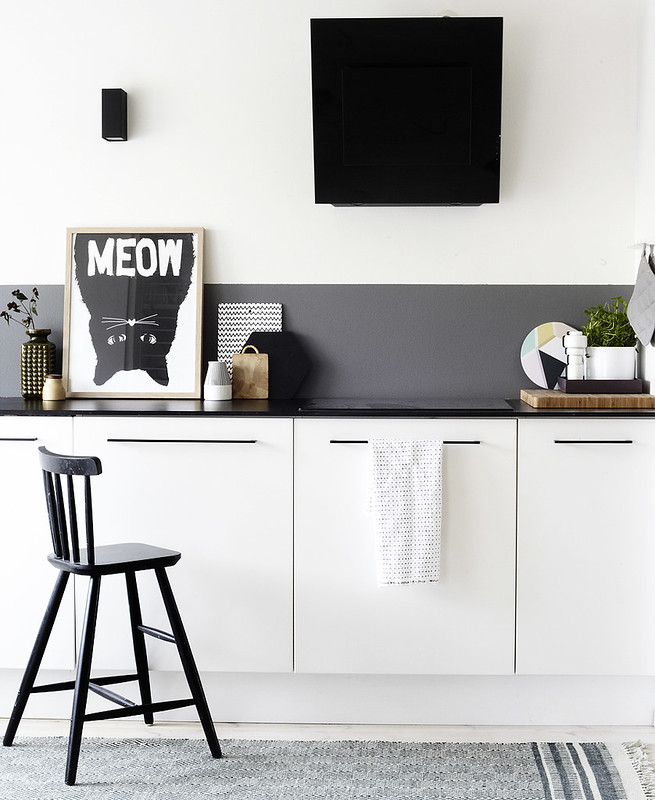
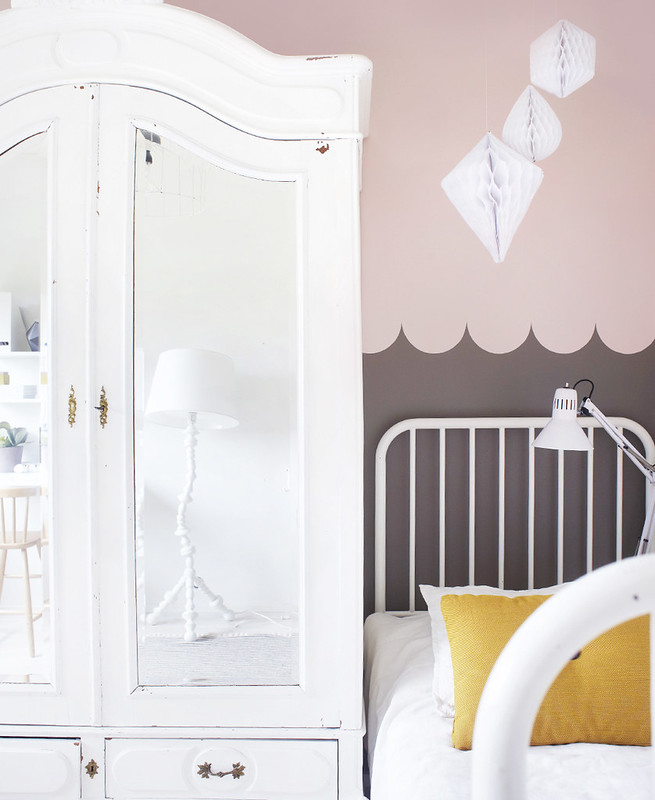
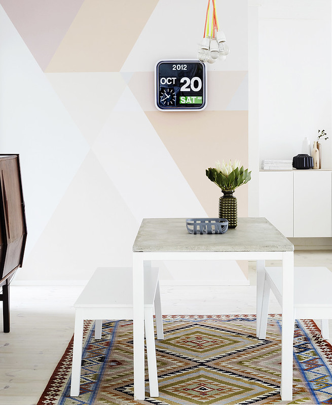
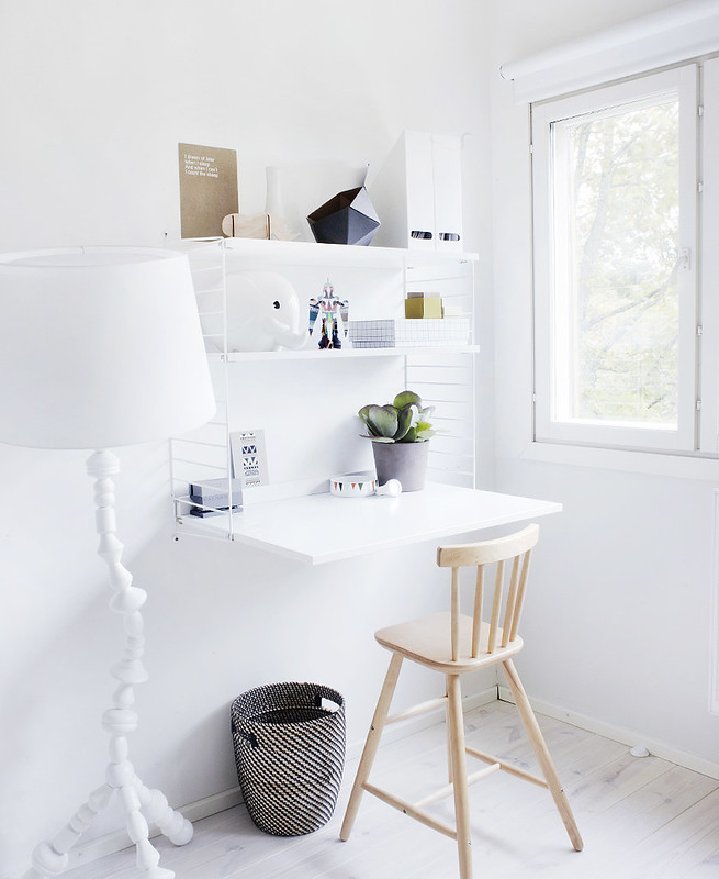
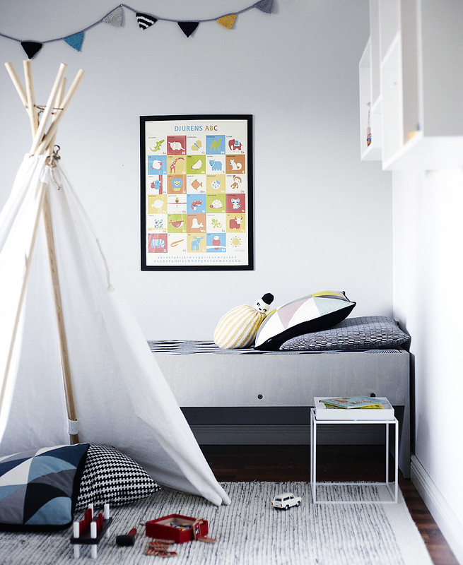
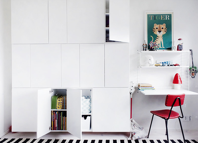
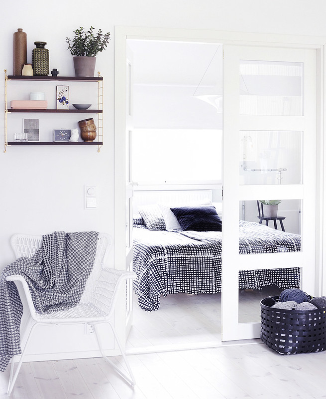
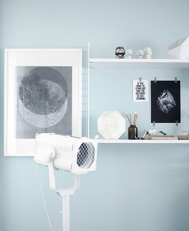
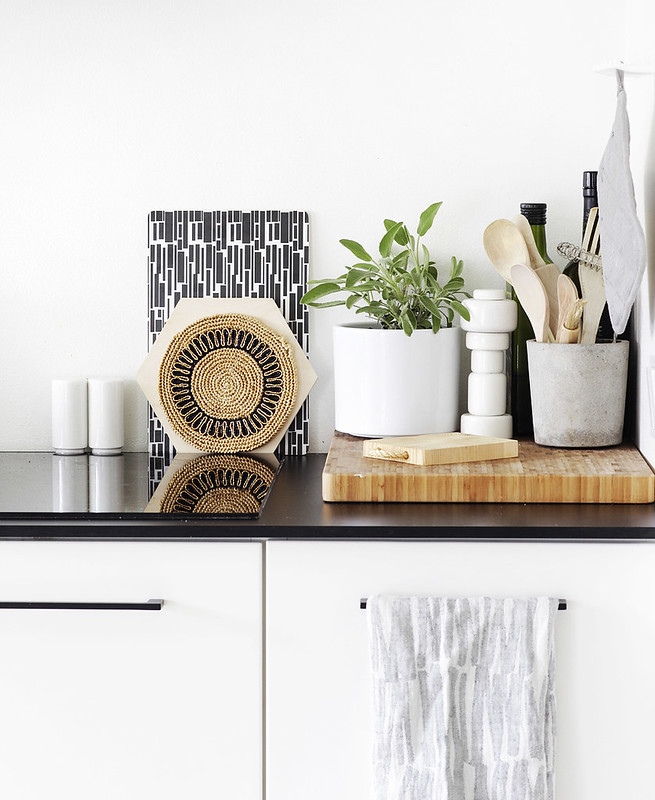
Are you familiar with Weekday Carnival, a Finnish blog authored by Riikka Kantinkoski, a talented photographer, designer and mother? She has an amazing knack for decorating her home in fact, I blogged about her over a year ago here but since she's done so much decorating over the past 14 months I have to share some updates from her gorgeous abode today. 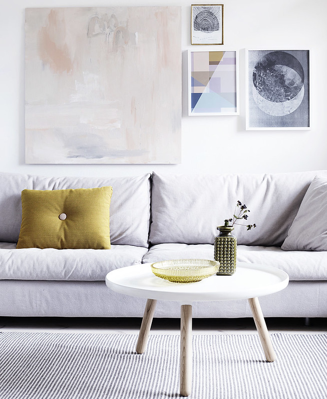
I just love seeing how she lives, I find her color palette (pastels with a shot of black) so mesmerizing and I love how tidy she appears. It's something to aspire to, for sure!
Riikka has a real eye for color and form but also a great ability to edit. Editing is the hardest job of any decorator - knowing when ENOUGH is truly ENOUGH. I think it's the toughest for any creative actually - knowing when to quit.
I see examples of poor editing all around me when I travel often in shops because they tend to overload the counters and shelves with product - items exploding all around - and shop owners wonder why no one buys anything and customers treats the store as a museum. That's most likely why. The Conran Shop in London does a terrific job stocking their shelves. They have a few of each item and that's it. Same with Anthropologie - there is A LOT of product but often they don't have 500 of the same thing. I walk into stores that often DO have 100 of the same cup on a shelf and I think WHY? This makes me feel like I have all the time in the world to buy that cup, I can come back for it in a month because they have plenty of them in stock! If they do (and some stores are more loaded than others) I often feel overwhelmed and leave empty-handed. Too many choices (think: Pinterest!) often leaves us stressed and worried that we won't make the right choice. With limitations, we have room to think and consider and decide. Space also allows for us to be creative.
Having the eye of an editor can help a shopowner as much as it can a homeowner. Knowing when to pause and say, "You know, this wall has ENOUGH art on it" or "This sofa has ENOUGH throw pillows" is a great skill. It also allows objects in your home to breath and stand out more - you can highlight your precious possessions this way as Riikka has in her Finnish home. Riikka's stunning home doesn't feel overwhelming, overloaded or crammed with stuff. It feels like there is movement and flow - so it's impossible for your decorating waters to stagnant with such movement. When a room is packed wall-to-wall it can quickly feel dated because there is no movement. You literally cannot move anything else into the space and you can barely fit in it yourself! This makes me think of shops that are so packed that you can barely move around. Stores like that make me want to leave as quickly as I've entered!
Please visit Weekday Carnival for inspiration, decorating ideas and loads of beautiful photos taken by mostly Riikka herself. Let the pages of her blog whisk you away but also inspire you to try a fresh approach to your own home. Maybe for 2013 we can "slim down" our spaces a wee bit so there is more movement in them, more flow, more space to breath so the creativity can flow? Hmmm. Something to consider for our resolution list, isn't it?
(images: Riikka Kantinkoski)
