Home Tour: Light Living Family Home
Happy Friday everyone! It’s Holly Marder here with another gorgeous home tour for you in the Netherlands for my Homes With Heart column on decor8! This time, I am taking you through a Scandinavian-style renovated family home in The Hague that I photographed so you are seeing the photos first here! Interior designer Hedda Pier and her husband Michiel Lenstra saw immediate potential when they first laid eyes on their three-story home dating back to the 1800s. Period details, space and light were a few key factors that sealed the deal, launching them into an experimental renovation which resulted in a well thought-out, not to mention gorgeous, home for their growing family.
Considering both aesthetics and functionality, they re-thought the entire layout of the house to maximize light and their quality of life as individuals and as a family. As Hedda operates her interior design business Saus Design from home, she placed her studio space right at the entrance. A large window facing the street floods the space with light and provides a cheerful place for Hedda to meet with prospective clients and carry out her design work.
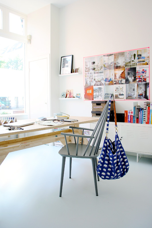
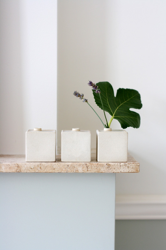
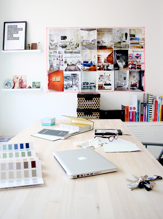
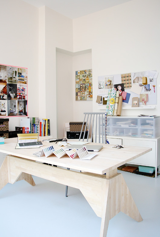
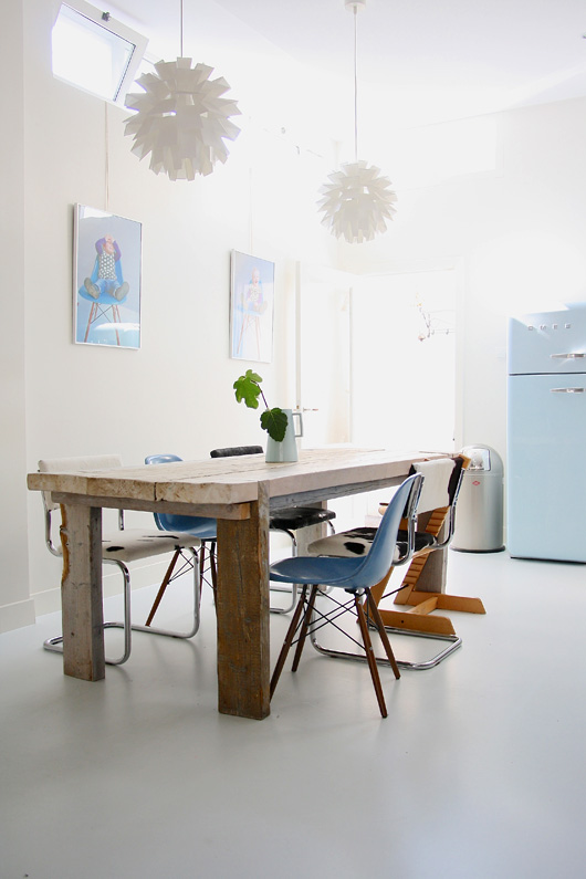
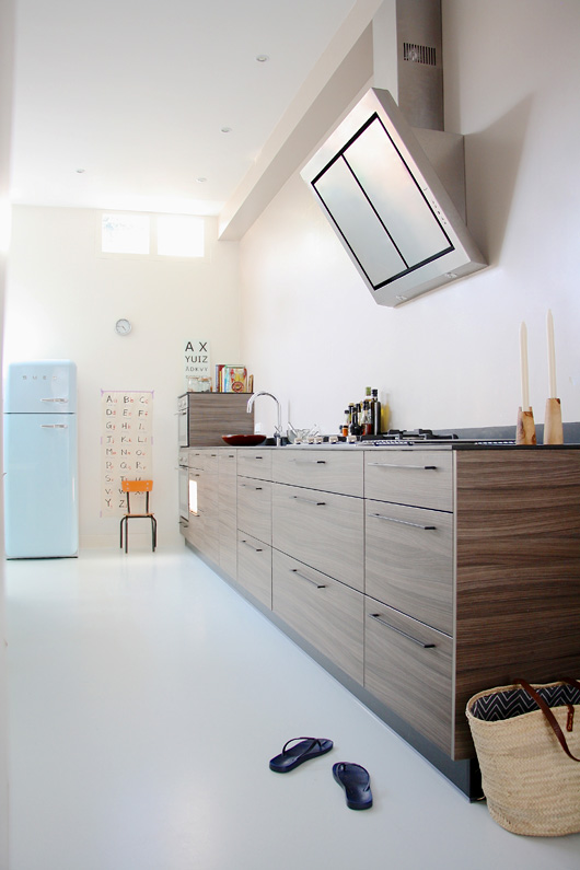
Through the office space is a contemporary live-in kitchen, which is where Hedda and Michiel spend most of their time as a family with their daughter Stella. An eclectic mix of chairs surround their custom made oak dining table. Though there were concerns that the kitchen would be too dark with small windows placed high up, Hedda is particularly proud of how the kitchen worked out. She owes much of the light and bright results to the clever use of fresh white and pale wood, with her signature blue accents (hello, gorgeous SMEG fridge and Eames chairs!).
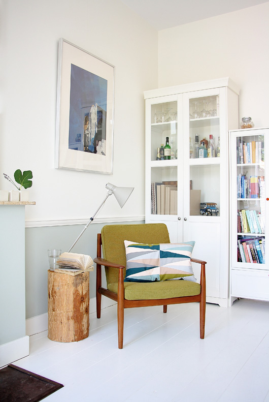
The living room on the first floor carries through Hedda’s Scandinavian style, with white painted floorboards, natural light by the bucket load and an eclectic mix of furnishings both old and new. Though they stripped the interior back to its bare bones during the renovation, Hedda and Michiel were careful to retain some of the property’s original charm. An original fireplace with marble mantel as well as classic cornicing echo the era in which the property was built. White painted wooden floorboards enable the couple’s many works of art to really stand out.
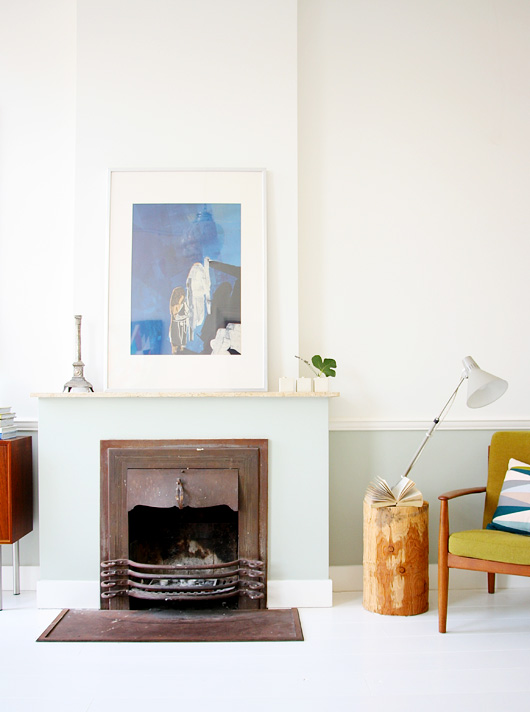
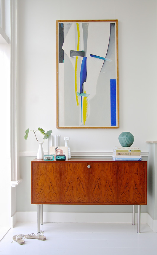
In the living room, they painted the lower half of the walls in Farrow & Ball’s ‘Mizzle’. I love how this muted color adds warmth and life to the space while complimenting the bolder teal and red highlights seen through the artworks and accessories.
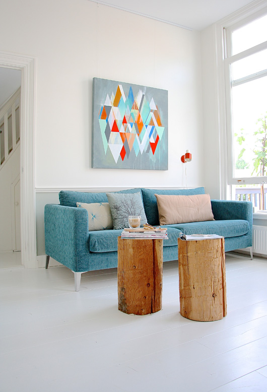
I also adore the vibrant artwork above the sofa, by Anna Taratiel from Battalion Gallery in Amsterdam.
From teal to turquoise, from sky to powder, Hedda’s obvious love affair for the color blue follows her to the master bedroom, where Piet Hein Eek’s ‘Scrapwood’ wallpaper adorning a singular wall commands the palette. Various shades of the cool hue are striking against charcoal bedding and white floors, while soft and floaty lace curtains add a feminine touch to the space.
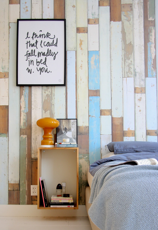
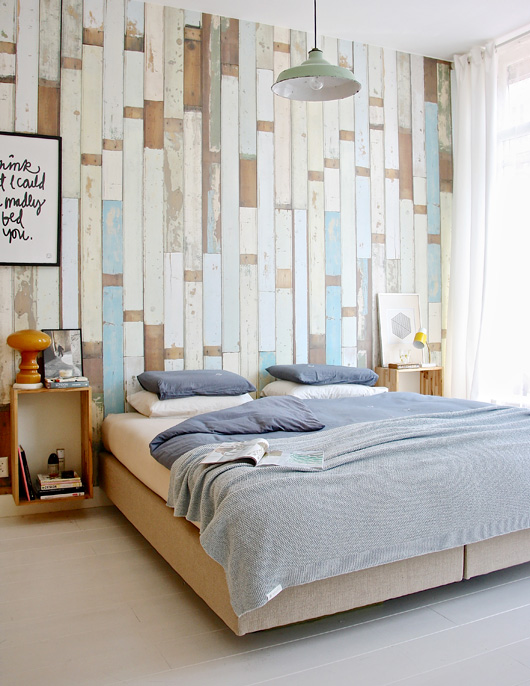
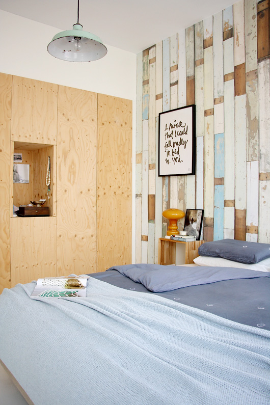
The couple chose to have built-in plywood wardrobes installed, much to their contractor’s hesitation Luckily, the end results are as fabulous as they are functional. When it comes to design choices made during the renovation, Hedda admits, “much of what we did was purely experimental.” The bedside tables were repurposed from old Ikea kitchen cabinets. Vintage accessories, such as the industrial pendant and yellow lamp on the bedside add a touch of fun. The print, I could fall madly in bed with you, is by Therese Sennerholt.
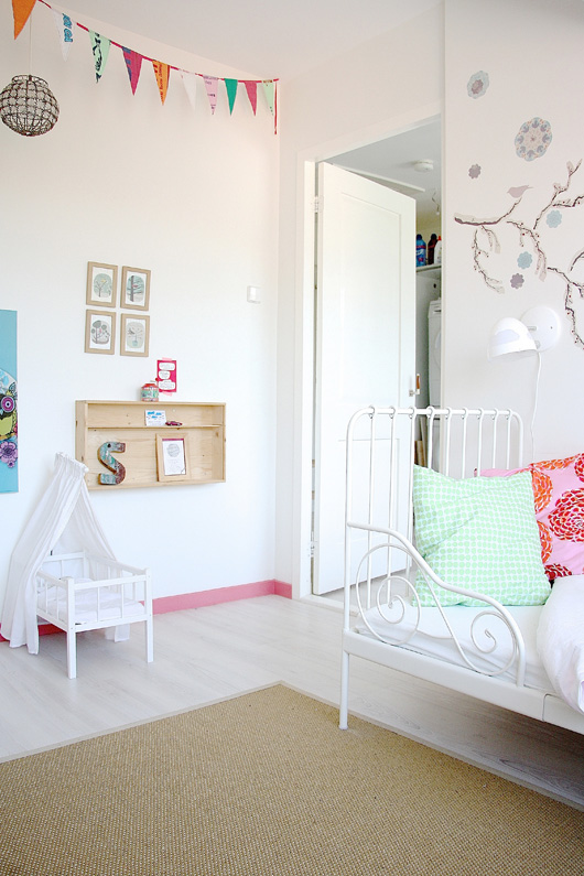
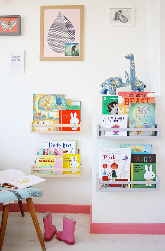
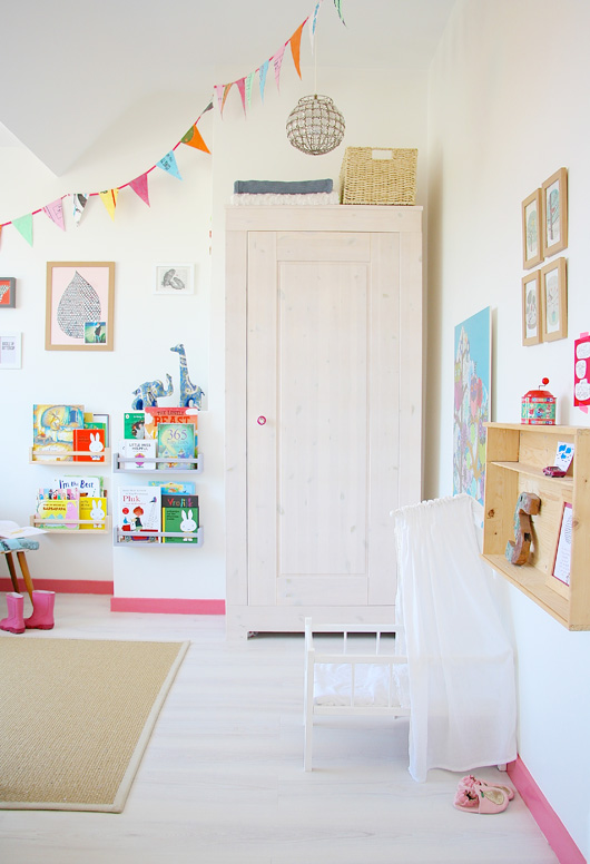
On the home’s third level, the couple’s daughter Stella enjoys a cheerful bedroom bursting with color and hand-crafted accessories. “Creating a happy but also functional space for Stella to enjoy was my main focus,” Hedda says. “All too often, people design their children’s rooms to echo their own style.” Low placed shelving enables Stella to easily reach books and toys, while pops of color positioned low add fun and visual interest.
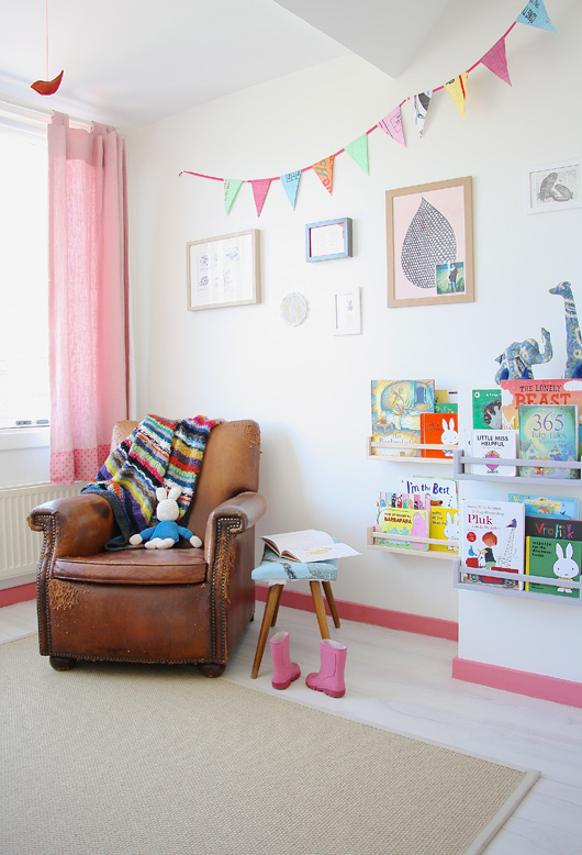
Wanna know my favorite item in the whole house? That gorgeous vintage cognac leather armchair, which Hedda gave to Michiel as a gift.
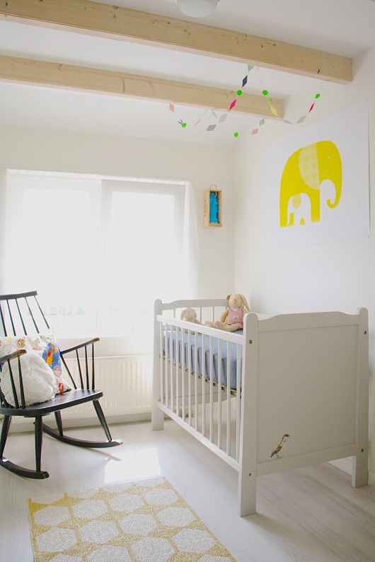
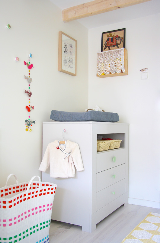
The latest addition to their home’s interior has been the creation of a bedroom for their second child, due this month. Not knowing the child's gender, they have gone with a neutral space with muted green and yellow as the primary colors, with a few vibrant colors thrown in for good measure. Exposed woodwork, fine lacy curtains and little hand-painted birds here and there give the space a soft, almost ethereal feel.
Hedda approaches all of her design work in much the same manner she did her own home - with a strong emphasis on functionality, the courage to experiment ever so slightly with a vibrant look and feel to finish things off. “My home is an extension of brand and my most successful experiment,” she says. A winning combination? I think so.
Tell me: what do you love about this home? I’d love to know.
Thanks for having me, Holly! See you all next month with anther inspiring interior! - Holly
(text/photos: holly marder)
