Home Tour: Nordic Simplicity
Hi guys! Would you like to see another home tour I've shot this month for decor8? It’s Holly Marder and I'm back with my Homes with Heart installment. Did you love last month’s black and white home? Well this time around, I have more Nordic interior inspiration, with a touch of colour dotted throughout. I hope you enjoy touring the home of Jessica Peters, the owner of the online interiors boutique DesignLemonade. Let’s go! 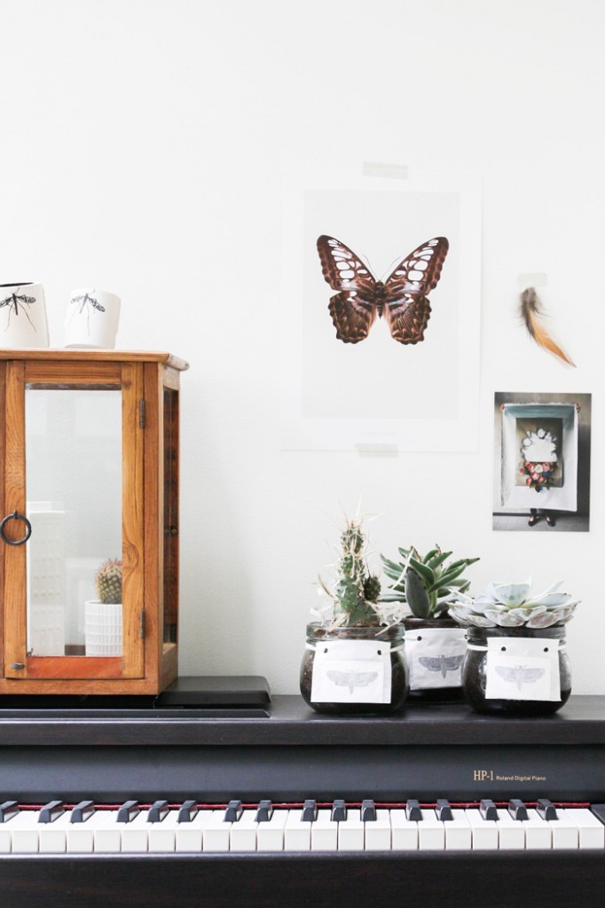
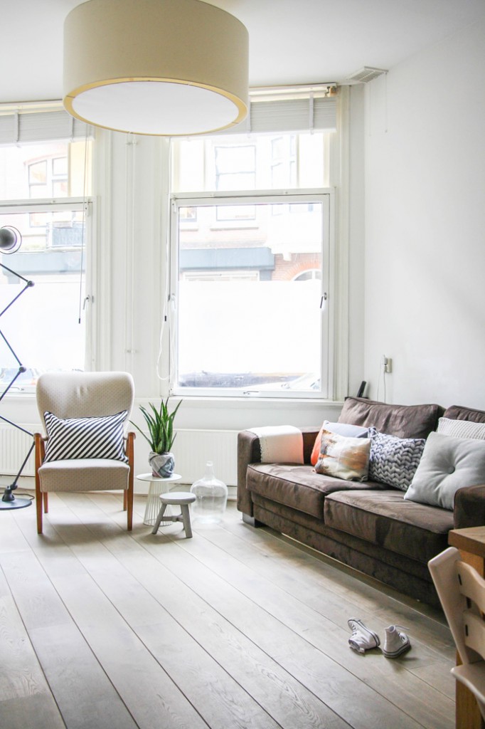
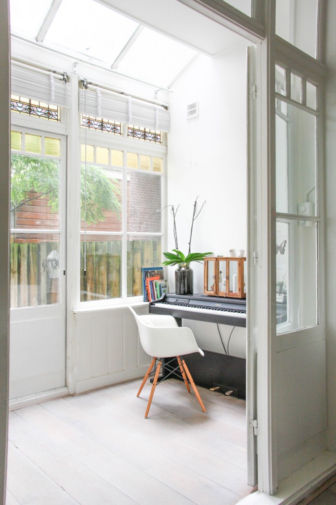
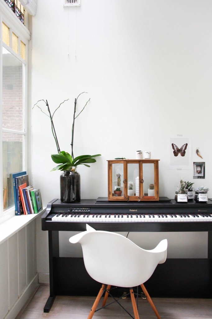
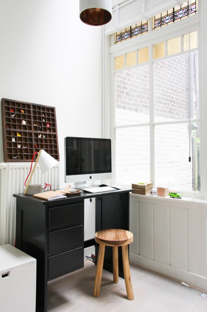
After a long and tiring house hunt, Jessica Peters and her husband Olivier Tardieu fell in love with the historical appeal of their 92m2 Amsterdam home. Majestic, authentic door frames leading out to an elegant closed verandah with quaint window frames and original stained glass were some of the details that caught the couple’s eye, just enough for Peters to see through the uninspiring wall colour, lack of flooring and less than ideal kitchen and bathroom. “It was so basic that there was room to make it ours - and the moment I saw the house I thought, ‘this is perfect.’”
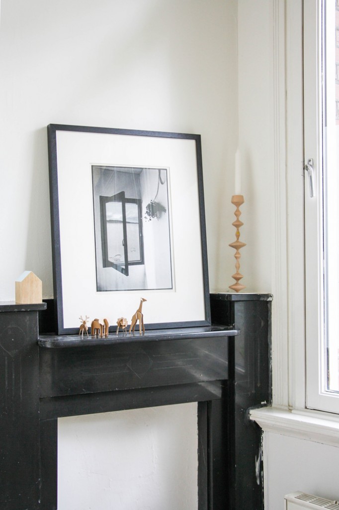
The fine art black and white photograph perched on the fireplace is a personal favourite, displaying a set of open windows. “It feels as though it gives the room an open, airy quality. It is very hard to find authentic, easy, simple pieces to put on your walls, so I’m glad I found it,” she says.
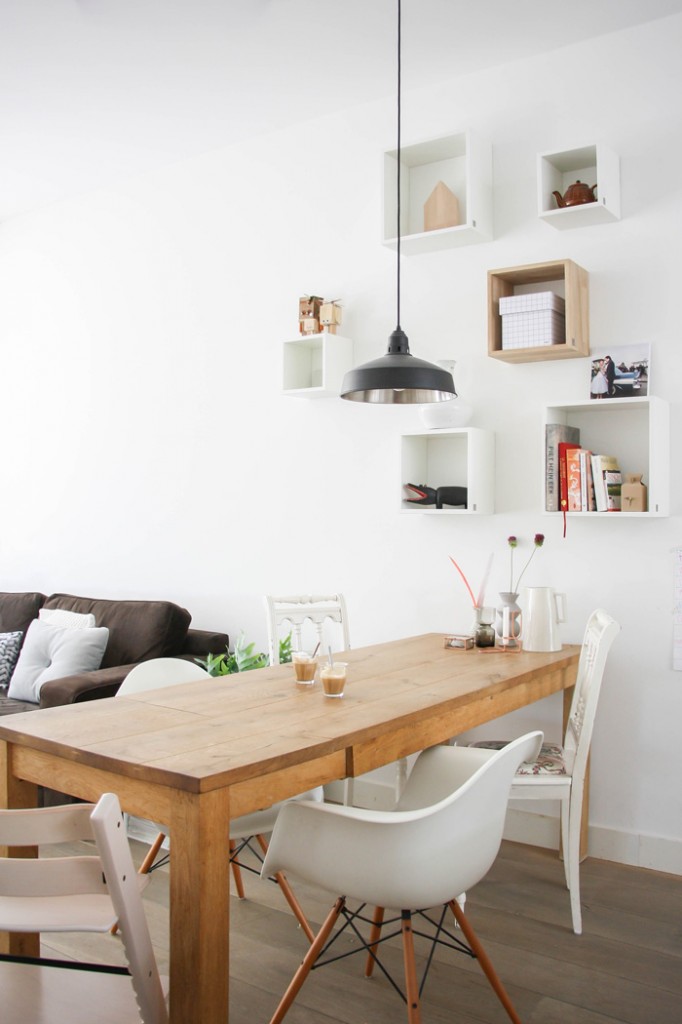
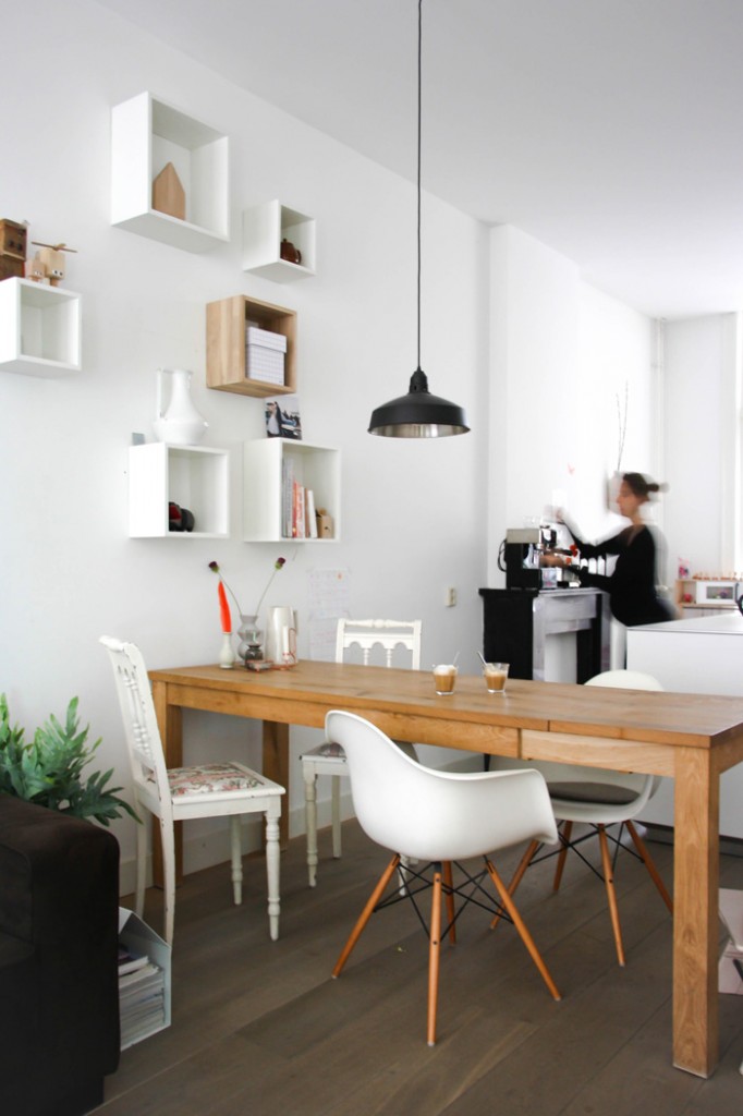
The couple began renovating the home in stages, starting with the kitchen. They wanted a live-in kitchen central to the main living area to bridge the living and work spaces. Offsetting their home’s historical architecture, they chose a sleek, minimalistic kitchen with plenty of storage in the centre island so that the walls would be free of cabinets and the space would remain open. Being a classic ‘Pijpenla’ home (which means a narrow drawer-like home typical to Amsterdam), the middle of the house is very dark but large windows infuse each end with light, so keeping the kitchen as sleek as possible was important to ensure the natural light in the space was not compromised.
“I wanted the kitchen to be a real piece of furniture in the living room. We chose an elegant design. Everything is very slender, which I feel corresponds with the stained glass, narrow window frames of the verandah, and the original details.”
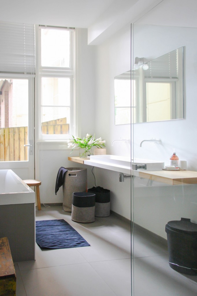
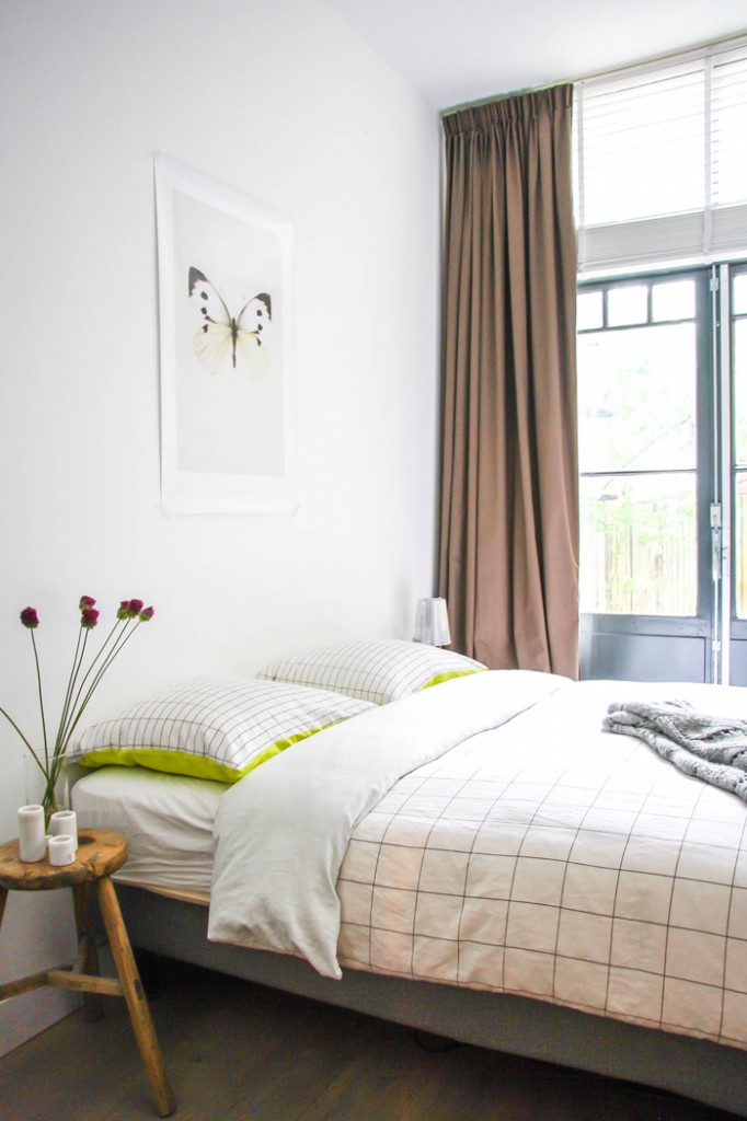
In the space of three months the couple changed the entire layout of their home to end up with the current design. In the initial layout, the bedroom was where the bathroom now is, and the kitchen is what is now the bathroom. Rethinking the layout and centralising the kitchen meant the couple had gained the space for a large family bathroom, which they realised three years into owning their home. “We were young and were on a very limited budget as I began studying shortly after we bought the house,” Peters says.
With a keen eye for Dutch design and a love of the Scandinavian decorating ethos that relies primarily on light and furniture basics, Peters has infused their historical home with “a fresh mix of design items and basics, old items and new.” Starting her webshop nearly 3 years ago inspired Peters to give her home a fresh new look, but she also draws her inspiration from blogs. “I love to read home tours and peek into the homes of real people, as well as what designers (Dutch in particular) are doing and their style,” she says. “There’s something about the Dutch design style - such as that of Ontwerpduo and Scholten & Baijings - that I love. Perhaps it’s their use of colour. Their designs are fairytale like, whimsical and lighthearted, whereas Scandinavian style is more basic and solid.” Striking the perfect balance between the two styles is something that Peters aims to achieve in her own home.
Keeping the look evenly distributed throughout each room is how Peters maintains the natural flow of her home. “I try to balance out the use of colour and materials in my home,” she explains. “I try to make sure that pieces and colours correspond with one another in the space.”
When it comes to colour, Peters prefers to layer in increments through accessories, keeping the base neutral. I am non-committal when it comes to colour,” she explains. “I use authenitc styles, colours and muted tones so I don’t get bored.” Peters adds shocks of colour through art that can be easily replaced, florals and accessories such as cushions. “I still love the red lamps above the kitchen island. They are really fresh, being the only shock of colour in the room.”
Pieces that trigger an emotional response are a sure to make their way into the shop owner’s home. “When I see something that I feel has a poetic quality, I buy it. I like to collect small items that were handed down with a story attached to them.” While key pieces are brought in for their basic quality, Peters enjoys filling her home with quirky treasures that add personality. “I get bored easily, so it would need to be a very special item for me to keep it,” she says. “I prefer collecting little special knick-knacks, which I find at flea markets and more special boutiques.”
What do you love most about Jessica Peter’s home? Do you feel like packing up and moving to Amsterdam, or what?
See you back here in April with another gorgeous home tour! - Holly
(photos/text Holly Marder)
--------
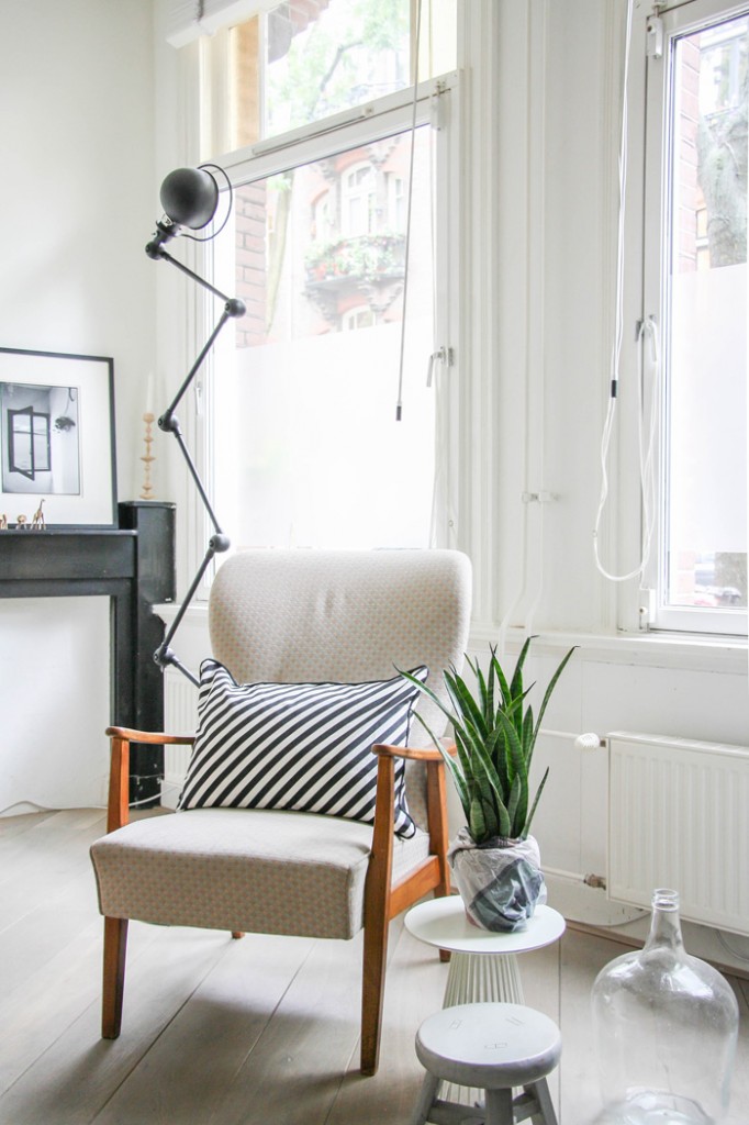
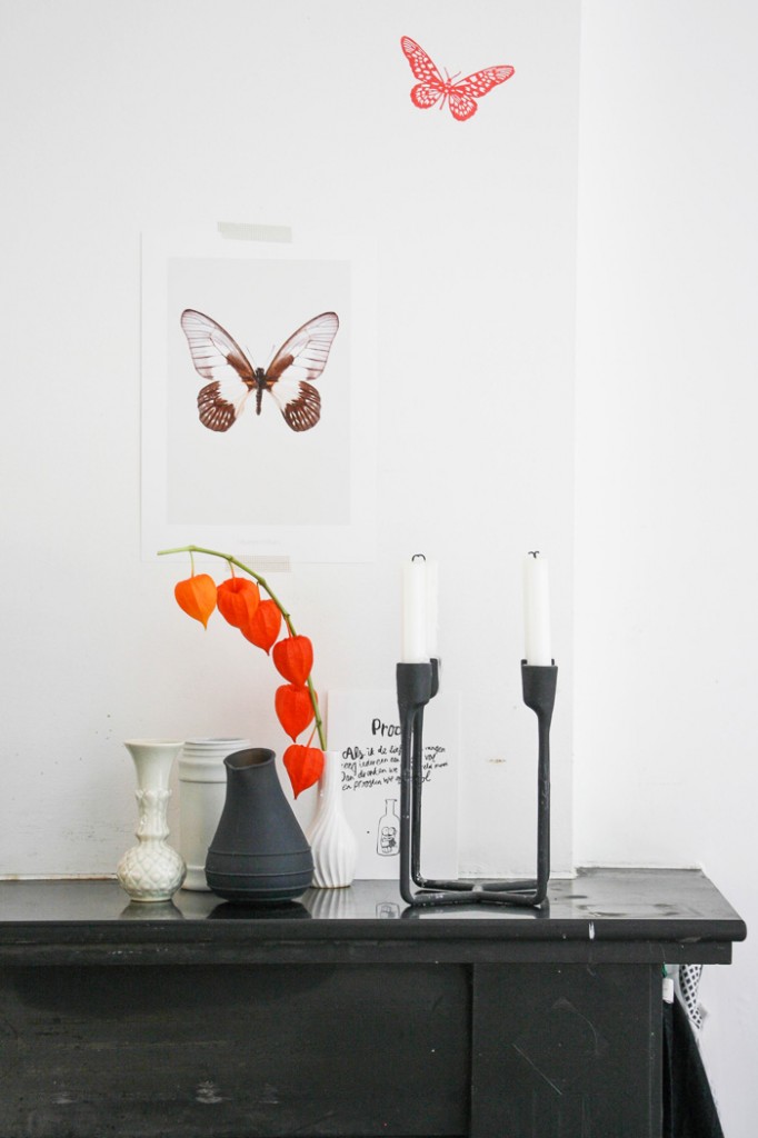
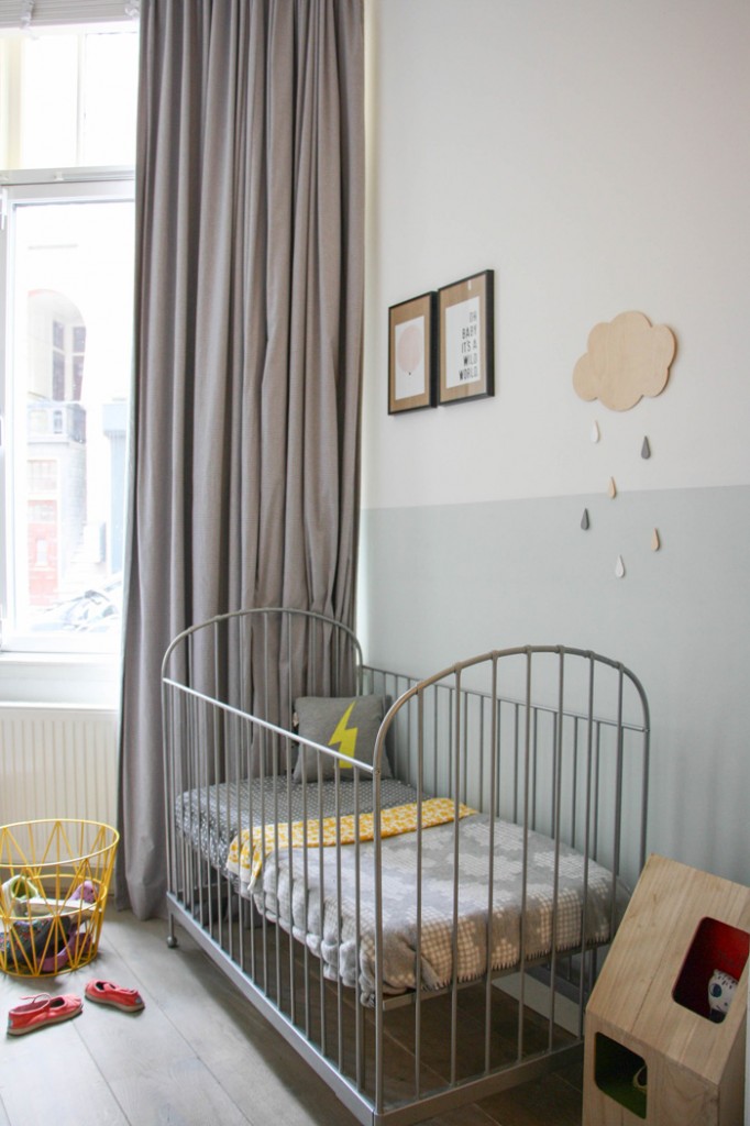
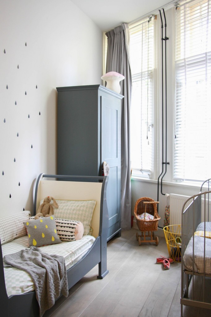
Spot something you love in this home? Here are the resources: - TV cabinet: custom made; poster Ladybug; poster 'NON': Sarah & Bendrix Etsy; photograph of window: Kunstuitleen; wooden candleholder: Perles; Vintage fauteuil: thrift shop Amsterdam; black lamp Jielde via Fens Decor; cushions: Ferm Living, Snurk, HAY, Chocolate Creative all via DesignLemonade; dining table: custom made in Amsterdam; chairs: flea market finds, Vitra via Loods 5; wooden houses Applicata; wooden dolls 'Woody' by Dutch twins designers ' Tweelink'; black hippo: purchased on a family trip to Mozambique; chest of drawers: Ontwerpduo via Friday Next; lamp 'Anything but a vase' from Arnhems Keramiek Atelier; Kitchen: Bulthaup via Ekelhoff (Germany); lamps above kitchen: Campari lights by Ingo Maurer; school blackboard: made from an old door and painted with blackboard-paint; white wall vases: Sofie Boonman; bathroom sink: Marike Andeweg / www.notonlywhite.com; bathroom hardware: VOLA; butterfly poster: Hagedornhagen; copper candleholder: HAY; bed linen: HAY; hallway chest: Van Dijk & Ko; art 'passing sentence' (terloopse zinnen): Simone de Jong; kids beds: second hand; grey wardrobe: Loods5; toy cabinet: Van Dijk & Ko.
