Covet Garden Home: Special Print Edition
Hello everyone and happy Friday! How are you today? I'm feeling great because the heat has lifted and the weather is sublime which greatly impacts how I feel. And now I can take my little one outside - when it's boiling I have no will and he seems to hate sweating too, so we play indoors and he hangs out in mommy's work studio. The weekend is here so we're hoping to hit some flea markets and festivals like the Maschseefest which I just love - it's a huge open air festival around this massive lake in the center of our city with food and music and this year, they've totally changed the format to include foods for more diverse palates like mine, so I'm excited to see what they have. You can follow me on Instagram to check out my fest photos this weekend if you'd like. So, let's talk about beautiful rooms shall we?

I was thrilled (and little Aidan was very curious!) when Covet Garden Home sent a copy of their gorgeous magazine in print. They usually publish online (see all of their issues here on ISSUU), so holding it in my hands was a first for me and a really beautiful moment. I wasn't into digital magazines at all, I couldn't connect and couldn't really save anything from them, so I normally bypassed digi mags for print or just went to Pinterest for inspiration. BUT Issuu has a new "Clip" option for viewing digital magazines, which has totally changed the game for me and I'm suddenly a big fan of digital magazines on Issuu at least. I digress...
Anyway, until now, Covet Garden never hit my radar but now that they've released this print issue (below) and Issuu (which is their viewing platform) has Clip, I'm a brand new fan and totally absorbed.
As I went through the issue, I fell in love with the home stories that ranged from family nests to small spaces for artists and larger ones for couples who sought peace in the countryside. I found myself drawn to the more natural palettes with quirky handmade touches and a mix of styles, so I asked Covet Garden if I could show some of my favorite rooms for this blog post and to my delight, they were happy to do so.

This special print edition is so beautifully done, I'd like to congratulate Lynda Felton (co-editor, content lead, stylist), Jessica Reid (co-editor, creative director), and Rhonda Riche (co-editor, features editor, writer) for pulling this off. With their combined talents and rich professional backgrounds, they've managed to pull together a winning piece of quality work. I also LOVE that they were able to make this issue come to life through crowd funding on IndieGoGo where they raised $20,230 (CAD) from friends and fans. I absolutely love the concept of crowd funding GOOD ideas (there is a lot of crap to filter through on these sites more and more but some real gems definitely exist) and adore the thought of having your fans and friends financially back your work, this is a positive and rewarding way to launch a product or service that you may not be able to fund yourself but also it adds that market research component - you get to see if something has legs before you invest in it. If people don't back you, it may not be the right product, the right timing, or both. Then you have to tweak and try again or move on to another idea. But at least you didn't go into debt learning your lesson.
Here is another room below from Covet Garden that I love. I think it's that very industrial architecture combined with a very traditional decor - it's such an unexpected mix, it threw me off at first - made me look twice, and I like that. It's daring.
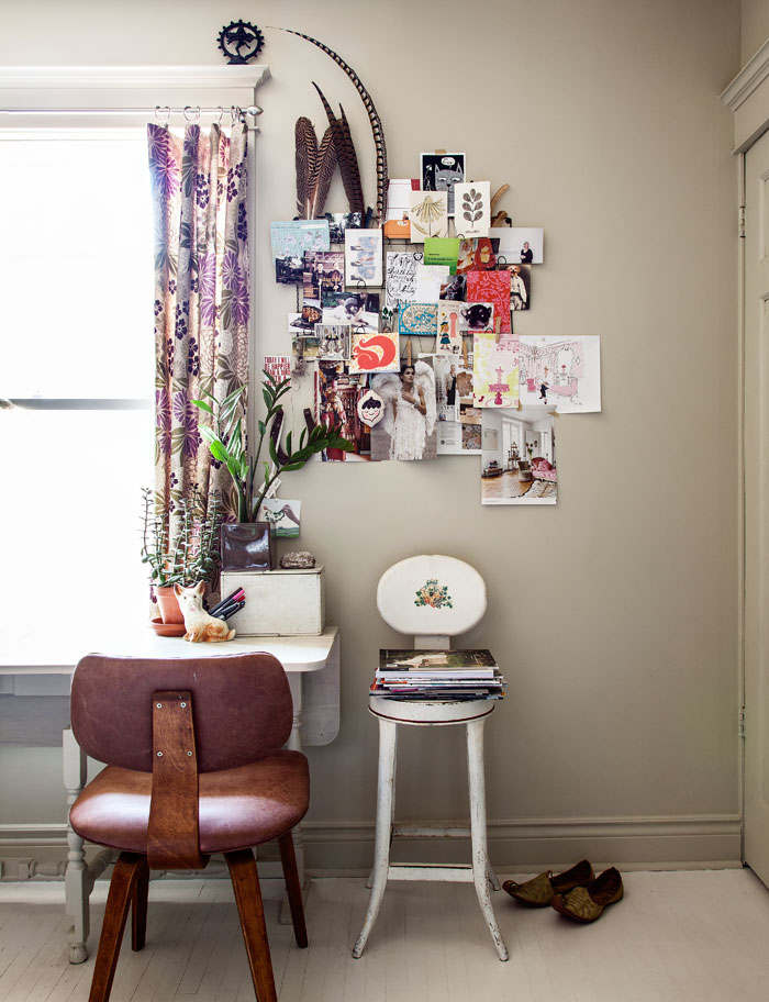
This sweet stool combined with that postcard holder for the wall is a sweet duo. I like showing art, postcards, notes, etc. this way - open, casual, creative and gives visitors a chance to touch your beloved favorites - it doesn't feel too precious.
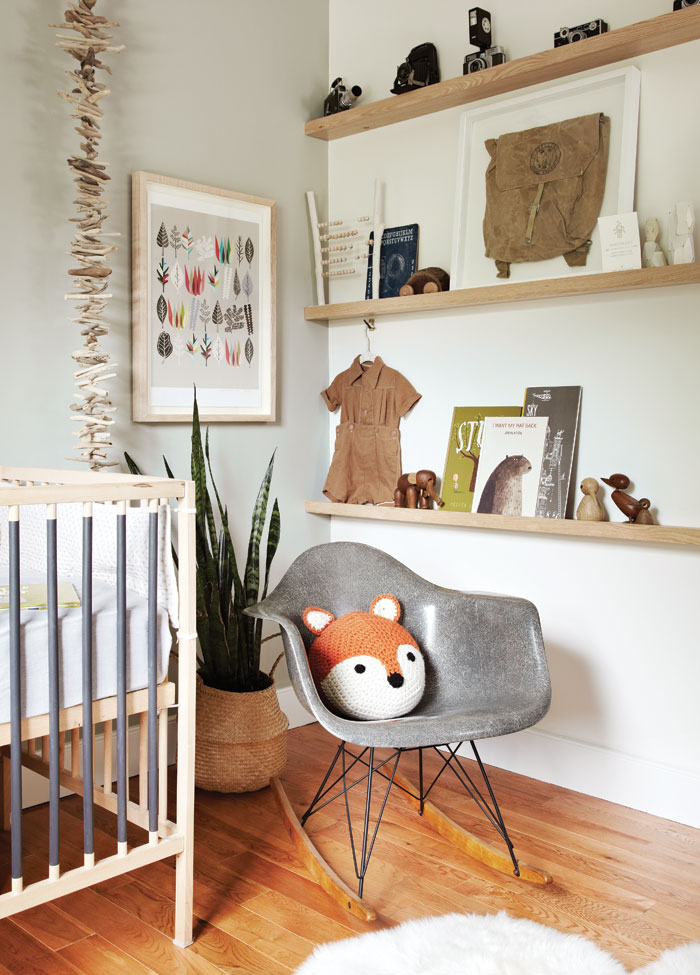
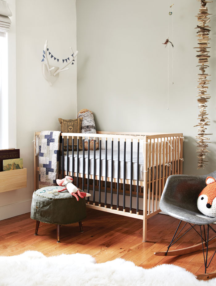
I don't know if the homeowner painted those crib rails but if she did, it's a really cool idea. If not, then I guess it's worth a try if you use non-toxic paint and your baby isn't a railing chewer as I read some babies can be. I love the naturalness of this nook. Crib bumpers are risky, but it seems in Canadian publications (which this is) crib bumpers are kept in baby room photos (in Germany too), but in the USA magazines have asked me to remove all bedding (I don't have bumpers) in order for them to run the photo. Interesting isn't it? Of course, it's for baby safety and SIDS, but still interesting... Anyway, this nursery is gorgeous and I love it.
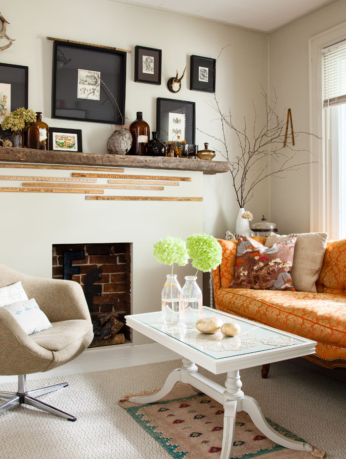
Yardsticks on the fireplace surround, black matted framed artwork, that cool couch, the tiny rug below the sofa table which breaks ALL of the boring design rules out there about "proper" rug size... What is NOT to like about this tiny living room? It really grabbed my heart. It feels so warm and inviting. The homeowner is clearly clever and creative.
Ok I'm going to be adventurous here and say I love this dining room, because I do, but I still am NOT SURE I COULD EAT around all of those insects mounted on the wall in shadow boxes. Could you? Or am I being a wimp here?
Are you a fan of Covet Garden Home magazine? If so, get your print edition while it lasts and support this wonderful home-grown business. You will love the issue and home stories (and NO ads!), I promise!
(images: covet garden - Donna Griffith and Jodi Pudge)


