Muuto Newbies
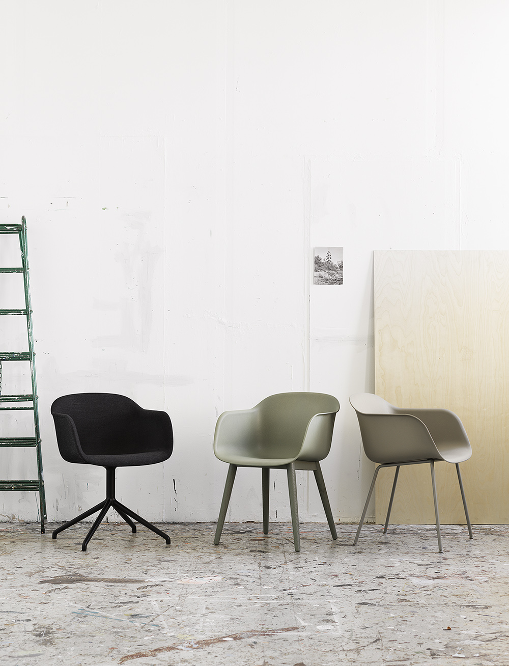
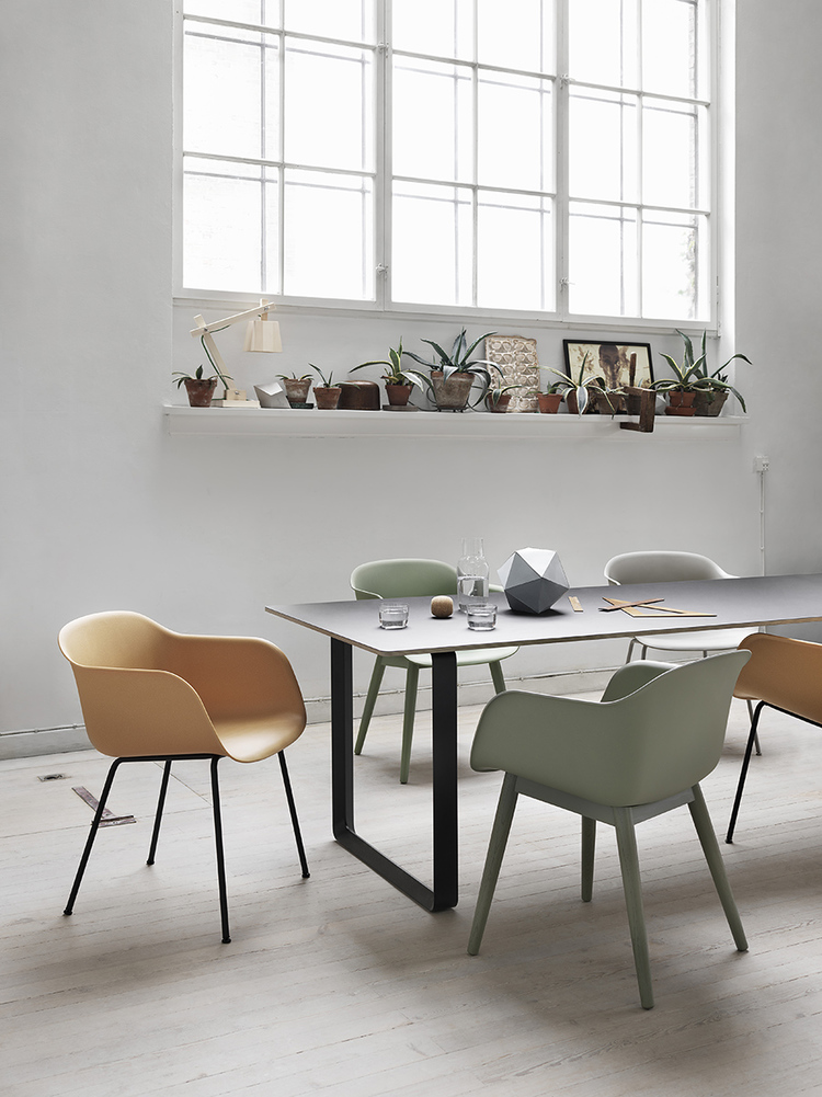
It's no secret that I love Danish design firm Muuto and have for several years now. They've just launched a new collection including the Base table, and have expanded the colors for the Stacked storage system (I have the stacked system and love it). They've also added new colors for their Fiber chairs and those colors are not primary brights but rather understated and mellow hues.


Isn't that dining room at the very top of this post so pretty? Especially with the cotton candy styled into the shot. Very cute and original. I love examining the details when I see photographs from catalogs and magazines, don't you?
With interiors, I've noticed that happy brights are quickly becoming passé, I don't see them trending nearly as much for 2015 and even Scandinavia, home of bold patterns and primary hues, seem to have taken a turn for a more grown up, sophisticated interior scheme. Consumers are quickly tiring with primary brassy bolds. I'm all about moody hues, grown up decor, organic shapes and well-crafted handmade items, mixing textures, working with a variety of tints and tones, adding metallics for some flair... But bold brights are but definitely not my thing. Just thinking about bright pure color right now stresses me out. It must be a winter thing. I crave warmth, texture, color that makes me feel more romantic, raw and pure.
(images: muuto)
