17 Tips For A Beautiful, Organized Office Space
My friend Holly Marder, who lives in the Netherlands, has such a beautiful home-based office that I thought I'd share a tour of it with you today along with my 17 tips for a beautiful, practical office space that I took from each view of her space. Located on the top floor of her home, this open concept, large loft space is flooded with natural light and as a stylist and photographer, Ms. Marder definitely required this for her work. I visited her here last summer and just loved it! It feels like the best spot to be creative and that is exactly what she uses it for. From her client work to her photography and writing assignments, it's the place where all of her creative ideas see the light of day and where others are born. Would you fancy a look?

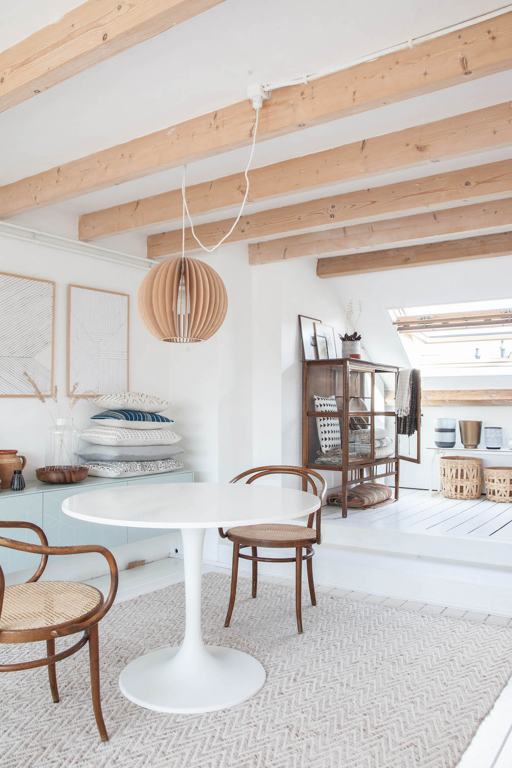
1. Neutral palette - I love how neutral and natural everything looks while also feeling very modern, light and fresh.
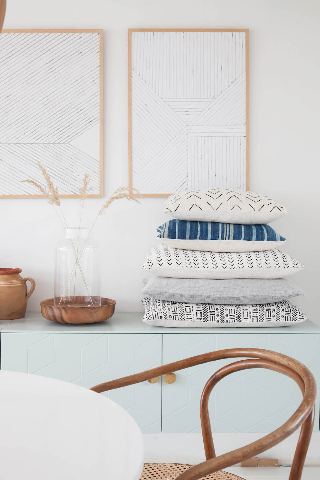
2. Lots of pattern - From the weave on the chair seat to the subtle pattern on the Superfront cabinet, the herringbone patterned rug, the wood grain on furniture and accessories, the beams in the ceiling, lines in the floorboards, watercolor prints by Silke Bonde that are available at The Poster Club (I also have these in my home), and the cushion covers (many of which are African Mud Cloth, I get mine on Etsy at Homegirl Collection and One Fine Nest), there is an abundance of pattern in this room - mostly subtle, but sometimes bold. The mix keeps the room tranquil but still lends a cozy vibe and keeps the space from looking boring which can easily happen in mostly white or neutral rooms.

3. Accent piece/s - This cabinet by Superfront is a real stand out piece despite being subtle, it's still very noticeable when you enter the space. It's unique and the minty color is just fabulous combined with those perfect brass handles.
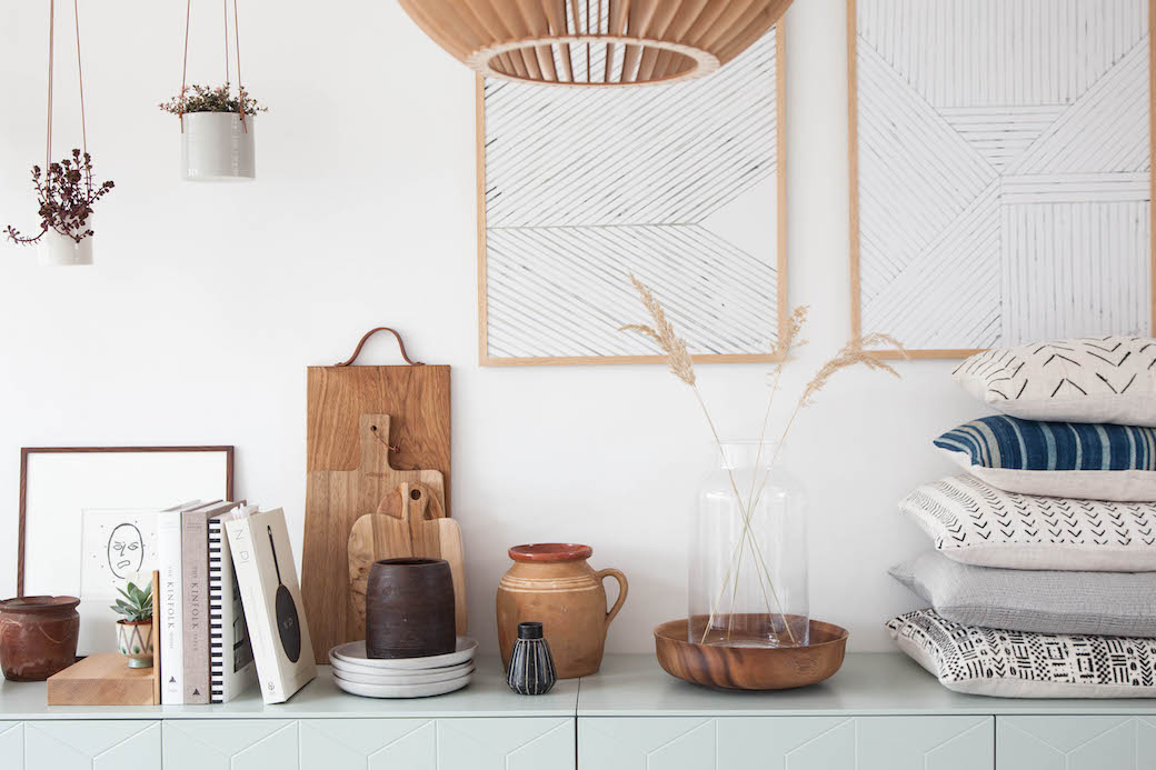
4. Organized - This space has a sense of clarity and openness yet it's not entirely empty - there are things out and displayed yet they are stacked and positioned so neatly and with great care, so you feel more like you have entered a retail space and not so much like the prop space of a stylist where things are constantly being rotated in and out according to her client's orders.
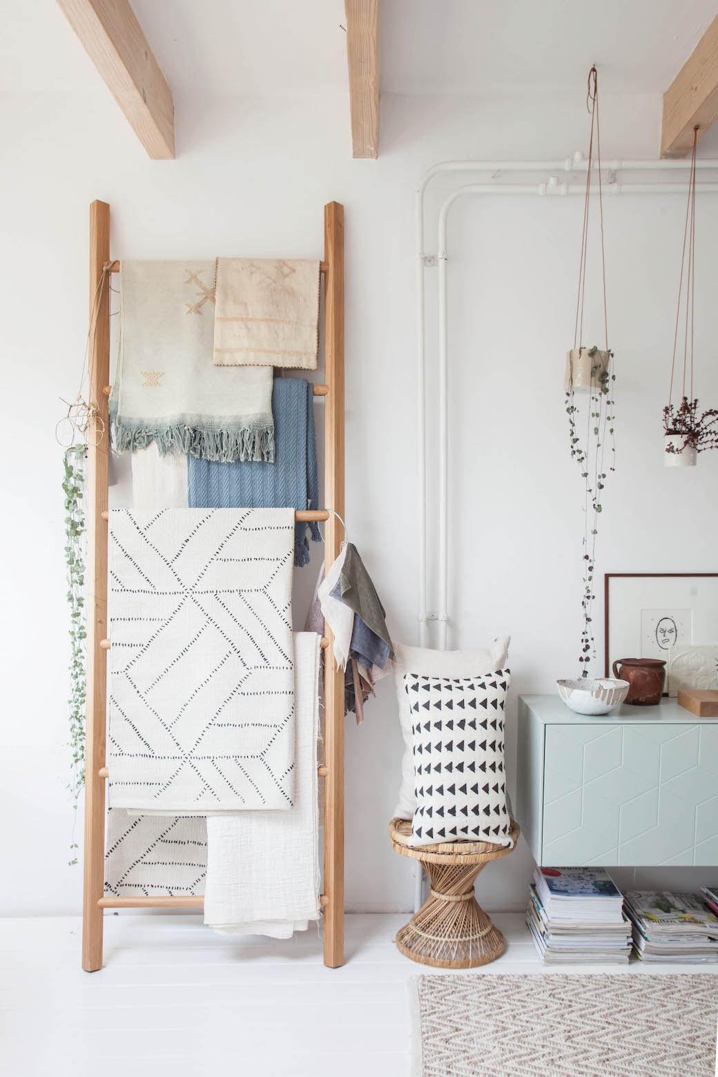
5. Open storage - I really like how Ms. Marder uses every chance to showcase the things she loves and to tuck away the bits she doesn't. These fabrics, some from Molle, are far too pretty to place inside of a cabinet, so she has displayed them on this wooden leaning rack by Walden.
6. Texture - Holly has a nice mix of texture in the space from wood to ceramics and textiles. Some of her ceramics from Anne Black and just gorgeous. Mixing in ceramics always brings in a sense of personality but also warmth, especially pieces that look made by hand versus mass produced and perfect.

7. Lighting - I can't say how much I love how her space is bathed in natural daylight. It's just gorgeous, isn't it? And I love her lamps and pendant lighting too in brass and wood (wood pendant over her round table is by Iumi, wall scone by Schoolhouse Electric and desk lamp from House Doctor). Natural light doesn't always come easily. Sometimes you have to remove a wall, pop in a skylight, remove heavy window treatments opting for lighter ones (i.e. simple roman shade), even install windows or replace old ones with those that allow in more light. There is usually expense involved in making your home light and bright when you aren't blessed with natural light. No matter the expense or hassle though, it's worth it if your mood and work depend on it.
Note: Look at this room before (HERE) and (HERE). See what I mean? A white wooden floor bounced the natural light back up and painting the walls made it even brighter so those two tricks really gave the loft an airy, bright mood. Definitely worth the time and expense to renovate.
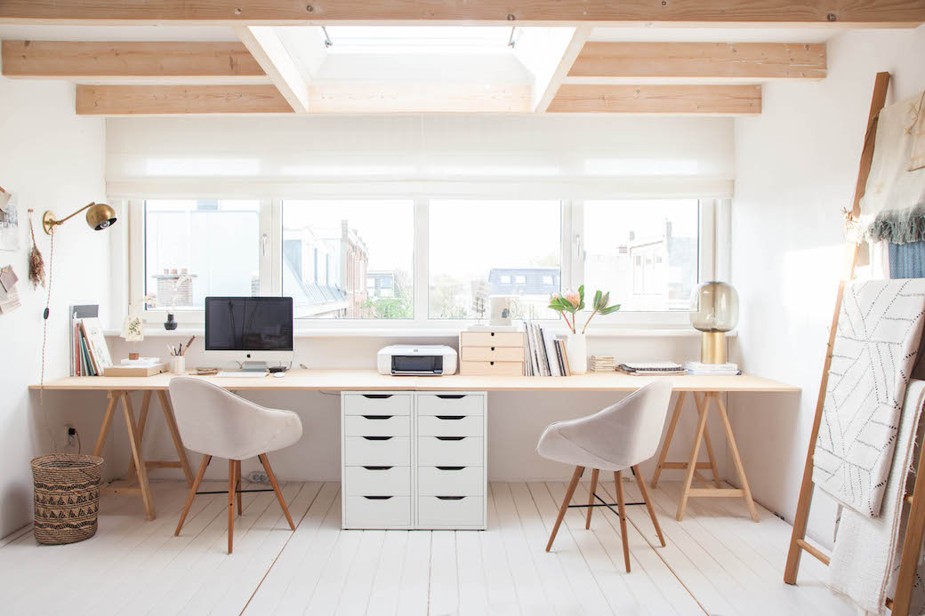
8. Massive desk area - I have had a full wall with my desk like this for the past 5 years and I honestly could never go back to working on a single desk. I love it so much and I find that most creatives, after they try it, also can't go back to working on a single desk. To spread all of your work out on a surface and be able to stand and move around as you shuffle papers and work - it's great. Add good music to the mix and the basic tools you need to work (printer, computer, paper, etc.) and you've got everything you need.
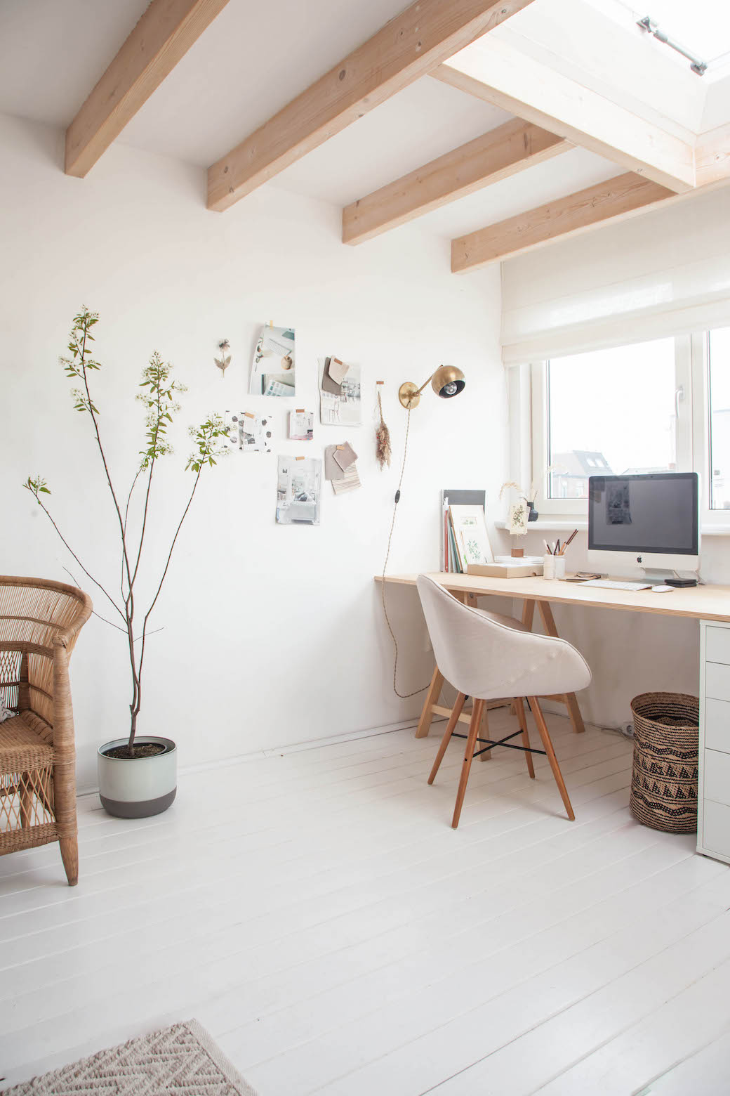
9. Open Space. When I look at this office, I don't feel like it's packed. I don't feel overwhelmed or stressed. I don't feel like there isn't a way to quickly transform it for a workshop or photo shoot or to welcome a client. It does feel very flexible and open. I like this sense of open space. Everything feels like it can be moved around and used in a new way. Even her desk - nothing except her minty green cabinet is screwed into a wall. Everything else can be moved about so she has total creative freedom here.
Note: You can see how this space has been used in the past for workshops (HERE) and (HERE).
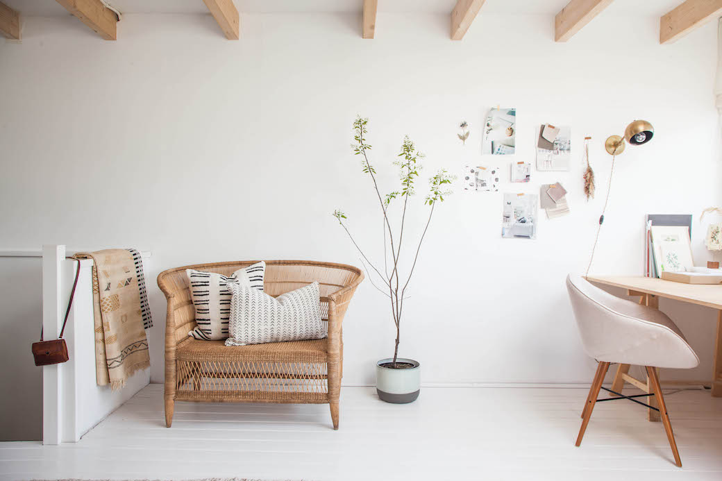
10. Character. This sofa! I really adore this wicker sofa, more than I should because it's a special piece and I'll most likely never be able to find one like it. But I do adore it. And this is what every room needs, those special pieces that only you can have and that are special - you sourced it from a flea market, it was handed down from family, a few pieces that have a story to tell. They add soul.
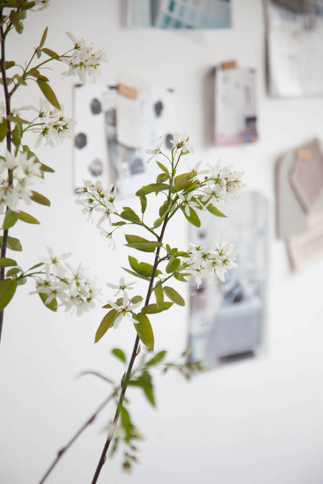
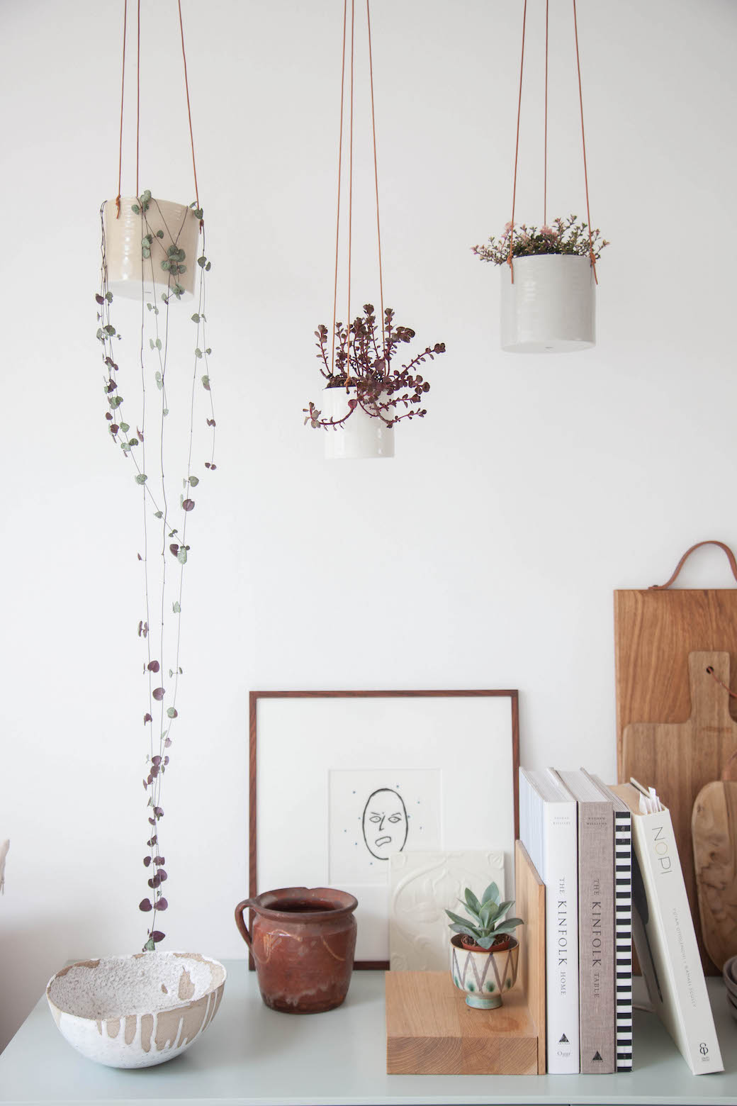
11. Fresh Greens - While not the focus in the room, I like how she has added some plants in the space to bring in some natural greenery and life. When it comes to plants, I'm a bit of a minimalist and though jungle fever is trending and I love how it looks in the homes of others, I prefer only a few per room. Same goes for flowers, I like some dotted around a space - mostly those that look fresh picked from an English garden, but I'm also not into perfect arrangements that overtake a space.

12. Mood board. I know everyone organizes their thoughts differently, I admit to using Pinterest more than pinning on my own walls these days, but I still love a nice arrangement of things pinned to a wall near my computer. It gives my eye a place to rest during the day that often centers me and helps clear my mind.
13. Texture. When you have texture, you bring in warmth. The more natural texture (vs man-made cheap synthetics) the better - wood, wool, clay, wicker, straw, cane. It also adds dimension and makes you feel good. Stepping on a soft wooly rug with bare feet is so nice in any season.
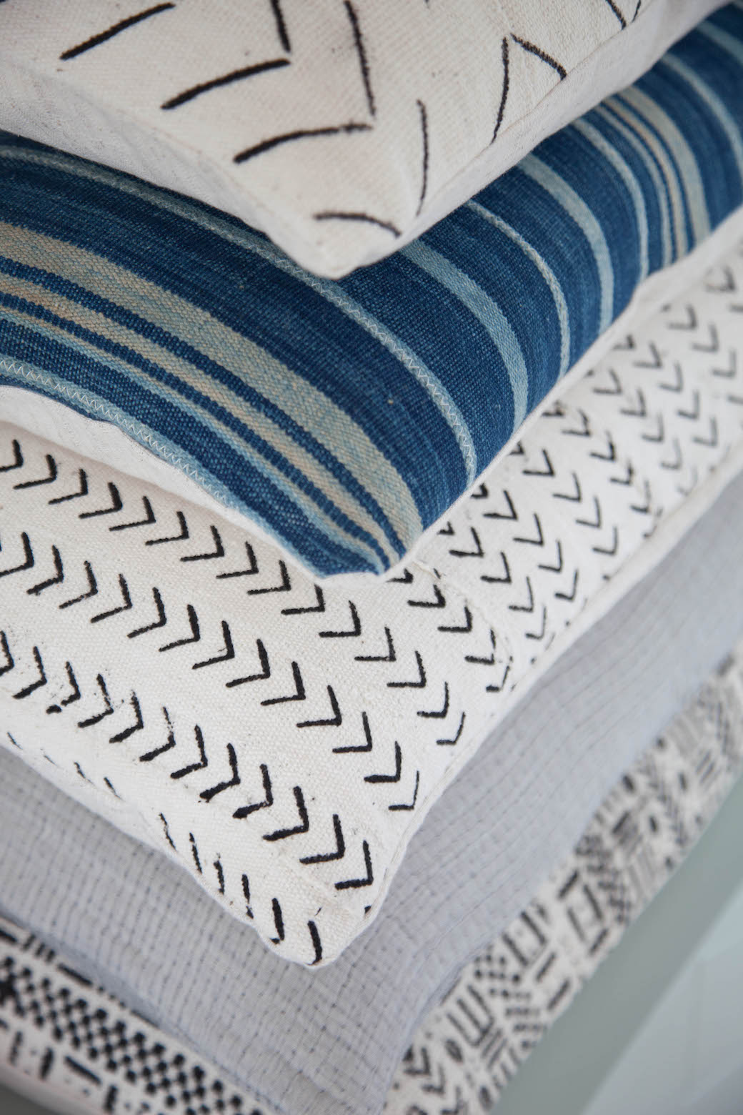
14. Pillows. Maybe it's the American in me, but I love throw pillows. Stacked on a cabinet, in a cabinet, positioned nicely on a chair or sofa, on my bed, on the floor - I really enjoy having them in a space - and why not a work space? Sometimes you may need to sit on the floor to work on a project, or you just require an extra one for your back while seated. They add a element of home to what could easily turn into a boring, generic work area, don't you think?

15. Contrast. You always need heathy tension in a room or else it can quickly look to too same-y or boring. This wooden cabinet, because it's so dark and unexpected since it's old and everything else in the room is somewhat new or modern, is just perfect. Because the doors are glass, it's not too heavy looking and it houses fine textiles and pieces worth showcasing.
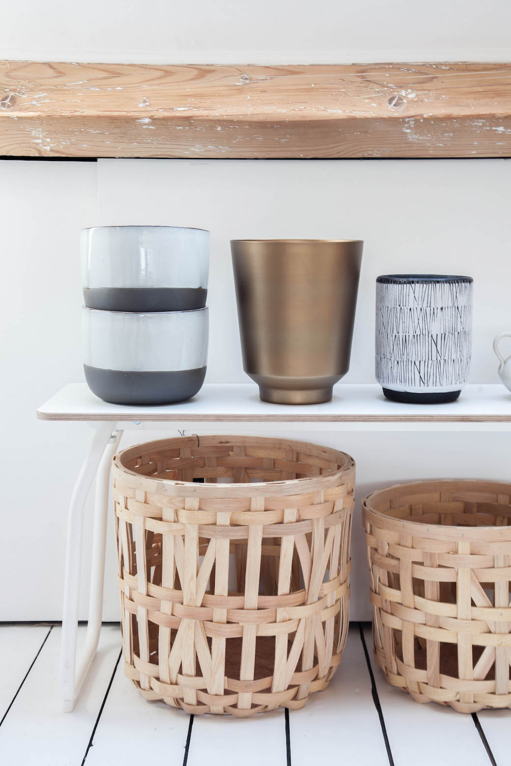
16. Pretty objects on display. This space definitely has a lot of beautiful objects in it. Even simple pots for plants and baskets for storage, though currently not in use for their intended purpose, look beautiful displayed simply on a bench like this. Some are tempted to store everything behind closed doors if not being used, but often objects that are pretty to look at can make an impact when not tucked away.

17. Styled right. This work room is styled like a store. In fact, when I look at it, I think Ms. Marder has a retail space in her future or an online shop because she has the eye of a shopkeeper for sure. I really love how she folds and drapes and stacks her objects that eventually go out to her design clients. Working daily in a space where such care and love is given to objects can't help but inspire your work!
I have to add that whenever I think about the day when I worked with Holly in this space, I hear the Australian band Boy & Bear. Do you know them? It's all I heard when I looked at these photos this morning while writing this post. They're a great band and super nice for listening to while working.
For more resources and ideas of how this space was put together, refer to Avenue Lifestyle here.
(Photographs + Styling: With Permission from Holly Marder. Text: Holly Becker)
