8 Design Tips For The Perfect Modern Country Kitchen
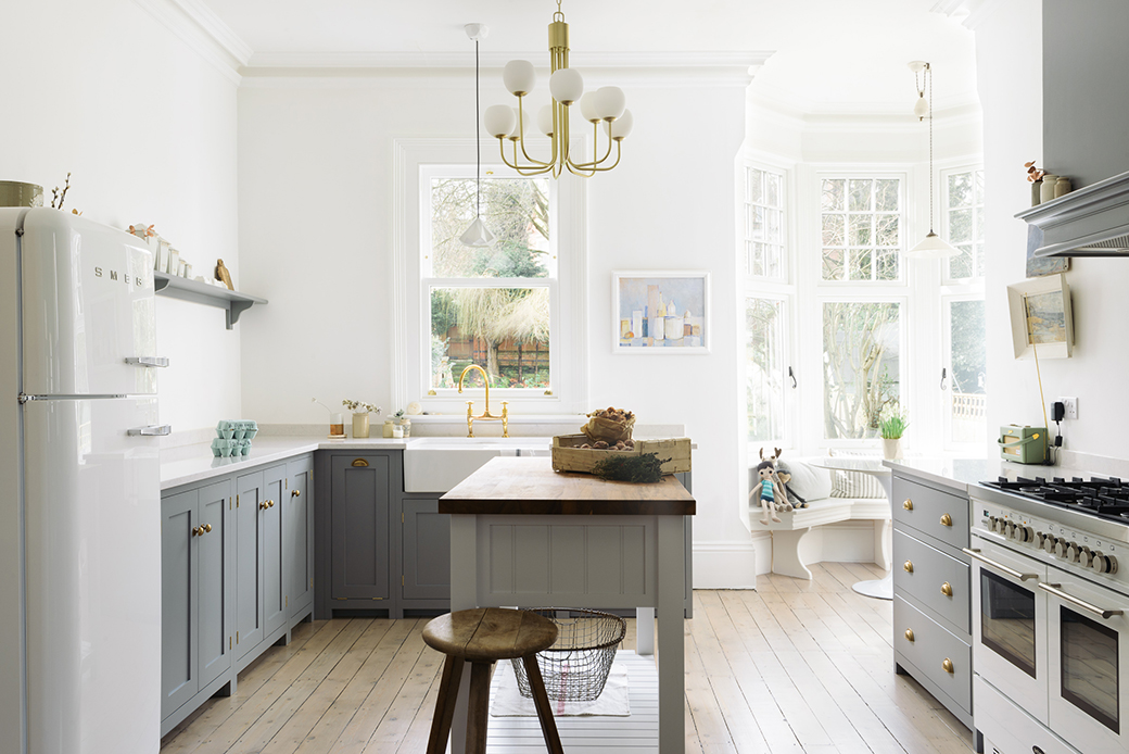
All I have been thinking about for the past several months now are kitchens and bathrooms! What is your current design obsession? I came across the Park Kitchen Nottingham by DeVOL today, so very English I think, and I simply MUST how you some of the details because it's like one of those kitchens that you imagine having if you took a place in the country in addition to your city apartment. I decided to put together a little 8 step guide to creating a modern country kitchen like this one.
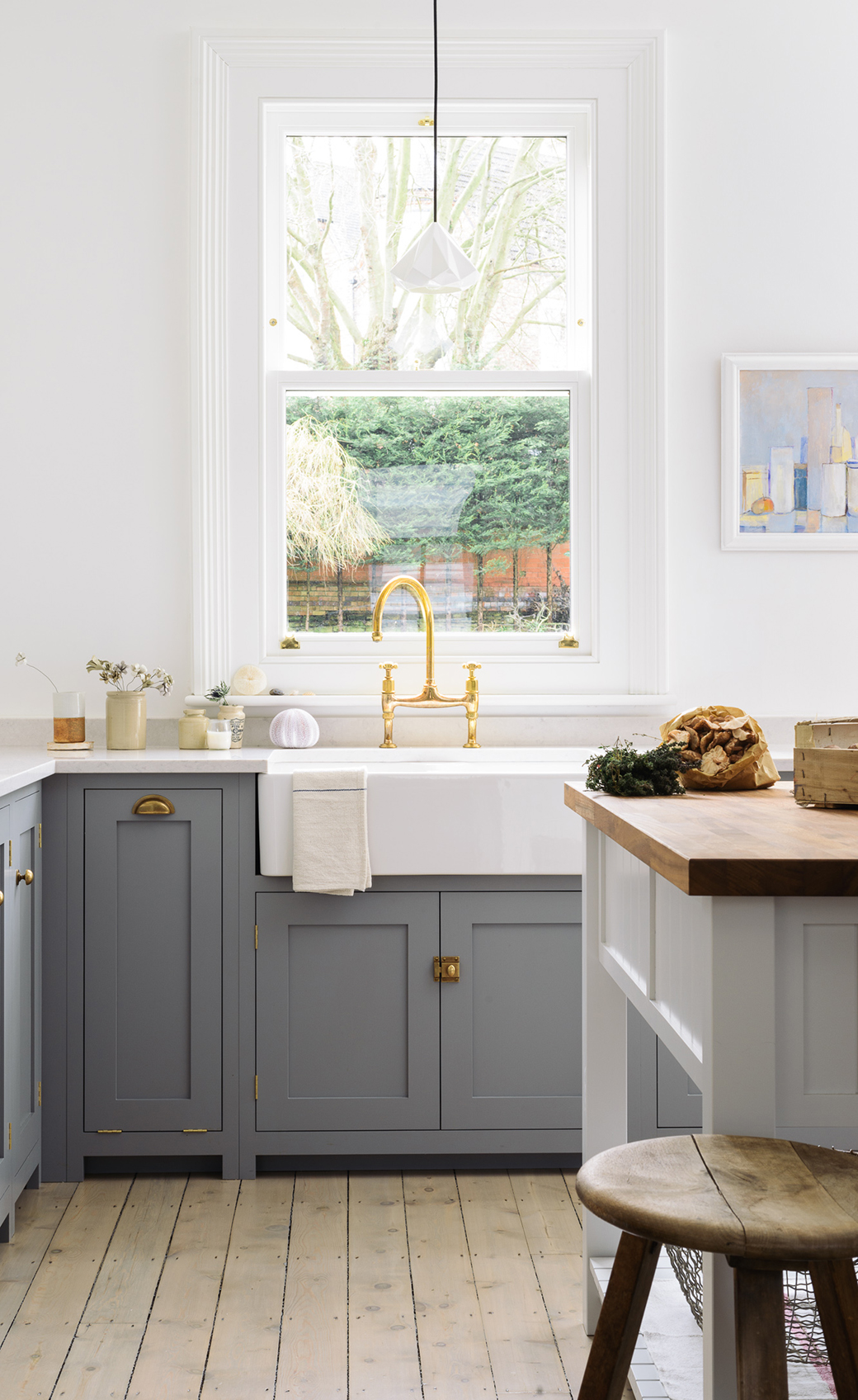
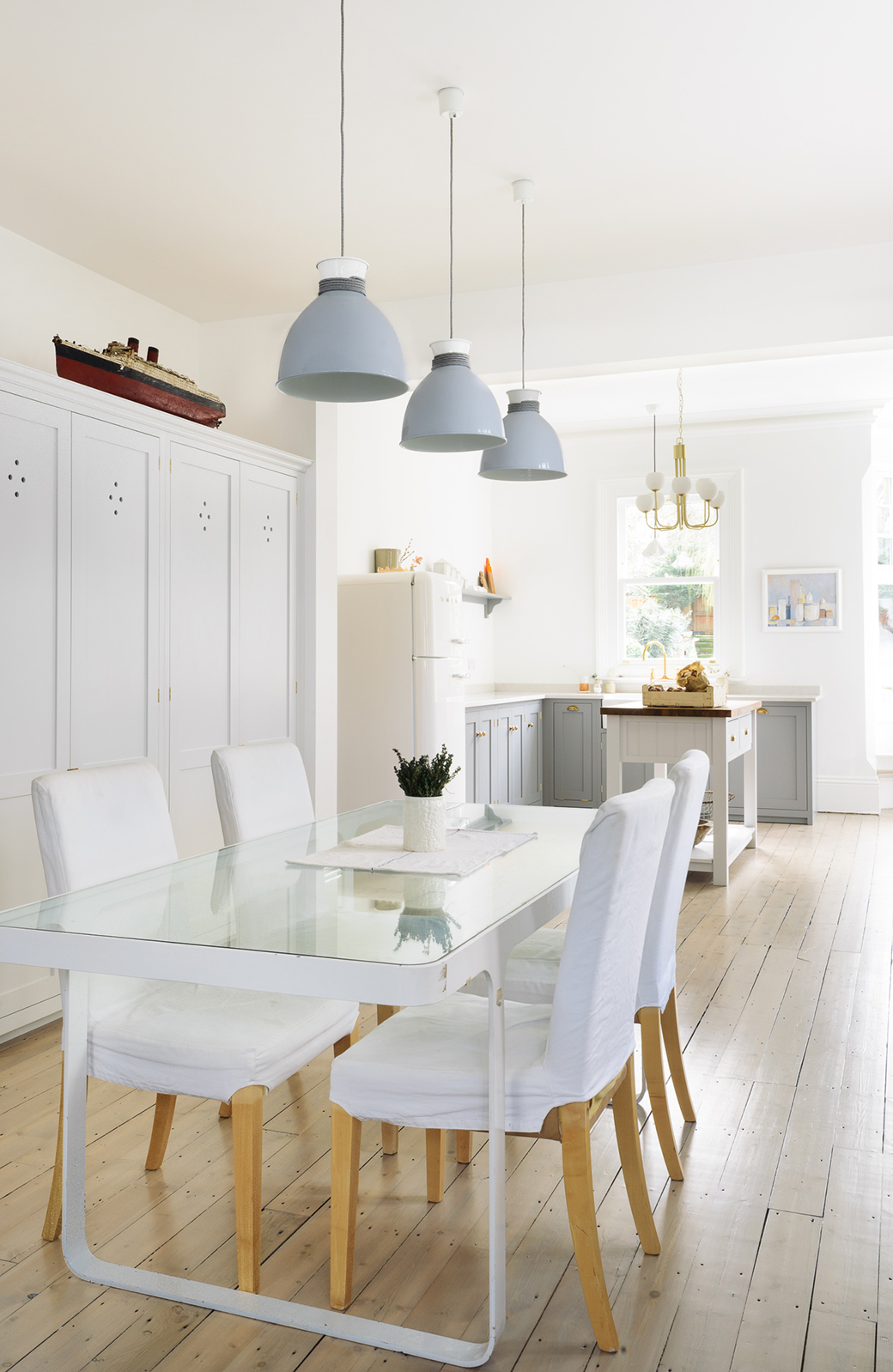
1. Lighting from a different era and style. I LOVE this. When I see a kitchen like this, I expect the typical overhead lighting that is generally used to complete the look - something country, for instance. This feels very modern, classy and definitely very early turn of the century. You'd imagine this in a sleek New York City penthouse in the 1930s for instance, not in an English country home. It's a great contrast. The understated oragami-like pendant above the sink is also very unexpected in a country kitchen but it's definitely working! It's modern and the form is just lovely.
2. Naked windows. If you don't worry about people looking in on you at night while washing dishes, keep the windows naked and fabric-free. If you must add a little something, opt for a barely there white shade that you can just roll down in the evening. Less is more, and if you want lots of light in your kitchen, naked windows are the way to go. I have white Plissé shades and will never go back to roman blinds or anything else in my kitchen. Plissé shades are amazing.
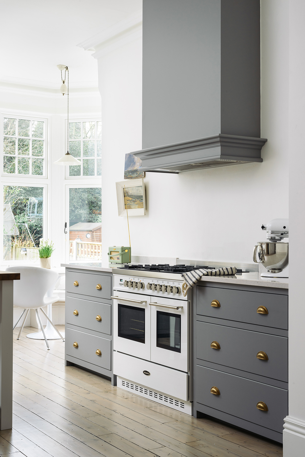
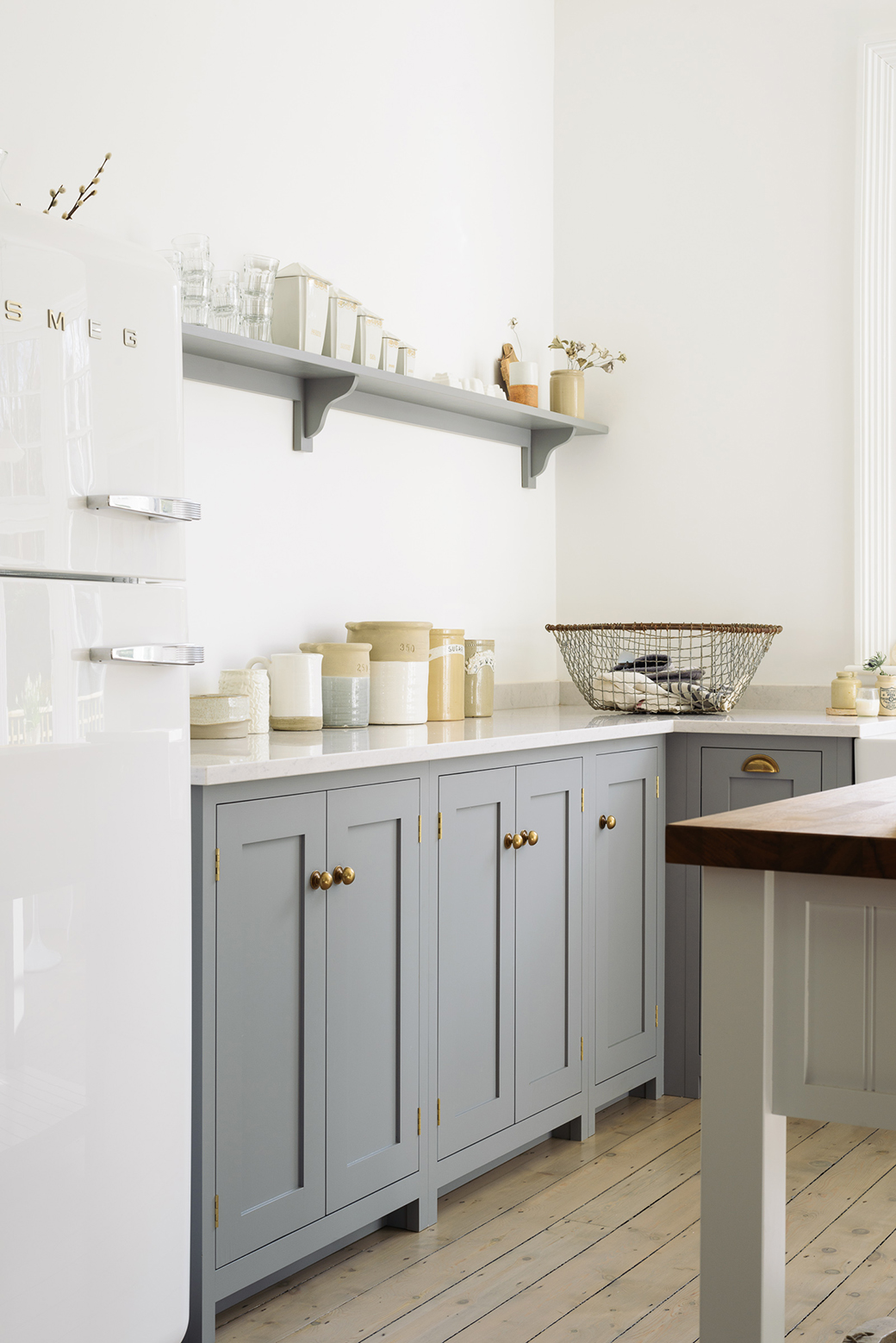
3. Retro minimalist touches. I love the retro touches - the radio on the countertop and the smeg - perfect. You don't need to go for an American diner look or cheese it up when it comes to retro hints. Keep them very spare but there. This smeg is honestly gorgeous in the space.
4. Hardware that doesn't look like a kitchen anymore. These handles look like something from your bedroom cupboard, right? They give this kitchen such a cozy and warm vibe, not clinical or typical kitchen with sleek this and sleek that. Warm brass hardware dresses the space up without making it glamourous. I also like these types of handles in a kitchen because of the way they age over time, brass is beautiful like that - such character.
5. Mix of work surfaces. I spot some hardwood on the island and marble on the countertops. This is a nice mix because if the island was also marble, the kitchen would look more sleek and modern. If the countertops had been all wood like the island, the gray cabinetry wouldn't have stood out as crisp and fresh. This mix works. Plus, on a center island, a wooden prep space in a family kitchen is so nice because you can really roll out cookie dough and get to work!
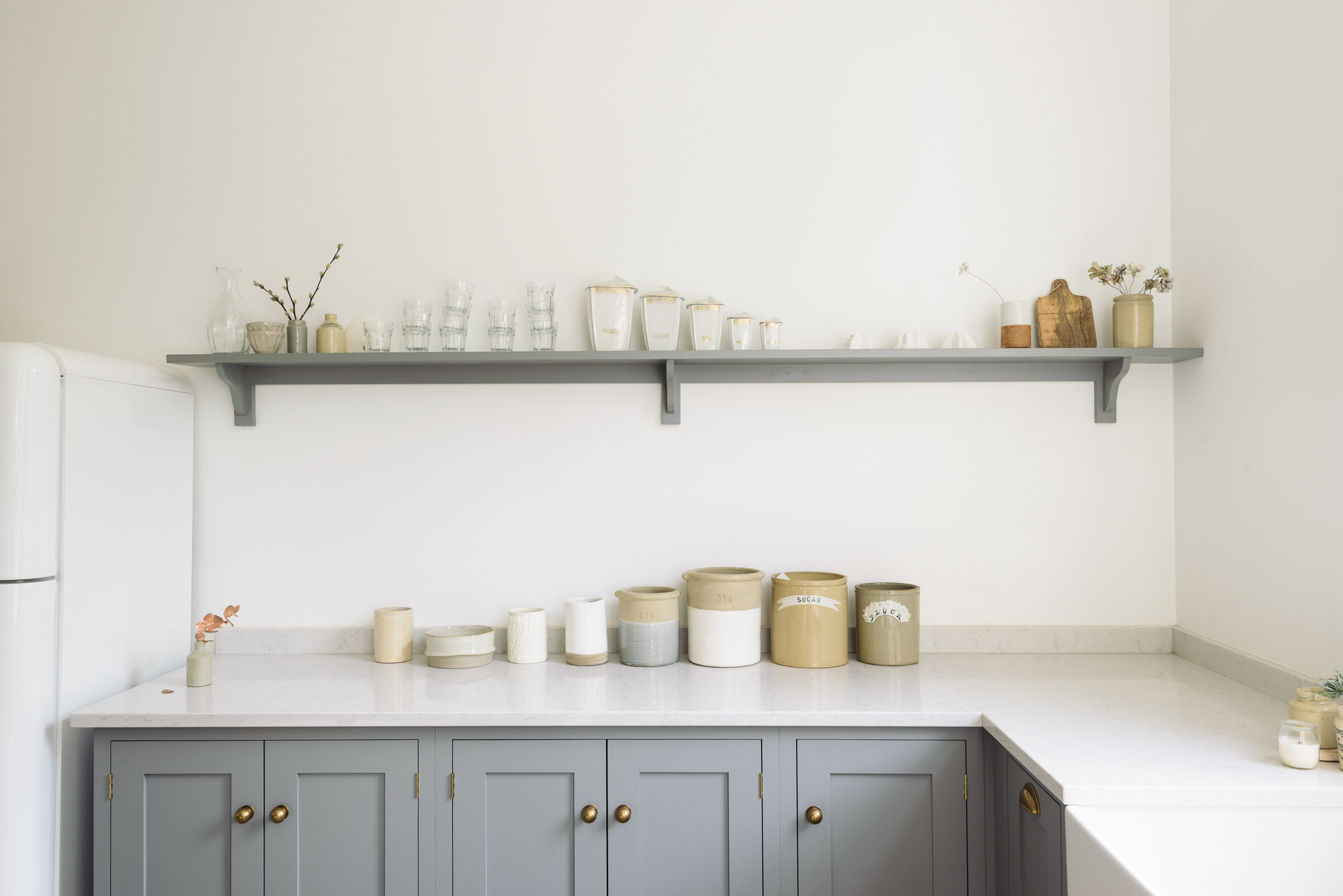
6. Simple open shelving. I like how this shelf isn't loaded with visual noise like product packaging and things to read. Instead, it's simple and clear - glassware, ceramics, a few sprigs of flowers, a wooden cutting board. Sure, you can drink from the glasses and use the cutting board, but it's more of a beautiful display area in my opinion. If you have enough storage below the countertops, who needs cabinetry on all of the walls in the kitchen?
7. Glass top dining table. In this room, I love the table the most not only because it looks vintage, but because it has a glass top which is not so common these days AND because I love how it reflects all of the natural light from the bright and sunny kitchen. Wood would have absorbed all of that light and the dining space wouldn't be nearly as vibrant. Such a great trick when you have a large room and you need to balance the light and the window sources aren't available to do it for you naturally - add glass and/or mirrored surfaces.
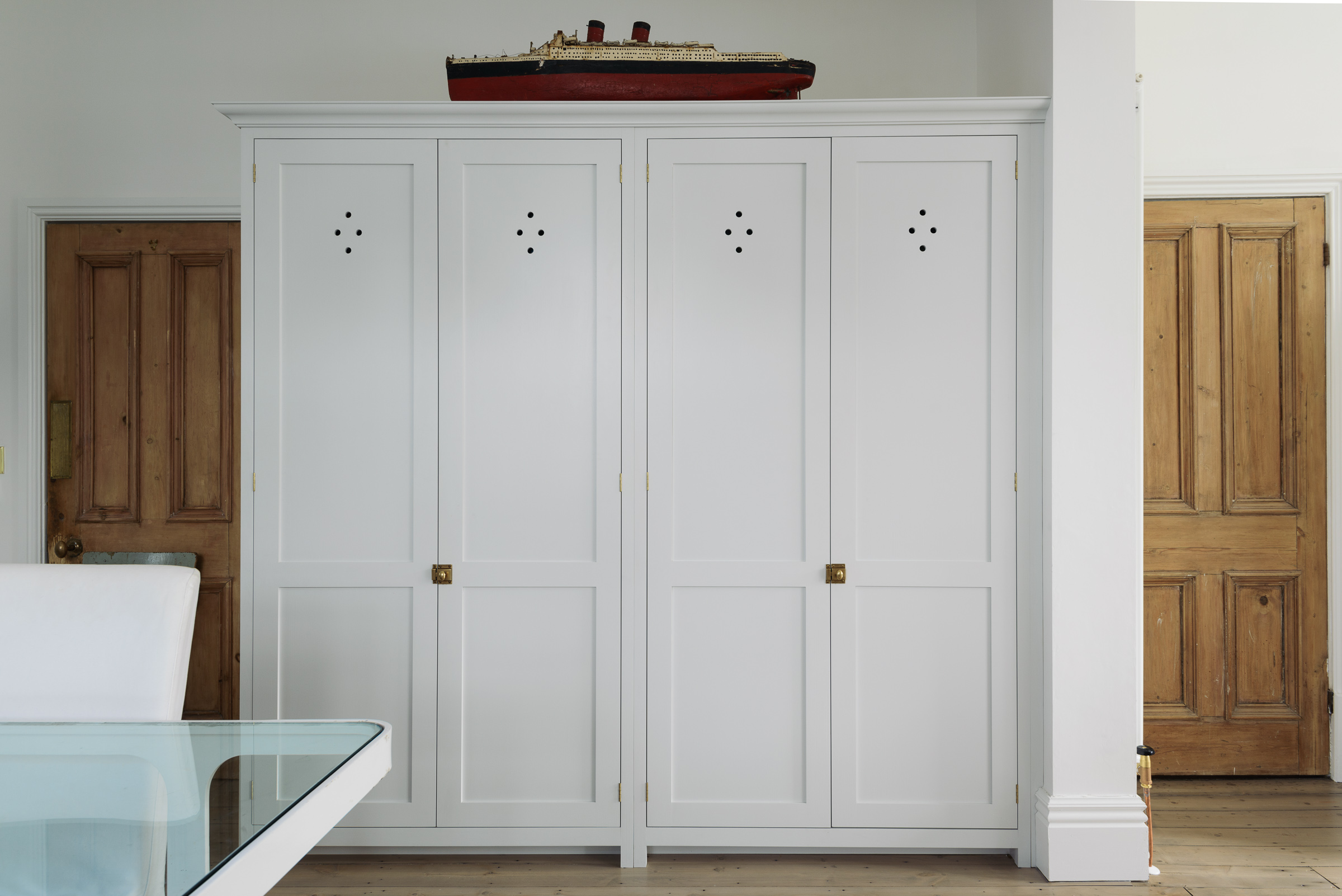
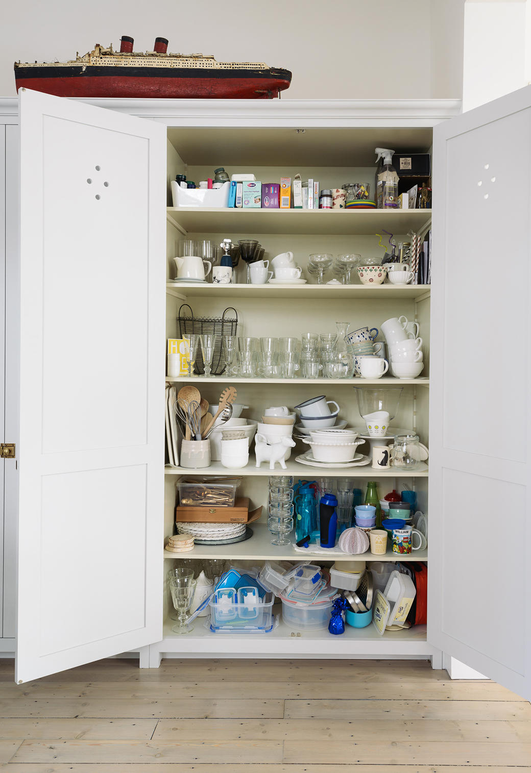
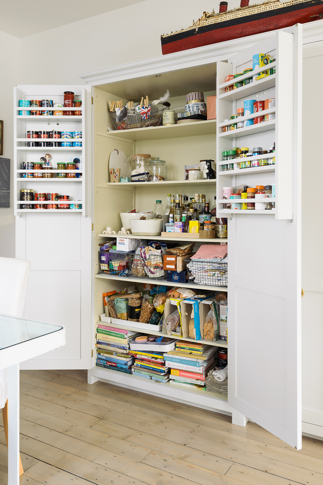
8. Nearby storage. I LOVE this massive cabinet in the dining room that joins the kitchen. Oh goodness, it makes me so happy. It's very robust but also so simple looking that you barely notice it. But look at what it holds inside...
What a gorgeous space! This is a little fantasy of mine now for many years - a country home with a lovely kitchen in perhaps this gray, shaker style. This kitchen is by deVOL and is absolutely stunning and indeed fits my happy country life fantasy very well.
Photography: deVOL


