10 Interiors Trends Spotted at Salone del Mobile 2018 with Design Diffusion in Milan
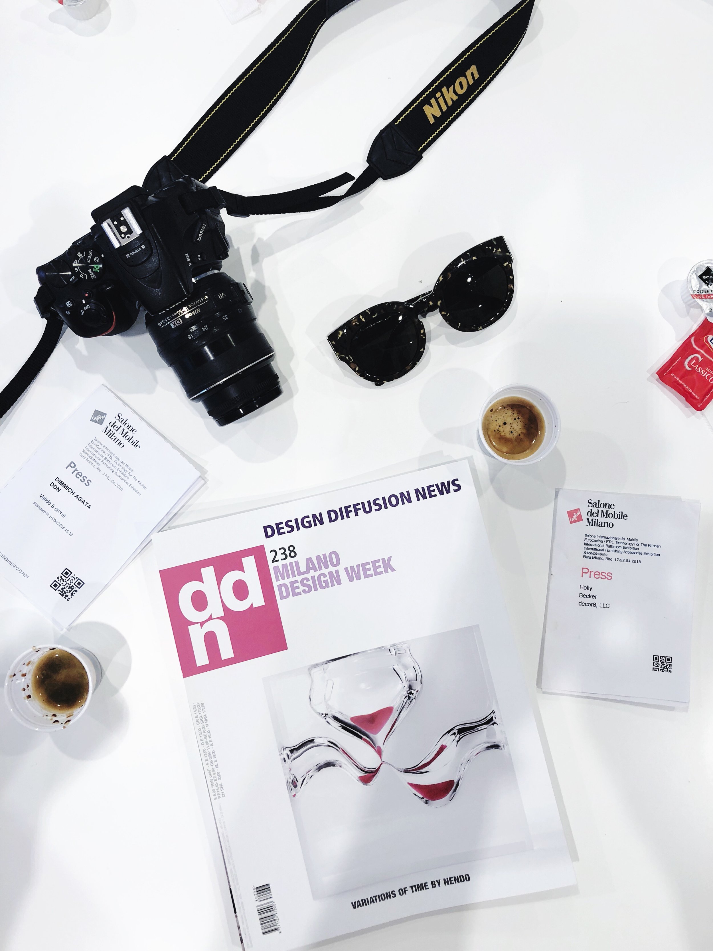
I was so happy this year to work for Milan-based publishing house, Design Diffusion, to tour some of their favorite spots around Salone del Mobile 2018 with some of my favorite blogger colleagues. Last year, the tour was very good but this year, it was fantastic. I can't wait to share my report and also 10 trends that I spotted as I explored each stand.
For the tour this year, it was very well organized, the stands were inspiring, the blogger group was great, and we had a fantastic lunch together in the Salone 'Red Room' where only 200 people in the world have a pass to eat there! The overall 'feel good' energy was contagious. All of it was a perfect 10.
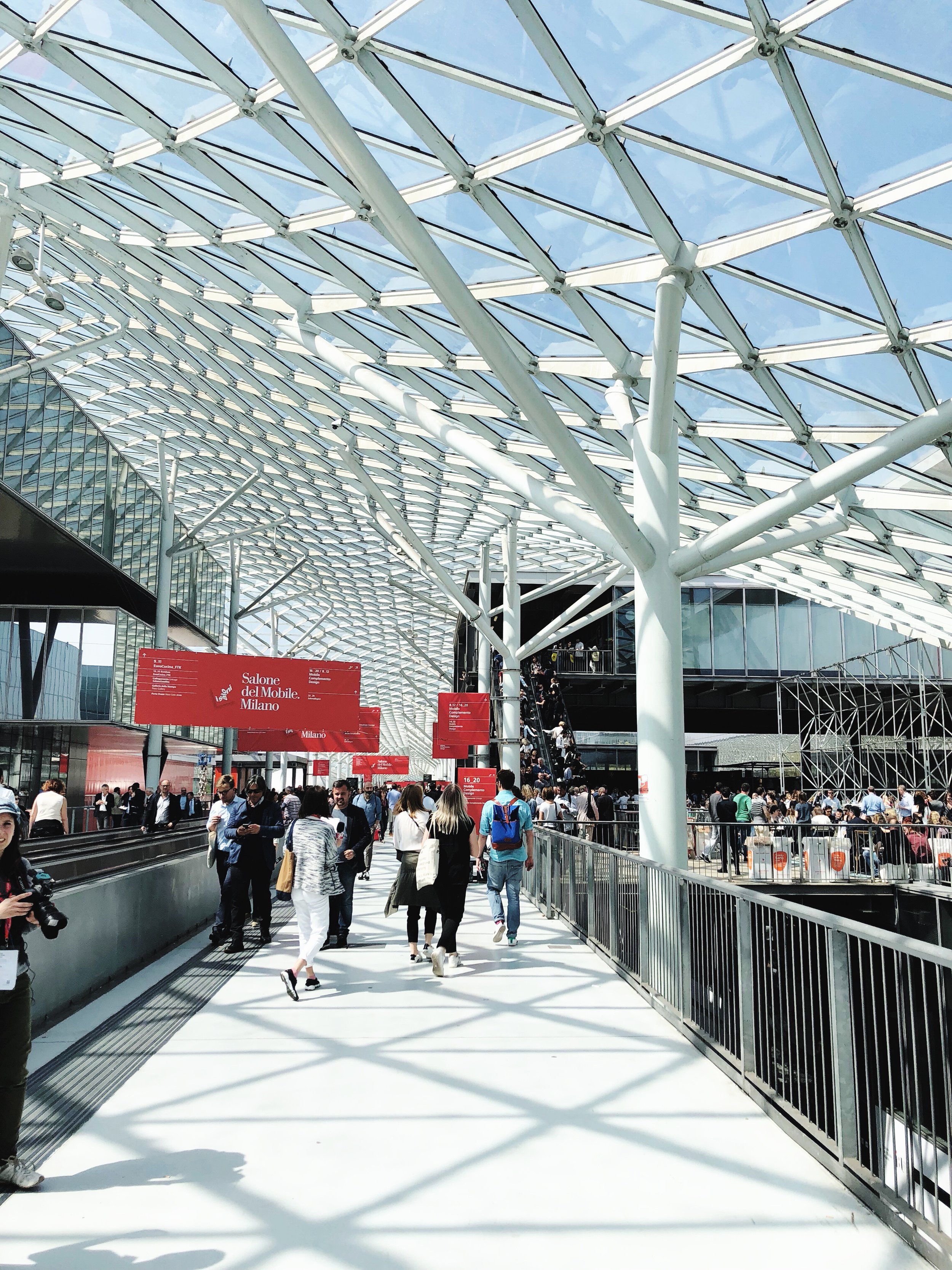
Out of all of the major fairs I've been to in Europe, the Salone del Mobile is one that I'm sure not to miss because it's just above and beyond when it comes to scale and inspiration. I'm so glad I went this year, the trip was fantastic overall and I came back home loaded with new ideas and inspirations to share with all of you.
I was happy that this year, part of the tour included the kitchen design hall, Eurocucina, which was absolutely mind-blowing. The technological advances being made in the world of kitchen and bath is nothing short of exciting. Kitchens are definitely turning families into chefs and it is no longer, "a woman's place", but men are finally being thought about more in the overall design - kitchens are becoming very gender neutral.
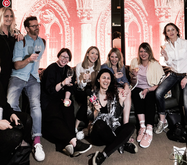
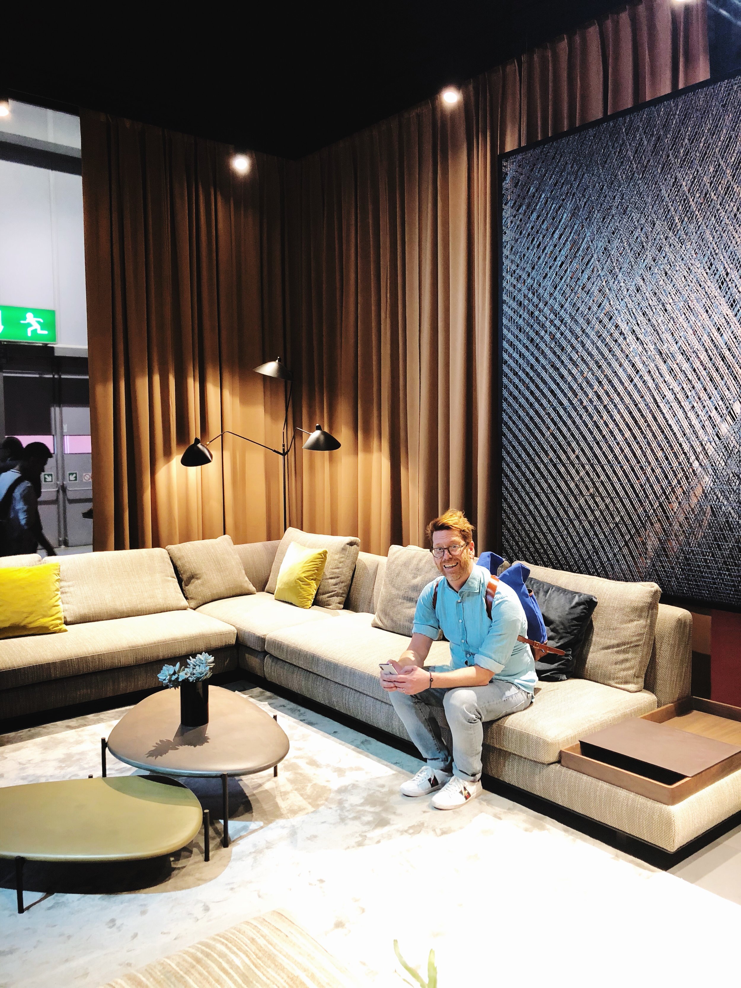
Our Design Diffusion tour group, consisted of Desiree Groenendal from Vosgesparis, Stefan Nilsson from Trendstefan, Mary Middleton from Hello Peagreen, Agata Dimmich from Passion Shake, Niki Brantmark from My Scandinavian Home and Ulla Michalak from Interiors Design blog, had a tight schedule to follow yet it still felt surprisingly relaxed and low key. I always felt like I was the last one being called back to the group, "Holly? Where's Holly?", but this is because I need a little more time than my colleagues to absorb what I'm seeing as I can go a bit into design fantasy land as I look at things I love. When I spot something that resonates with me, or that is just plain unusual, I tend to need a few moments with it, to observe, touch, ask questions, and draw a conclusion. I've always been like this, in school, in college, always... The last one in the group to follow the others... But other than often feeling a bit like I was two steps behind, I felt absolutely interested in each brand we'd visited and found something (or several 'somethings') from each that drew me in.
Who did we visit? I'll summarize with photos below.
1. Flou
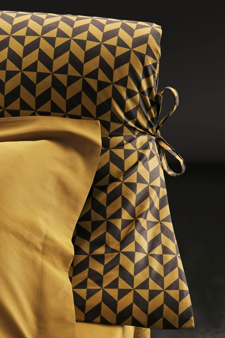
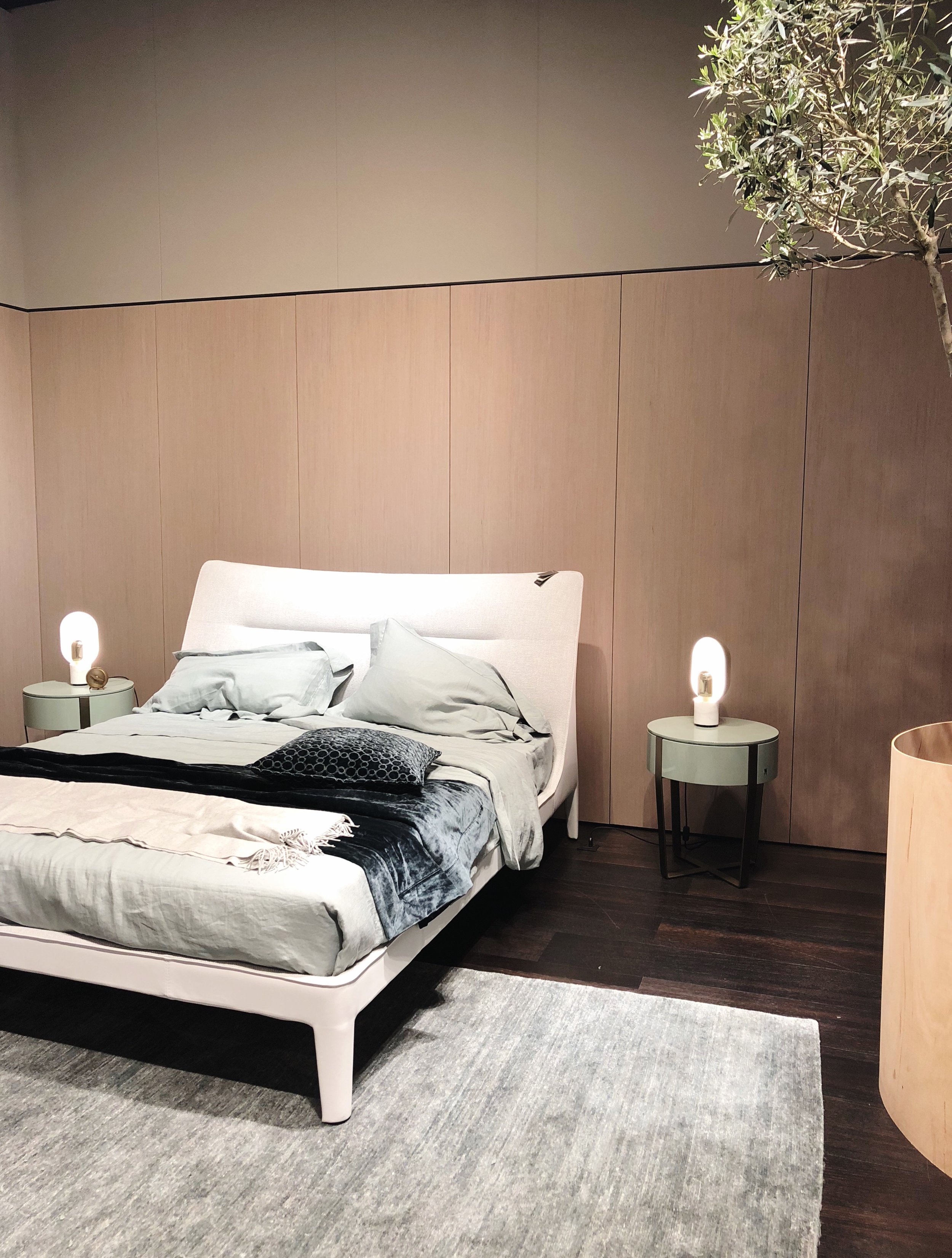
Flou was intriguing to me, simply because it's so iconic and vast, and their stand was incredible. This year, in honor of their 40th birthday, they've worked with Vico Magistretti to design a bed taking a 40-year-old fabric (shown below) from their archives and using it today as a headboard, pillow and duvet cover for this limited edition "Nathalie" bed (this model is my favorite from their collection of beds, I just love the ties on the headboard and the overall comfort and style of this design).
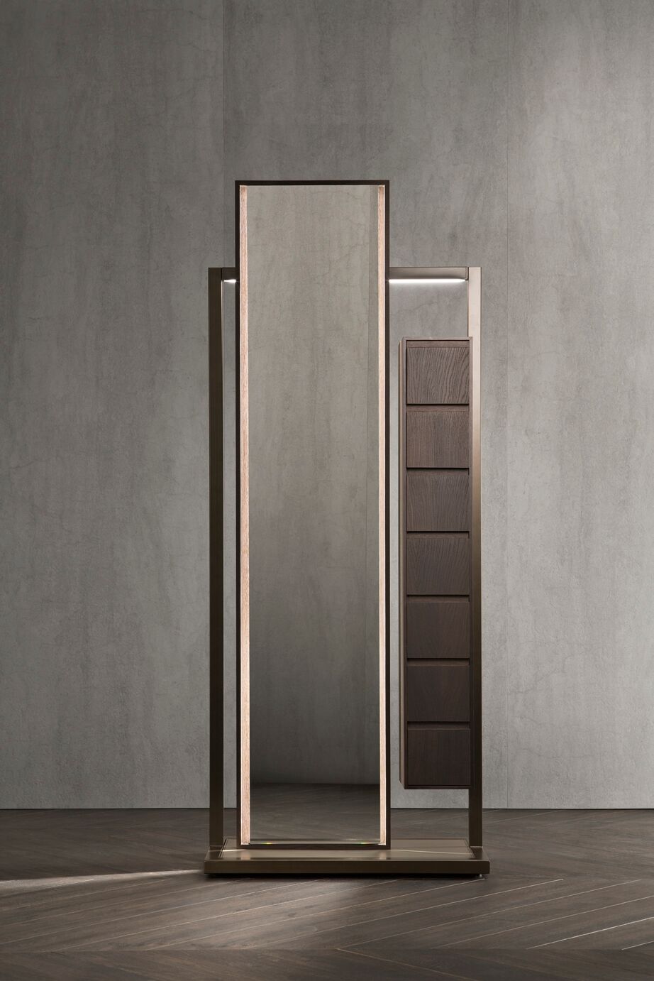
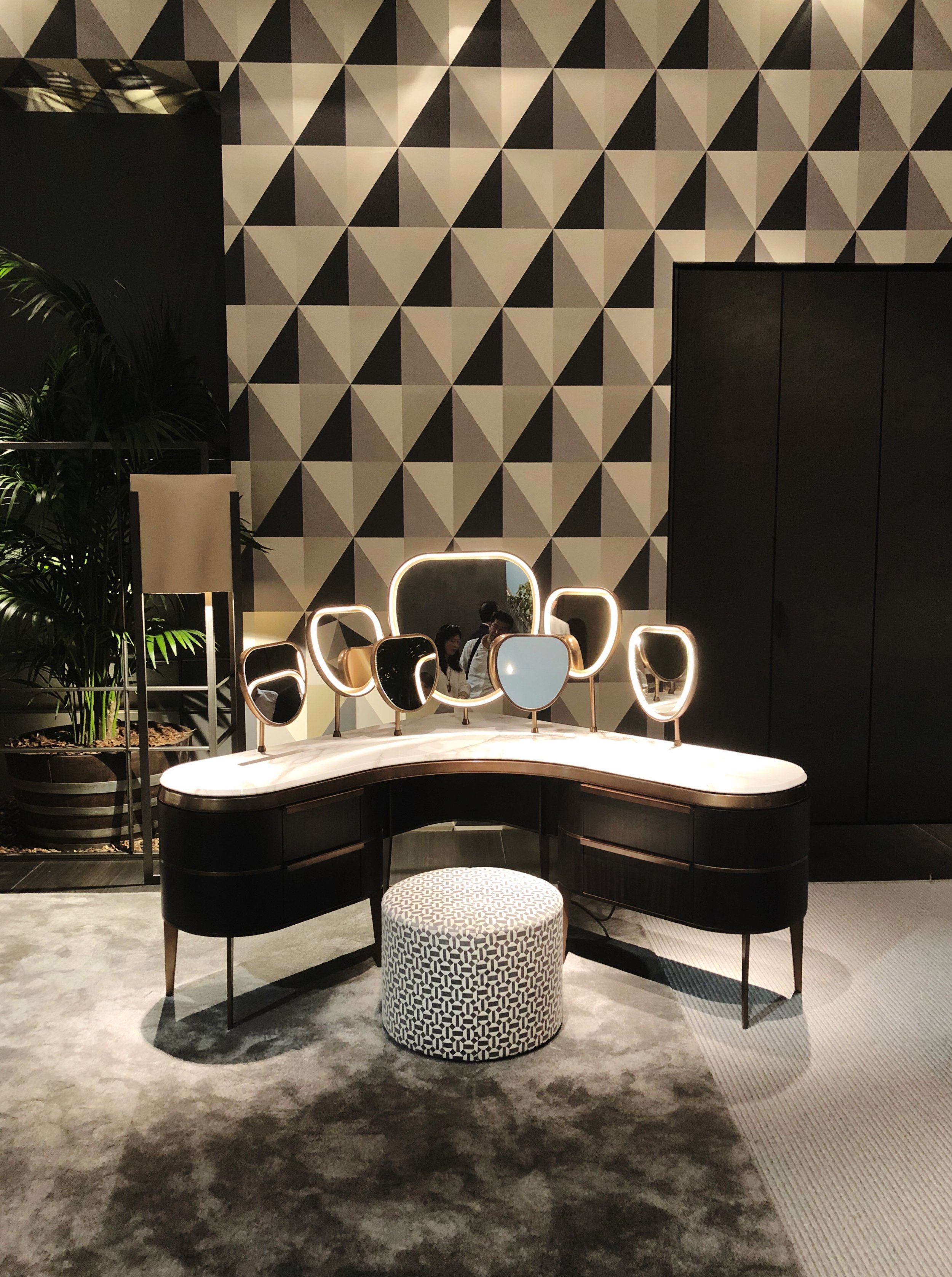
Flou had a heavy focus on wood, nickel, marble and interesting, tactile fabrics. I really loved the makeup cabinet shown below for the bedroom, so glamorous and rich with all of the illuminated mirrors, swoon!
2. Walter Knoll
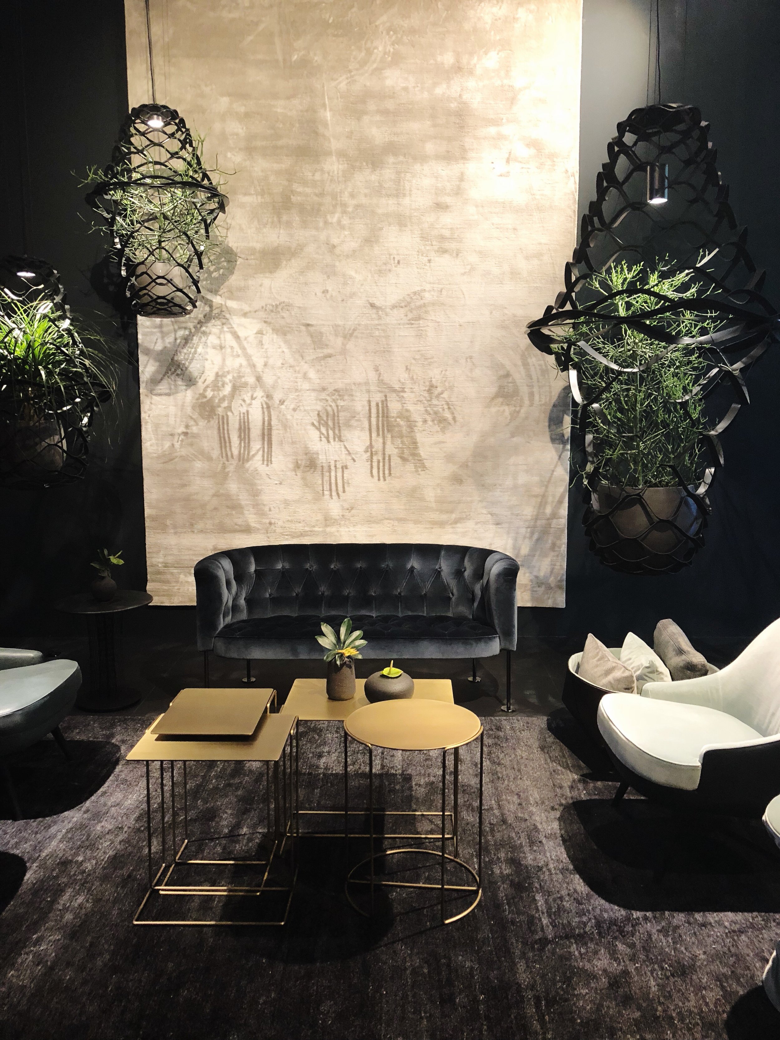
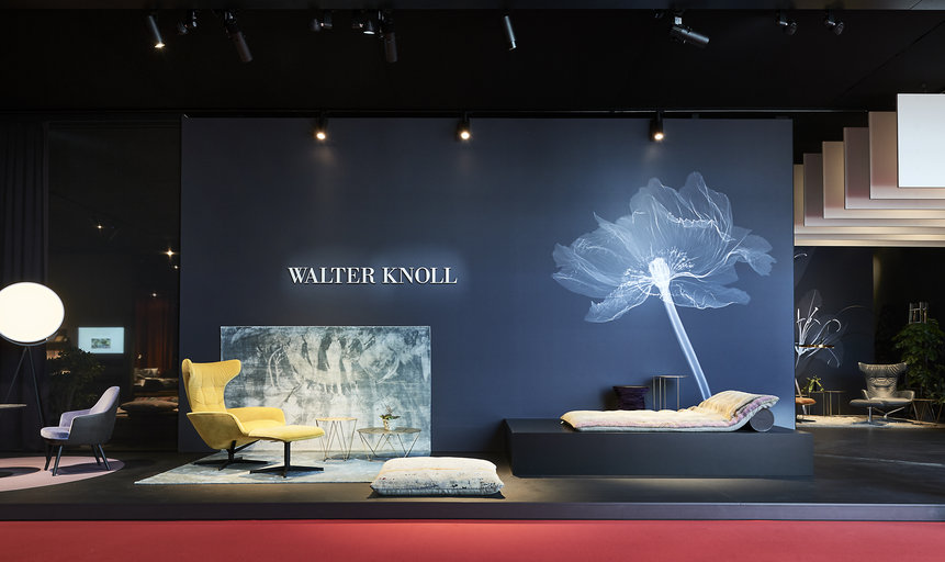
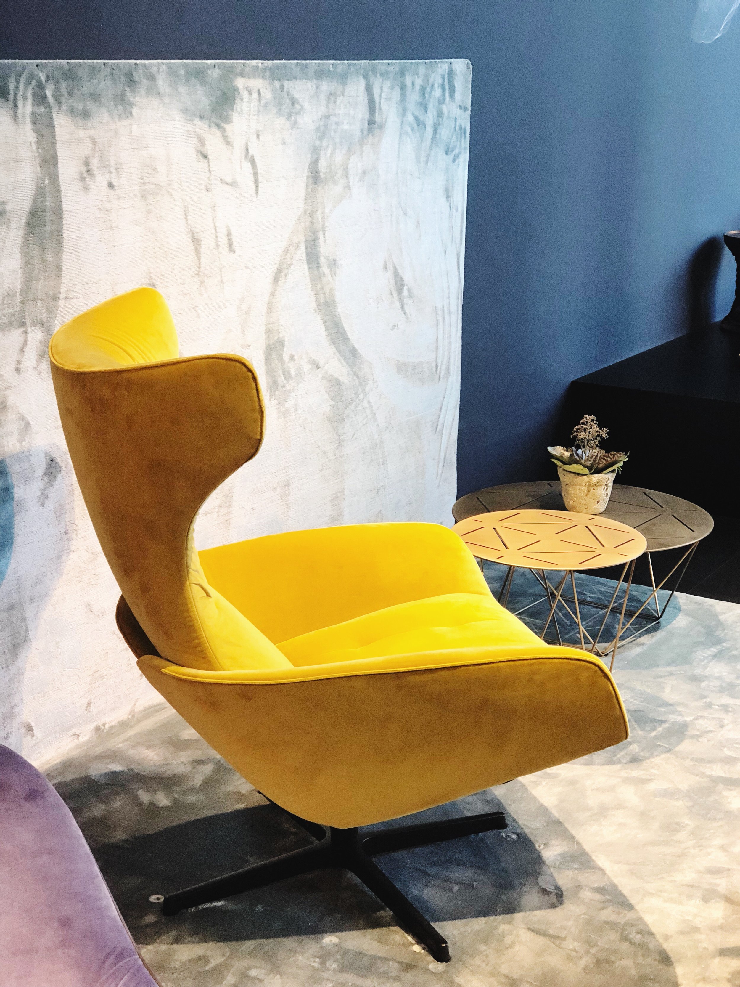
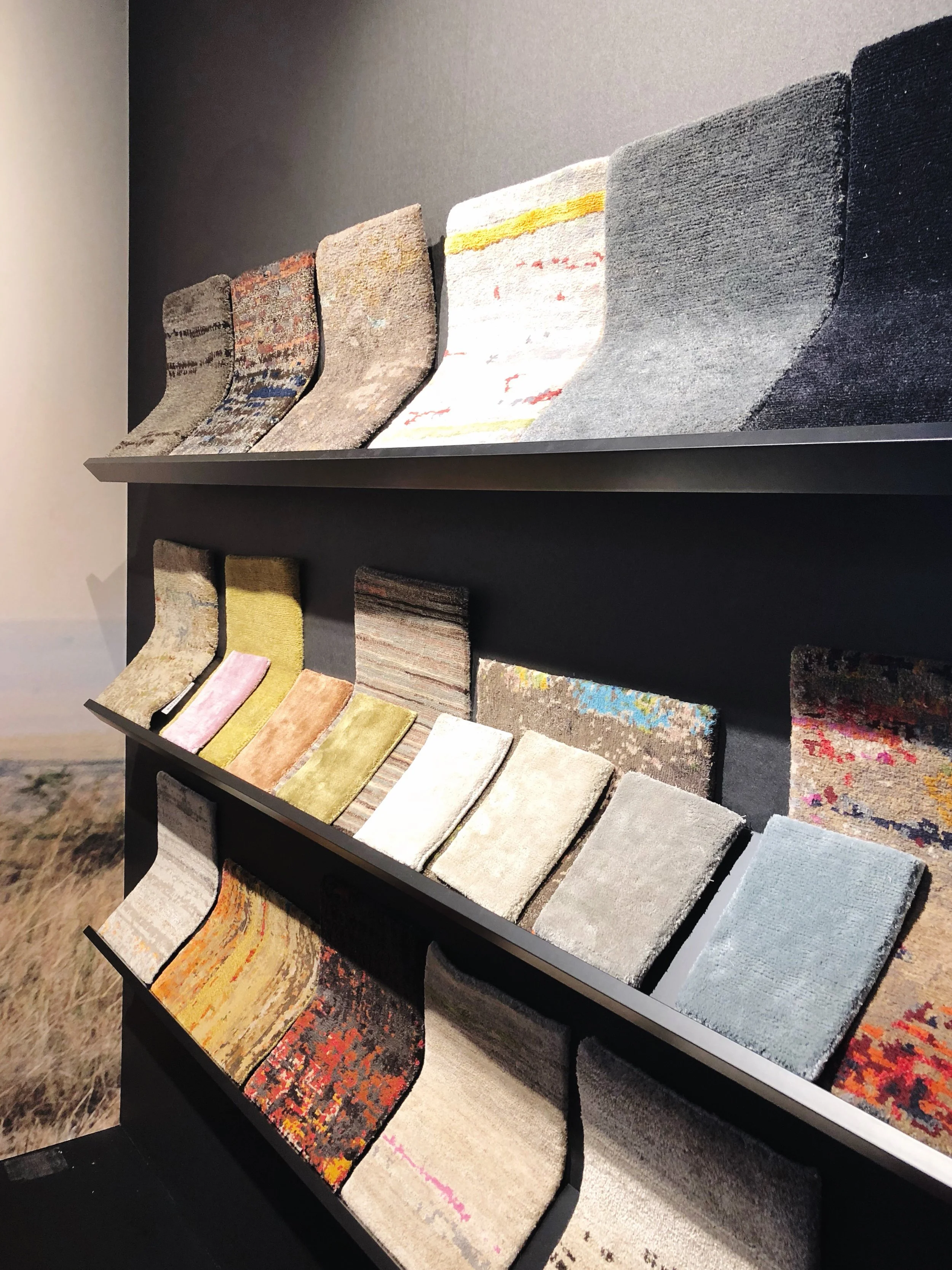
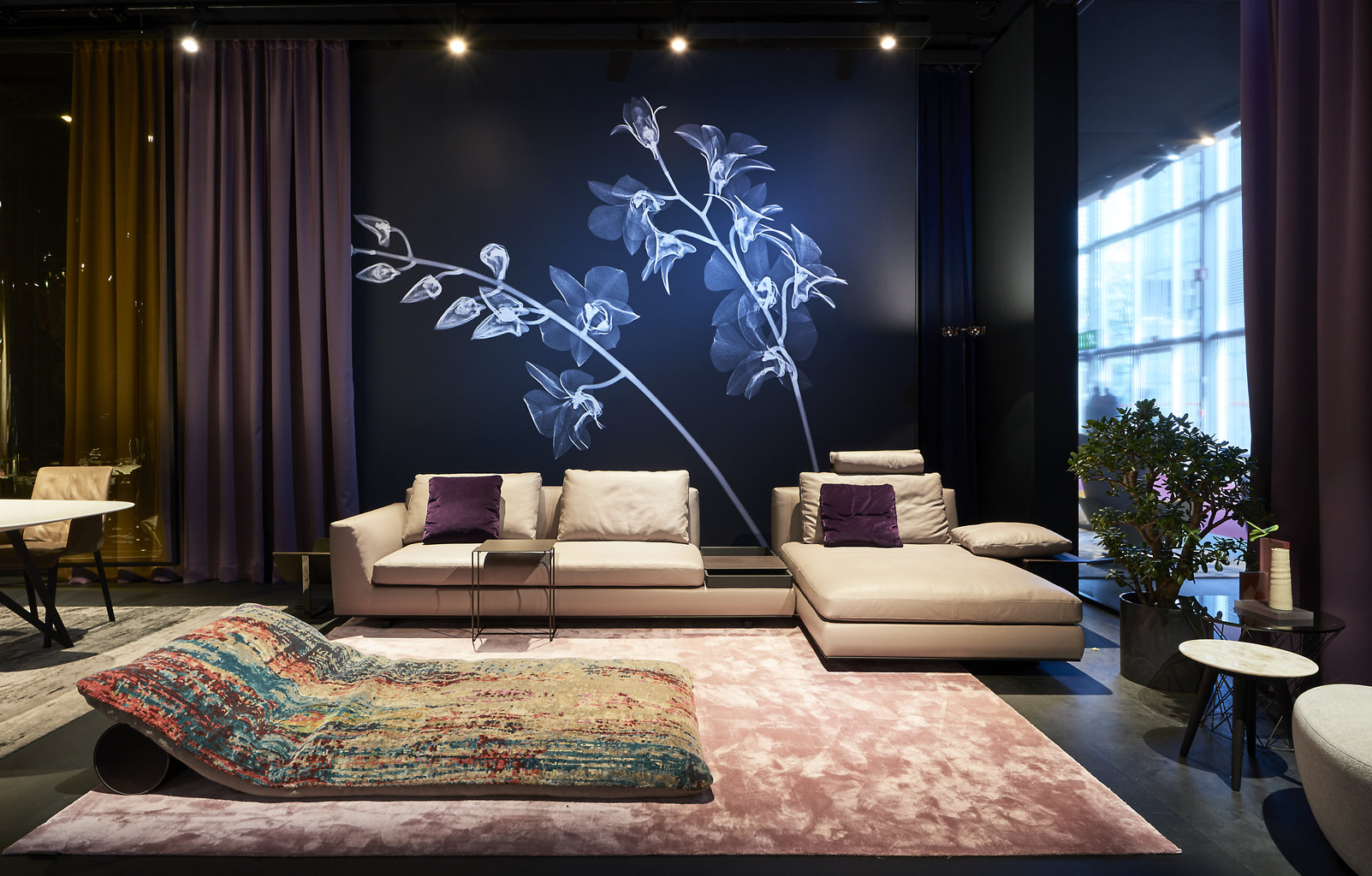
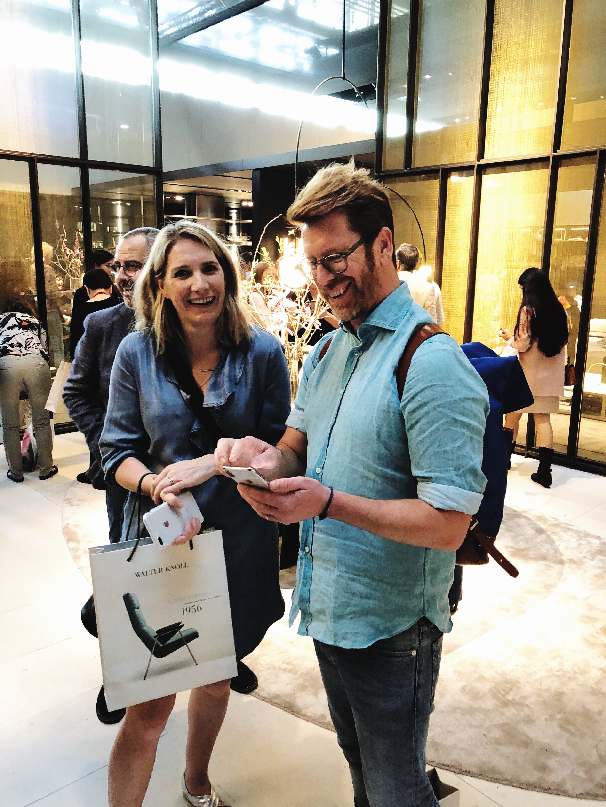
I really liked the presentation at Walter Knoll, particularly the drama mixed with the big black lights filled with plants. Also the carpets, but also the Badawi pillows, which look a bit like a big stuffed carpet that you can use to create lounge-y areas in your home. As I walked through, I imagined a big resort in Bali or something else quite exotic and over the top. I loved the huge murals on the wall too, mostly of black and white florals. Lots of metals in this collection, bronze brass, all brushed and not too shiny. I also liked the curved chairs and sofas, a big trend this year, and the sumptuous fabrics. Accent colors were definitely there in yellows and tones of orange and red.
3. Poliform (kitchens) and Poliform (living)
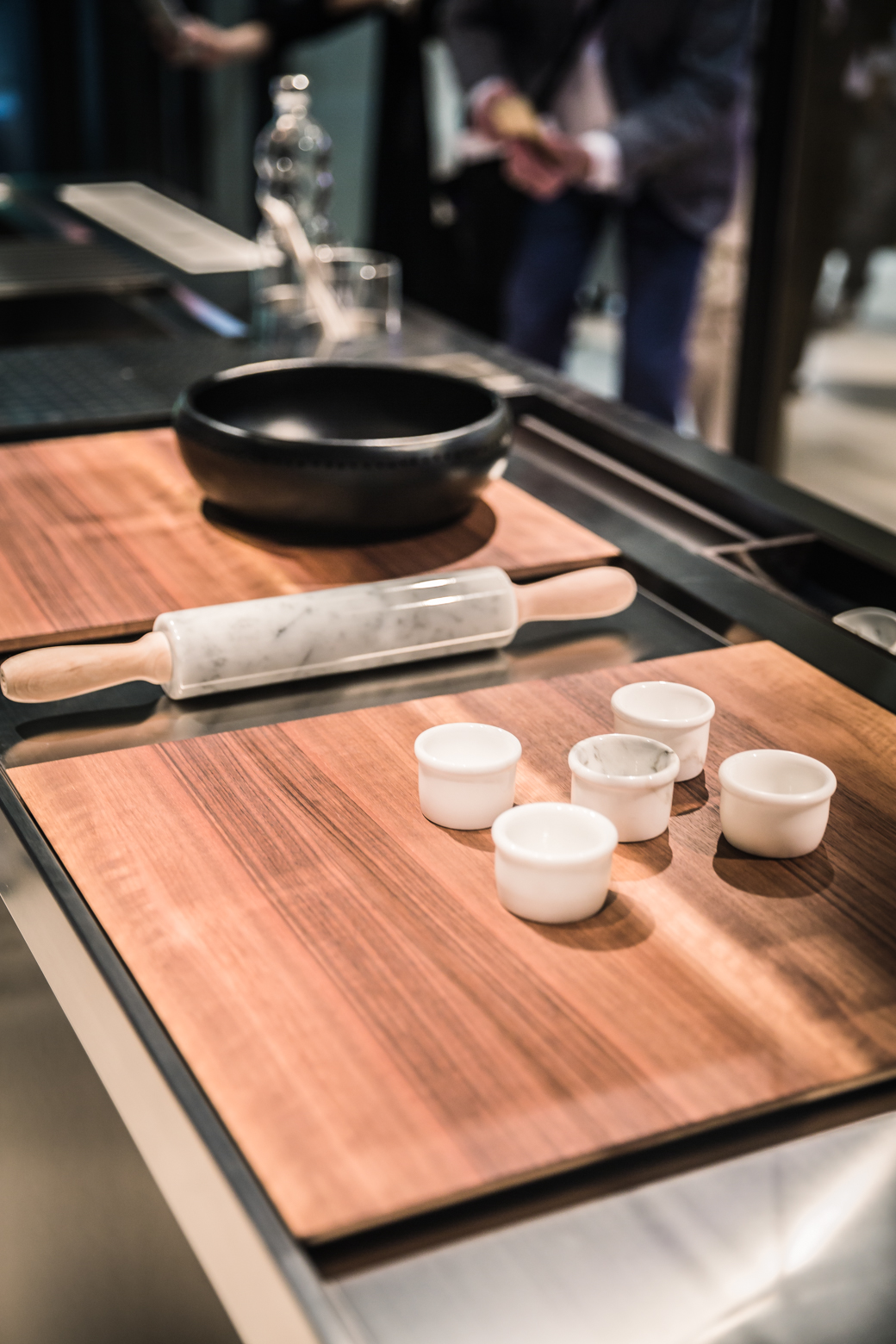
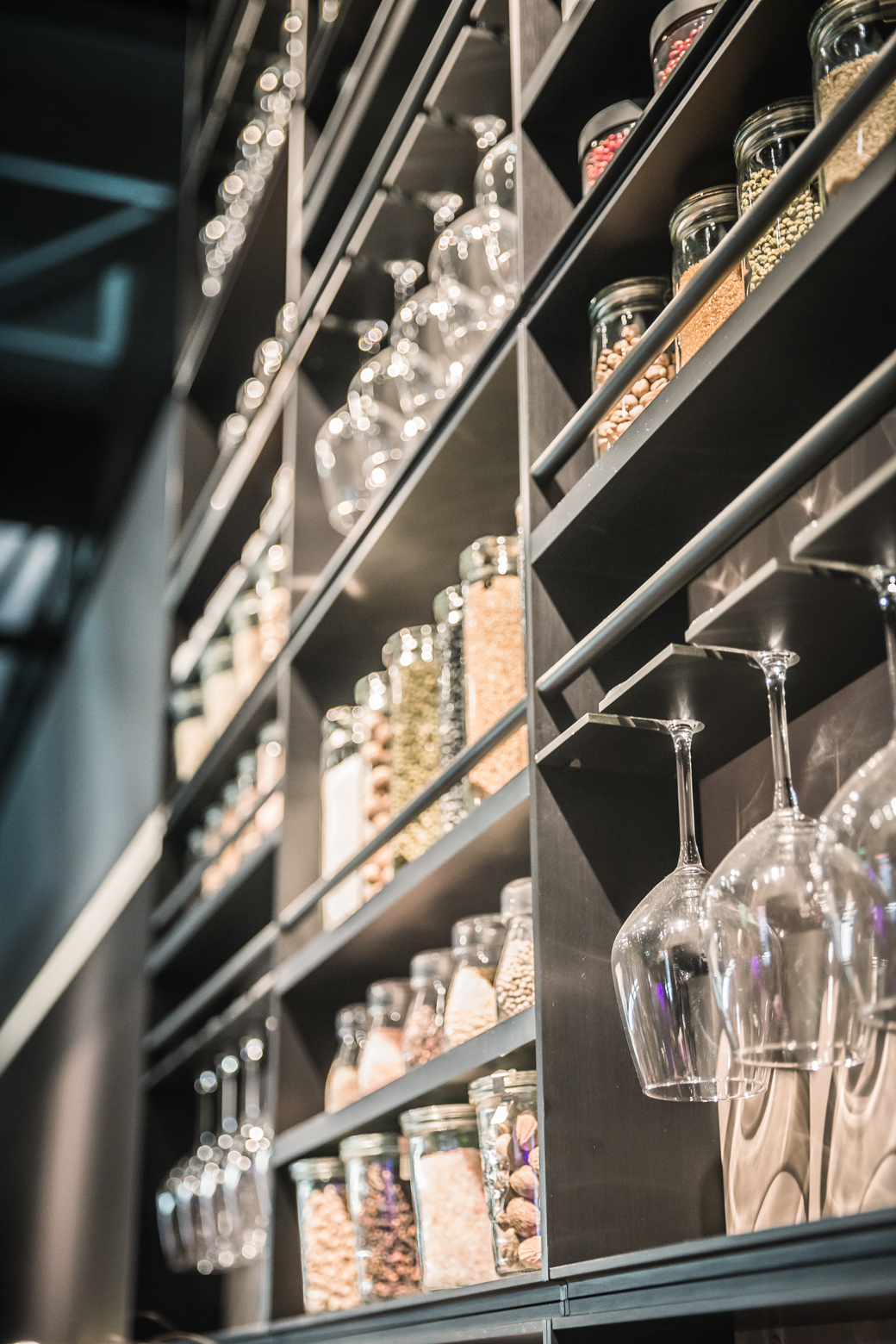
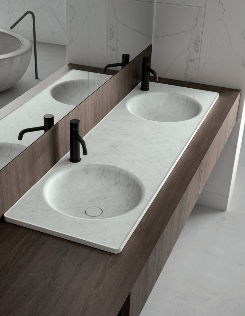
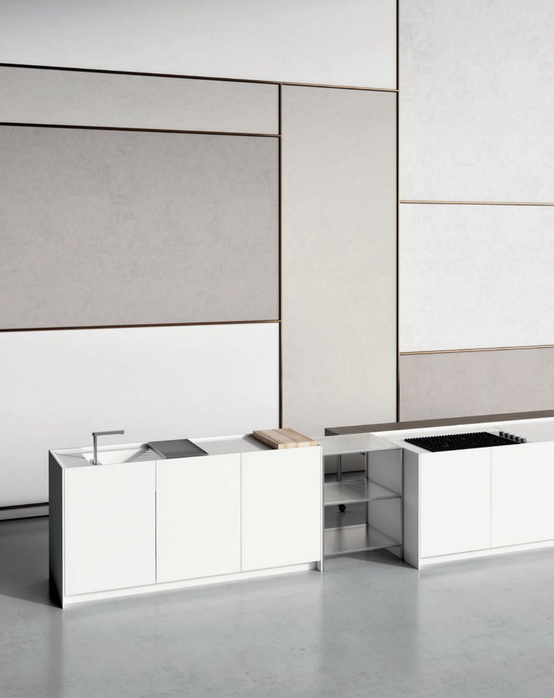
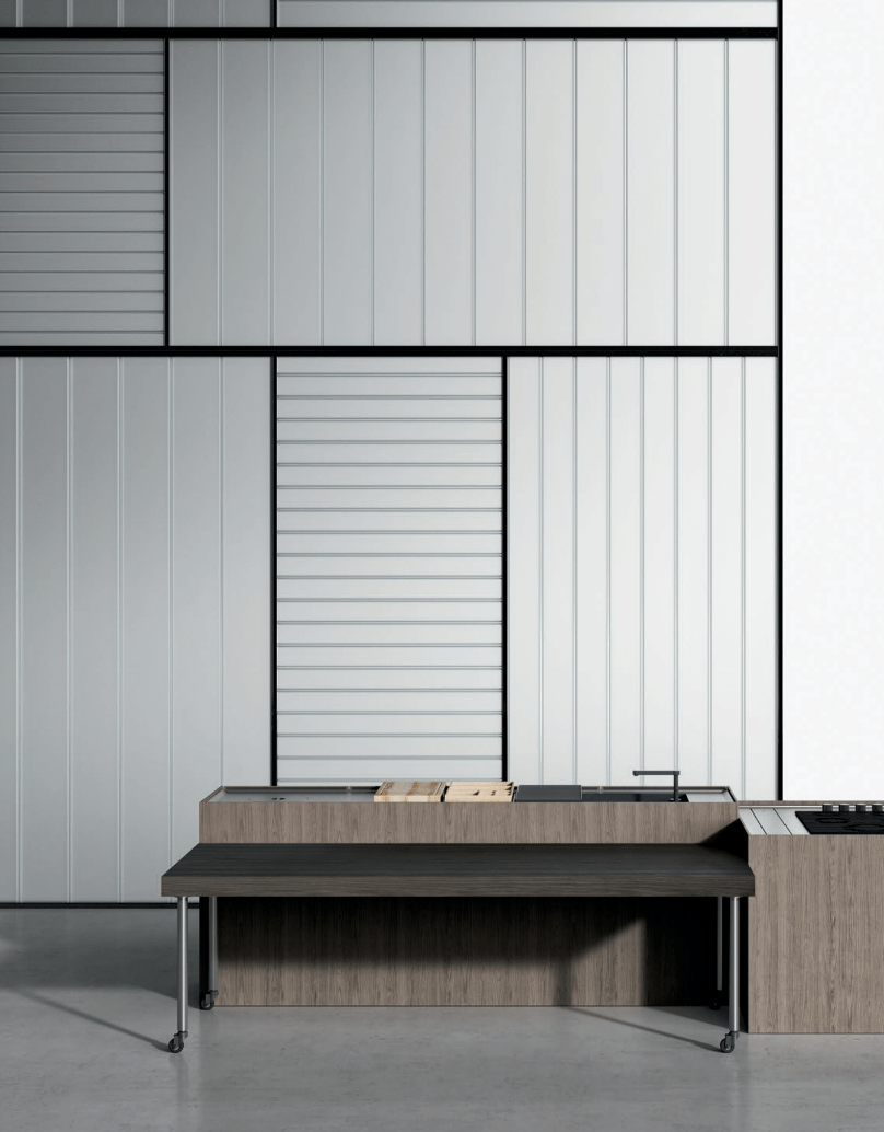
It was exciting to see some of the newest kitchens at Poliform, who really are leaders in the industry for contemporary kitchen design, and have an amazing presence at the Salone each year. Kitchens have gone darker in nearly every stand I passed, including Poliform, where dark wood and lots of dark stone was quite on trend. I really like how Poliform has a new countertop with a groove opening that runs down either side, which is great for clean up and prep (water and food cannot easily spill over onto the floor) but also the groove is there so you can place various pieces into the counter for cooking and prep work - like a cutting board.
About this groove opening, the brand says, "An innovative solution, able to transform a technical detail into an aesthetic detail that harmonizes with every type of finish, from steel to solid wood, and with all the other elements of the kitchen."
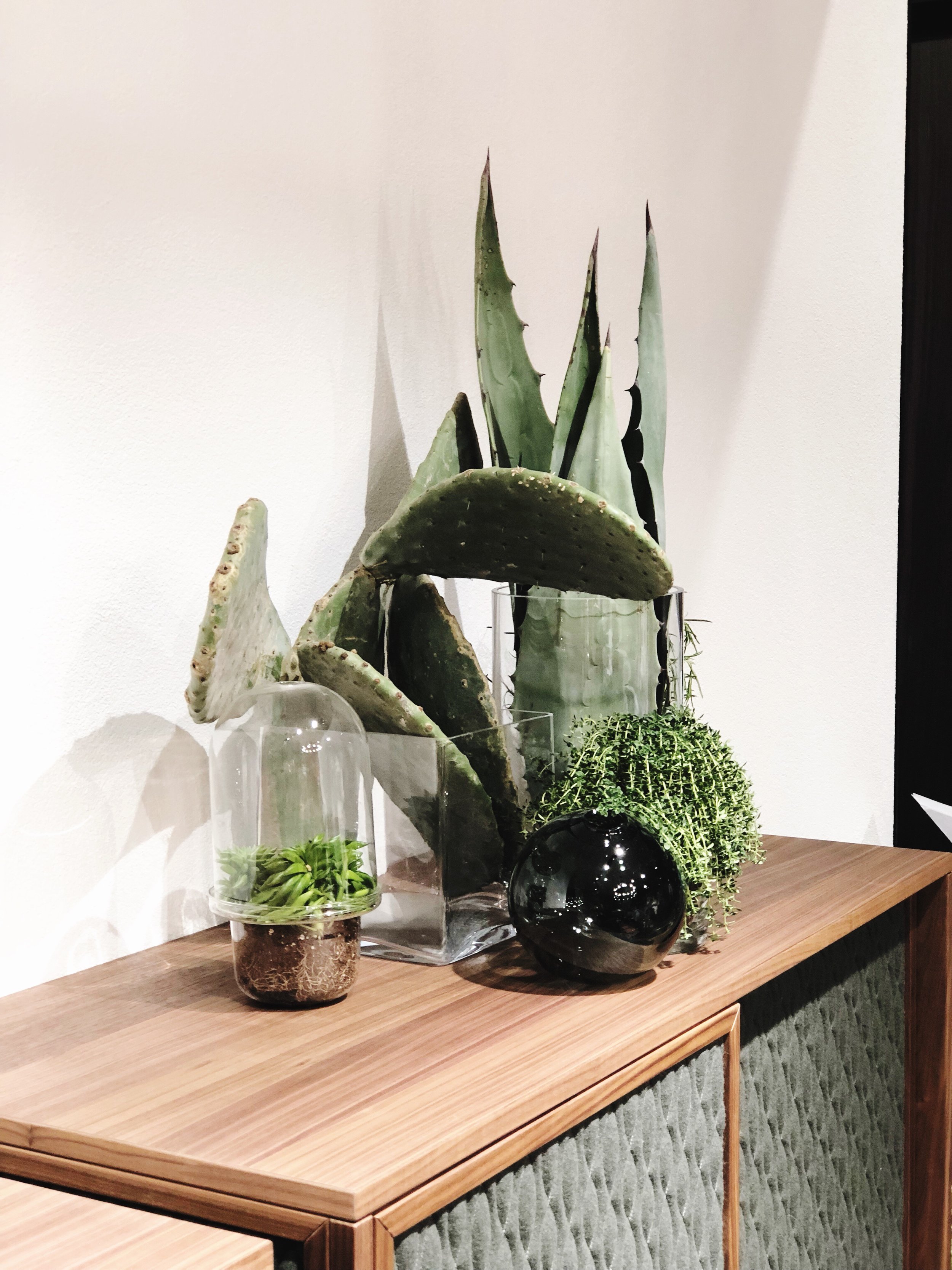
Additionally, some kitchens had built in spaces for herb gardens in the cabinetry and they can grow easily with the special lighting the brand uses to mimic sunlight.
4. Natuzzi
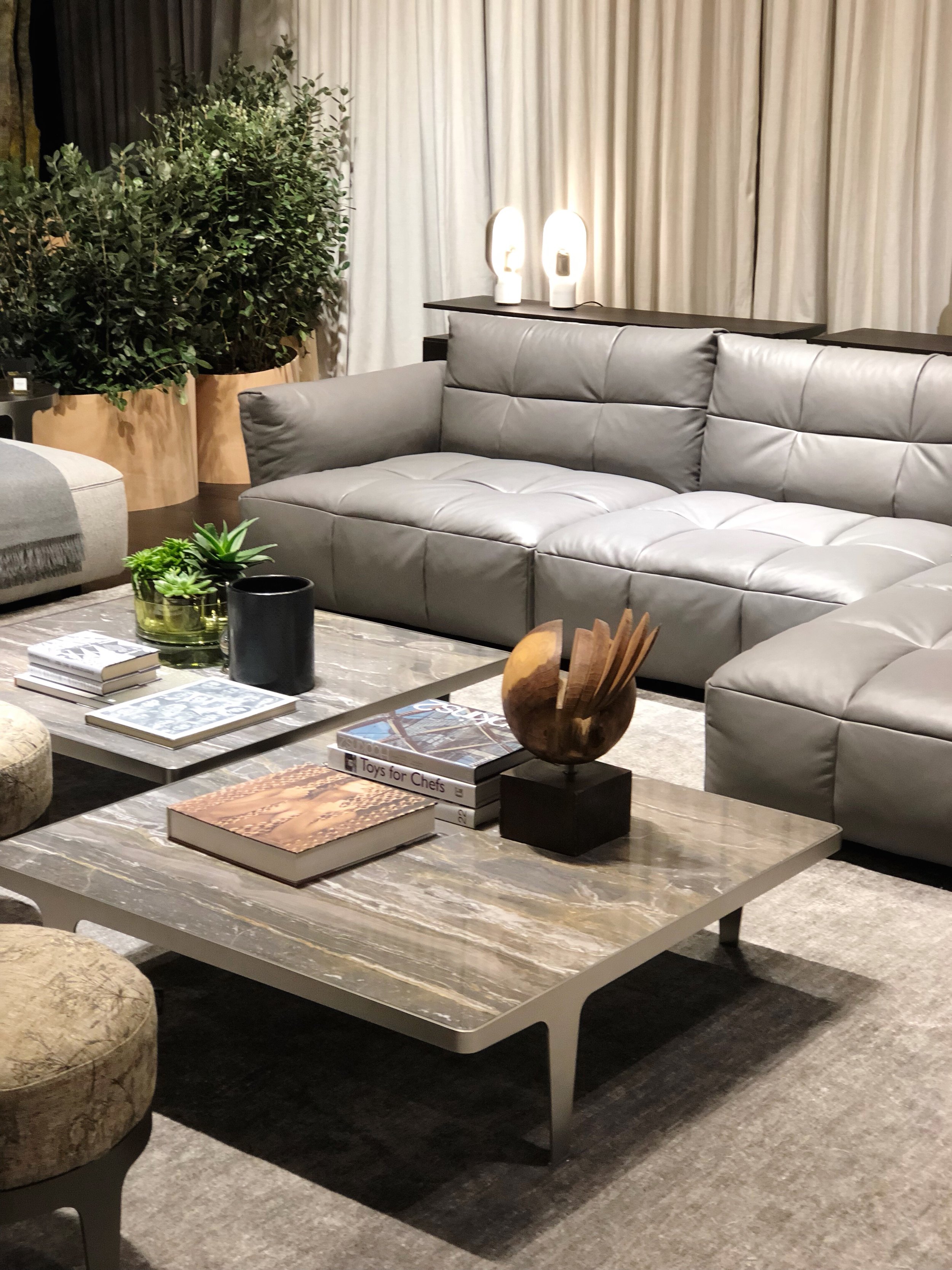
Natuzzi's stand was similar to last year, with lots of elegant clean lines, several rooms to peruse where you could imagine living with their products, and lots of grown-up colors that felt very classy. You can tell their focus is on nature and materials. And I always love their closets and beds!
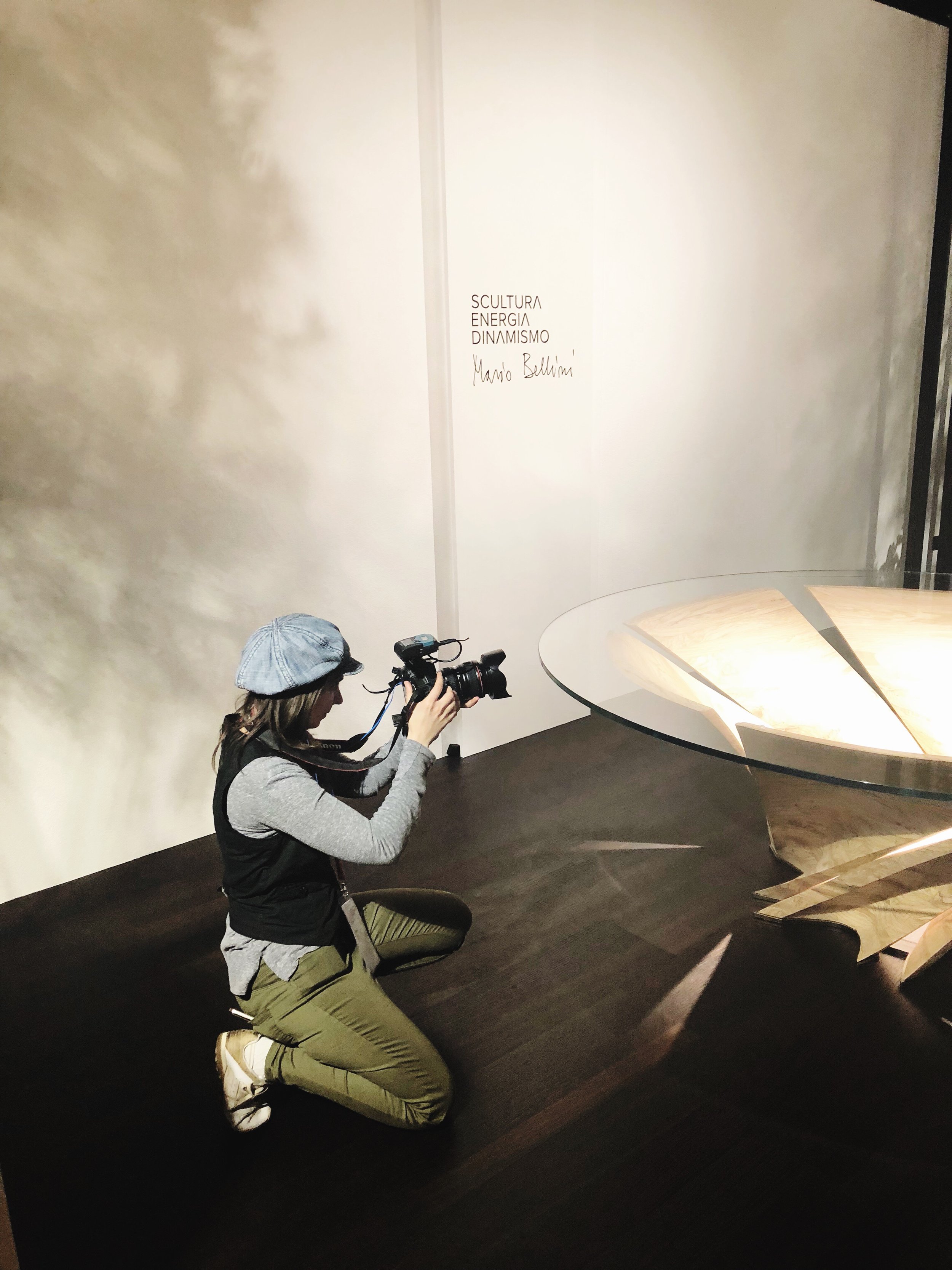
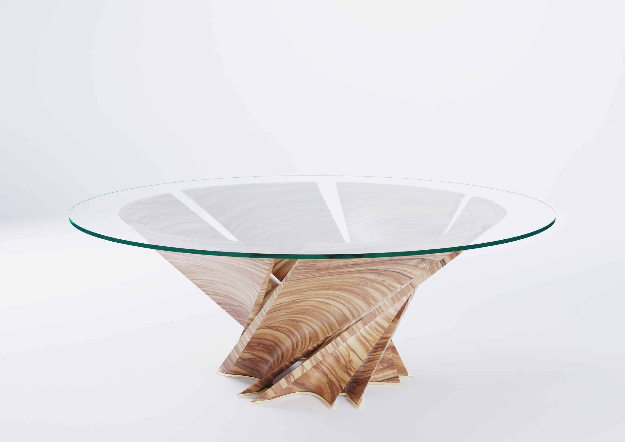
I loved the new Torsion table designed by architect Mario Bellini with its thick glass top and a storm-like base composed of six solid olive wood pieces and inspired by the olive trees from Puglia which resist the inclement weather by twisting. I couldn't take my eyes off of it! Look...
Side Note: It was interesting to also see that Marcel Wanders, whom I had the pleasure of meeting the day before in Milan, designed the Agronomist collection of sofas, armchairs, and furniture inspired by the land, the landscapes, the architecture and the lifestyle of Puglia and also Oceanographer, another collection of seaside inspired sofas, armchairs, chairs, tables and accessories.
5. Kartell
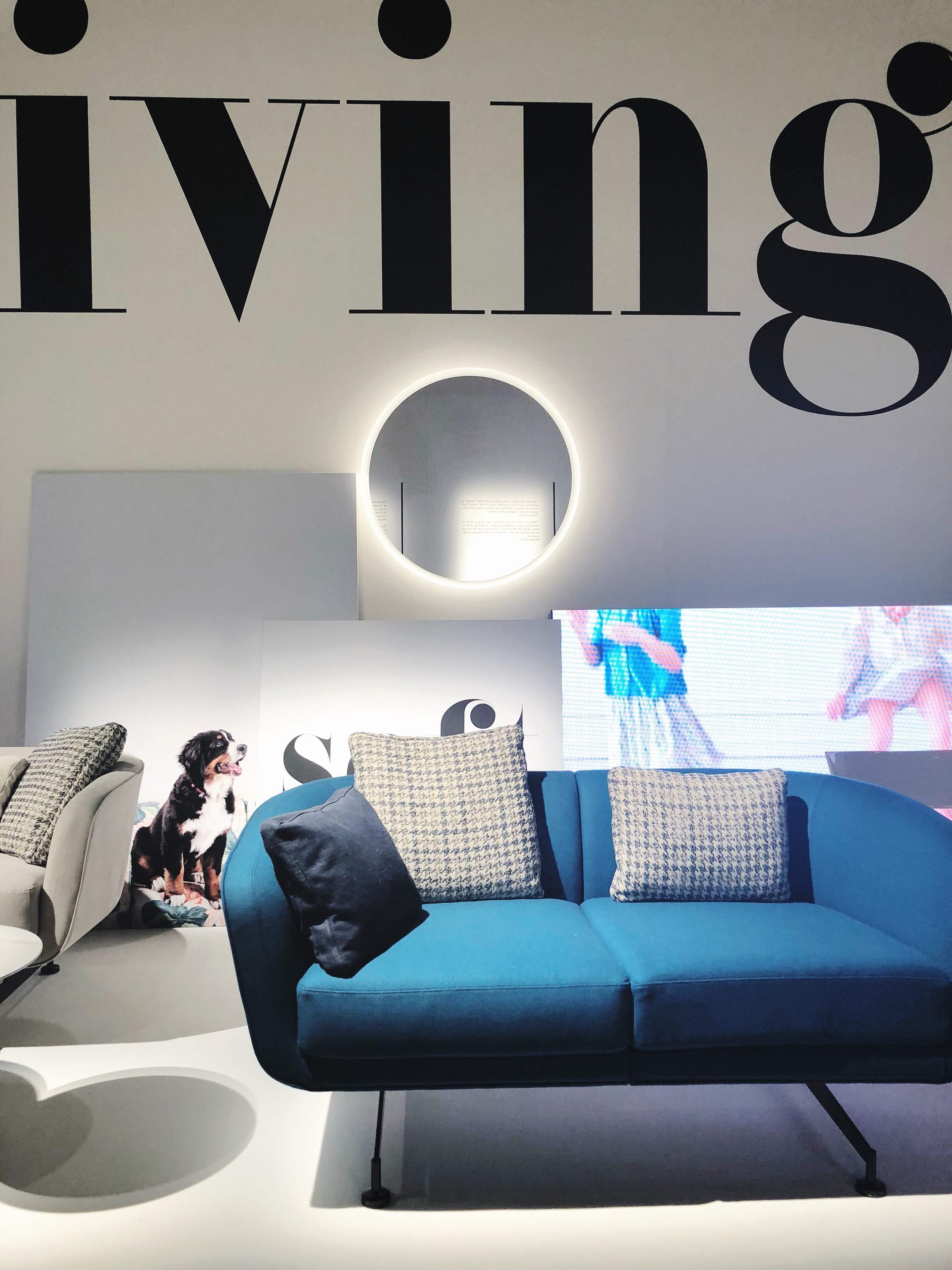
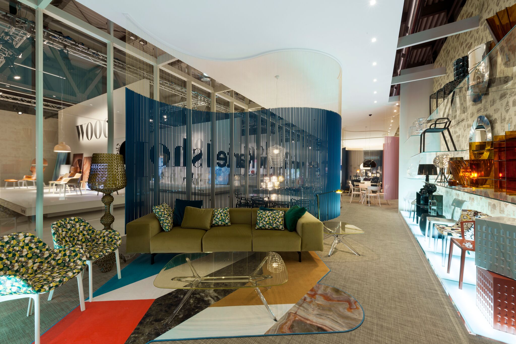
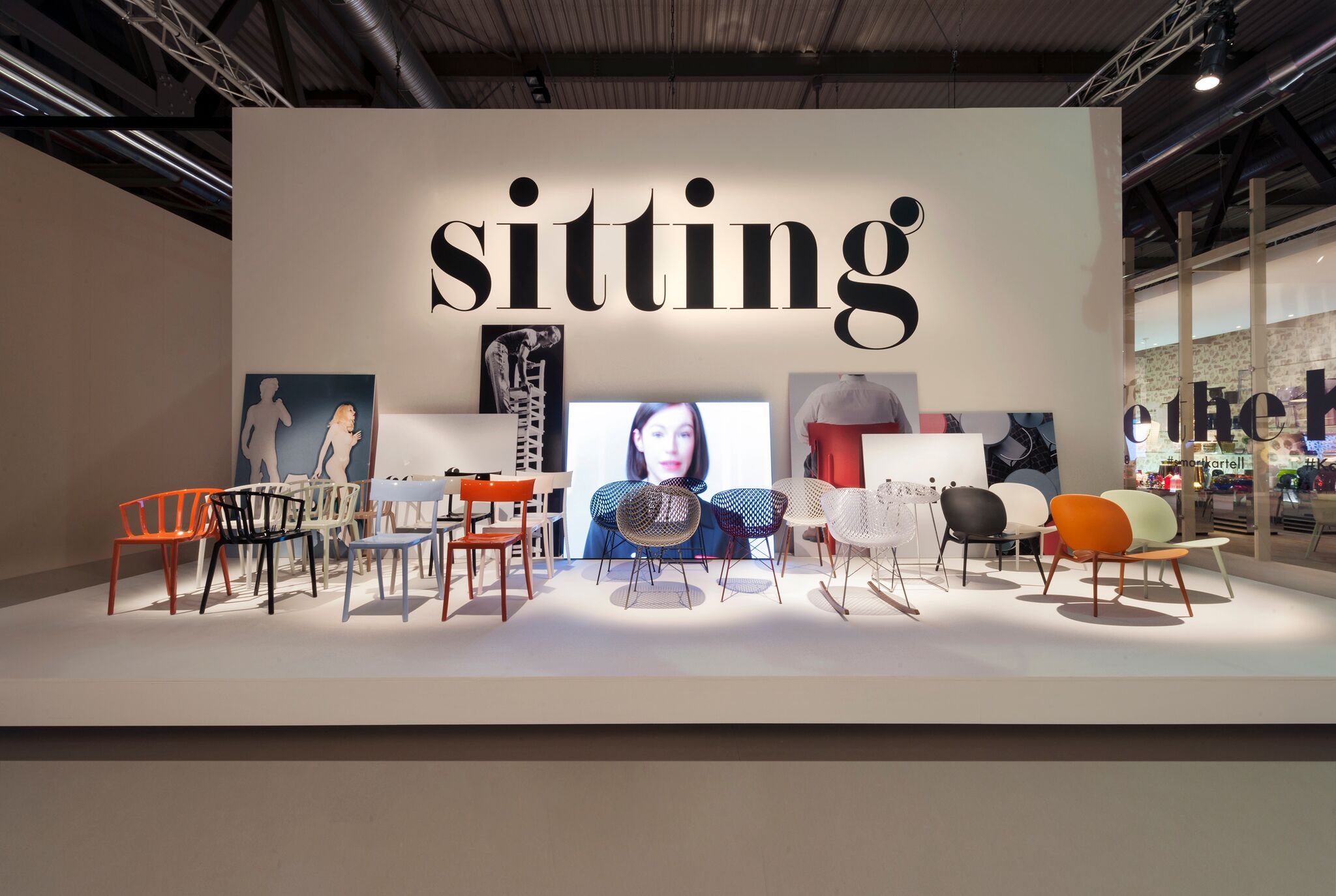
I loved Kartell this year and the,"Smart Design For Smart People", themed stand. It was so easy to find products, learn about them, photograph them and to get into the moment because the stand was split into row after row of themed displays where you could see the theme, read about it and photograph it easily since everything was on display gallery-style so no one was lounging on sofas or chairs getting in the way of your photography moments!
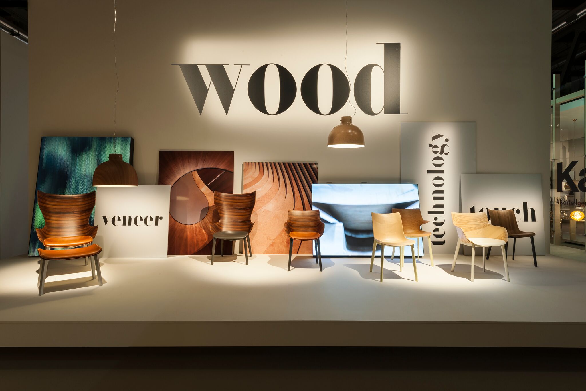
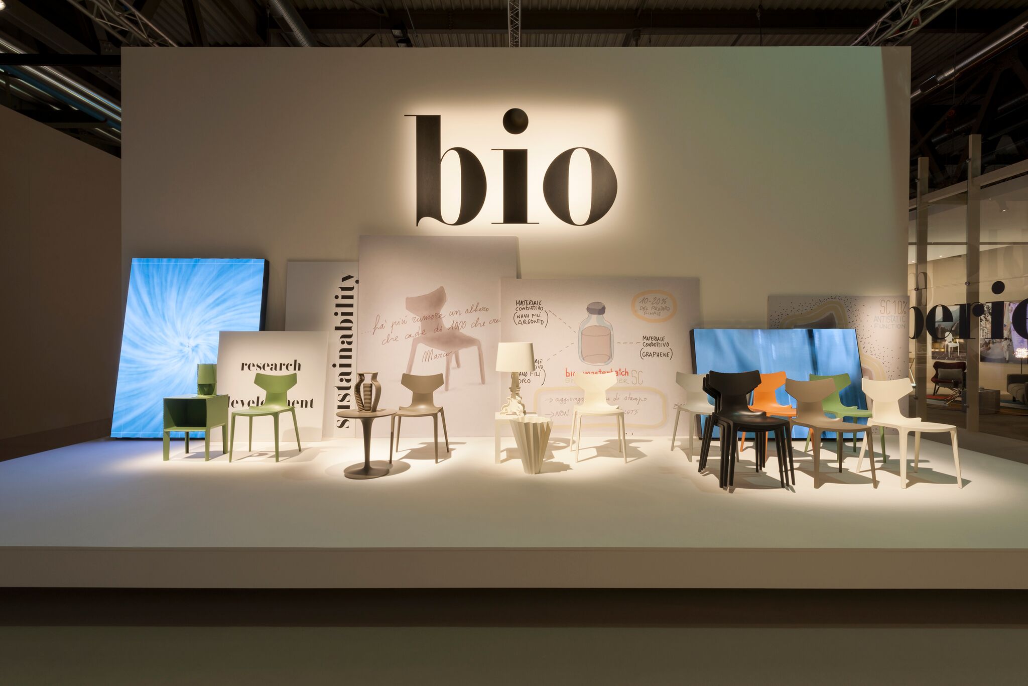
"The display involves eight platforms, each for a project representing a macro-theme of the corporate strategy: new research into wood, with the WOODY collection; a focus on BIO themes and new materials; innovation of the SMART TABLES; the placing of value on essential and universal design for the OUTDOORS; the new proposals for LIVING and SITTING; the shapes and plays of light of the LIGHTING line; and, last but not least, the recent collaboration with La Double J for investing the living with colours."
This was such a smart and interesting presentation, I actually loved it. I liked the new WOOD and BIO collections best, I found it so interesting that Kartell would integrate wood into their collection but also that they are thinking more about sustainability and the environment.
6. Boffi + De Padova
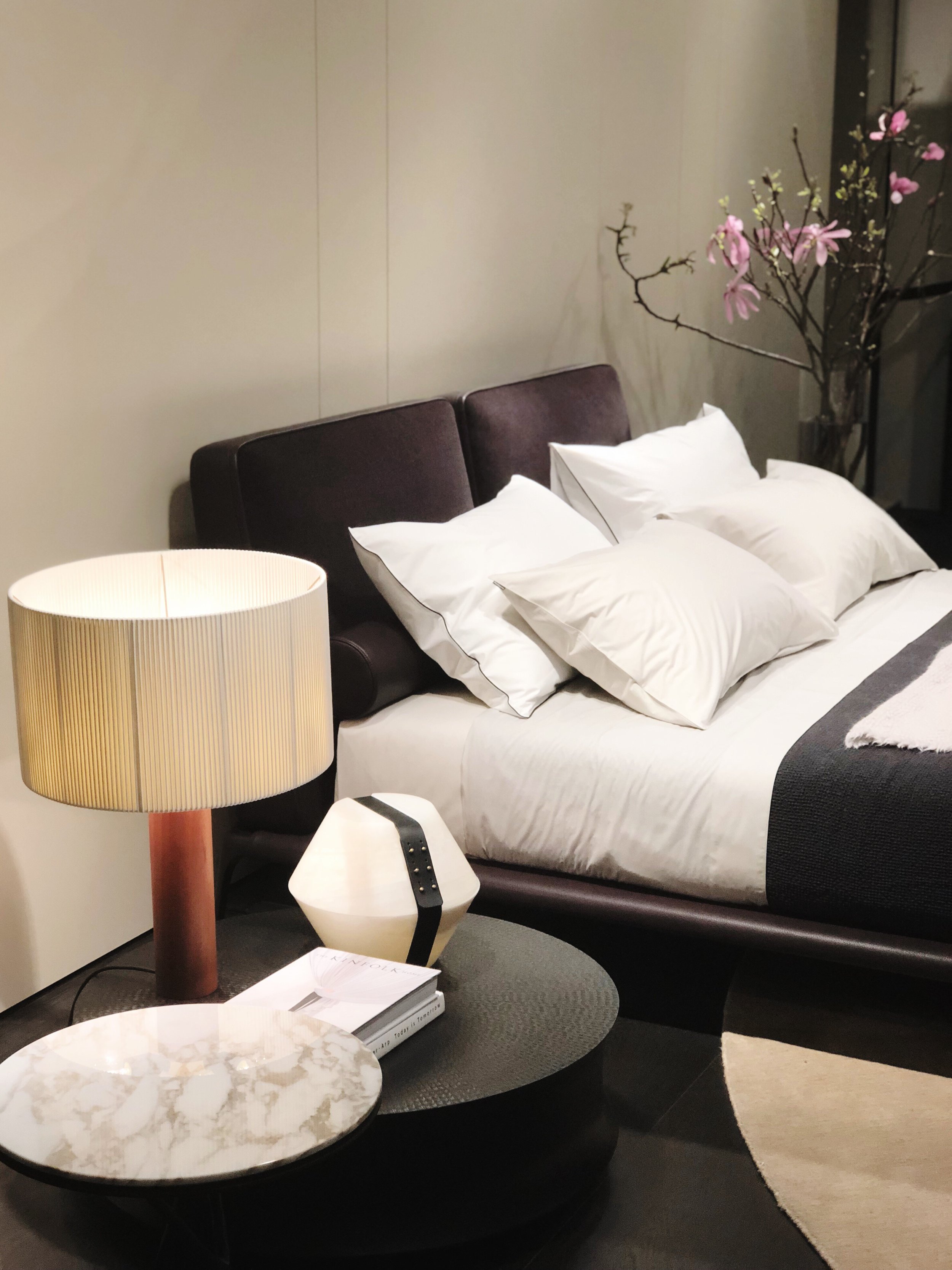
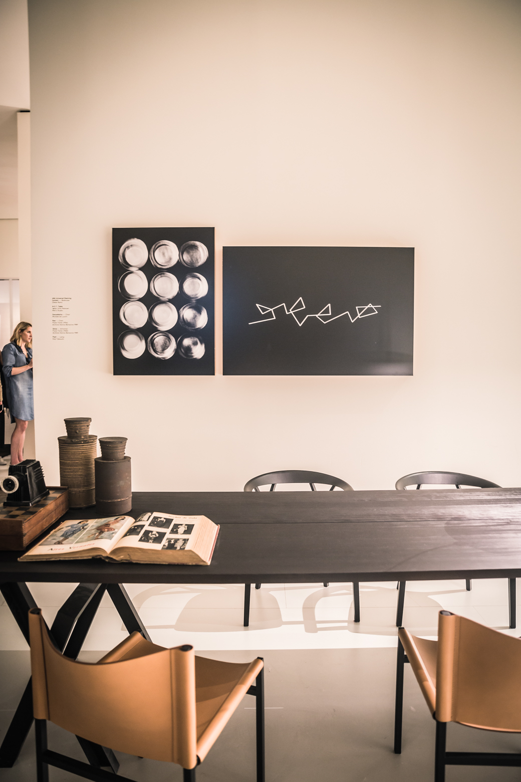
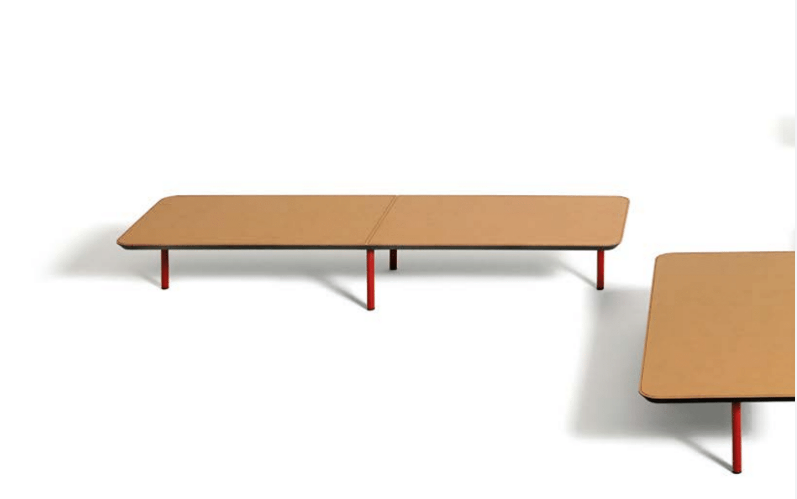
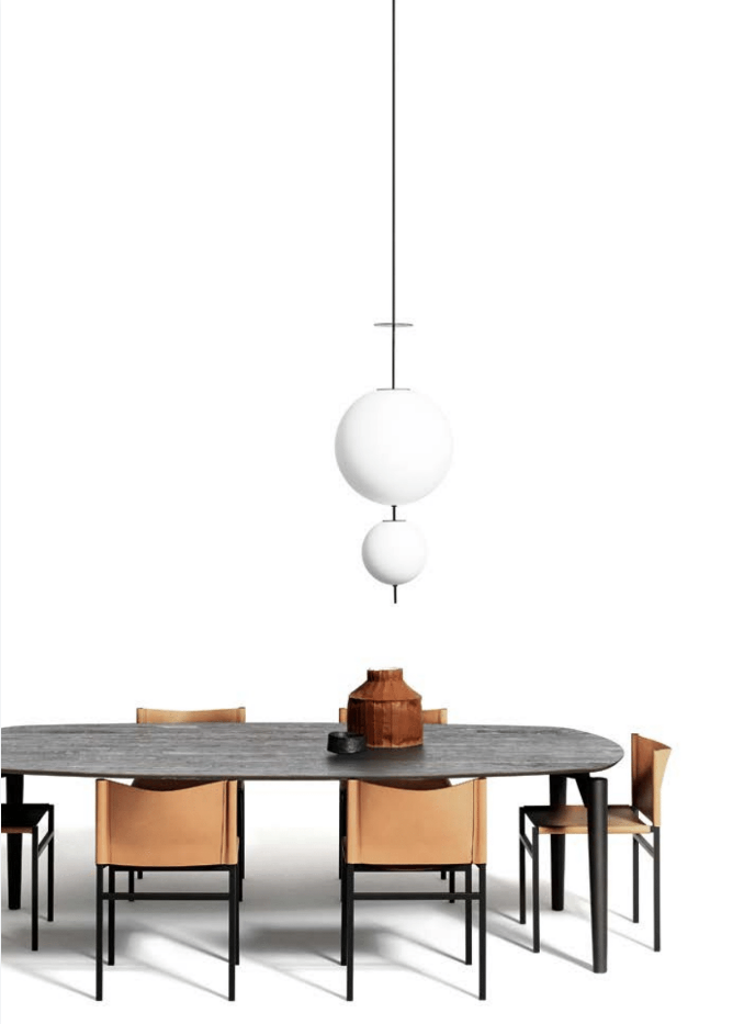
Boffi and De Padova teamed up and their stand at Salone was most impressive. I think it was my favorite after the Kartell stand because of their gorgeous design, but also their styling and attention to detail were spot on and also I liked the lighting in their stand - it wasn't jarring or clinical, rather it was relaxing and warm. I noticed a lot of stands this year paid a great deal of attention to styling. Maybe we have Instagram and scoial media to thank, but brands are really seeking to create an interior story for their products and finally seem to know and understand the value of props and good styling to create an ambiance that helps a consumer understand their products better but also, to feel comfortable around them.
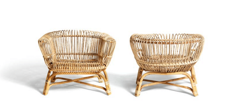
Some of my favorites (above) from this stand included the Silvia Poltrona Armchairs, the Blendy curved sofa, Fratelli Monti 1954 armchair, Erei small tables, Elementi Lampada (hanging light), Poet lamp.
7. Scavolini
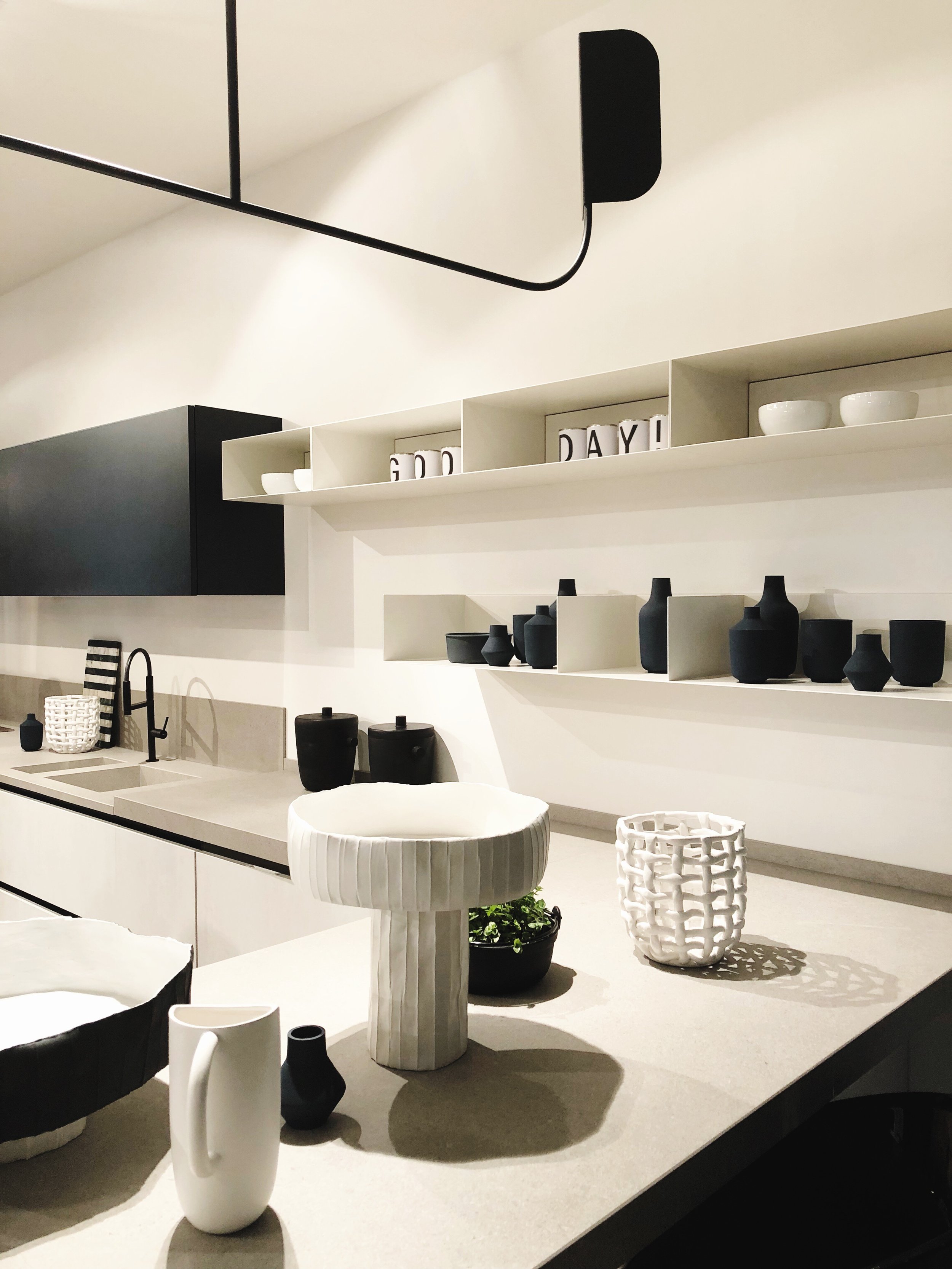
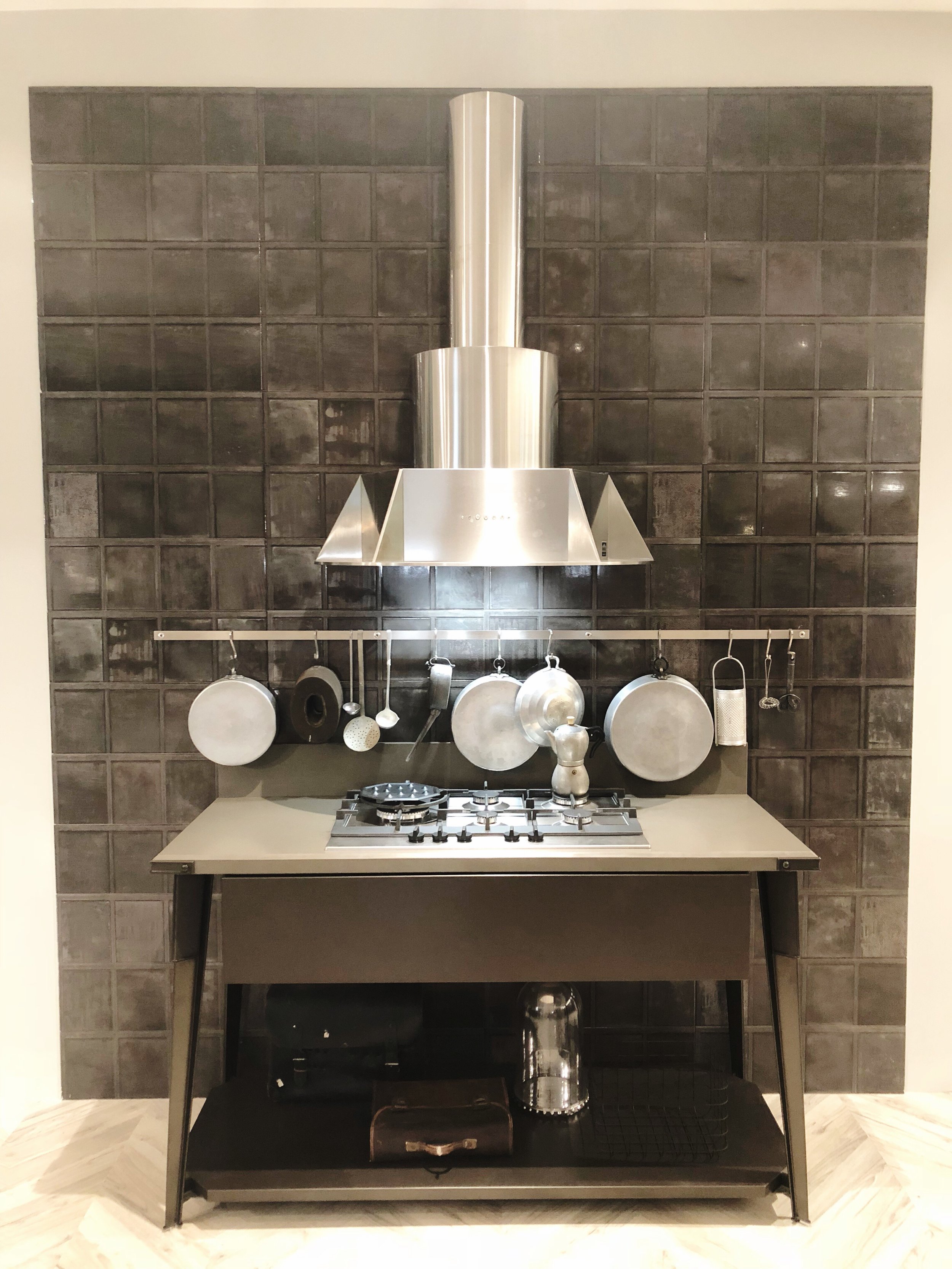
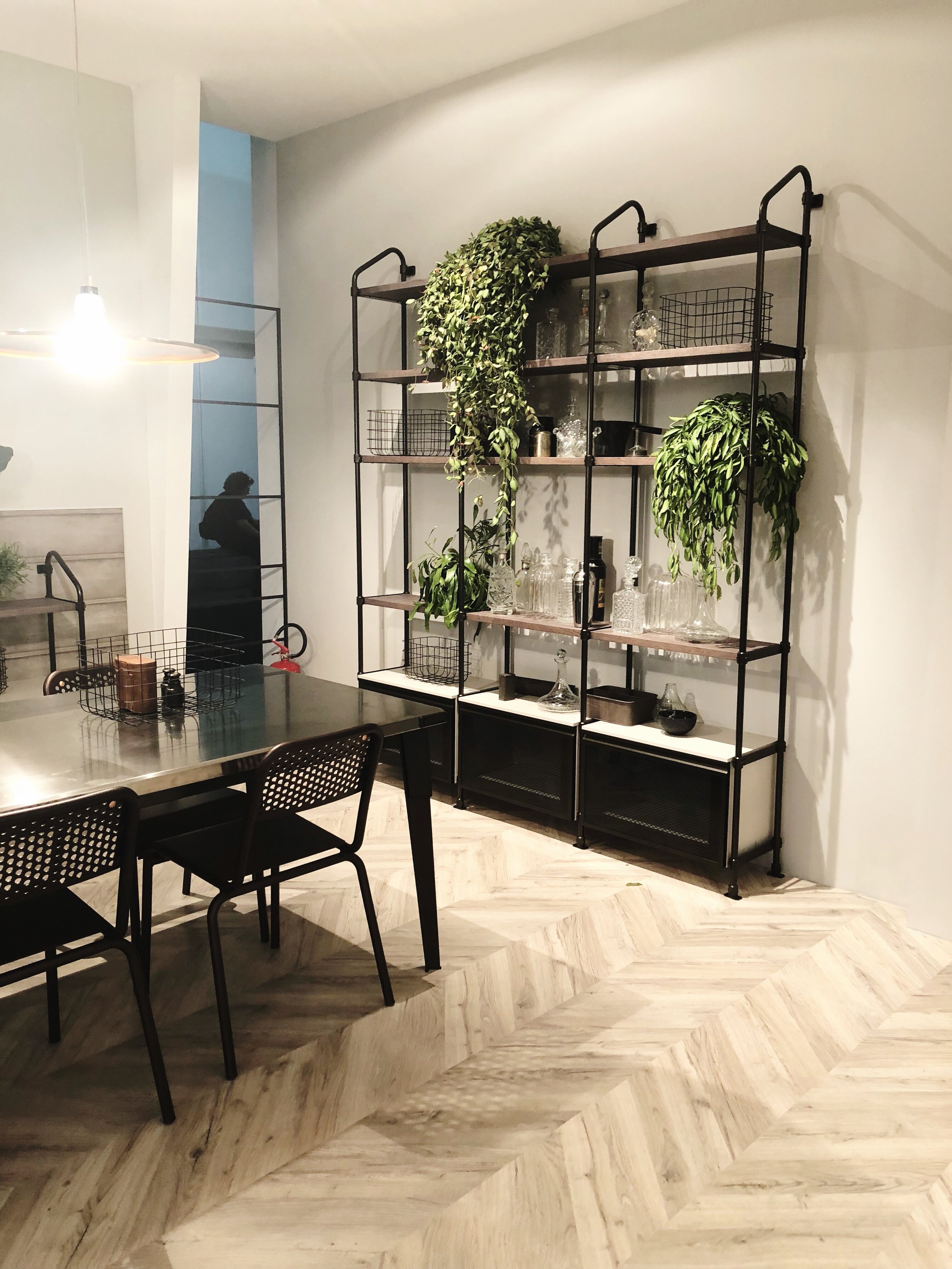
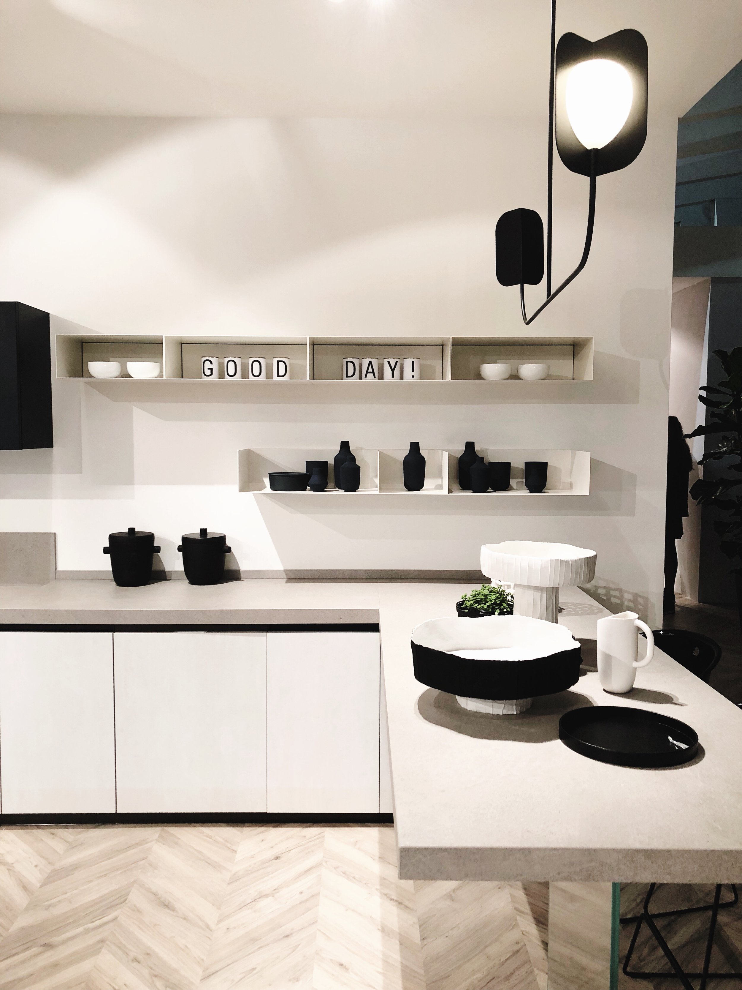
Our final stop on this tour ended with Scavaloni where we saw their newest collaboration with Diesel and to my surprise, some white kitchens which have definitely taken a back seat in the past year when it comes to sought-after kitchen design. I'll always love a bright, white kitchen though and to combine it with industrial elements and black, along with some plants and pretty, styled opened shelving... Well, I'm smitten for that look and I don't think that will change anytime soon. White and black, classic and always in vogue!
In summary, here are 10trends I spotted from touring these brands at Salone this year:
1. MODULAR seating and kitchens
2. LOTS of dark wood
3. BLACK marble
4. BLACK metal
5. TEXTURE everywhere
6. GROOVED countertops in kitchens
7. DARKER kitchens, more masculine
8. STYLING spaces - a big focus
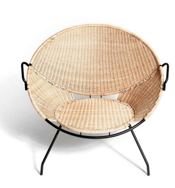
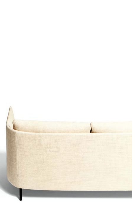
9. CURVES - sofas, chairs, tables, wall hangings, lighting - rounded or oval
10. SUMPTUOUS fabrics that beg you to touch and sit on them
Thank you so much Francesca for having me this year at Design Diffusion, I'll never forget it!
If you'd like to see us in action, check out video footage from our day HERE on Youtube.
(This post was sponsored by Design Diffusion. All thoughts and words are my own. Thank you for supporting the brands that give me the creative freedom to pursue work that I love.)

